Stevo Chartrand
Forum Replies Created
-

Stevo Chartrand
MemberApril 7, 2006 at 11:15 pm in reply to: can anyone help with this bookshop design please?Yes Peter all week in between other jobs. I’ve been carving this piece.
It’s easy to use and it was a huge time saver for hogging out big depressions and for some of the finer details I could do with some of the smaller bits that came with it. Is that too hard to comprehend??? 🙄HDU would be a really nice choice of material for this Hugh. It’s nice to work with and surpisingly easy to carve.
-
I got Omega 2.0 if you still need to, I can take a quick look at ‘er.
(mod-edit)
Stevo
-
Thanks for the nice word guys!
If anyone has any troubles with them don’t be afraid to give me a shout!Stevo
-
Stevo Chartrand
MemberMarch 3, 2006 at 2:11 pm in reply to: can anyone help please with different ideas for this logo?Hi Nancy,
I agree with Jill’s suggestions. It really is hard to read, and when designing a logo I always consider how it will be reproduced for all their letterheads, biz cards, website and any other promotional material.
I took a stab at it not knowing anything about this company. By the looks of your heartbeat graphic shall I assume that it’s something to do with the medical field?
I tried to keep it really clean with just a couple of effects for some flavor. A neat little graphic on it can kind of communicate some sort of idea what the company is.
Hope this helps.
Stevo
Attachments:

-
WOW!! Very Impressive Monty!!!
Your work is amazing!!
😮
Stevo -
Nice work Monty!!!!! 😮
Stevo
-
Stevo Chartrand
MemberFebruary 21, 2006 at 2:59 pm in reply to: question for our American Friends (Jill, Stevo….etc)No worries!! I actually have some american in me! 😀
If you’re not set up with a spray booth or blasting I would sub-contract it out. Get the sign media blasted then have an auto body shop prime and spray the background for me. Then I would brush in the tops of the letters using the same type of paint. You could use one-shot with adding in a hardnder, but you still run the risk of it wrinkling with a clear coat. I did forget to add that yes I would get these clear coated.
They will last a looooooong time having them painted this way.
There’s many different brand name auto paints. I’m not really familiar with all of them but would consult an auto body shop.
Stevo
-
Stevo Chartrand
MemberFebruary 21, 2006 at 2:08 am in reply to: question for our American Friends (Jill, Stevo….etc)Can’t really help you out on pricing it.
But it looks like you’ll have to sandblast and I would get it painted with automotive paints and brush on the raised letters.
I hope they would be restoring the poles as well.Stevo
-
Awwwwww!
I was planning on coming over for the Letterhead meet. But there’s just too much going on right now!Have a great time folks!!
Stevo
-
Stevo Chartrand
MemberFebruary 15, 2006 at 2:22 pm in reply to: can anyone help me with turning this logo into 3d?Hi Richard!
It’s still possible to use a drop shadow. Just use a darker grey than the van. It gives it a natural look! One of my fav effects.
The eye candied version looks cool, but stand back about 5 feet. Can you still see the effect?Stevo
Attachments:

-
Stevo Chartrand
MemberFebruary 15, 2006 at 1:06 am in reply to: can anyone help me with turning this logo into 3d?Jill’s right. The letterstyle is quite weak to be putting a 3D effect on it.
I added some highlights and a drop shadow on this to add some dimension.
See my Corel demo to learn how to do this in Corel.Stevo
Attachments:

-
Looks pretty cool, dig the colors.
You have a pic of the graphic on the hood? I mean bonnet. 😀Stevo
-
Brian it’s actually a pretty simple concept. I just seen a show on how Billy accomplished it. Pretty cool! Now that’s a bike builder! Not some ‘ol geezer with a rope glued to his face barking orders and trying to be all dramatic for the cameras.
Stevo 😀
-
Nothing personal Brian. I’m just more of a traditionalist when it comes to choppers. Lean, big motors, loud, and rideable! 😀
Stevo
-
That’s Russel Mitchell Jill.
I think OCC sux and there bikes are for shows and pansies! I know Jesse has been really overexposed but I still think he’s one of the best bike builders.Stevo
-
Stevo Chartrand
MemberFebruary 9, 2006 at 8:57 pm in reply to: Do you put your name on signs you make?There’s been a few nephew art type signs I was forced to produce that I didnt put my name on because the design was sub-standard. The work your proud of definetly put your name on it!
We call ’em “brag tags”. 😀
Stevo
-
Hey Checkers!!!!!!!!!!!!!!!!!!! Good to see ya here!!!!
Stevo
-
Stevo Chartrand
MemberFebruary 3, 2006 at 11:59 pm in reply to: just need your opinions on this illustration please?😮 NICE!!!!!! Impressive work Ramj!
Stevo
-
As of now, I haven’t made a sign in five months and have stopped offering them, simply because there is no money in it. It’s just not fun anymore busting my ass making a measly little profit.
Materials have gone up alot here , there’s no profit to be had, customer respect is nil, and all they care about is price. The last couple quotes I priced it to make some decent money on it, knowing full well I wouldn’t get the job. I’m done even trying.
The industry has gone in the crapper and it’s tough to see alot of my friends constantly struggle to make a buck.I have been fortunate to work on some really nice sign design projects with world class signmakers. They pay me top dollar for my work but it’s getting to be a rarity.
My main focus right now is custom vector illustration. There’s pretty much 100% profit in it. Hard to beat that! And I really enjoy it! As far as signs go I am done with them and couldnt be happier.
Stevo
-
Glad I am getting out of this stoopid sign business. Peter’s thoughts on the industry make me wanna puke!
-
Stevo Chartrand
MemberJanuary 27, 2006 at 8:16 pm in reply to: Can I get some input on my logo design/card layout please?Me too. I hope I didnt come off as being a bully.
There are reasons why basic rules and guidelines of layout should always be used. I adhere to these everyday and the reason I use them is simply because they work! I dont think every business card looks “samey”, but with every break of a guideline to be different you will lose the effectiveness and communication to the reader. Copy priority is always crucial!!A business card is a powerful communication tool and if it appears highly ineffective and hard to read, then what’s the point.
Keep us posted on your progress.
No offense intended here either. 😀
Stevo
-
Very Nice Marcella!!!!!!!
I’m impressed!! 😮Stevo
-
Stevo Chartrand
MemberJanuary 27, 2006 at 4:52 pm in reply to: Can I get some input on my logo design/card layout please?I agree with Rodney too. There is no flow or copy priority to your layout. I’m attaching a quick guideline for you. This is how I typically layout business cards with the main focus being your logo.
Hope this may help you some. 😀Stevo
Attachments:
-
Draw two circles, overlap them, weld them together, add a node in the center at the bottom, pull it down to desired length and tweak out the sides. Maybe add some highlights. It’s done.
I really dont mean to sound like a jerk here, and I realize that we are all on different skill levels. But these kind of requests cry of laziness to me. I wouldn’t think someone that is in this industry could have a rough time building or even know of a good resource to BUY something. Spend a buck or two on something decent.
My 2 cents.
Stevo
-
I just did an image search with google there are tons there to vectorize.
-
Hey Sal!!! Good to see you in the hood!
Yup folks, this guy is mean with a brush and airbrush.Stevo
-
Stevo Chartrand
MemberJanuary 17, 2006 at 5:06 pm in reply to: can anyone please help with First van design?😮 WOW!! Paul that’s amazing work!
Stevo
-
Sh!t Geary, is that really you? 😮 I thought I’d just seen a different avvy of yerself. That is a b!tchin doo man!! I love it!
Stevo
-
I can see the pic now. Graphics? No offense, but it just looks like the general lee’s numbers.
Stevo
-
Chop it off! Get a MOHAWK!!!
Stevo
-
Stevo Chartrand
MemberJanuary 11, 2006 at 4:57 pm in reply to: Truck Lettering: Stevo Design/Jill LaborThanks folks, and nice install Jill! No bubbles and it looks straight too!
Stevo
-
Stevo Chartrand
MemberJanuary 3, 2006 at 11:40 pm in reply to: can anyont help withfiesta van design please?Best way that I’ve found to avoid that sort of scenario is to always get a deposit or art fee. Even if he’s a friend of yours you still put time into his project and then shafted you by bailing out and changing vehicles.
I learned this the very hard way. Hasn’t happened since I’ve asked for deposits.
Well at least the next project is a bigger one for you and you did get some ideas and practice.Good luck to ya Richard!
Stevo
-
I think SignDNA has a font called smoothie! 😀
Stevo
-
Stevo Chartrand
MemberJanuary 2, 2006 at 11:13 pm in reply to: can anyone help with my logo that needs putting onto truck?Looks like it has alot of potential. Do you happen to have any ideas for it?
Stevo -
Stevo Chartrand
MemberJanuary 2, 2006 at 7:47 pm in reply to: can anyont help withfiesta van design please?Better! I’d like to see some different colors on your text to seperate things abit. Maybe the lighter blue for the service listings? And bumping up the stripe and the text from the bottom a tad more. It’s getting there! Hope you dont think I’m being too hard on ya! 😀
Stevo
-
Hi Jayne!
Well there are quite a few sign font sites out there.
Here’s a few that Jill and I both use.http://www.letterheadfonts.com Lots of antique style fonts here. There’s a few workhorse typestyles. Arthur Vanson’s collections are quite versatile.
http://www.signdna.com Lots of nice scripts and prismatic fonts here. The Mike Stevens collection is great!
http://www.thefontry.com Some scripts, Atkinson fonts, and lots of racing style ones too.
http://www.artandsignstudio.com/fonts
Have a browse and pick ones that you think will work the best for you. The antique style fonts are really nice but would you use them everyday? Personally, when doing alot of just commercial style work I like Arthur Vanson’s work. The Mike Steven’s fonts are great too and can add some punch to what otherwise would be just a boring layout. Lots and lots to choose from!
Have fun!Stevo
-
Stevo Chartrand
MemberJanuary 2, 2006 at 7:24 pm in reply to: can anyont help withfiesta van design please?Ahhhh okay! I tend to get carried away doing other people’s designs! 😀
From what you’ve described I’d just simply have the logo and phone number in the top panel. Nothing fancy but gives him some identification. Didnt realize it was your logo mate, but you might want to consider making the bottom panels with the text bigger, so it can be read.Stevo
-
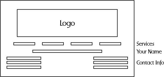
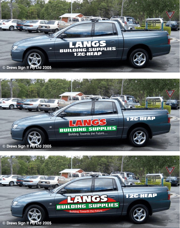
Stevo Chartrand
MemberJanuary 2, 2006 at 7:11 pm in reply to: can anyont help withfiesta van design please?Well here’s my shot at it. The root of your layout trouble is the logo. It simply does not work, it’s very difficult to read and looks like a logo for a night club.
Vehicle graphics should be high impact, easy to read and uncluttered. That’s how they get noticed. Aside from sitting in traffic the amount of time to read the message is about 1-3 seconds. Usually when a client wants a listing of services I like to list them on the back. The only time it will most likely get read is at a stop light. Otherwise its just cluttering up the sides.
Here, I messed around with the logo(souped up the car too) and seperated the text from the graphic. The text on the logo is useless being that small. The yellow stripe was just too loud and found it overpowered everything. I’m not totally happy with what I’ve done here. it is a tad bottom heavy but it is legible and noticeable. Hope it may spark some ideas for you.Stevo
Attachments:
-
Looks great Paul! I like those colors together and it’s a nice clean design.
Stevo
-
Merrrrrrrrrrrrrrrrrrrrrrrrrrrryyyyyyyyyyyyyy Christmas Leigh!!!!!!!!!!
Stevo
-
Been there, done that ,got the t-shirt, and arthritis.
Richard, that looks like a great kind of job to sub out to a printer for next time. No need to kill yourself weeding. But I guess if it was well worth it. 😉Stevo
-
Stevo Chartrand
MemberDecember 14, 2005 at 2:31 am in reply to: need help please on designing new layout for vehicles?Here’s mine. Just goofing around, couldn’t resist sprucing up the car a little.
Stevo
Attachments:
-
Hmmmm, it’s a pretty small pic.
Something from the Futura family?
Humanist, Franklin GothicStevo
-
Stevo Chartrand
MemberDecember 12, 2005 at 2:17 pm in reply to: Black on a bottle green van, help, any colour suggestionsOkay Jill, Actually it doesnt look too bad at all. 😀
Stevo
Attachments:
-
Stevo Chartrand
MemberDecember 12, 2005 at 1:06 pm in reply to: Black on a bottle green van, help, any colour suggestionsI think it looks good so far! I agree with Jill on her color suggestions, (except imitation gold 🙂 ). Sometimes I like to use a lighter green for an accent pinstripe around the lettering. Here’s a couple samples.
Stevo
Attachments:

-
Sorry mate but I can’t say it’s very legible. In fact I cant read it at all. I don’t mean to harp on you but it’s very important to have your very best work projecting your image. My first impression was that it was for a comic book store. It does have potential though dont get me wrong. With a few tweeks and something alot more realted to your business (no superman). I think you can pull out a cool looking van.
As you can probably sense, there might be something wrong with your layout and design, especially if its coming from your fellow peers. Its allright though. If you need some advice, critiques, or more ideas on how to improve it, that’s what this resource is here for.Its’ nothing personal mate, I’d like to see you have a killer looking van!And unlike Autosign I like to try and explain why something doesn’t work.
The “I don’t like it” comments don’t sit right with me either. Why don’t you like it Autosign????? Just because????? Seems rather unprofessional if you ask me.
Stevo 😀
-
Stevo Chartrand
MemberDecember 6, 2005 at 8:03 pm in reply to: a Tickle in the Trossachs letterhead meetYup, that McLaren boy can twirl a brush purty good.
Can’t make any promises yet if I’m going to make it over, but the pennies are starting to pile up!
Adam did a great job on your site!Stevo
-
Cool!! Aren’t those guys great!
Been awhile since I seen any of those east coast stripers. I love AJ’s signature it’s soo teeny but he does it perfect every time!
Sounds like you guys had fun!Stevo
-
Stevo Chartrand
MemberDecember 4, 2005 at 7:24 pm in reply to: Design for a mate’s van…what do you think?#6 here too. One little thing. The drop shadow on the main copy should be going to the right. You have the highlights on the left hand side of the lettering, so the shadow should on the right. Keep in mind that the light source is coming from the upper left.
It’s looking good!Stevo
-
Nice Work Terry!
Stevo
-
Looking good Steve! Truck lettering is my fav to design.
Stevo
-
Impressive work Leigh! I loooooveeeee those antiqued signs!
Stevo
-
Stevo Chartrand
MemberNovember 29, 2005 at 10:08 pm in reply to: hand painted signage: Kiss the FrogNicework Neil!!!
You sure know how to twirl a brush!Stevo
-
Stevo Chartrand
MemberNovember 29, 2005 at 5:17 pm in reply to: hand painted signage: pitsburgh Golf CourseTurned out great Jill! I reallly like that natural shadow, it looks sooo real.
Jill, that artist is still in there!
I’ve always stared in awe at the way you can look at a picture and just paint it. I mean I’d have to sketch it out do some erasing and tweaking then paint it in. You have a great talent for this and always love to see you do it.Love…Stevo
-
Stevo Chartrand
MemberNovember 29, 2005 at 2:17 pm in reply to: sandblasted sign: eagle scout patioNice clean work.
How did you achieve the finish on the banner and eagle? Paint?
Stevo
-
Nice work Robert!! HUGE improvement over the old one. I hate to admit it, but I like the pink on it too. Really eye catching and well suited for the business.
Stevo
-
Atta boy! That’s a good read.
I’m still developing my skills too, what sets a good designer apart from the pack is that motivation to learn, try new things and really is never satisfied. I can look at some of the work I did as little as a month ago and see flaws and improvements I could’ve made. Those little things will carry over to the next design and so on and so on. It’s a never ending process and I’m glad to see someone enthusiastic about it.Stevo
-
Ahhhhhh so that’s what it was! That’s cool man! I like the fact that you didn’t settle to use just another font.
Keep it up!
Stevo
-
DUUUUDEE!!! 😮
Man I really like that! Nice and clean with that right amount of jazz on it.My guess on your modified font issssssss Brewer’s Bold???
Stevo
-
NICE!!!!!!! Very classy looking sign Steve!
Stevo
-
Stevo Chartrand
MemberNovember 28, 2005 at 12:33 am in reply to: Vehicle Graphics: Bull contractingLooks clean Steve.
Stevo
-
Stevo Chartrand
MemberNovember 24, 2005 at 10:37 pm in reply to: can anyone help with this sign layout please?Here’s something reeealllly simple. I added an inset border and a couple of rules to take up abit more room on the sign. It is abit of a tough format to work with when you’re limited to that letterstyle.
Stevo
Attachments:

-
Stevo Chartrand
MemberNovember 20, 2005 at 3:39 pm in reply to: hand painted signage: costumes for santaLooks great Jill!!
What a neat technique to add some dimension to a sign.
Gotta love those Arthur Vanson alphabets.Stevo
-
Had a few of those clients myself,
Joe Hellvetica
Ace Futura
Franklin Gothic
Roman Times
Brad Font
Simon Script
Ivanna Badfont
I. P. Frankfurt
Mr. Tallington
Mya Fontsux
Heywood Japickafont🙄
Stevo
-
Stevo Chartrand
MemberNovember 19, 2005 at 9:33 am in reply to: can anyone help with layout on car please?:lol1:
-
Stevo Chartrand
MemberNovember 19, 2005 at 2:56 am in reply to: can anyone help with layout on car please?I know how to fit vynull Peter. I’ve done it for seven years now and understand whats involved from start to finish. A couple of trims here and there really isn’t going to take much longer. And like I said as long as it doesn’t interfere with the lettering too much then it works for me. I would tweek this one abit more before production.
-
Stevo Chartrand
MemberNovember 19, 2005 at 1:36 am in reply to: can anyone help with layout on car please?Thanks Peter and Carrie.
Peter,
When I design vehicle graphics I treat it like there are no obstacles involved. These designs may have to be tweeked a little bit for the handles. As long as it doesn’t interfere with the lettering too much it doesn’t bug me if it hits something, you can usually wrap abit of vynull on the obstacle when installing. Makes it really look like part of car.Stevo
-
Stevo Chartrand
MemberNovember 19, 2005 at 1:00 am in reply to: can anyone help with layout on car please?Hi Shane,
Here’s a quick one for ya.
It goes from cheapest to cheap, to over budget. Their company colors are kind of tough to work with so I did use white for their name for impact and dropped the stripes. I know how you feel when a project drags on for too long. You lose your enthusiasum for it. Hope this may spark something for you.Stevo
Attachments:
-
Stevo Chartrand
MemberNovember 18, 2005 at 8:00 pm in reply to: can anyone help with layout on car please?Shane,
Do you have a pic of just the car with no graphics?Stevo
-
Stevo Chartrand
MemberNovember 18, 2005 at 2:21 pm in reply to: Is methylated spirit suitable for cleaning? Advice please?I’ve used Methylhydrate before in a pinch. It’s like a camping fuel. Sounds similar to what you mentioned. Its risky and you have to wipe it on and off really fast (dont be smoking around it!) and it did dull the finish a little. Thank goodness the lettering covered it up. Too risky for me, so I dont use it.
Isopropyl alcohol will work but find that it can leave a residue if you havent cleaned it with windex before using it. Isopropyl you can buy at the local pharmacy or drug store. (well here you can).
I now use Rapid Prep. Not sure you can get it over there but if you contact Roger Bailey at http://www.rapidtac.com. He’ll be glad to send you some samples.
Happy Cleaning!
Stevo
-
Deposit!!
Clients that are serious and have every intention of using you and your services won’t normally balk about giving you a deposit. I’ve learned this the hard way. Sorry it had to happen to you Lorraine. We’ve all been down this road before.
Send them a bill and see what happens.Stevo
-
Hi Signguru!
Good to see you here! You’ll find alot of great folk here with a wealth of information. Where abouts in the US are you from?
:lol1:
Stevo -
Stevo Chartrand
MemberNovember 17, 2005 at 3:11 pm in reply to: Can anyone come up with any suggestions for this van?Hi Jayne!
I was just about to answer your font questions and email you the wrench but it looks like a done deal now.We all want to put out those great looking designs and have fun with it. It does benefit the customer alot more than they think (and satisfies our creative urges). When I worked for commercial sign shops I wanted every design, sign or vehicle too look its best and have some fun with designing and making the CLIENT look good. So I would try and try to educate the client on IMAGE. You are giving them an image, not just a sign! “ohhhh I dont want that it looks too nice”. It’ll turn some heads and make people notice your company. “ohhh but it looks too nice”. Any businessman with half a brain knows that image is very important these days. The other half just want that POWER over you to design there garbage ideas. So you gotta cave in sometimes and give them the crap they want.
No offense Jayne but this design he likes is not exactly too beneficial for him. All I see is his name which is barely legible. I know you would’ve done a heck of alot better job. It’s now HIS design and not yours.
It’s frustrating, isn’t it??? As Jill always says “The only taste a Customer has is in there mouth!!”
Take the money and run!
Rant over! 😀
Here’s the fonts anyways. Sante Fe Script from Sign DNA “Wayne Ch…” and Convecta from Letterhead fonts. “Heating, Plumbing and Vehicle Graphics”
Stevo
-
Might be a little late but here’s a nice clean one.
(mod-edit) no advertising
Stevo
-
Yup I do the same! They’re given enough choices with two layouts and I’ll give them a couple of revisions and tweeks. If they cant convey exactly what they want on the sign after the revisions then I start charging more. They are totally aware of this right from the git go and in most cases it works and the job goes smoothly.
Jills case however, the client was very indecisive and was taking too long and being very petty about moving this and that and generally being a pain in the arse. She’s showed a heck of alot more patience than I wouldve put up with.
I know we try to be as accomodating to the customer as much as we can, but it can only go so far. It is YOUR time, charge for it!!!!!
Stevo
-
Stevo Chartrand
MemberNovember 16, 2005 at 4:35 pm in reply to: Can anyone come up with any suggestions for this van?Hi Jayne,
Had a few moments and whipped a layout for you. I like to use big strong typefaces for vehicles. And being that this is a plumbing and heating company it does convey a stronger image. Getting too fancy or cartoony with letterstyles doesn’t really fit the image of the pipe wrench weilding, butt crack showing plumber.Copy priority was a little tough on this one because of the use of one color for everything. So you have to rely on the weights of the letterstyles. I tried to have the heating and plumbing the boldest and used a script for his name for abit of character. Another bold letterstyle for the phone numbers and a lighter weight one for his services. I did drop the “tel/fax” (dont think too many folks have fax machines in their car or while sitting in the pub as they see it drive by) and also dropped the “mobile”. People know what to do with these numbers.
I also used a very subtle graphic of a pipe wrench to sit in the background to add abit of interest and color.
Hope this may give you some ideas!
Stevo
Attachments:

-
hahahahahhahaha Jill!!!!!
:lol1:
Stevo
-
Stevo Chartrand
MemberNovember 10, 2005 at 9:42 pm in reply to: vehicle graphics: north hope fire dept.Turned out great Jill!
I’m sure the pics don’t do it justice with the gold on there.Stevo
-
Hi Andrew,
I just use an HP 1315 all in one printer and scanner. Nowadays it doesnt really have to be anything high end. Your raster to vector program is pretty important and the quality of your drawing. It’s best to draw it as big as possible.
I am using Omega and it’s not real difficult to vectorize a scanned B&W image. Cleaning up the image is where it could get time consuming, but i am getting to be fairly quick at it.Stevo
-
WARNING
Balcony Ahead.
Dangling babies is strictly prohibited MJ.Stevo
-
Hi Leigh!
The bevels on the panel in the Lawn Care logo are just different shades of the green. I’ll assign all the bevels the main green I’ll be using and then mix up the lighter and darker shades myself.
Dave,
I’m a mouse user. I attached a photo to give you an idea of the evolution. I still love to draw out graphics on paper. I haven’t tried out a tablet yet, some people I have talked to about it have said there is quite abit of a learning curve and getting the hand eye co-ordination can be tricky.I do get alot of people asking if I do this in photoshop. In fact I don’t know photoshop or illustrator at all!! I’m clueless with those programs. I had experimented with filters in photo paint but it just didnt give me the sharp look I was trying to achieve. I find that it’s just too easy to throw on an effect with a filter and have seen alot of abuse of these easy ways to make things look “cool”.
Lots of these effects and tricks I do, have stemmed off of painting first. Experimenting with color mixing, beveled edges and highlights I discovered and tried with paint first. Then this carried over into my designing.
Thanks again for all the compliments! I blush with all the nice words from you folks. 😳
When I do get some time I’ll write up something up on how to make your own clip art.
Stevo
Attachments:
-
Thank you for all the nice words everyone!
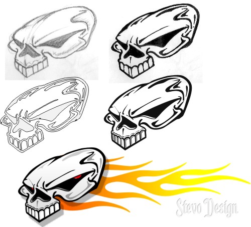
These are all done in Corel, no photoshoping here. I’ve always liked the crisp clean look you get from vector illustrations.
For the Woodpecker I sketched it out in pencil, inked it in, scanned it into Omega, cleaned up the nodes and smoothed it out a little. Then I bring the image into Corel Draw where I can add some color, abit more detail and some shading.
When I get a chance, I’ll do a quick write up on a couple of tricks.
Stevo
-
Stevo Chartrand
MemberNovember 9, 2005 at 9:14 pm in reply to: Traditional Signwriting Brushes. What do you use?Thanks for the links fellas!!
Stevo
-
Stevo Chartrand
MemberNovember 9, 2005 at 2:58 pm in reply to: Traditional Signwriting Brushes. What do you use?I’ve got a few different kinds.
Lucos
French Masters
A couple Mack quills.
But my Favs are the Handovers! I got them for free at a Letterhead meet. Now if I could just find a good source for them in Canada or the US. No such luck so far.
May just end up getting them from overseas. Does anyone have a good source for ordering them online?Stevo
-
Sounds easy enough to sketch on white vynull and cut it by hand.
Stevo
-
Stevo Chartrand
MemberNovember 8, 2005 at 2:53 pm in reply to: vehicle signage: Magnetic on Diamond PlateThatsch schome nice looking work Jill! I think they’re both great!
I like the Schimplicity of the one on your truck, but itsch schtill eye catching.Love…Schteevo
-
Stevo Chartrand
MemberNovember 4, 2005 at 2:11 am in reply to: can anyone help with the layout for a truck please?Here’s my take on it.
It’s not groundbreaking or anything but I can feel your frustration on this one. The logo is very weak ,the eye really doesn’t fit, and there really isnt alot of surface area to work with.
Hope this might give you an idea or two.Stevo
Attachments:
-
Stevo Chartrand
MemberNovember 3, 2005 at 9:22 pm in reply to: can anyone help with this logo please?Gotta agree with Jill. Black and red doesnt work together.
You do have alot of “ands” in there. Signs AND Graphics Embroidery AND Printing. Doesnt seem to read well. Maybe you could narrow down what you want to emphasize. Graphics usually comes with the territory of making signs.Tailor Made SIGNS
Embroidery and Printing.Just some thoughts.
Stevo
-
hahahahaha I can’t believe I did this, sober yet. You guys are a bad influence!!!
No snow here yet, but you should always be prepared!
Thanx for the compliments. 😳
Stevo
-
There are a few jobs where I have to wait the thirty days. This is usually work I’ve done for big corporations. The thirty days usually means 60 to them even though my invoice does say COD. I rarely can get a deposit out of them. But I do always get paid from them.
For new clients it’s 50% deposit up front and the rest upon completion. If I do continue to do work and build a realtionship with the client then after a few jobs I don’t need the deposit ,but they do pay me when the job is complete.
Stevo
-
Here’s how canadian sign painters work in the winter. It’s always handy to have the snow shovel around so I’ll use it as a mahl stick in case of an emergency shovelling.
Stevo
Attachments:

-
Stevo Chartrand
MemberOctober 29, 2005 at 5:02 am in reply to: How do people get to your website???Yellow pages Schmellow pages, unless you want price shopping morons looking for quick and stick my asss garbage. I’ve seen your work man you are very good at it!! To me the yellow pages are a complete waste of money!
I’ve tried to promote myself through sign forums and other sign related sites. So far it’s paying off and getting the jobs I love to do!
A better way is to do up your vehicle with your BEST work on it. It really is the best form of advertising you can have because it never stops working.
Stevo
-
Congrats Dewi!!!!!!!!!!!!!!
Stevo
-
Okay, forgive me for being out of the loop here, but where can I get info or a website to subscribe?
Apparently my Corel tutorials ran in there and I am curious on how to get ahold of one.
Thanks in advance!
Stevo
-
Waiting for a copy here too.
Stevo
-
Nice stuff!!!!!
Always refreshing to see some nice hand painted work around here!
Stevo
-
Stevo Chartrand
MemberOctober 10, 2005 at 8:23 pm in reply to: hand painted signage: monro village appartmentsNice work Jill!!
Yeah the original concept was the first classic style sign. Jill tells me she did a 180 on her and then had to do up some more renderings. Darn Picky Customers!!!! I still like the more corporate clean look.It did turn out nice and clean!
Stevo
-
Stevo Chartrand
MemberOctober 10, 2005 at 3:10 pm in reply to: Traditional signwriting: Newport ArcadeBeautiful work Neil! I like that shadow as well.
Stevo