
Stevo Chartrand
Forum Replies Created
-

NICE WORK!!! I love it.
You’ve got a great style.
Stevo
-
I think it looks great!!
Nice, clean, highly legible with just the right amount of lettering effects to give it a bit of flavour.
Don’t always need all the photo effects, fades, etc. to make a nice looking design.
Glad the customer was happy too Jill!
Stevo
-
Looks great!!
Stevo
-
Nice work Brian! Glad I could help you with the shadow, ya did good with the color choice too!!
Usually when I do the “twinkles” I tend to put more points on it and extend out 4 of them to make it look more realtistic. Just a thought for next time. It does look good though!! 😀
Stevo
-
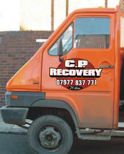
Nice looking banner Ricky!
I see ya even got a Tim Horton’s in it. Hope all is well. Say hi to Bubbles and Julian for me ,and have a breakfast pepperoni on me.Too bad about the idiot customer.
Stevo
-
When we got home after we were done I did the dishes and the windows. 😉
“yes dear”
Stevo
-
Stevo Chartrand
MemberMay 9, 2005 at 12:38 am in reply to: vehicle graphics: port of larne car washI really like this.
It stands out so well.
It’s nice to see something different.Stevo
-
Stevo Chartrand
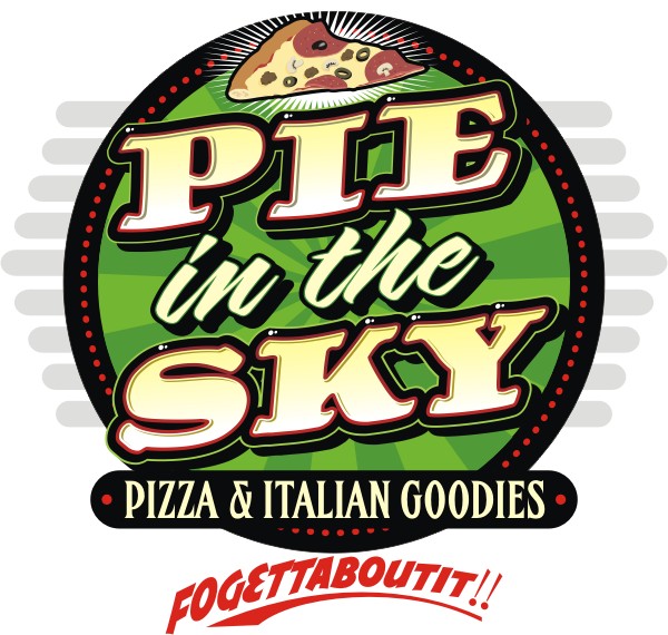
MemberMarch 21, 2005 at 6:10 pm in reply to: can anyone suggest a layout for a pizza place?Had a few spare moments this morning. Nice Job My Jillbeans!! I forgot about the 50’s look when I was jammin on this one, yers is more 50’s lookin than mine.
Here’s Mine.
Attachments:
-
AWESOME!!!!!!!!!!!!!!!!!! 😮 😮 😮
Stevo
-
Google it!
I’m sure there are pictures of curtains out there on this immense thing we call the internet.
Stevo
-
Thats my latest work! What does everyone think?
Critiques Welcome.
Stevo :lol1:
-
Very Nice Work Leigh! Excellent use of color! I’m impressed.
Stevo
-
Hello Rob!
Good to see another crazy canuck here. You’ve found a great site with good folk and info.
Hope all is well in Sunnyvale and Mr. Lahey hasn’t been bustin your chops lately. Say Hi to Julian and Bubbles from a flatlander out west.
Didnt think coffee went with pepperoni too well, but hey I know a good cold Keith’s does!!
I’d watch out for that Corey and Trevor, Ive heard they’re trouble.
hahahahahhahaa
Stevo
-
Stevo Chartrand
MemberJanuary 27, 2005 at 2:05 am in reply to: hand painted banner: pfiefer hardwareAhhhhhhhhhhhhhhhh. Something painted!!!! Great work my Jillybeans!
Stevo
-
I like it! They turned out reallllllllyy nice! I especially like the green background with the hot spot in in.
Ya done good my Jillbeans
Stevo
-
Here’s mine. Dimensional gilded letters for the main copy and surface gilded sub text. The scales will be dimensional too standing off the sign.
Stevo
Attachments:
-
Ditto!!
I’d like to also thank Robert for all the effort, time, and loss of sleep to put together and maintain this great site for all of us!
THANK YOU ROBERT!!
Me and Jill will be over there to buy ya a pint in the future. Looking forward to it mate!
Stevo
-
Stevo Chartrand
MemberDecember 20, 2004 at 5:39 pm in reply to: Has anyone got the ramones logo please?

-
Stevo Chartrand
MemberDecember 20, 2004 at 5:32 pm in reply to: Has anyone got an .eps or .ai file of this -
Seeeeeeeeee told ya!
I think yer doing great babe. My first 10 days in Corel looked like complete garbage. Keep at it and in twenty days you’ll be way better! I know it.
Yer Stevo
-
Yayyyyyyyyyyyyyyyyyyy
Just what this industry needs another HACK with a vynull cutting machine! And has the BALLS to come in HERE and boast how expensive we are!
What NERVE!!!!!!!!!
DUMBING DOWN AND UGLY-ING EVERYTHING WE HOLD DEAR!!!!!
-
Stevo Chartrand
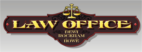
MemberDecember 9, 2004 at 1:18 am in reply to: can anyone help with van design please?Yup I agree with Dewi.
If he did say he was open to suggestion then you have the green light to spruce it up abit, at a FEE of course.If this is what he has already on all his adds, biz cards, etc., and doesnt want to have you do anything to it, I would just crank it out, give him great service and get his money. Sometimes bringing it up to your client that his logo sux and you could do better will only complicate matters.
Most of the time these customers already have in mind what they want so it’s tough to change there vision on what they want.
You can ask him if he would like some improvements on the design and give your professional opinion. If he isnt receptive to your opinions then just cut and stick it.
I have cranked out and done some of the most ugliest signs on the earth!
Its all just part of the gig man!
Stevo
-
Stevo Chartrand
MemberDecember 8, 2004 at 5:08 pm in reply to: can anyone help with welding problems please?Hi Everyone!
I’m baaaaaaacccccck
Dan, I’m not exactly sure what you question is.
If its the text you are trying to weld together here’s what I do:
Convert text to curves (CTRL Q) or under "arrange"
Then I break it apart (CTRL K) or under "arrange"
I then go to wireframe mode and select the shapes I want welded. I dont select the islands in the letters. I then weld them together. Then I select all of the text and then "combine" them under the "arrange" menu or CTRL L.Seems like you may have forgotten the "intersect" step. After I have combined all of my shapes ( the lines) then I intersect them with the letters. Your original shape will remain there so you can delete it. Then go to the wireframe view and you’ll see your shape trimmed and sitting on top of your letters trimmed perfectly to them. Now you can select them and assign them a colour.
If you have more troubles you can e-mail me.
Stevo
-
I’m not gonna dwell on any nerdy vynull crap here.
It looks great Dewi! Very punchy and I’m sure they’ll get some biz from it!
Stevo
-
HAPPY BIRTHDAY!!!!!!!!!!!!!!!!!!!!!!!!!!!!!!!!!!
Stevo
-
Stevo Chartrand
MemberNovember 30, 2004 at 7:42 am in reply to: can anyone help with my window layout please?Dewi
Just an idea. I think the first one you had done was on the right track. The second one you have has very little contrast and no flow in your typestyle choice, it looks like a business card on a window.This one i did I went for the staple window splash look of high impact and vibrant colors. I think it will attract alot more attention.
With the impact this one has it pretty much says what you do. I feel there is no need to have a list on your window. People are lazy they wont read all of it.
Stevo
Attachments:
-
Thats what I’m talking bout! Looks great, love the impact it has. BOOM
Stevo
-
Keith,
For this design I think I spent about 7 hours on it. Not all at once though but it was over the course of two days. I even worked at it at 3 in the morning to try something out, I eventually scrapped that idea. I was trying new ideas and tricks in this one so it took a bit longer than I wanted, but I know I’ll be much faster for the next one. The thing for me now is I dont want to be predictable and having a design I did easily picked out from the crowd. I am constantly looking for new ideas and things to try out. For me it keeps things new and keeps the experimentation level up or I’ll eventually get bored.Thanx folks for the kind words!!
Stevo
-
Thank you everyone!
I truly am flattered that people here are inspired by my work and I do like to share it with you. Seeing you folk use some of my elements that I use to liven up your work is really something to me. It is a compliment!
I got into the sign business to have fun, paint, and design. It truly is my passion!
Now that I am not strapped by a “real job” working for a sign shop ( a decision made for me) working for a shop just didnt jive for me at this point. I can now focus on what I truly love! And I think my work is starting to reflect that.
I have to give credit to the Letterhead movement as well. I have found the love of my life because of it ( my Jillbeans), inspiration, the desire to learn and most of all SHARE! I feel we’re all in the same boat and sharing each others tips and tricks ,design ideas, is what is going to keep us going to keep things new and fresh!
It is great that we have access to this,via this site, to learn from and inspire each other. My applauds Robert for your work here.
Hearing Dewi and other folks on here being enthusiastic about somethin I have done makes me just as enthusiastic! There’s a fun in that for me and I love to see that.
Happy Signmaking!
If anyone (More than just Dewi hahaha) hits a snag e-mail me
Stevo
-
Contact Robert! He’ll help ya out.
Stevo
-
Stevo Chartrand
MemberNovember 26, 2004 at 10:55 pm in reply to: Vinyl Graphics: T.Cooke (3D effect)Carrie I like the word “KERPOWY” you use. hahaha You’re inventing new sign lingo!
😀
Stevo
-
Stevo Chartrand
MemberNovember 26, 2004 at 6:00 pm in reply to: Vinyl Graphics: T.Cooke (3D effect)Excellent!!!! Paul and Chris!
You guys are getting this down! What a huge difference a few details can make. Glad I can inspire you to try new things and make yourself stand out from the norm.
In fact it inspries me too!
Great stuff boys!
Stevo
-
Stevo Chartrand
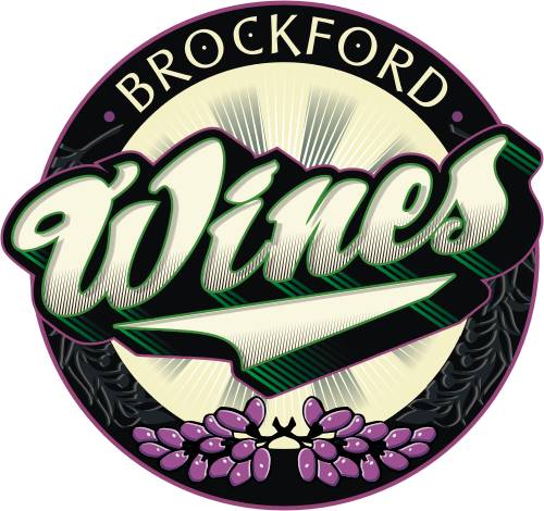
MemberNovember 25, 2004 at 12:59 am in reply to: can anyone recommend a layout for this logo please?Thanx again folks.
Nik, the typestyle I used on Brockford was from one my fav lettering designers Arthur Vanson, they’re neat little details. http://www.letterheadfonts.com
Stevo
-
Stevo Chartrand
MemberNovember 24, 2004 at 11:09 pm in reply to: can anyone recommend a layout for this logo please?No Problem Steve, glad to do it!
This time I resorted to using clip art for the grapes but what I did with them was add some shading and highlights to liven them up abit. I did go overboard on the effects and shading but it can still be an effective piece for vynull output minus some of the effects.
Stevo
-
Stevo Chartrand
MemberNovember 24, 2004 at 2:25 am in reply to: can anyone recommend a layout for this logo please?Hi Peter.
This design took about an hour for me. Alot of my inspiration comes from old adds I see in “A Magazine About Letterheads”, Signcraft magazine, fellow letterheads, painting, package design. I pretty much absorb anything I see that I like and try to emulate or put my spin on it. Package design is a great way to get inspiration. I probably look weird to folk just looking at packages in the grocery store! I cant help it! I look at everything, I can be watching a movie and checking out the signs and lettering in it before the actors!
As far as how fast I did it, its basically all practice to me and I even tried out some new elements in this design to see how they would look. After absorbing all that I see I can usually come up with something within 5 minutes or so and execute it.Stevo
-
Stevo Chartrand
MemberNovember 23, 2004 at 6:36 pm in reply to: can anyone recommend a layout for this logo please?Here’s mine.
Its more of a logo design than a sign design. But I hope it gives you some ideas.
Stevo
Attachments:
-
Stevo Chartrand
MemberNovember 22, 2004 at 8:25 pm in reply to: can anyone advise me on which way to layout this van?Just goofing around.
Stevo
Attachments:
-
I love it!! That yellow really pops out dont it!
Nice work My Jillbeans
Yer Stevo
-
Thats Nice Steve!!!! Good to see those effects on there.
Cool Stuff!
Stevo
-
Stevo Chartrand
MemberNovember 17, 2004 at 2:00 am in reply to: Airbrushed Arai Lid: Motorbike HelmetBITCHIN’!!!!!!!
Stevo
-
Stevo Chartrand
MemberNovember 14, 2004 at 9:15 pm in reply to: can anyone help with my van layout please?Staring to get better. But your choice of Typestyles are Weak. Take a look at Jill’s and my own designs and try to emulate those. The three most importabt rules to designing vehicle lettering, Impact, Impact, Impact!! How about a sans-serif typestyle with a beefy outline, all caps, and drop shadow.
Stevo
-
I Like it tooo!! Nice Job Dewi!
Stevo
-
Dewi!
Cool, looks like you got some of my tips already! Thats what I like to see!!Starting to get better!
Stevo
-
Stevo Chartrand
MemberNovember 6, 2004 at 4:23 pm in reply to: can anyone help with my van layout please?Widget its this
*
shift+8
Stevo
-
Stevo Chartrand
MemberNovember 5, 2004 at 6:10 pm in reply to: can anyone help with my van layout please?Sureeeeeee Widget I could send you the file but I think my efforts are worth something.
Stevo
-
Stevo Chartrand
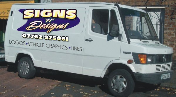
MemberNovember 5, 2004 at 2:53 pm in reply to: can anyone help with my van layout please?Hey we got some really cool designs happening here!
Widget, When I design vehicle graphics I like to keep it fairly simple but try to be as loud as I can with the lettering. People may have only a second or two to actually read it on the road. Text priority is crucial! Your original design has no priority at all.
Here I have prioritized it like this
1. name of your company and what you do is in your name. “SIGNS “n” DESIGNS”2. How do get ahold of you? Your phone #. I have a huge pet peeve when it comes to the word “phone”, Tel.”, or “call” in front of phone numbers. We all know what those numbers are for and it doesnt need to be there.
3. What else do you do? I feel this text of of lesser impotance because I think your name shouts out what you do already. I mixed them up a bit saying “LOGOS VEHILCLE GRAPHICS LINES” The first two have pretty much summed up what you do.
Hope this helps abit for you. Dont be afraid to GO BIG impact on your vehicle graphics. It is the best form of advertising you have.
Stevo
Attachments:
-
Thanks a bunch for all the compliments!!
Robert,
I agree with you on the shadow, its just a tad too dark. After working on it for awhile right in front of ya, you can miss some of the details.I can give you guys a quick demo on how I achieve some of this look if you’d like.
Stevo
-
Us canadians also call them “DAGOS”.
Where ever you go, dago!
Stevo
-
Beautiful Work Mandy!!
I love it!!
Stevo
-
First thing I thought of was Palm Trees in a sunset with some high impact lettering.
I do have a sketch in mind for it but I would like to see your ideas on it.
Stevo
-
Stevo Chartrand
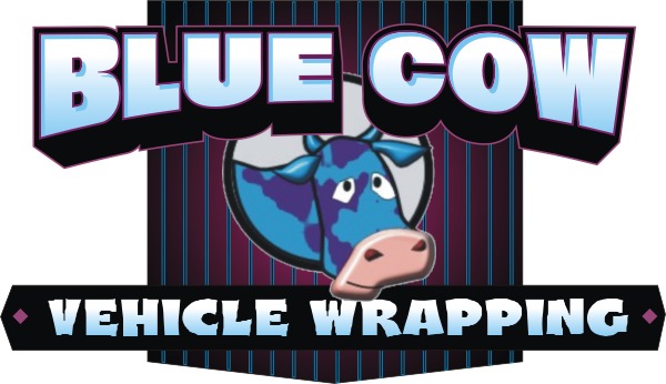
MemberOctober 11, 2004 at 3:20 am in reply to: what can i do with me new company logo?The last one is getting there Mr. Cow. I do have some more suggestions for you.
I find that letterstyle you’re using to be “wimpy”, so a nice bold font I think would work. Dont be afraid to be loud! We do want to get noticed.
Here Ive used a really bold font and pushed it out even further with a perspective block shade. Your version is really loose looking with nothing really tying them together so I opted to try a panel in the back to put them together. I did have a bit of a struggle with the cow in the circle it leaves alot of space on each side of it and when you put it in between your copy it breaks it up way too much.
I’d like to see if you could maybe put it off to the side like I did in my earlier version to group up the text more. Your name and what you do should be a bigger priority than the cow.
Well I hope this helps you out more Blue Cow.
Good Luck in your new venture.
Attachments:
-
Stevo Chartrand
MemberOctober 10, 2004 at 8:21 pm in reply to: what can i do with me new company logo?hahahahahhahah Kev! Lesbian cows! The one cow needs some bull horns on it or just add some sort of apparatus(sp). 😮
Stevo
-
Stevo Chartrand
MemberOctober 10, 2004 at 5:44 pm in reply to: what can i do with me new company logo?Here’s one.
When designing this I took into account your name and gave it that cartoon feel. It definetly has a fun name and cartoons are highly effective for catching attention. Hope it gives you some ideas.
Stevo
Attachments:

-
HAPPPY BIRTHDAY DEWI!!!!!!!!!!!!!!!!!!!!!!! belated
Stevo
-
Here’s the logo i designed for the meet. Hope to see some of you folk there!
Attachments:
-
Stevo Chartrand
MemberSeptember 20, 2004 at 9:26 pm in reply to: Greetings from the Land of the Maple LeafHelllo Graham!
Yer only a province away from me! You got some big skys there in saskatchewan. Me and Jill were there this year at Pat Welter’s letterhead meet.Welcome to the board, you’ll find plenty of fine friendly folk here.
Stevo
-
Stevo Chartrand
MemberSeptember 20, 2004 at 5:49 pm in reply to: need a new logo and i dont know where to start?Just goofin around.
Stevo
Attachments:
-
Too Cooooolll!! Can ya fit a 4′ x 8′ in it?
-
Stevo Chartrand
MemberSeptember 4, 2004 at 8:56 pm in reply to: Window Graphics: Morrow & Morrow (Signgold)Awesome work as always babe!!
Stevo
-
Thanx everyone!
Jill made my day today, as always. I got flowers delivered to me, a package with flamed boxers, and a panel.She’s the greatest!
Thanx
Stevo
-
Hey! Coool another fellow Canuck! Where aboots are ya in Canada eh?
Welcome to the board, there’s alot of great folk here so make yerself at home.
Stevo
-
Stevo Chartrand
MemberJuly 18, 2004 at 4:33 pm in reply to: vehicle graphics: wally kuzuk enterprises1 more
Attachments:
-
Stevo Chartrand
MemberJuly 18, 2004 at 4:32 pm in reply to: vehicle graphics: wally kuzuk enterprisesmore
Attachments:

-
Holy Smokes! That is one huge piece!
Looks great!
Stevo
-
Wow who’s the fox on the right! She looks purty hot!
The chick on the left sure does need a shave though, and I’m meaning on her face.
hahahhahahhahhahhahaha
good stuff
-
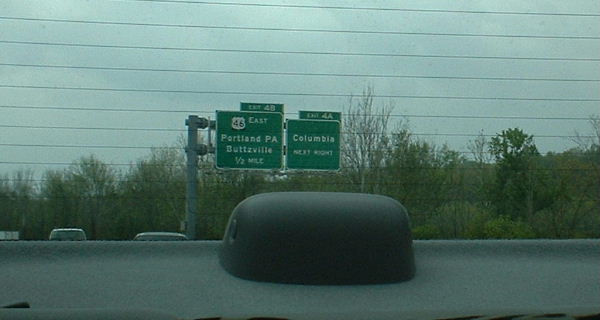
Hi Steve.
Here is an Interstate exit sign that me and Jill just saw on the way back from Mass Mayhem. Jill took it out the back window when I was doing about 90mph!
Hope the quality is okay for you to make out what the name of the town is on the left sign.Stevo
Attachments:
-
Yup thats my gal!
She’s famous to me! -
Got my design done and sent Robert. Look forward to seeing the other guys work too!
Later eh
Stevo
-
Hi Becky.
I have printed on cling with no problem. Turn yer heat down a notch and put masking tape on the squeeges so it doesnt drag on the cling. Should have no problems!Stevo
-
Nahh Ken dont look like me.
maybe its the glasses.hehehhehehe
Stevo
-
Stevo Chartrand
MemberMarch 5, 2004 at 1:39 am in reply to: Sign Stand Off Fixings supplier needed please?There’s also Shop Kit in England if I recall right.
-
duhhhhhhhh how emabarassing.!! 😳
i was kinda half in the bag when i read well not even half the post and jumped on a reply!Now that I read it again sober it’s hilarious so I hope I give ya guys a chuckle! hahahahhahaha
You guys are good sports!
Talk to you later. 😀 😀
-
Sounds like me!
I am an employee. I am on my third job in 6 years in the biz. This new job seems to be cool but i am kinda gun shy cuz the last employers I had Burnt me big time. I kicked ass for them and put out tons of product and they wouldnt pay me what i thought i was worth! And in the end they ended up being jerks cuz I was too motivated to get the company and myself going. There loss! Had to have a little rant there.Sounds like you would be great to work for cuz you really appreciate what he does for you. I commend you for that. Employers like you in this industry from what ive experienced are kind of rare.
Stevo
-
Stevo Chartrand
MemberDecember 6, 2003 at 5:32 am in reply to: traditional signwriting sounds interesting should i do it?Okay! I gotta say sumthin!
Noel I commend you for wanting to learn about the CRAFT of makin signs. To me this shows that you do have an interest and understanding of what signmakin really is! Sure I’m a vinyl jockey at work like the rest of ya but i do make an effort to actually sling a brush every weekend and attend letterhead meets to better myself as a Sign Artist. And i did know how to draw and paint a letter before i actually touched a machine.And it does peeve me off to hear comments like Sammyr has to say, because that is what is wrong with the signmaking world today. To me thats saying why bother to learn anything new and why learn the roots of what you do when ya got a machine that can crank tons of pedestrian crap like the rest of the shops in your town.
Extremely Closed Minded Thoughts on Sammies Part.
Noel pick up a brush a can of one shot and practice, it is good for the soul!
There is nuthin more pure than that!Stevo
Just Give ‘er!!!
-
Stevo Chartrand
MemberNovember 27, 2003 at 12:36 am in reply to: hand painted signage: fosnights of valenciaJillbeans! I dig it.
Nice balanced layout with the right amount of negative space. Nice colors too.
The girl knows what she doin!Stevo
-
Jillbeans!!
That is some kick ass work. I havent really seen much of your work before and i am really impressed. I really dig the auto body sign. Coooool.
Share some more!Stevo
-
Hey Jillbeans! Are you following me? hehehehe
Good to see ya here too. Seems like a very cool and friendly place.