
Stevo Chartrand
Forum Replies Created
-

Do you know Marrge? She has a husqavarna.
-
Stevo Chartrand
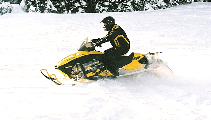
MemberJanuary 9, 2011 at 6:31 am in reply to: Edmonton finally is getting a good dump of snow…Had an incredible day today on my snowmobile!! This is without a doubt the most snow Ive seen since the 80s and the most snow I have ever snowmobiled in!!!
Spent most of the morning just trying to get to my buddies place, then pulling and pushing out all the mini vans on his block.
After sledding we came back and once again had to help neighborhood folk get their vehicles out.
Then it was my turn!
YUP! Got stuck!
Barely made it home here and dont think I’ll be going too far tomorrow!!Stevo
-
Menu in the top left corner.

-
-
You have to convert true type fonts to make them work in Omega.
Go to start>programs> GSP Omega> True Type Font Converter, where this will pick up all of your fonts in your windows font folder. Select one, hit convert and then start Omega.Stevo
-
Just a quick mock up for ya regarding color and layout.
😀Stevo
Attachments:
-
Ya did good! I would have been nervous as hell!!
Good to see Susan too, I haven’t talked to her in ages.Stevo
-
I see a few familiar faces there that I haven’t seen in ages!
Looks like it was fun Joe!!Stevo
-
I think Tony Teveris posts on here.
😉Stevo
-
Dave’s right. It wont work on XP.
Get an older OS and it should work for you.Stevo
-
FWIW. I tried working in an excavator but it just threw everything off balance. Just a suggestion on some letterstyles that could be used.
Stevo
Attachments:

-
The snow is fun when you own a snowmobile!!
Had a great day out today!Stevo
Attachments:
-
-
😀
Stevo
Attachments:
-
Happy Birthday Dave!!
Stevo
-
Stevo Chartrand
MemberJanuary 23, 2009 at 11:52 pm in reply to: Home Coming Scotland logo needed please?Looks like it says Homecoming Scohand.
Stevo
-
Welcome from Edmonton Ty!!!
Been through Olds many times on the way to the mountains.Stevo
-
All the best to everyone in the new year!
CHEERS!!
Stevo
-
Unbelievable work!! As always. 😮
I’d like to know how many hours it takes to do this.Stevo
-
I realize this isn’t your design, the install looks nice.
But, if I could have had any input, I would have suggested at least an outline on the main copy to separate it from the background.
The cup of coffee really just looks like a circular thingee on there, and we hope people can recognize what coffee beans are, cuz it may look like a bunch of feces to some.
I love people who can layout brochures and think they can treat a vehicle layout in the same manner.I’m an old schooler that has yet to (if ever) warm up to vehicle wraps, cuz I see so many bad ones out there. LETTERING first, Graphics second doesn’t seem to be the way anymore.
This one at least has images pertaining to what the company does, but once again the “pictures” have taken over the lettering.
It doesn’t look terrible by any means. I guess I may be a “wrap snob”.
Stevo
-
Happy Birthday Lynn!! Hope you had a nice day.
Stevo
-
Welcome from Edmonton eh!!
I thought Toronto was the capital of canada?? 😉Stevo
-
ha ha!! And to boot, it’s from newfoundland. "Newfies" as we call them here.
Stevo
-
Very nice work Neil!
Stevo
-
Very belated here Shane.
Hope it was a good one for ya.Stevo 😀
-
Bookmarked!
Nice work, VERY colorfull.Stevo
-
Stevo Chartrand
MemberOctober 20, 2008 at 12:44 pm in reply to: Drew’s Sign It Pty Ltd & Murrays Australia LtdCongrats to ya Shane!!!
Best of luck.Stevo 😀
-
Yikes!!!!
I best be backing up my data today!Stevo
-
Stunning work!! 😮
I love the shading and the lettering.
Very nicely done.Stevo
-
Stevo Chartrand
MemberOctober 6, 2008 at 12:41 pm in reply to: anyone having trouble getting onto IStock?I can log in just fine over here.
Probably just a temp thing.Stevo
-
Is it really affecting your business?
I think it’s very unprofessional on his part and he’s the one that looks like an ass.
I wouldn’t worry about it too much. Let your work speak for itself.Stevo
-
Nice clean work Karl.
Well done.
Stevo
-
Lovely work John and AJ!
Stevo 😀
-
Well done Terry!! Always enjoy seeing your work.
Stevo
-
Stevo Chartrand
MemberAugust 17, 2008 at 11:31 pm in reply to: Design help needed with my own logo.For what it’s worth I whipped up something quick for ya.
I do really like Robert’s clean modern style. Nice work!Stevo
Attachments:

-
Great!! I didn’t think Honda had ever changed their logo.
Glad it worked for ya.
I’ve been busy these days working full time and doing design work.Stevo
-
The lettering is different? Looks the same as in the pic, and you could draw the stripe.
Stevo 😀
-
-
These jobs are always the most fun to do! Nicely done Terry!
Do you get the "wobbly legs" when stepping onto the ground after being in a bucket all day?
Or is that at the pub after? 😉Stevo 😀
-
You’re welcome Martin!!
😀
Stevo
-
-
Thank you Ade! I’d like to see how it turns out for you.
Stevo
-
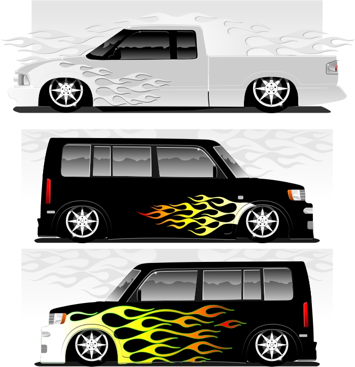
Here’s some examples of those flames in use.
Most of those flame designs are mine and thought I could illlustrate to you better how they would look. You can do abit of stretching with them if you’d like.
Hope this helps.Stevo
Attachments:
-
What kind of cutter?
It should work with others. I’ve run Roland plotters with Omega using the basic HPGL driver.Stevo
-
Hi folks!!! I’m still alive and kicking. Been pretty busy as of late.
Lovely work Brian!! All great ,but will agree that the Gibson one is my fav.Cheers!!
Stevo
-
I’m still on 2.02 and it imports/exports without any major problems. Although Corel files have to ver.5 and .ai files have to be 6 or lower for importing.
I didn’t even hear of 3.0 coming out yet. If you are doing alot of converting I would upgrade to save yourself alot of potential headaches.
Check out gspinc.com for info.
Best of luck!Stevo 😀
-
I ain’t diggin the new prices. My royalties will go up, but I bet my sales will go down. I have quite a few 1 credit images that are my big sellers on there. They are fairly simple graphics but I’m not so sure people that have been paying 1 buck will pay 5 bucks now. That worries me a little.
Stevo
-
Sounds like a tough day there Shane! 😛
Here it’s -35 with the windchill and I’m shovelling snow!!! That’s right folks -35C!!! 😮 BRRRRRRRRRRR!!!
Working on a hot rod illustrattion today, had my hangover yesterday. Weekends and nights are now my only time to work on artwork since I got myself one of those "real" jobs driving a big 1ton truck in the city hauling parts around. At least it’s steady pay for the time being. 😕
Back to hibernating from the elements!Stevo
-
At least this one is readable (on the sides). I do agree with Robert on some more negative space, but I still can’t figure out why people put images that don’t even pertain to their business on wrap designs. In this case a city scape scene.
There’s a local sign guy here that has a huge image of a monster truck on his vans, and this is for a sign shop? People think it’s for a toy store or monster truck team.
I really don’t mean to be hard on ya, but the first impression I got was that the image looks like it could be used for a phone company.
It really is nice work and like I said is readable, compared to wraps I see out there. I just don’t really think the photo portrays an image of a sign shop. But that’s just me.Stevo 😀
-
Stevo Chartrand
MemberNovember 22, 2006 at 2:03 pm in reply to: can anyone help with quick question about corel draw?You’re welcome!
I’m sure there are a few more that I don’t know. So if anybody wants to add to this, I’m all ears!Stevo
😀
-
Stevo Chartrand
MemberNovember 22, 2006 at 1:28 pm in reply to: can anyone help with quick question about corel draw?Here’s a few more shortcut keys.
I use these as much as possible. It really does speed things up and once you really get to know them it’ll become second nature.Stevo 😀
Ctrl+A – Select All
Ctrl+Z – Undo- I believe you can have up to 99 undos!!
Ctrl+Shift+A – Re-do
Ctrl+X – Cut
Ctrl+C – Copy
Ctrl+V – Paste
Ctrl+O – Open File
Ctrl+P – Print
Ctrl+S – Save
Ctrl+W – Window RefreshDuplicating Objects:
Ctrl+D This way you have to set your X & Y axis parameters.
Ctrl+C then Ctrl+V Duplicates object right on top of original to the front.
"+" sign on your number pad. Duplicates object right on top if original but will keep it on the same layer.
Select object- Drag it- and right click with the left click button at the same time.Align and Distribute
Align Left- L
Align Right – R
Align Top – T
Align Bottom – B
Aligh Horizontal – E
Align Vertically- C
Center of Page – POrder
To Front Shift+PageUp
To Back Shift+PageDown
Forward One Ctrl+PageUp
Back One Ctrl+PageDownGrouping
Ctrl+G Group
Ctrl+U Ungroup
Ctrl+U+U Ungroup all
Combine Ctrl+L
Break Apart Ctrl+KEffects:
Ctrl+F9 Contour
Ctrl+F7 EnvelopeHolding Shift when resizing will size it uniformly.
Holding Ctrl when moving and object will keep it on axis
Double click on ruler. Brings up nudge options menu
Double click on Box Tool will make box the size of your page.
Z – Zoom -
Stevo Chartrand
MemberNovember 21, 2006 at 1:55 pm in reply to: can anyone help with quick question about corel draw?Group your logo. Select your text, hold shift, select the logo then hit "e" and "c". Done!
(corel 11)
Stevo -
Stevo Chartrand
MemberNovember 13, 2006 at 11:13 pm in reply to: hand painted signage: oxenbury & sonsWOW!! 😮
Beautiful work AJ!!!Stevo
-
Stevo Chartrand
MemberSeptember 27, 2006 at 12:08 am in reply to: Need a little help witht this font….papyrus? I think I spelt it right.
Stevo 😀
-
Gorgeous work Mike! 😮
Stevo
-
Hey thanks Bernardo for the compliment. It really looks like you can sling a mean brush! That’s very impressive work!!
Stevo
-
Very nice work!!!!!!!!! 😮
Stevo
-
Stevo Chartrand
MemberSeptember 8, 2006 at 1:43 pm in reply to: new sculpting product: roseberry cottageWhat a beautiful sign!!! It’s got just the right amount of elegance and class with a nice clean look! VERY well done!!
Digital Schmigital is what I say!! 🙄
Stevo
-
For some really nice traditional sign eye candy there’s A Magazine About Letterheads.
http://www.letterhead.com/suppliers/amal/index.html
Stevo
-
Fantastic Work everyone!! Keep ’em coming!
Stevo
-
Stevo Chartrand
MemberAugust 23, 2006 at 12:02 pm in reply to: Can anyone tell me how to turn off automatic update?Hi Shane!
I still get that with my ver.11. Not sure if it’s the same with 12 but I think there was a little drop down menu on it that asks to remind you in 30 days, 60 days, etc etc. I always forget to set it to "never" when it pops up.Stevo
-
Thanks folks!!
I think I had enough beers for everyone on saturday night! 😕Stevo
-
CONGRATS TO NIK AND ED!!!
Stevo -
HAPPY BIRTHDAY ROBERT!!!!
One day I’ll be by for a pint or a breezer!!
Have a good day mate!!! 😀Stevo
-
I assumed you have re-booted everything?
Maybe this might work:
https://www.uksignboards.com/viewtopic.php?t=20334
Stevo
-
That turned out great Marcella!!
It looks soooo clean, uncluttered and it really is an eye catcher because of the simplicity!
Nice work!!Stevo 😀
-
Stevo Chartrand
MemberAugust 6, 2006 at 3:56 pm in reply to: why is the fill not showing in CorelDraw11?Sounds like you have some open ends somewhere.
You could also select the object, go to the shape tool and click on "extend curve to close" on the top toolbar. It will close the object and you will be able to see where the open nodes are.I’ll have to try Dave’s tip! Didnt know that one. Thanks!
Stevo
-
Arthur Vanson’s Tideway script at letterhead fonts.
Stevo
-
That’s what I’m talkin aboot!
Gorgeous work!!!!!!!!!!!! 😮Stevo
-
Stevo Chartrand
MemberJuly 24, 2006 at 10:47 pm in reply to: Traditional signwriting: dalshian houseLOVE IT!!!
You can sure twirl a brush Brian!!Excellent!!!
Stevo 🙂
-
Stevo Chartrand
MemberJuly 21, 2006 at 6:16 am in reply to: Logo inspiration needed please for a joinery business?I dont think it’s that bad either Marcella.
I think you need to tighten things up abit. The diamond looks a little detached from the lettering.Stevo
Attachments:

-
Stevo Chartrand
MemberJuly 20, 2006 at 6:46 pm in reply to: Logo inspiration needed please for a joinery business?Does sound like abit of a tough one to do.
Dan Antonelli’s work is great!! I go there as well for some ideas and have got some great feeback and encouragement from him. He does have that nice clean look going that works great ,and a modern feel to it. I can always see abit of that sign guy come through on most of his work.
I like how just a simple graphic can speak alot for a logo. Especially for a real simple name like this one.
This was a really quick idea I had for you.
Stevo 🙂
Attachments:

-
Yup, looks like something from Sign DNA!
Stevo
-
Stevo Chartrand
MemberJuly 11, 2006 at 2:47 pm in reply to: can anyone help with Digital Output in corel please?The color pallete is in cmyk. I just wish i could see the finished prints, but the supplier lives about 2000 miles from here, so I’m not exactly sure how they ever turn out. My clients seemed happy the first couple times with the prints. But i’d like to know if there’s a diference in the output color from the color modes that I see on my screen.
Clear as mud right. 🙂
Thanks!
Stevo
-
Stevo Chartrand
MemberJune 28, 2006 at 1:30 pm in reply to: can anyone help with layout for my own van?Not at all Ian! 😀
Stevo
-
Stevo Chartrand
MemberJune 28, 2006 at 12:13 pm in reply to: can anyone help with layout for my own van?I like the silver one too.
Not really keen on that angle though, looks like it’s just thrown on there and it’s not flowing with the body lines.
How about making it straight across the upper left, going over the window?
Or decreasing that angle?
It’s looking better for sure.
And I hate designing my own stuff too! I’m never satisfied!
You’re doing well though!Stevo
-
Stevo Chartrand
MemberJune 28, 2006 at 12:32 am in reply to: Vehicle Graphics: Grahams / Doggy day careNothing wrong with those Robert. They’re eye catching and effective.
I like the doggie one. Nice and clean with no clutter!Stevo
-
I think the lettering turned out great, just needs a wee bit more contrast to pop off the van. I really like those flags!!!
Nice work Gordon.
Stevo
-
Stevo Chartrand
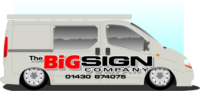
MemberJune 24, 2006 at 12:29 am in reply to: can anyone help with layout for my own van?Hi Ian,
I think the word Big is to BIG! I’d like to see more emphasis on the word Sign. It is what you do, and driving by all I would see is Big. Big what?
I tried to keep this more on the simpler side and rearranged the copy in your logo.
Didn’t have time to do something for the back but that’s where I’d list all your services.
Hope this sparks some idears for ya! 😀Stevo
Attachments:
-
I’m not really happy at all with the sign layout yet, I’m still working on it and I am playing with the idea of having a dark background. The problem I’m having is with the color of the truck (as per their request). It falls within that value of too dark for a dark background to really pop. I’m just not really big on white backgrounds.
What I did for the reflection on the side of the truck was use the same steps as my chrome lettering demo, but I filled it with white and used the interactive transparency tool and put a gradient transparency on it. This way it stays consistent across all the graphics.
Appreciate all the nice comments!!
Stevo 😀
-
Hi from Edmonton!!!!!
A little hungover today, 2 more wins and the Oilers will have the Cup!!
Welcome to the boards.Stevo
-
Stevo Chartrand
MemberJune 11, 2006 at 6:12 pm in reply to: G’day from sunny south Australia. yep another aussie.Welcome to the boards Rod!
This guy can sling a mean airbrush folks! I even got myself a really cool panel of his proudly displayed in my office.Stevo
-
Hi Rod!! 😀
Nothing less than spectacular work mate! As usual!
Hope things are well with you.
Stevo
-
Atta boy Shane!!! 😀
I think it turned out great!! Nice work!!Nice stuff too Chris! I like the white inline you added for that extra pop!
Stevo
-
Oh good! I’ve never had to use that button before and really didn’t know about it until after about 4 years of running Edges.
Glad it worked for ya!
I’ll have a Stella please! 😀Stevo
-
That’s great!!
What was the solution?Stevo
-
If you haven’t already, reboot everything. Been awhile since I ran one but I think there’s a hidden button in between the slew and foil key on the keypad that resets everything by holding it down for a couple seconds.
Give it a good clean too you may have a dirty sensor somewhere.Stevo
-
Hi Glenn,
When I’m designing signs I usually have a pretty good idea in my head right away for the look I want to get. I used to do thumbnail sketches on paper then work on those ideas in Corel. Now it seems I just run to the computer and start picking out an alphabet for the main copy and start from there. I still have a pretty good idea on what I’m after, but there’s always tweaking and scrapping of ideas on the fly.When I’m commisioned to do custom illustration, I’m asked to draw so many different things I do a google image search for ideas.
Thanks for the compliment!!Stevo
-
Hi Leigh!
That skull was a custom one done for the customer. Been getting quite abit of work from England as of late doing designs for a heavy metal t-shirt company.Thanks for the nice words everyone!
Stevo
-
Nice and clean looking job Marcella!!
Bring Out your Deeeaaaaaddd!!!! 😕
Stevo
-
OOPS double post
-
Personally I like the grain running horizontal, seems to flow better with the lettering. I think if their were italicized letters it looks funny if the grain is running top and bottom.
There’s been the odd occasion due to material useage on the router that I had to run the grain top and bottom. Didnt really care for it ,but the client didnt seem to mind.Stevo
-
The font almost looks like copperplate.
Stevo
Edited: Ooops looks like Dawn might have it fir ya!!
-
http://www.brandsoftheworld.com/search/ … _id=126021 Is this the Nitro one?
Sorry, no luck on the others.
Stevo 😀
-
Looks pretty sharp! But I can’t seem to read it very well.
I realize this job’s done already but keep in mind that red and black don’t work, their values are much too close together. A white outline on Scarf would’ve cured it and would’ve tied in better with the white name and electrical services.
The background on it is pretty neat though!Stevo
-
Stevo Chartrand
MemberMay 13, 2006 at 5:16 pm in reply to: can anyone help with some ideas for this logo?Goofin around here too.
I’m not really a big fan of having the website adress worked into the main copy. So I tried it just below it.Stevo
EDITED to say: CRAP!! I misspelled the website adress!! 🙄
Attachments:

-
Hi Josh.
What is the size of your banner? Are you talking about space for when you layout your design?
I will generally consider about 2 inches height wise top and bottom when laying out my design. 3′ high grommeted and hemmed banners are 33′ high, 2′ high banners are about 20-22" high, but can vary with the manufacturer.Stevo
-
Stevo Chartrand
MemberApril 8, 2006 at 10:40 am in reply to: can anyone help with this bookshop design please?Harry, you beat me to it.
The text should follow the book spines.
I would dull down the green, using a sponge technique.
As it is now, the background stands out more than the books.
Maybe even perch an apple on one of them (no bookworm in it tho)
and as Marek suggested, a "shelf" would easily cover up the weird bottom edge on the existing fascia.
Hugh, HDU comes in a few brand names, some are cheaper than others but none are too cheap.
That is why I suggested trolling for samples at Sign UK.
I know that the Precision Board rep Kellie will be at the Tickle.
Other brand names are:
SignFoam
Jasper Board
Precision Board
There are probably others as well. HDU (High-Density Urethane)
is a lightweight yet sturdy material which comes in several thicknesses and weights.
It is used a lot for sandblasted signs here.
I’d make the books from it, as stated, and the backer from Alucore.
The books can easily be glued to it with Gorilla Glue.
HDU accepts both good latex and enamel paints.
Some prime it, some don’t.
Love…Jill
(oops! Stevo is still logged in, but trust me, he’s in bed) -
Stevo Chartrand
MemberApril 7, 2006 at 11:53 pm in reply to: can anyone help with this bookshop design please?No nothing personal but I do like opinions that are valid and have some experience to back it up. And if they are not valid then it is nothing more than blathering.
Thanks for answering my questions. 🙄 -
Stevo Chartrand
MemberApril 7, 2006 at 11:43 pm in reply to: can anyone help with this bookshop design please?What tool would you use for carving fine details Peter???? Please enlighten me.
A plotter has also been used as a "hobby" tool as well. It is just a tool and in the right hands can be be used to create some nice work.
Have you even used one or even worked with HDU????? Just wondering, but I have a feeling you haven’t and we’re just hearing your same old blather.