Activity Feed › Forums › Sign Making Discussions › Gallery › Traditional signwriting: Newport Arcade
-
Traditional signwriting: Newport Arcade
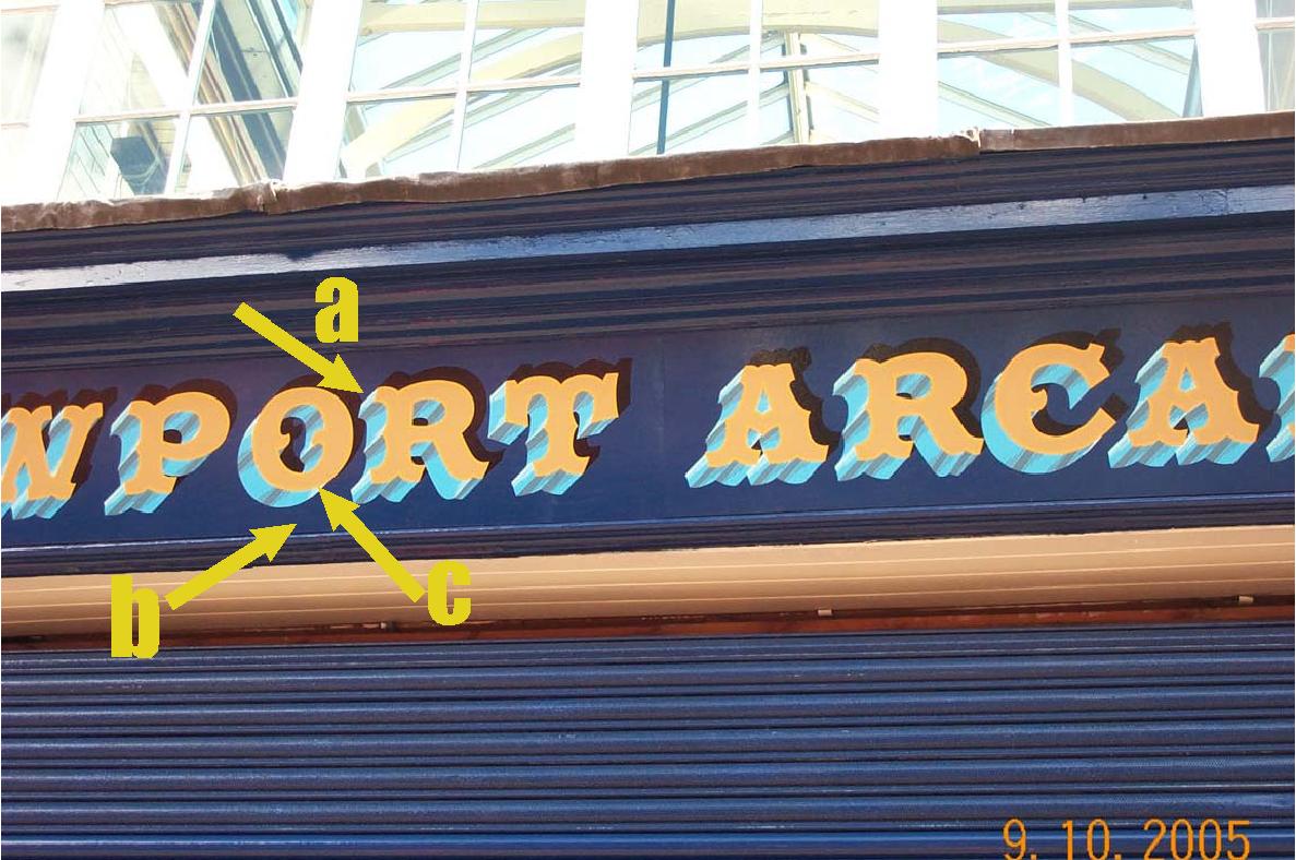
Posted by Neil Davey on October 9, 2005 at 10:03 pmI finished this sign today. All hand painted with one shot. Letters do have an outline in gold but its difficult to see on the photo.
Hope you like?
Neil
Attachments:

 David-Foster- replied 18 years, 7 months ago 14 Members · 45 Replies
 -
45 Replies
-

nice sign neil 😀 great you did it by hand…const. crits i would have ditched the black shadow, it looks odd and lost at the top they normally run at the bottom either left or right….maybe an idea to incorporate it in with the blue shadow at the bottom… 😀
great job done 😀
nik
-

Now that’s a lotta brushwork!
Very well rendered.
I actually like the black shadow,
it really adds to the 3-D look.
What talent.
I’m sooo jealous.
Love….Jill -

Nice work Neil …. looks great ….. 😀 I havent had a go at any paint work …. apart from painting the odd a-board …. I would like to have a go though and airbrushing is another that I wouldnt mind having a go at eventually too.
Good of you to show us your work. 😉
-

Beautiful work Neil! I like that shadow as well.
Stevo
-

Looks fantastic, I really admire anyone that hand paints signage. How long did it take you? Did the customer specifically ask for hand painted lettering? One more question………do you charge more for doing it as a signwritten job using paint than you would using vinyl?
The problem round where I live is that people just won’t pay for the extra time and effort that goes into quality hand painted lettering. -
Jayne, people who really do care and appreciate talent WILL pay extra for hand-painted signs.
I only charge a little bit more.
The costs are MUCH higher for me to produce vinyl signs.
It’s a win-win for both parties.
Sadly, most clients percieve hand-painting as unaffordable.
It’s our job as signfolk to teach them the value of a well-rendered sign, be it hand-done or computer generated.
Love….Jill -
I agree with you Jill, most people dont appreciate skill and effort, what I am up against in my part of the country is all the pound shops, cheap tatty signage and an unwillingness on most people’s part to buy good quality traditional signage. The opportunities are very few and far between as every one wants quick cheap signs and there are always cowboys willing to sell cheap rubbish.
-
Jayne…that’s why I got a day job!
Tons of cowboys here too.
Once their signs fall apart, folks will come back to me (I hope!)
But when someone wants a good traditional sign, they come to me.
Maybe make yourself such a sign, better than a cowboy could stick together,
a sign that screams QUALITY and ORIGINALITY.
Put it up at your shop.
I’m sure you will create a niche market.
That’s what I’m trying to do.
I refuse to compete with licky-stickies.
Love….Jill 😉 -

Thanks people for all the positive comments about my work.
Jayne. the sign took about 20 hours to complete that includes painting the background dark blue. And yes, the customer asked for hand painted lettering.
I charge more for signwritten work especially as detailed as this sign was but to me this work doesn’t look good in vinyl.
Too many sign people are jumping on the digital bandwagon and I’m just not interested in going that route. I prefer to try and sell signs that still have more of a traditional feel or have some form of hand or airbrush applied detail to them.
Nik, I used my artistic licence with the black shadow, to me the lettering needed something above it so it got a shadow. I’ve seen similar on very old hand painted signs and fairground art so it’s been done before.thanks everyone,
Neil
-

Hi Neil
hope you don’t mind me asking, how did you layout the sign? Paper pounce pattern, stencil mask or just chalk by hand?
Lovely sign
Cheers -
Hi David,
Don’t mind at all. I used a paper pounce pattern for the initial lettering then everything else was freehand.
Thanks Neil
-

very nice work mate, well done. really pops off that surface with the colours you have used. the 3-dimensional shading etc just adds to the effect. this sort of thing can never be easy handwritten, i always wonder where you traditional sign writers get the patiants from? 😕
constructive criticism: i know many have commented about the shadow, but i have to say i think it is casting in the wrong place. what i mean is, looking at the shadows on the sides of your letters, they contradict the cast shadow. if that makes sense?
i.e. looking at your highlights and shadows on the letters, mean that the black cast shadow should fall on the lower right?thanks a million for showing us your work, look forward to seeing more mate. 😉
-

Nice job! I know what you mean about the ouline not showing up on the photo!! A lot of my jobs use gold leaf and you only ever see the real effect if you catch it in the best light for the photo. But whenever I go to take a photo the skies darken! 😕 The shadows on old signs used to be a lot more diverse. I think a lot of people nowadays only ever see a shadow that was created by the computer. Aj
-

Well Done Neil
This sign struck me because its so much like a sign I did 15 years ago in the same colours and fair ground font (still got the photo)
….and it was on a dark blue fascia with a shutter!
I give customers two quotes:
One for vinyl and the other traditional
The traditional can be as much as four times the cost of vinyl yet some customers will opt for the traditional -
I agree with you aj, I think the computer can be very limiting because you can only go with what get in your sign software, but with a brush you can be more adventurous (that spelling looks wrong to me but its been a hard week) and bend the rules.
I’m surprised at the amount of interest in black shadow, who said you can’t put a shadow there!!! if the peeps on here all took a look at some old signs I think they would be surprised how crazy some of them are. 😮
-
Hi Neil…
Sorry for my “sort of” negative reply as way of constructive criticism mate. Nothing personal meant by it at al. Just purely my view on the work carried out, & by way of discussion on this shadow topic only… ide like to continue as I feel it healthy for the boards to discuss a design element like this for others to read and decide for themselves.
Ok, im NO traditional sign writer but I would like to think, as a graphic designer/sign maker/sign fitter that I know something about design. well…. a bit 😕 :lol1:Do the laws of light for the traditional Sign writer, differ from the laws of light to the sign maker using a computer?
anyone?
.
.
-
Rob, I think that in this instance it is merely a design rather than a shadow if you get what I mean. If you view it as simply part of the design rather than a cast shadow then I think it works. You can get a little hung up sometimes on wether something is correct ( not you personally 😀 I mean in general here) rather than does it look good. I personally like it because the black shadow is somewhat lost on the dark blue background anyway and doesnt shout out at you, to me it is merely a design element not a shadow in the wrong place.
Just my opinion and if the customer is happy then all is fine, you could always argue that you have two spotlights on it coming from different directions and casting different angles of light :lol1: :lol1: :lol1: -
To be perfectly honest guys and gals, regarding the issue of the black shadow. I felt I needed to put something above the lettering because to my eye the lettering seemed to be falling off the fascia ever so slightly.
Also I didn’t want it to overpower the lettering so, as Jayne points out, I thought if another source of light was being cast then it would produce a shadow here. -

All art is subjective, it does not need justification, it is what it is.
if the artist is happy thats all that matters. (as long as you get paid before you die)
Anyway I think the shadow is in the right place.
peter -
quote ndsigns:To be perfectly honest guys and gals, regarding the issue of the black shadow. I felt I needed to put something above the lettering because to my eye the lettering seemed to be falling off the fascia ever so slightly.
Also I didn’t want it to overpower the lettering so, as Jayne points out, I thought if another source of light was being cast then it would produce a shadow here.fair enough but i started out with the brush when i was sixteen…never switched to cad until very late on…when i had too, i understand you were reproducing an example of an older sign….fine but i still would not have done the black shadow with the brush ….i was not taught to do it that way 😀 not having a dig at your sign, just that i was trying to point out layouts to the new folk onboard 😉
nik
nik
-
That’s an interesting piece of art Nik (wot did peter show)
Why did you put the shadow on the left handside? -
i am going to agree that an “artist” is free to do what he does and it will always be right. its his style, choice at end of the day…. same goes with painting signs, or even using a computer or printer to generate it. however, whats right in our own minds, doesnt nessesarily make it right. even if we are happy and the customer is too, and has paid.
i do not know how many times i pass a “bad” looking sign and think “how the hell do these sign makers get away with it?” (stretched text, too much slant, bad choice of fonts, colours etc etc)
whos wrong now, me? or could the guy producing the bad sign argue its “his thing/style?”
by the way i am not for one minute saying this is the case here, the sign is wonderful and oozies talent. but if passing it in the street, ide still think great sign, but that shadow is wrong. 😕 at end of the day, its just my opinion, i do see where others are coming from but… -
Hi Neil
Great job, the shadow is spot on! As you say, if they saw some old fairground stuff they would have nightmares over shadows in wrong place 😀
Be nice to post some more of your work.
-
The more you look the more you can find reasons to be critical, that is what makes art, art.
The shadow doesnt have fixed place to be. some people percieve the light source from their eye, so on an overcast day who is to say where the light is coming from?
a,b,or c are all highlights and contradictory.
just my bumble pinion,
the overall sign works for mePeter
Attachments:
-
i think we will have to agree to disagree, i will anyway!
my view, we are trying to justify why its there, not wrong or right?
if the shadow is cast on top right the hitting light should generaly be lower left. this being the case the underside of these letters should not have the graduated dark spots where they are. they should be light leading into dark. my opinion anyway… 😉 :lol1:if an old signwriters at fairgrounds had shadows in wrong places then they too were wrong. it may have been their thing, but still would be deamed as wrong. we can argue the point out till we are blue in the face, its the artists style of the shadow is wrong.
one hing for sure, if “i” or most other folk here posted a picture of a van with text and highlights and shadows in wrong place, it would be pointed out to us. “and rightly so” if i were in turn to tell you all, “im not wrong, thats just my thing/style” ide probably hear you all laughing from were i sit now!
my comments are just my opinion, like everyone elses… if its someones style then so be it, but others readers can at least take both opinions on board and decide for themself. 😀one last thing, if the colours are as vibrant on the letters due to the light, the shadow should just be a little darker a blue. not black… 😉 :lol1:
ok so i am now being picky :lol1: :lol1: :lol1: just kidding, put the soap box back… :lol1: :lol1: :lol1:ndsigns; sorry for keeping your post going with my negative remarks mate. not intended that way at all mate…
-
and to think that your average bod on the street would walk past that sign and look up and say…………..”aaaaaaah thats a pretty sign” and walk on non the wiser that it been the subject of a major debate 😮
-
I can’t believe the debate on one very good sign. I would like to see the lick em and stick em’s do one :D. To keep Rob happy Neil I have edited your photo….. :lol1:
😎
Attachments:

-
Me neither, David.
I actually spent awhile last night looking at sign pix by the Letterheads to show that oftentimes, traditional things do not fit into the lick-em-stick-em way of thinking.
Then I thought, why bother, those will get picked apart too.
It’s a lovely piece of work…..just like me.
Nuff said.
Love…..Jill -

Jill
Whats going to happen if the licky stickies go to stuarts meet next year cos they will be bombarded by this sort of thinking from us brushies. By the way IMHO the sign is about right AND has that personal touch that you can’t get with vinyl. Why do we have to abide by rules, the people we now regard as masters would have done exactly what ND signs has done!!! My 2p’s worth.
-
Paul, with any luck,
their eyes will be opened and they will walk away inspired,
off to change the face of modern signmaking into something better than it is now.
Love….Jill -
Wow!
Can’t believe this is still going on
Absolute brilliant piece of work – great to see – so happy you sharedThere is no exact science in shadows either in cast or thickness so long as it is consistent i.e. if its top left then keep top left
Is it not true that as ‘brushies’ we add a broader stroke on the slant of an ‘N’ because if we followed the shadow religiously it would almost disappear (the same with an’A’ ‘R’)….. We use artistic license to adjust
Quite interesting is the fact that it would be difficult to make this adjustment in vinyl because the computer doesn’t think that way
We cut off serif shadows at an angle and we sometimes have a pencil line gap between letter and shadow and so on and so on
-
quote ndsigns:To be perfectly honest guys and gals, regarding the issue of the black shadow. I felt I needed to put something above the lettering because to my eye the lettering seemed to be falling off the fascia ever so slightly.
Also I didn’t want it to overpower the lettering so, as Jayne points out, I thought if another source of light was being cast then it would produce a shadow here.nobody is having a pop at ndsigns work, like i said its a self preference, ive only given my “own constructive critisism” its only the direction of a shadow for god sake… :lol1:
ndsigns comment above is justifying “why” he went this route anyway…i think we are forgetting something here, something that is often mentioned, if we pat every job the back, how is anyone supposed to progress? im not perfect nor is anyone for that matter so if we see something we think is out or wrong, then why cant we say it without being flammed? vinyl, paint or digital print. irrelavant!
dave, thanks for amendmant but ide say less drop more & to the right 😉 :lol1: :lol1:
as for lifting a brush? whats the bet you will see my sit down and paint a sign at the letterhead meet??? 😉
i would like to think i am not ignorant to any aspect of sign making. i have turned my hand at carving several times, gold leaf, stained glass etc
at times i too use paint, not start to finish but when i think a sign needs it… i often use spray paint too if and when i feel the need, heres one already loaded on the boards
https://www.uksignboards.com/viewtopic.p … son+towersanyway, like i have said, im only pointing out something “i feel” isnt right.
ill keep my mouth shut from now on :lol1:
😉 😀 -
dont you dare keep yer mouth shut, its what makes these posts interesting, and everyone is entitled to their opinion after all and you did have a valid point to make. Oh and I’ll make sure you have a go at sign painting I’ll even lend you the brushes, then I’ll bombard you with printing questions.
Paul
-
quote :Oh and I’ll make sure you have a go at sign painting I’ll even lend you the brushes
you got yourself a deal paul! 😛
wouldnt miss it for the world mate, not everyday you get to attend a meet like this….. 😀 -
I’ll help you too, Rob….but I always get told that I hold my
“brush the wrong bloody way!”
(quoting John Jordon)
Love….Jill -
Has this thread been ‘brushed aside?’ 😀
Its good that those standing in the shadow have come out and offered their opinion – no matter which way their opinion has been castNo shadow is cast – tis just a mere reflection of reality
-
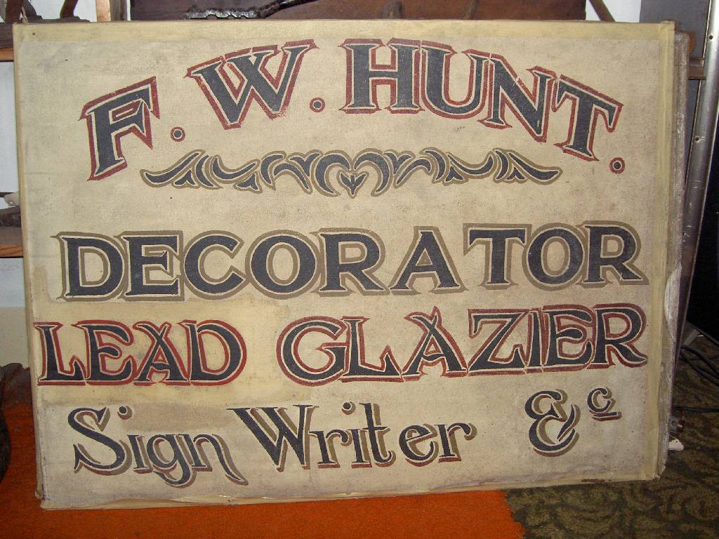
found this in a museum the other day, look at the shadows!! 😎
Attachments:
-
quote aj:found this in a museum the other day, look at the shadows!! 😎
hmmm i just see a badly written sign. the writer has talent to a certain degree, but i wouldnt say its great.
shall i run now? 😮
😉
-
Had Mr Hunt been on t’internet and posted that sign in show us your stuff,
he would have been slagged of for using to many different fonts and im sure someone would not agree with the kerning and colours. 😉
as for the “shadow” it’s more of a style than a deliberate shadow. 😀
Peter -
i can only see one shadow…the rest are outlines :lol1: :lol1:
nik
-
oh yeah run while you still got legs cos Grant and Phil are back and out of the shadows!! :lol1: ha! ha! &c
-
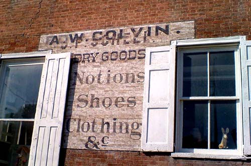
I love the use of &c….here it is on a wall sign in my ancestral village of Schellsburg PA.
The only constructive crit I have for Mr. Hunt* is his lack of negative space.
Here also is an old sign from where I live now that is in the Sign Museum over in Ohio.
Love…..Jill
PS
*Does he have a brother named Mike?
Attachments:

Log in to reply.
