Activity Feed Forums Sign Making Discussions Off Topic Chat Hair-Pulling Client Email Saga

  • Hair-Pulling Client Email Saga

    Posted by Jill Marie Welsh on November 16, 2005 at 12:47 pm

    This has gone on over the course of two months:
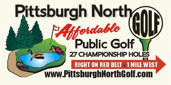
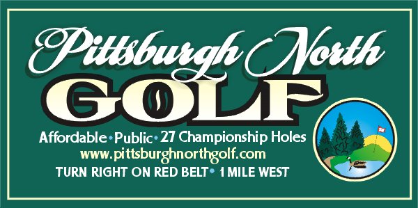
    (an “artist” client who supplied her own wood to replace an existing 25-yr-old sign)

    Here you go, Patti.
    #1 is a variation of your layout.
    #2 is my idea.
    Note that this is an approximation of how I would replicate your logo.
    These are basic renderings.
    Please let me know what you think.
    Of course, colors on either can be changed.
    In #2 I merely enclosed your logo as a focal point.
    Thanks…..Jill

    WOW they are both beautiful!! Will have a voting session and get right back at cha.. just WOW!

    What would an arrow on the green sign look like.. around the turn right? It sends me there on the white sign? thanks plp

    (enter the brother, who wants to change everything)

    Hi Patti.
    Please be advised that an additional sketch requires a fee of $75.
    I can make you one, just wanted you to be aware of the fee.
    I feel that the script would be quite legible and is geared to compliment the alphabet used in “Golf”.
    If you must have a non-script alphabet, it would be the same as what I used in the web address.
    Thanks…..Jill

    (third sketch added with an arrow then she wanted to change the script to a block letter)

    Thanks Jill,
    I agree with you, the lettering that exists looks good .. But I will send this on to him to consider …patti

    Hi Jill,
    Well… to please my brother…he realizes that it will cost us $75 xtra for a look at lettering changes..
    I personally like the Script..and the web address print is …. well.. then..let’s have a look. Thank you… Patti

    Here you go Patti!
    Thanks…..Jill


    (there follows at least 3 emails asking specific lettering sizes, which I cannot give without a pattern that I cannot make without client approval)

    Hi Jill
    How would the Pittsburgh North lettering look outlined in black as the GOLF is? so that it stands out
    and.. on the arrow.. that you have “red” lettering and red dot on the white arrow. it is futher suggestive that they turn on the RED BELT
    The flag in pix is red.. as should be.
    Thanks,
    I am going out of town for 2 weeks back the 28th.. Thanks Patti

    Please be advised that any additional changes or sketches will result in additional fees.
    At the risk of sounding rude, I have never had anyone take this long to decide about a design or in fact to take this long in pre-production.
    I am at the point in this project to just give you back your wood and keep the deposit for my design time.
    I did the layout as I saw fit as a trained graphic artist for over twenty years.
    Please let me know what you decide.
    Jill

    Jill,
    As I said on the phone I agree with you and I have asked others which
    they like and why.. this is the one.
    So .. One request.. that the Dot between “Belt” and “1” on the arrow.. be
    RED
    There are 2 courses that go to the left on the Red Belt and I want to
    impress that we want them to turn RIGHT for sure to get to Pittsburgh North.
    Our course has been there for over 45 years and we always get calls from
    customers trying to find there way to the course.
    Late for their times… oh well.
    So this is choice of the sign that I would like you to do.
    Thanks for the ear.
    Patti


    (she then chooses the original #2 layout!)

    I am glad that you have made up your mind…and I will paint the dot red.
    Will start this ASAP.
    Thanks!
    Jill

    I will be back in town 11/28 thanks again.. I know that it will be beautiful

    Frustrating to say the least, ain’t it?
    What would you have done?
    Love…..Jill


    Attachments:

    Brian Maher replied 18 years, 7 months ago 15 Members · 18 Replies
  • 18 Replies
  • Jayne Marsh

    Member
    November 16, 2005 at 1:14 pm

    You must have the patience of a saint to put up with her and her changes, to be honest she had lost me after the 2nd email! I also love your direct approach to her, in other words “dont waste my time”! There are many customers I would have liked to say that to but have never had the guts :lol1:
    I love the second layout, is that the one she evntually chose?

  • Martin Pearson

    Member
    November 16, 2005 at 2:17 pm

    I think they are both great Jill, what to do in the future when you get customers that waste you time is just pass them on to the lick it and stick it woman just up the road from you.

  • Gordon Forbes

    Member
    November 16, 2005 at 2:39 pm

    Why deo they have a 27 hole course

  • Marekdlux

    Member
    November 16, 2005 at 3:29 pm
    quote Forbie:

    Why deo they have a 27 hole course

    We have some courses like that here. They have 3-9 hole courses so you can switch it up. You can play course 1 and 3, or 2 and 3, etc. It makes it a different course each time you play it.
    -Marek
    BTW Jill, I’m glad you didn’t take any more of her BS. Good job!

  • David Rowland

    Member
    November 16, 2005 at 4:09 pm

    the biggest problem is that they are a brother/sister arrangement, which means they will fight.

    nice work jill, crack that whip, customers know nuffin’ 😉

  • Leigh

    Member
    November 16, 2005 at 4:24 pm

    I wish I could be so direct too….maybe one day, cause’ there are plenty of customers that I’d like to tell them where to go (just had one that I almost walked out on….surprised that man had a wife, put it that way)

    good for you!
    and hey at least they were willing to pay

    and isn’t it always the women!!!
    (yes, sorry to offend anyone, but that just seems to be the case out here :lol1: )
    and Dave what about a husband wife team OY hehe

    so layout 2 is the one they went with?
    I got so lost

  • Martin Cole

    Member
    November 16, 2005 at 6:22 pm

    Jill
    I had a similar story the other week for a simple banner for a new
    cross Atlantic airline.

    I was producing banner for a client of mine, it was virtually an
    open phone line between New York my client in Essex, and me.

    It was incredible I think I produced maybe 8 proofs, the client in NY
    was on the phone ” could we just move this or that to the left about
    another few cm.

    I appreciate it had to be right but for a relatively simple job it became
    a joke.

    Love both designs by the way 2nd would be my choice.

  • Joe McNamara

    Member
    November 16, 2005 at 7:40 pm

    I’d have done something different with her wood (Clue : where the sun don’t shine) :lol1: :lol1: :lol1: :lol1: :lol1:

    You have the right attitude though Jill, fair play!

    At least you kept charging for your sketches.

    I think the second design is fab!

    Cheers
    Joe

  • Nicola McIntosh

    Member
    November 16, 2005 at 9:23 pm
    quote Joe McNamara:

    At least you kept charging for your sketches.

    good for you jill… 😀 i wouldnt get to do that where i am 😕
    had the same thing happen a few weeks ago…spent hours on a full colour design which took quite a bit of time…and guess what the fluffy customer decided he didnt want the job done…says he ran out of cash 😮 (two brothers fighting over the layout) (chat.)

    i dont normally get those type of customers..as its all repeat work i get, but im on guard now 😀
    the second design is the best one jill 😉
    hope the job goes well 😀

    nik

  • Jill Marie Welsh

    Member
    November 16, 2005 at 9:39 pm

    Thanks folks.
    I began to doubt my sanity after a while.
    Gonna get started on the damn thing, now that I have lost all enthusiasm for it.
    Just for the heck of it, here is what her brother wanted.
    Love…..Jill
    PS
    I am a better letter writer than a talker, I would have been bawling on the phone to her from anger.


    Attachments:

  • autosign

    Member
    November 16, 2005 at 9:55 pm

    Wish I could charge £75 to change a font on a customers design.

  • Jill Marie Welsh

    Member
    November 16, 2005 at 10:00 pm

    ….you can!
    (usually when I quote this price, most people back off)
    $75 is cheap for a new sketch.
    Love….Jill

  • Stevo Chartrand

    Member
    November 16, 2005 at 10:12 pm

    Yup I do the same! They’re given enough choices with two layouts and I’ll give them a couple of revisions and tweeks. If they cant convey exactly what they want on the sign after the revisions then I start charging more. They are totally aware of this right from the git go and in most cases it works and the job goes smoothly.

    Jills case however, the client was very indecisive and was taking too long and being very petty about moving this and that and generally being a pain in the arse. She’s showed a heck of alot more patience than I wouldve put up with.

    I know we try to be as accomodating to the customer as much as we can, but it can only go so far. It is YOUR time, charge for it!!!!!

    Stevo

  • Shane Drew

    Member
    November 16, 2005 at 10:24 pm

    Good on you Jill.

    I admire your approach too.

    Unfortunately people assume because they have a computer and can do a simple design ‘quickly’ in MS Notepad, that we should be quicker to do something outstanding.

    Must confess, I would have walked from this woman after the 2nd or 3rd call. I have plenty of work that I don’t need the agro. You did well to keep her onside tho.

    For what it is worth, I find family businesses can be the worst to deal with. Especially Bro & Sis that are each trying to be dominant.

    Much rather deal with a company that has guidelines, at least you know the ‘rules of the game’ before you start.

    Like #2 too Jill.

  • Lynn Normington

    Member
    November 16, 2005 at 10:30 pm

    we have had one recently been going on for months, what ever we would have done wouldn’t have been right, wev’e hopefully walked away ,she will if she comes back, one of the ones hasn’t a clue of what she wants and when you can’t get in the head to claw it out you don’t have a clue either, small rant over

    Lynn

  • Jill Marie Welsh

    Member
    November 17, 2005 at 12:55 pm

    Autosign,
    I tried to be positive to your comment initially.
    But after a night’s sleep, it still bugs me.
    You sound just like my customers!
    It is attitudes like yours that de-value our industry.
    I didn’t “just” change a font.
    I had to re-work the entire design, put up with that lady’s crap, etc etc.
    Plus that was not a free font.
    Try going to a lawyer and having him just change a sentence in your will.
    Or having the plumber just look at your toilet.
    😮
    Nuff said.
    Love…..Jill

  • Leigh

    Member
    November 17, 2005 at 1:47 pm

    Jill just wanted to let you know that your statement to your clients about having to charge more for this/that etc.
    Pushed me to do that yesterday —- ahhhhhh

    I won’t normally charge more after the initial layout for customer’s who are ordering a large sign (read…mooooore money)
    but I’m having a time with some customer’s with a logo – back and forth
    you know the gig – seems to be more so than usual with this “couple”
    They also want some quick coro and banners

    I gave them a layout
    heard back about what they wanted and didn’t want
    and immediately let them know (through email)
    that I will only make one more additional change and after that would have to charge them 😛
    (I’m not doing constant changes on temporary signs for free)

    love it – not for the money, but because it backed them off immediately
    and they made a decision!
    It was nice to head them off before I received the
    umpteenth email that I knew I would inevitable get from them
    :lol1:

    thanks for the push
    I needed that

  • Brian Maher

    Member
    November 18, 2005 at 8:02 pm

    it looks great jill…. you have must have been really fed up with all the changes….just get it done before they change their minds again :lol1:

    i’d have roared “Fore!!!” and fired the board back at them 👿

    there are easier ways of earning a living….. 😉

Log in to reply.