Activity Feed › Forums › Sign Making Discussions › Graphic Design Help › Black on a bottle green van, help, any colour suggestions
-
Black on a bottle green van, help, any colour suggestions
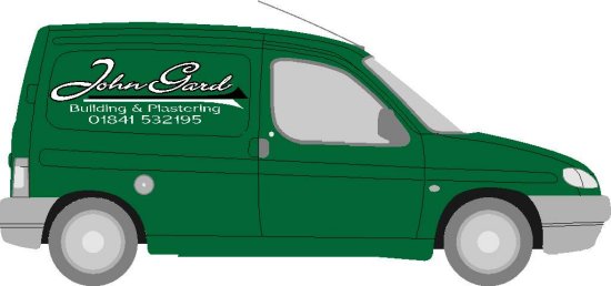
Posted by Alistair Richards on December 12, 2005 at 12:43 pmHi,
I’m only new to this, so please don’t laugh at this simple design, anyway, I was wondering if anyone had some colour suggestions on what looks good on a bottle green colour van. I think the black in my design (out line of main name and line underneath) looks fine on the computer screen, but am worried that it might not stand out very well when applied to the van, any suggestions greatly appreciated,
Thanks Ali 😉
Attachments:
 Alistair Richards replied 18 years, 4 months ago 8 Members · 11 Replies
 -
11 Replies
-

Hey I really like that a lot!
Some color suggestions (as I feel the black will be lost)
are imitation gold, tan, or cream.
Love….Jill
PS
Grey might look nice as well, or even a dark burgundy.
(Keeping the white parts white of course) -

I agree with Jill …… shes good at this sort of stuff 😉
I was going to suggest burgundy or silver/grey?
😀
-

Funny you should post this.
Did a yellow with black outline on a bottle green vehicle the other day.
Laid the black down first, then went to lay the yello overlay, and I couldn;t define the black edge from the bottle green vehicle. It was a nightmare to lay. Finished up doing it wet so as I could better define the outline. Should have used clear app tape really.
End of the day I was not happy, from a distance the black was lost on the green. Client was happy tho so that was good.
You may be better to reverse the colours, so the white is the outline and the black is the main sign..
jmo tho
-

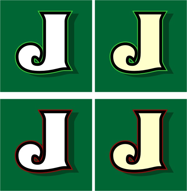
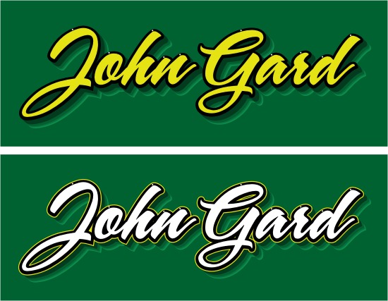
I think it looks good so far! I agree with Jill on her color suggestions, (except imitation gold 🙂 ). Sometimes I like to use a lighter green for an accent pinstripe around the lettering. Here’s a couple samples.
Stevo
Attachments:
-

nice stevo 😀 the top right looks like the one i would go for 😀
nik
-

I like the green pinstripe alot and would use either of the top two. 😀
-
Embrace your inner imitation gold, Stevo….you know it’s gonna look fab.
Trust me!
Love….Jill
PS
Fire Red could also be an option if done correctly. -

I do like cream with dark green, gives it a slightly ‘olde worlde’ look. And the lighter green pinstripe does the job nicely! 😀 (in my opinion)
-
Okay Jill, Actually it doesnt look too bad at all. 😀
Stevo
Attachments:
-

Thanks everyone, that’s really really helpful, cheers Steve for the pics, I’ll see what the customer reckons and try and get a photo uploaded when it’s done.
Cheers Ali :lol1:
Log in to reply.
