Activity Feed › Forums › Sign Making Discussions › Graphic Design Help › can anyont help withfiesta van design please?
-
can anyont help withfiesta van design please?
Posted by Richard Urquhart on January 1, 2006 at 6:04 pmhi all and happy new year
need some layout help with this one
logo to stay but can go any where
fonts used eras mdbt
i would like to use the above as i have used these in the signs i have already done for them
colour of van is dark blue and would like to keep to blue and yellow
i have had a go but need help as you can see although i like partsplease help if your hangovers are not to bad rich
Marko replied 18 years, 3 months ago 9 Members · 43 Replies -
43 Replies
-

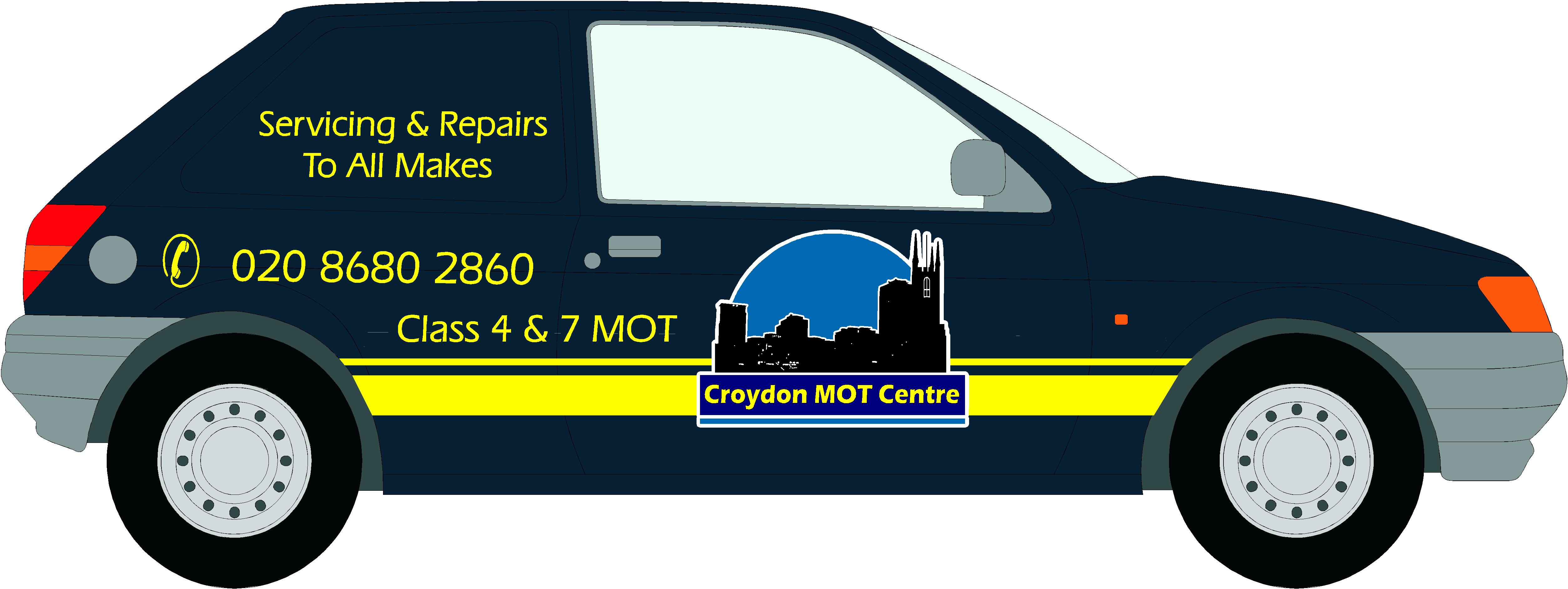
tricky one Richard ! that logo is an awkward bugger to sit anywhere comfortably,
anyways, here’s my effort, i did experiment with making the logo larger and smaller on the rear qtr but if i remember rightly, the lines on those older vans are quite sharp/deep, so i suspect fitting might be a pain, so i opted to keep it small !
Attachments:
-
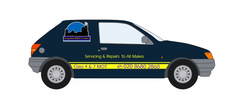
or maybe…….
i’d still like to be able to do more with the name, but the logo just doesnt work when it’s blown up any bigger on a small van, imho 😕i’d prob move the logo rearward more than in the pic below, just doesnt look balanced where i dropped it !
good luck !
Attachments:
-

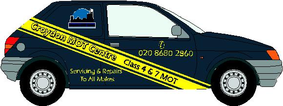
Just to give you something to think about! I have lost the black outline on the text in the logo.
Attachments:
-

thanks for input guys please keep them coming
nick there should not be a black out line on the text may be when i saved from flexi to adobe something went wrong should be yellow on bluethanks rich 😀 😀
nick your right there was a black outline !!!
-
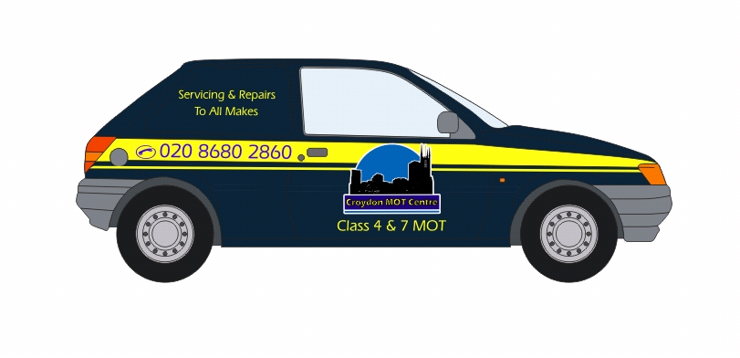
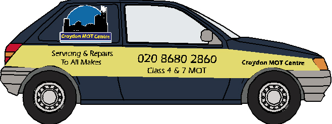
have moved the text to follow on from tel number ???????
Attachments:
-
try this 😕
It will work!!!! (hot)
Try this!
Yes, probably to much yellow but its only a Idea to get you thinking!
Attachments:
-
no its not doing it for me
nick whats the black dot for
i think it is nicer to read but think the yellow is to wide this really is a hard one ! -
cant see tif files on firefox for some reason ?
oh well, i think thats ok Rich, but i’d still move the main logo a little more rearward, not much, but more toward the rear edge of the door,
-
Not sure whats going on its not coming out right (hot)
-
nick i think it looks better as before i.e logo in middle of door so there is more yellow to the rear of vehicle
-
thats how i just did it Rich, ultimately its up to you and the majority view, i just thought it looked more central to the vehicle in your last capture, its a clumsy shaped vehicle !
-

hello Richard,as your last image, but how about reducing the size of logo and sitting it above the yellow stripe, just a thought! also for some strange reason I would like to see the logo image of the buildings reversed so the taller building was at the rear of vehicle, by the way you seem to have lost the ‘C’ in logo . good luck and happy new year to all
-

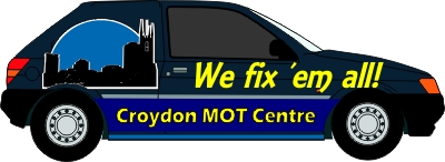
Hi folks,
Just a quickie…
Not sure about colours but thought it might add another idea into the pot..
Cheers
Ian
Attachments:
-

I don’t have time to mess with this today, sorry…but
Constructive crits…
There is no “flow” to the layout,
all the info just seems tossed on.
Ian’s version has the best readability.
I like Hugh’s with the logo up top too.
Nick’s isn’t bad either.
Love….Jill -
how about this
help im going mad!!!!!!!!!!!!!!!!!! (:) (:) (:) (:) (:) (:) (:)
Attachments:
-
that looks ok Rich ! just feel that the text on the upper rear panel looks out of place somehow, i wonder how it might look as a line of text above the otherline but more to the rear ?
i know you’re then left with the top bit empty, which looks a bit silly too ! can see why yer pulling hair out !
-
Do you have to have the logo on the door? why not have the text in lines as you have it and put the logo at the back in line with the side window.
-
you guys have been a real help
but ahhhhhhhhhhhhhhhhhhhhhhhhhhhhhhhhhhhhhhhhhhhh
i hate fiesta vans -
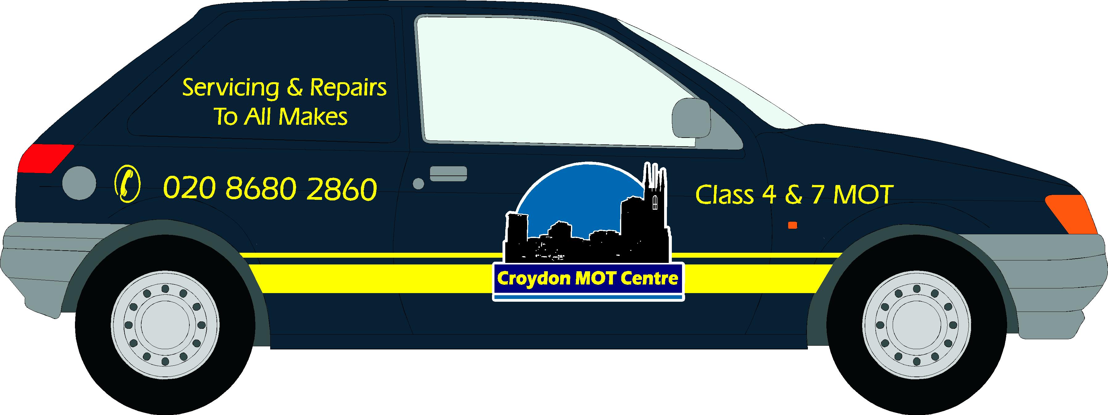
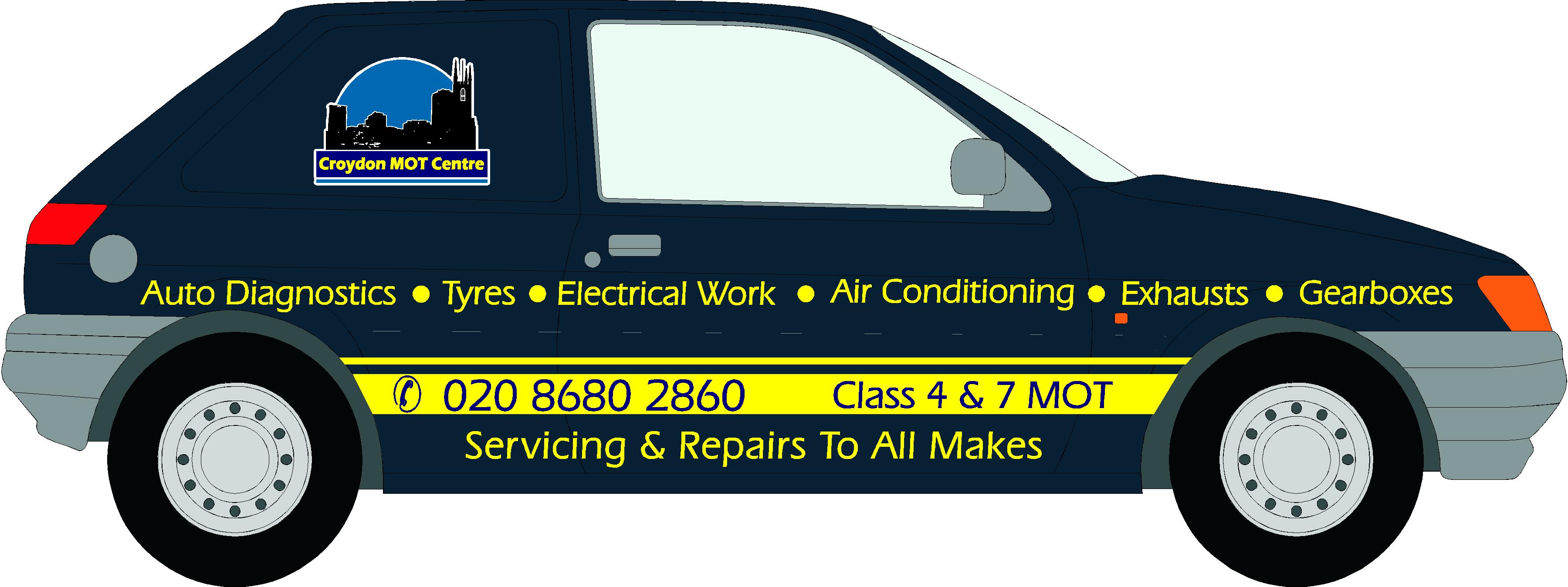
bigger logo and moved text up a touch ??
Attachments:
-
Nick thats as close as i would like to go without coming out of panel i don’t mind going over body lines but think it would look out of place i see what you mean though if it could come down then it would look better but the panel is where the window would go on the fiesta car so its a no go
-

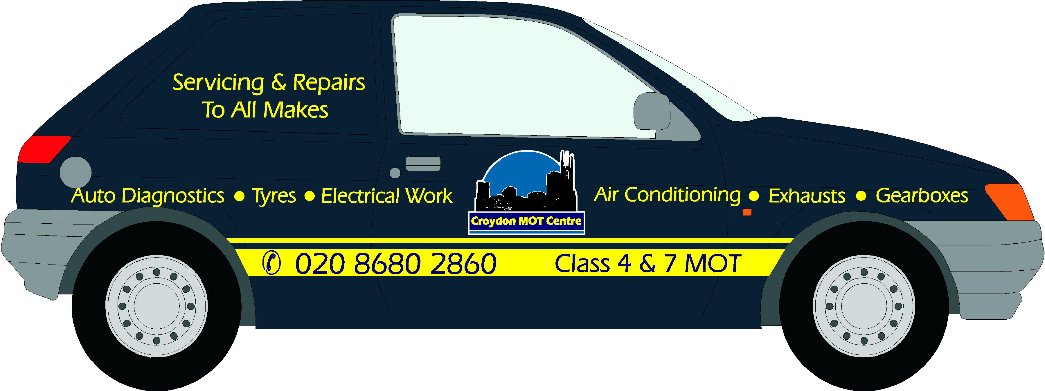
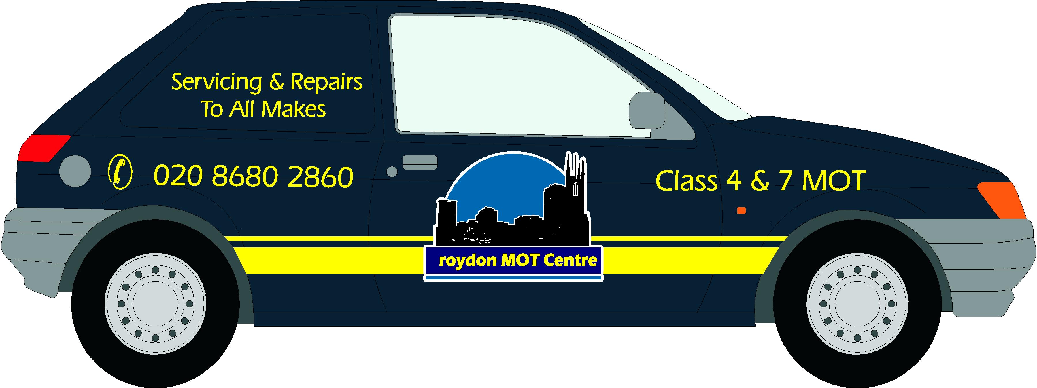
Well here’s my shot at it. The root of your layout trouble is the logo. It simply does not work, it’s very difficult to read and looks like a logo for a night club.
Vehicle graphics should be high impact, easy to read and uncluttered. That’s how they get noticed. Aside from sitting in traffic the amount of time to read the message is about 1-3 seconds. Usually when a client wants a listing of services I like to list them on the back. The only time it will most likely get read is at a stop light. Otherwise its just cluttering up the sides.
Here, I messed around with the logo(souped up the car too) and seperated the text from the graphic. The text on the logo is useless being that small. The yellow stripe was just too loud and found it overpowered everything. I’m not totally happy with what I’ve done here. it is a tad bottom heavy but it is legible and noticeable. Hope it may spark some ideas for you.Stevo
Attachments:
-
Steve thanks for your input and i hear what your saying
i like what you have done but reminds me of a stock car or race car
i agree it gives massive impact
my customer just wants to sign his van to tie it in as there company vehicle
not to make a massive statement i put the services to try to make the design look better
wow am i stuck on this one
i also agree about the company logo but i designed it and they like it its on all the letter heads , tee shirts etc etcso what do i do now
thanks for the help im getting on this
rich -
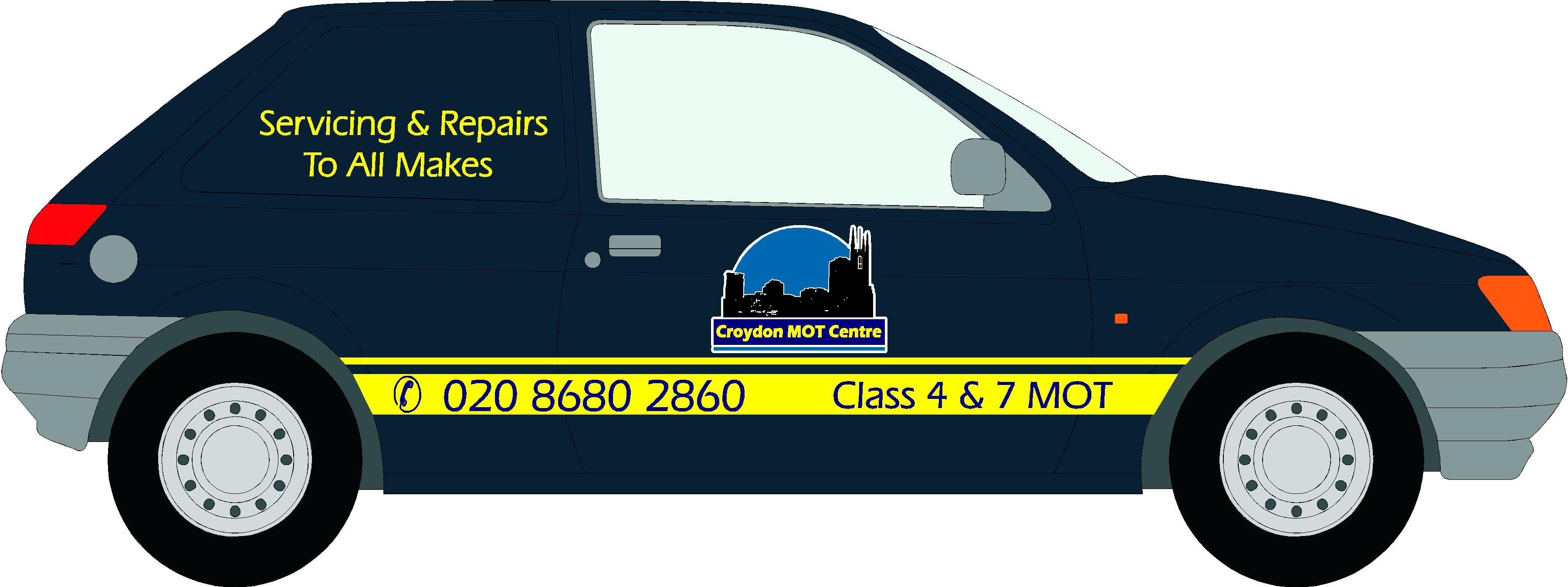
Ahhhh okay! I tend to get carried away doing other people’s designs! 😀
From what you’ve described I’d just simply have the logo and phone number in the top panel. Nothing fancy but gives him some identification. Didnt realize it was your logo mate, but you might want to consider making the bottom panels with the text bigger, so it can be read.Stevo
-
Steve you have given me an idea
i need a night club to ask for a sign
i have the prefect logo for them to use 😀 😀 😀
thanks Steve i may go back to painting cars and vansno cant do that !!!
I’m leaning all the time
still not sure what to do with the van though !!
rich 😀 😀 -
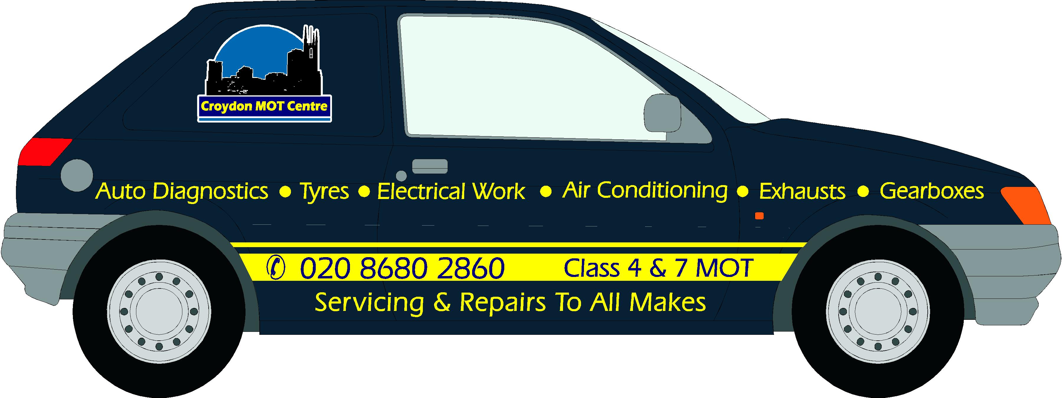
Better! I’d like to see some different colors on your text to seperate things abit. Maybe the lighter blue for the service listings? And bumping up the stripe and the text from the bottom a tad more. It’s getting there! Hope you dont think I’m being too hard on ya! 😀
Stevo
-
not at all
its good to have your help along with the others that have helped
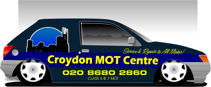
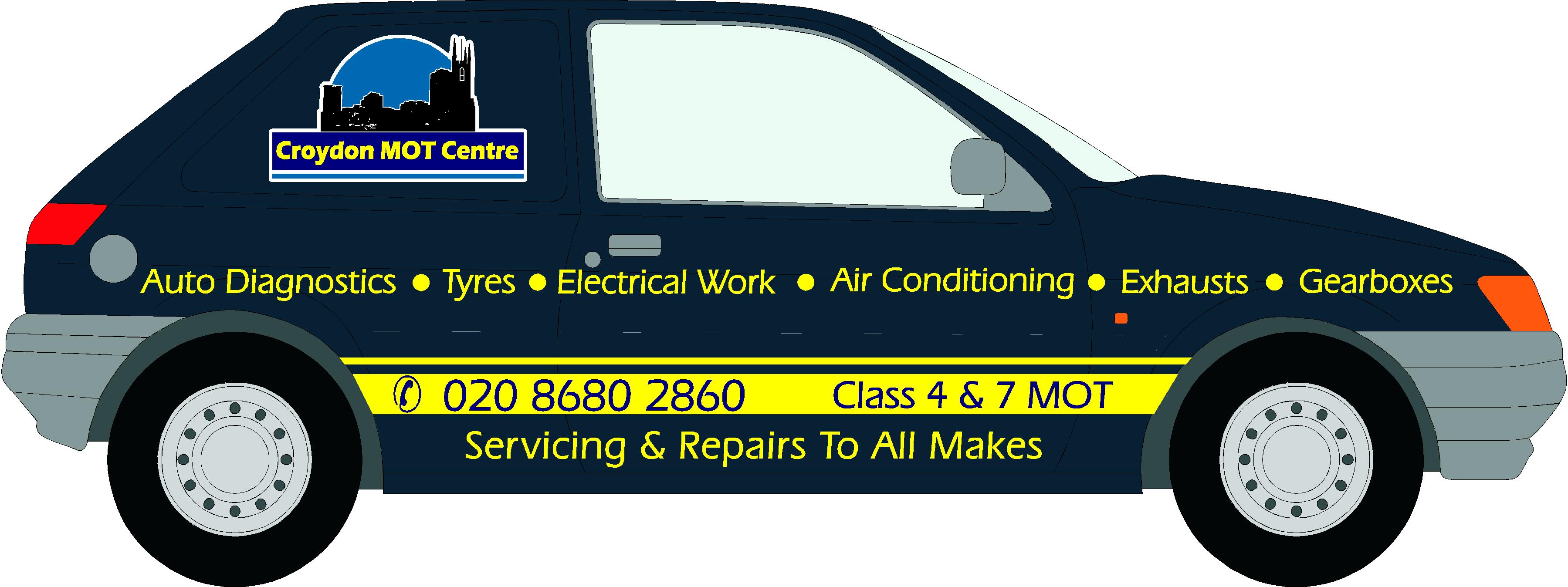
hows this ???
Attachments:

-
Its a shame you cant get the logo bigger and close to the text, looks to far away were it is, and as Stevo says the text needs to be bolder.
Can you do the lower bit the same sort of way Stevo did?
-
nick Steve huge
you ready for this
went in to work today and croydon mots is under my unit so showed him what i had come up with
he loved the last design and we looked at the colour swatch and chose the blue and yellow he wanted and i agreed
any way hes a good mate of mine and said rich go for it do it when you canany way i went away and did a few jobs i had booked in
getting ready to come home so i grabbed impacts latest disc and book so i could get it ready to cut for tomorrow
came down the stairs and my mate said rich have you started cutting the vinyl for my vanno i replied whys that
oh great he said don’t bother were going to get something bigger and later so were wait till thenwell how would you have felt we all did our best with what was a hard vehicle lets hope the next one works better
rich i love wasting my time
(:) (:) (:) (:) (:) (:)
-

Rich why not steer him the way of a good van to sign !!!!!
liked the last one by the way.Lynn
-
Oh well, at least you have some idea for the next one 😕
lets hope he gets a better van 😀
-
Best way that I’ve found to avoid that sort of scenario is to always get a deposit or art fee. Even if he’s a friend of yours you still put time into his project and then shafted you by bailing out and changing vehicles.
I learned this the very hard way. Hasn’t happened since I’ve asked for deposits.
Well at least the next project is a bigger one for you and you did get some ideas and practice.Good luck to ya Richard!
Stevo
-
Hi Rick!
I know this one´s wasted but none the less, I quess I´d have gone this way… like this…
Attachments:

Log in to reply.
