Activity Feed › Forums › Sign Making Discussions › Graphic Design Help › can anyone help with layout on car please?
-
can anyone help with layout on car please?
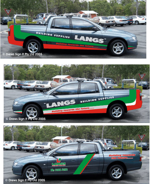
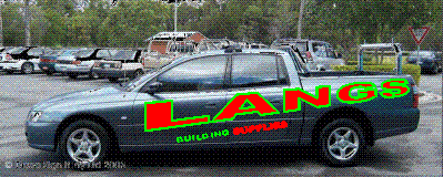
Posted by Shane Drew on November 18, 2005 at 12:37 pmI have been working on this for a few weeks now.
Originally these people had a graphic designer come up with some good concepts (I thought so anyway) but the general manager was not impressed. He aske dme to see what I could come up with, after giving me a brief.
The top design is basically what he wants, and he loves it, but it is well in excess of his budget when I gave hime the price.
The bottom one IS in his budget, but he hates it.
I’d love a fresh view on this. I am sick of the site of it to be honest.
The vehicle is Charcoal Gray, and the corporate colours are 3M Brite Green and 3M Tom Red.
I’d rather a conservative look than a big flashy appearance, especially since they have a limited budget. But the GM wants to be big and bold… and cheap 🙁
My view is that, as they are a building company, the vehicle will be getting a pretty hard work out. This car has already been dented after only 2 days on the road.
Any comments would be greatly appreciated.
Attachments:
 Shane Drew replied 18 years, 5 months ago 9 Members · 21 Replies
 -
21 Replies
-

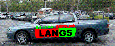
Hi Shane, would something like this be in the budget?
Attachments:
-

probably not nick. :lol1: good thought tho. I’ll certainly include it in my next lot of designs.
The problem is I know the owner of the company really well, and I know he’d go for the bottom one, but they will not take the designs to him until they have chosen one first. And the bottom one will never see the owners desk at this rate 🙁
Other thoughts welcome too.
-

Shane, surely all the shadowing will bump up the cost anyway?
I tried doing a design, but cant get your design off! How does one go about that anyway
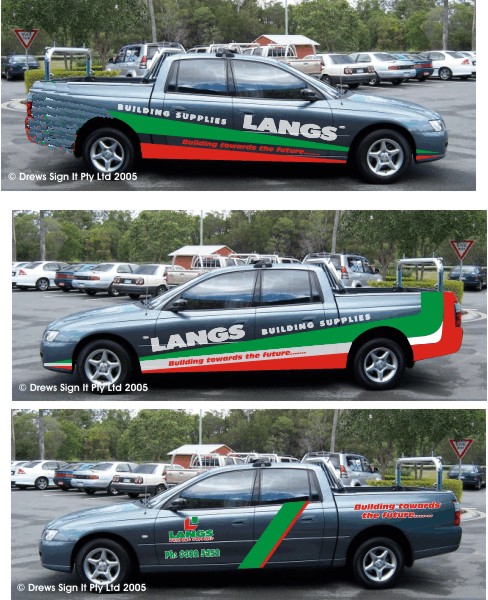
I personally like the middle one, with the white stripe.
The bottom one, I would like to get rid of that stripe, or maybe alter the angle-as it is it’s not doing anything except look out of place! Put it on the front door only & incorporate the writing. Get rid of the outlines. Wish I could demonstrate properly.
Can you tell I havent got too much work on today?
-

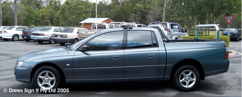
Shane,
Do you have a pic of just the car with no graphics?Stevo
-
quote Stevo Chartrand:Shane,
Do you have a pic of just the car with no graphics?Stevo
:banghead: some days I am not thinking straight. Sorry about that, never thought to post a blank one .. d’oh 😳
Attachments:
-

Shane, Dont take this the wrong way, if the firm are working down to a budget, and were not impresssed by a graphic designer (probably his fee rather than is work)
Why try and give them something for nothing?
I Know you are a nice guy, but they should only get what they are prepared to pay for, If it is outside of their budget that’s their problem, not yours.Peter
-
Hi Shane,
I’ve never posted a photo on here and stupidly never taken note of how to so this may not work – we’ll see.
Here’s my take on this design (as a concept!)
Good Luck
Simon.
Attachments:
-

I agree with Peter, Shane.
i also like the top one the best.
I don’t prefer the designs with the white in, because my first thought is “italian” or “Pizza shop”I kinda liked nick’s suggestion of taking a way the vinyl from behind the rear wheel well…. That would take off an hour or so of time and some less vinyl to cut costs… and looks just as nice to me.
nothing else popped in my mind.. sorry.
If stevo’s gonna give it a crack, you’re in good hands.
-
On a roll now :lol1:
Notice the deft missing of the door handles. 😎
Attachments:
-
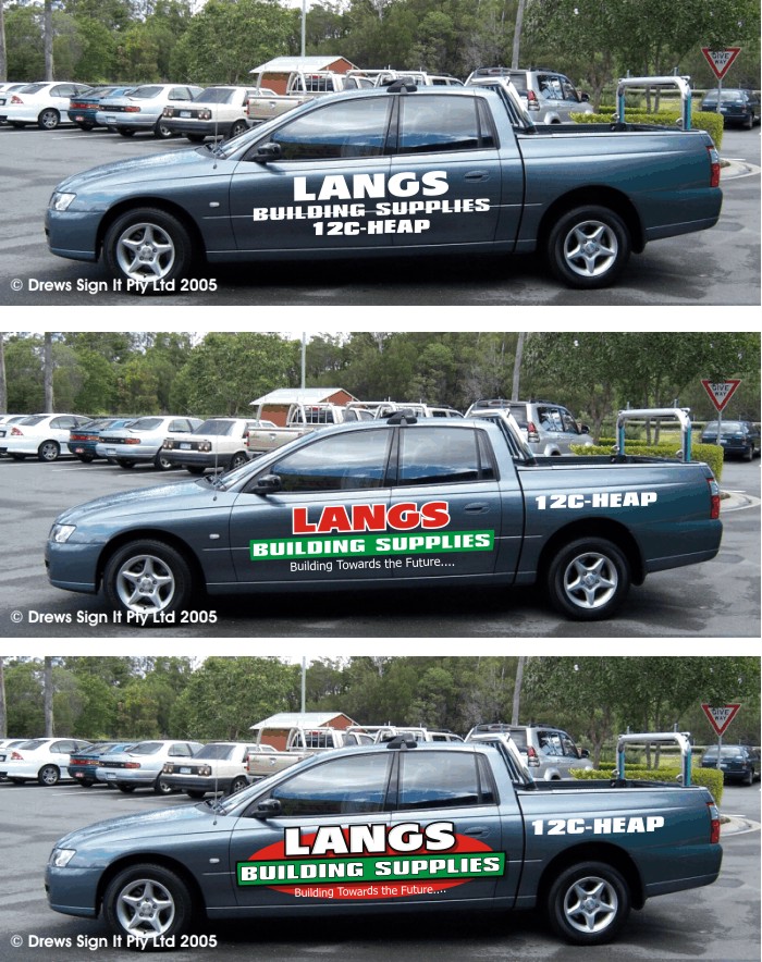
Hi Shane,
Here’s a quick one for ya.
It goes from cheapest to cheap, to over budget. Their company colors are kind of tough to work with so I did use white for their name for impact and dropped the stripes. I know how you feel when a project drags on for too long. You lose your enthusiasum for it. Hope this may spark something for you.Stevo
Attachments:
-

I like those designs Stevo …. especially the bottom one, the middle one works well too …… they look nice and smart, eye catching and neat.
😀
-
Stevo, nice designs, I’m sure it will help Shane to give the client some choice.
Now, just a bit of cc, what happens to the vinyl around the door handles?Peter
-
Thanks Peter and Carrie.
Peter,
When I design vehicle graphics I treat it like there are no obstacles involved. These designs may have to be tweeked a little bit for the handles. As long as it doesn’t interfere with the lettering too much it doesn’t bug me if it hits something, you can usually wrap abit of vynull on the obstacle when installing. Makes it really look like part of car.Stevo
-
Stevo,
thats fine, and when doing a wrap the overall picture is what is seen. But the guy that has to fit the vinyl may see it differently.
Shanes customer is looking for cheap, so the extra time involved fitting to or around the handles/furniture adds cost.I admire your artistic talent, wish I could get close, but designers/artists,
for everyday jobs, should consider how it will be done in practice.Art and talent have no limits, anything can be achieved, but only if someone is prepared to pay the price. 😀
Peter
-
I know how to fit vynull Peter. I’ve done it for seven years now and understand whats involved from start to finish. A couple of trims here and there really isn’t going to take much longer. And like I said as long as it doesn’t interfere with the lettering too much then it works for me. I would tweek this one abit more before production.
-
Sorry Stevo,
it wasnt meant to be personal(I admire your artistic talent, wish I could get close, but designers/artists,
for everyday jobs, should consider how it will be done in practice)I was more talking in general terms, I know you do the fitting as well. Its just my personal thing about cutting into letters, I know it’s sometimes unavoidable, but I would prefer not to.
I also appreciate that the above designs are more for ideas than production.
Have a nice weekend
😀
Peter -
Firstly, let me say thanks for the contribution everyone has made to this thread. I know each of you are probably as busy as me, and your time is precious.
Thanks.
There are a few choices here now, and certainly I’ll tweek a couple, but I’ll submit them all, as well as a couple of my own.
He won’t be able to say he had no choices 👿 now
If he picks one of the designs here, I’ll donate $50 to the charity of your choice, on your behalf.
I’ll be using 3m 7725 Cast or Oracal 751c on this, and folding over the handles will not be an issue. If he wants the sign big, it is a concession he will have to make.
I think he’ll go for Stevo’s bottom design tho. Mad if he doesn’t. But then, customers being customers, you never know.
Cheers All,
-
Hi Shane
Tried uploading my take on it, but the files too large, and I’ve got to get off home now, so can’t do.
Mind you, it’s no-where near the class of yours and Stevo’s (that last one of his has real class & style)
good luck with your penny-pinching customer 👿
-

Stevo’s bottom (hahahhaa) It is a fine one!
or Nick’s top.
Definately needs the white, as Steve stated, reminds me of a pizza shop.
I hate clients who dilly-dally and try to cheapen you down.
Good luck Shane!
Love…..Jill -
quote Lorraine Clinch:Hi Shane
Tried uploading my take on it, but the files too large, and I’ve got to get off home now, so can’t do.
Thanks for your time on this Lorraine, try exporting as a 72 dpi gif @ 600px wide. That should work.
Thanks Jill
Log in to reply.
