Activity Feed › Forums › Sign Making Discussions › Graphic Design Help › can anyone help with this bookshop design please?
-
can anyone help with this bookshop design please?
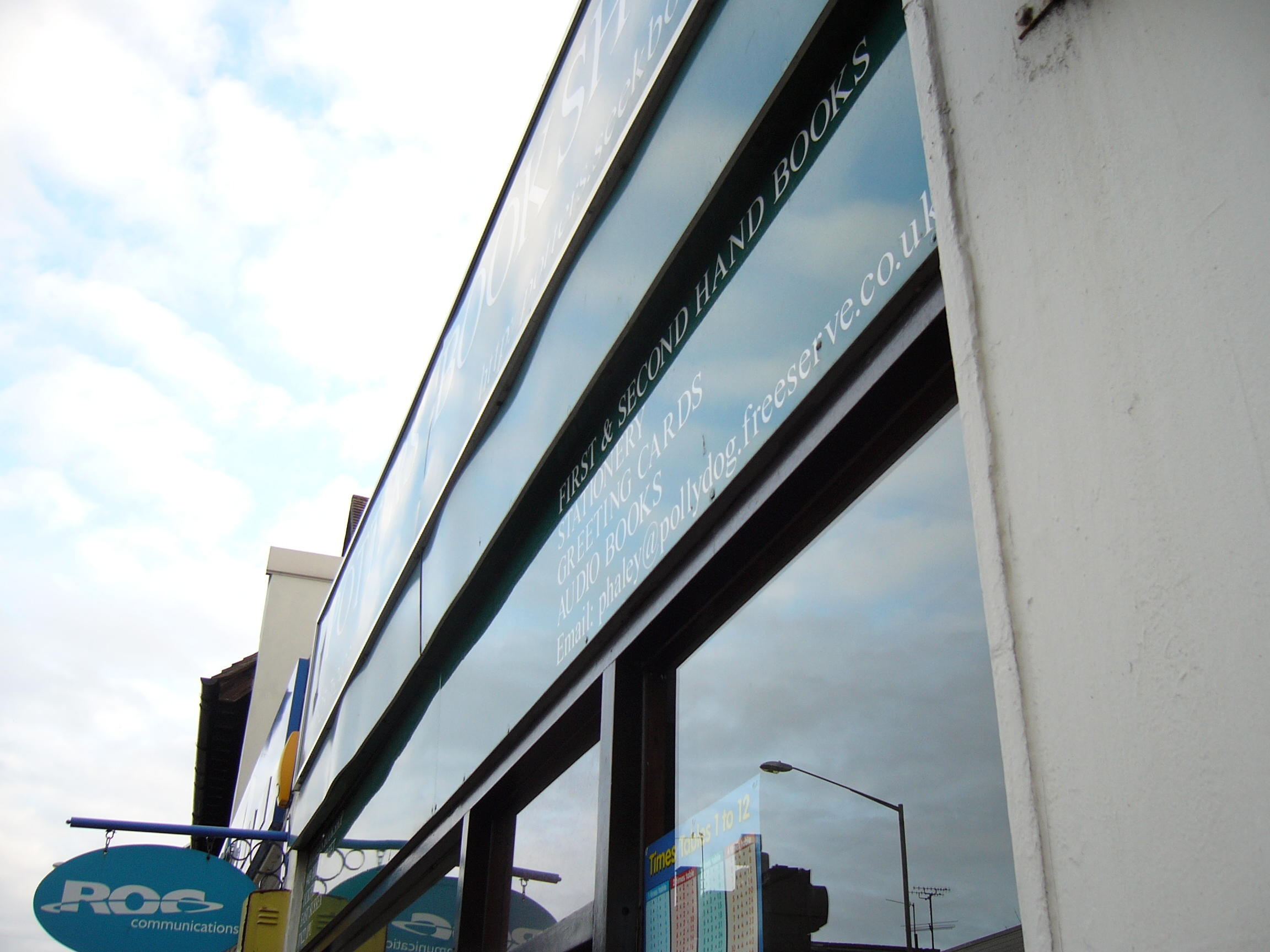
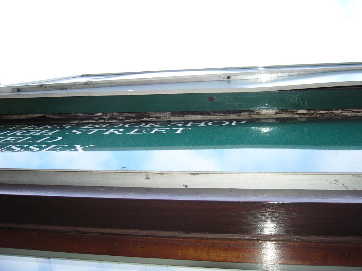
Posted by Hugh Potter on April 7, 2006 at 1:28 pmright, the first couple of images are what i have to replace, some not very nice signage, the main sign aint bad, just the ‘cover ups’ below it. one covering rotten timber as far as i can see. i originally discussed doing it as the three seperate panels, but after an early am inspection and re-measure at 7 this morning, i decided against that on cost factors.
right, my plan, instead of faffing about with the ‘three level sign’ as it is, i would prefer to get a chippy to simply bring the front out, by use of a timber frame, to be level with the top that way, also bypassing any rot wood i might have had to fix too,
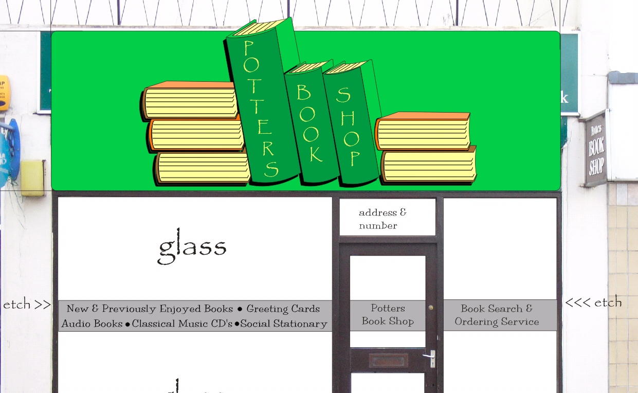
then, using alupanel (dibond type stuff) make one large background/facia panel, then, the main sign, contour cut (by hand i guess) from a 10×5 sheet of alupanel, and in some way, stood off, mayby, i may just afix it flat to the rear panel, the black outline is simply or illustrate the seperate layer,
the company colours are green and gold, so i wish to try and keep to that if i can, maybe some brown type colours as already there,
i had thought of laying the boks on their sides, but i like it like this !
i have a feeling that i’ll struggle to get what the job might be worth, but i want to do this anyways, i just like it too much to not do it, i’m not in competition with anyone else for the job, but i want to keep the price affordable for the guy, abnd the job easier for me (certainly easier than trying to fix to rotten stuff,
so, any constructive crit’s ? and as a ball park figure, have you an idea what you’d charge for this job (excl any chippy work of course) ??? i haven’t even started on a price yet, just had this idea when trying to get to sleep last night ! i wana do something a bit outta the norm !
thanks in advance.
Hugh
Attachments:
 Hugh Potter replied 18 years ago 17 Members · 54 Replies
 -
54 Replies
-

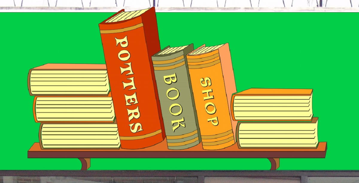
here’s the design.
ps, books drawn from scratch using corel draw 12, i think i’m quite pleased with them !
ah yes, would also be interested in suggestions for a bolder, but similar font to papyrus, as used on the book spines. ta
Attachments:
-

hiya Hugh
I have a nice idea for this, but have to do taxes…I will work on something over the weekend. I bet you get a lot of replies for this…interesting job
so much can be done with the booksI just wish I understood ‘proper’ English betta’
:lol1: 😉
having a hard time figuring out what you are planning
welllll cause’ I’m American :lol1: and from jersey (jurrrrsey)toss the font 😉
-
thanks leigh, maybe we need to do a glossary (or whatever you cal it !) explaining different meanings !
anyone else ? i want to show this to the customer asap, so would like to know what you think of it, and if i should make any changes now !
thankss
hugh -

Hugh,
I like the concept, the books would be easy to jigsaw out of dibond, and stand off by 10mm, the pics arnt that good of the original fascia, it looks all wavy? Foamex? Anyway one advantage with dibond etc. you can get away with just an external perimeter frame, so you may be ale to just fix
a baton (3×2?) top and bottom and get away with it.just my initial thoughts, as far as pricing, would need to know the size, but at a guestimate £750 ish for stand off, £500 for flat sign. dont hold me to it, its friday night, Extra for the window.
Peter
-

I’d make the books out of HDU…so easy to cut out & carve up with a Dremel tool.
…and I would NOT use Papyrus… :lol1:
I posted a few fontz on your other thread, I would use a different font for each book.
And I would gild the bindings.
Love….jill -
Jill, I have to take issue with you here, Dremmels are for hobby or amateur use, doing a sign this size would more than likely burn 2 or 3 out.
Peter 😀
-
I guess that the pheasant (2’x3′) that we have been Dremelling all week has been a figment of my imagination.
Have you never worked with Signfoam?
Love…Jill -

Jill is absolutely on the button, you should use different fonts Hugh, will look silly with the same ones. Different coloured books as well, with some gold leaf edging would look classy too. A subtle paint effect on the green background might be nice. I would be in the same price region as Peter for a 3D job. Would love to get some work like this. Look forward to seeing the finished ‘opus’.
-
All week?
Jill trust me, I am not an artist, but I am an expert in woodworking, metalwork and even good at cutting foam. dremels are a toy, invest in professional tools and you will get the job done quicker, therefore more profitable
Peter
-

Peter,
What do you suggest rather than a Dremel?
Maybe they are different over there? (?)
-Marek -
Marek, a dremel may be fine for very small detail work, but I would not even contemplate using one for anything bigger than say A4.
jigsaws, routers, fretsaws, belt sanders, and common hand drills with bits
are all better alternatives.If you want to get the job done, use proper tools.
Peter
-
One of the top distributors of HDU in the U.S. recomends using a dremel to shape their foam.

-Marek -

Yes Peter all week in between other jobs. I’ve been carving this piece.
It’s easy to use and it was a huge time saver for hogging out big depressions and for some of the finer details I could do with some of the smaller bits that came with it. Is that too hard to comprehend??? 🙄HDU would be a really nice choice of material for this Hugh. It’s nice to work with and surpisingly easy to carve.
-
Stevo , Jill, and Marek
we will have to agree to disagree, in my opinion, a dremel is a mass marketed toy, some people (like me) like toys, but when business is concerned, to to make my time profitable, I would prefer to use proper tools rather than hobby stuff.each to his own
Peter
-
We didn’t cut it out with a dremel, we used a table-model scroll saw.
It’s being carved with the dremel and some fine sandpaper…it cuts like butter.
Anyway, back to the design…
I love the idea of a faux or sponged background, very easy to do but looks hard.
Some bookends might be nice too.
The percieved value of the HDU sign would bring in twice the money of an Alucore sign. Even if only the books were cut from HDU.
Maybe get some free 12"x12" samples at Sign UK.
I’ve used samples to add money to my signs for years.
Love….jill -
Nice idea with the bookends Jill, maybe even an oversized shelf to hold the books up?
Peter, I know what you are saying, but for intricate details I don’t think there is a better tool than a Dremel. I know you can get attachments for a drill, but that’s a little bulky if you are doing fine details.
-Marek -
What tool would you use for carving fine details Peter???? Please enlighten me.
A plotter has also been used as a "hobby" tool as well. It is just a tool and in the right hands can be be used to create some nice work.
Have you even used one or even worked with HDU????? Just wondering, but I have a feeling you haven’t and we’re just hearing your same old blather. -
stevo. nothing personel then
I dont blather, just give my opinions
like you
If you are happy with your dremel, I dont have a problem, they are a recent mass produced toy/hobby tool, call it what you like, just wondered how you managed without it then?fine detail? use carving chisels,
Peter
-
No nothing personal but I do like opinions that are valid and have some experience to back it up. And if they are not valid then it is nothing more than blathering.
Thanks for answering my questions. 🙄 -
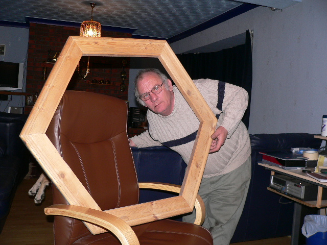
Stevo, just to reasure you, I ran out to the garage and grabbbed a part finished project, dont think a dremel would cope with something like this?
Peter
Attachments:
-
nice frame Peter, not sure the piccy in it would sel too well though !!!!
ok, thanks for the suggestions, i did find them in there somewhere,
right, book ends, my original sketch had them, but it just looked so much beter using other books as the book ends,
fonts, i’m happy to try them out,
guilding the covers and changing the covers, i’m happy to add a little detail like that, so long as it doesnt detract from the name of the Co, i did experiment with a few colours, but couldnt find a happy mix, i’ll try again !
as for hdu, high densiity something ? don’t think i’ve used it, unless it’s foam board type material, i want to do itout of dibond in this instance, i know it’ll be harder to cut, but it will need virtually a whole 10×5 sheet to cut the contour out, the shop over all is around 5m wide,
i am interested in the faux bit, i’ve seen you mention it before, i think there’s a demo somewhere, just realised i havent been to letterheads in months ! lots of inspiration there ! is the faux just likie… grab a sponge, mix some paint (thinly i assume) and dab it over ? cant be that easy can it ? !
think thats all that was mentioned !
i used to have a load of old books as a kid, all sorts of dull colours, guess i could try them first !
cheers -
Hi Hugh,
HDU is like a really high density insulation type material, I used it 10 yrs ago to cut some 3d letters, coated them with water based paints and they are still as good today as when new, great stuff to work with, and a dremel (despite what has been said) is more than adequate to add the fine detailing this project deserves.Design looks good, but I would be inclined to run the lettering parralell to the outer edges of the books, as it would be on a book. Veiwers will still be able read it.
http://www.paintquality.com/diy/content … m#sponging
A sponged effect using two shades of green, to look like an old limewashed wall with rich real gold on the book covers, would be stunning .
Hope this helps. -
Harry, you beat me to it.
The text should follow the book spines.
I would dull down the green, using a sponge technique.
As it is now, the background stands out more than the books.
Maybe even perch an apple on one of them (no bookworm in it tho)
and as Marek suggested, a "shelf" would easily cover up the weird bottom edge on the existing fascia.
Hugh, HDU comes in a few brand names, some are cheaper than others but none are too cheap.
That is why I suggested trolling for samples at Sign UK.
I know that the Precision Board rep Kellie will be at the Tickle.
Other brand names are:
SignFoam
Jasper Board
Precision Board
There are probably others as well. HDU (High-Density Urethane)
is a lightweight yet sturdy material which comes in several thicknesses and weights.
It is used a lot for sandblasted signs here.
I’d make the books from it, as stated, and the backer from Alucore.
The books can easily be glued to it with Gorilla Glue.
HDU accepts both good latex and enamel paints.
Some prime it, some don’t.
Love…Jill
(oops! Stevo is still logged in, but trust me, he’s in bed) -
cheers Harry,
when you say a rich gold, do you mean like a polished gold (5yr) for the bands i’ve put on the covers, or for the text aswell ? i’ll see what it looks like with the ‘titles’ written how they might normally be.Hugh
-
I would do the main title ‘potters’ in gold, real goldleaf or vinyl. A faux leather look to the main book (very easy to achieve with a paint effect) would be nice too. The prices charges for colourwashing recently was exorbitant in relation to the difficulty of doing it, it almosts happens itself if you use the proper glazing medium. Make sure your base coat is a vinyl finish ( for leather, a deep cream) mix and test the first wash ( a light tan) and finish with a burnt umber wash. Then apply the lettering and hey presto. Use the same technique on the background. The secret is to experiment. The bands would be raised out of the leather, if you know what I mean.
-

I know what you mean Hugh. Sometimes a job comes along that fires your enthusiasm and you really want to do it. This is obviously one of those jobs. From what I’ve seen and read so far this should turn out to be a fabulous sign.
You’ll probably spend a huge amount of time on this and only charge a fraction of what it has really cost you in time and effort. But for you it’s a labour of love and a matter of pride and job satisfaction to do this work.
It’s great to see someone who really enjoys the work they are doing. 😀
Make sure you keep us all informed with this sign as it develops
-
thanks phil, i just hope the customer goes for it, otherwise it’ll be another boring flat sign !
thank Jill, didnt spot your post earlier, as easy as the faux may be, it does sem quite daunting,
as do leather effects etc, i love the idea’s, but having only a basic vinyl knowledge base / experience, i’m concerned about biting off more than i can chew,
this was the job i was thinking of getting a crew in to fit, but that was before i had this idea, if i get a chippy (carpenter) to make the facia ‘flat’, then i dont really forse any problems,
-
Here’s a REALLY fast suggestion….
had not the time to create proper books so I just used shapes.
The faux finishes are truly idiot proof.
(not implying anything…but I did do a demo here last year)
The Gorilla Glue technique Sal Cabrera suggests would be great for the raised parts.
Gilding is not that hard either.
But you could do it with layered vinyl, just build it up slighty that way.
Just my 2¢
Love…Jill (logged in as Jill) -
Well Jill beat me to it 😉 same idea – HDU would work wonderfully with this Hugh. You can buy them in 1" thickness to keep your price down and have someone route out the basic shape for you – and start glueing the pieces together to get your book thickness of sayyyy 4".
Then use a dremel (hehehehe)
to shape and round over your edges – what have you.Gold leafing would look beautiful, but if you can’t fit that into the budget
even gold metallic paint could work. Granted it won’t be the same, but would still look nice.I was going to try to work up something (busy…cause’ I put off my taxes to the last second) a bit diff. than your design here.
Def. toss that font Hugh
look into some Letterhead fonts for this project.I was going to suggest stacking the books on one end of the sign
like the left side…to get their name out of them. I get the idea of
having the name in the books, but I’m just not crazy about how it looks.
If you build up a 2" frame the books could nestle in nicely
on one side and then you could Gold leaf (vinyl if you choose or gold leafed dimensional lettering) their copy.I would try a very dark background
almost black maybe (very dark green) as opposed to the lighter green you have now. Might look nice.
Your frame could be lighter or leafed as well.
Then diff. colored books, but still dark’ish’ to give it an old world look
Maybe try to make one of them look like leather
or instead of leafing the spines
make those look like dark brown leather.(heck if it was on my plate of jobs at this point Hugh – they would get
coroplast hehehehe)Def. try a diff. font for this project.
The papyrus doesn’t do it justiceand what is Jill doing with Stevo’s avatar :lol1: :lol1:
😉edited: oooh it’s a novel – sorry LOL
-
crikey ! i’ve alot to think about here, i was intenting to do it out of vinyl, on dibond cut to shape,
i’m gonna have to weigh up some options here, i really am limted with space, so weather wise it is not very often advisable for me to paint outside,
i guess the other side of the coin, who has a large enough router (10×5) to carve this out if i were to go for the foam board ?
i think, in all honesty, that on this occasion, i’ll stick with mostly what i know, but incorporating some of the above ideas, i’m happy to try new things, just not too many in one go, ‘ll consider the faux finish on the main rear board, maybe use the darker green, though the lighter green and gold are the companies colours. i also like the idea of bulding up the gold bits on the spines, and maybe using fatter fonts (though i think the new one’s i’ve used -thanks jill for 2 of em- look ok)
i like this over all design, and would rather see it go up, than be shelved (excuse pun) cos it’s way too expensive for the guys budget, i already forsee a big difference tween what it’s worth (time wise) and what i reckon i could charge,
-
 quote Leigh:and what is Jill doing with Stevo’s avatar :lol1: :lol1:
😉Wondered exactly the same Leigh-is this a UKSB union?
-

"SignRoc is a high density, outdoor durable, rigid polyurethane foam."
from Spandex [don’t know if they still do it!]
doubt if there’s any chance of getting a sample at Sign UK, everyone is concentrating on digital.
I agree…. the HDU would look great….
http://www.signworks-torquay.co.uk/main.html
go to 3D signs…….
-

andrew, nice link ,mate…. the world of dave smith eh… has to one of the worlds best at this sort of work. 😉
there is to be some demos of daves work on uksb, ive spoken to dave a couple of times on the phone and i met him 2 years ago at sign uk. there was suppossed to be a series of his demo on the boards but due to a serious accident it knocked it on the head. dave is apppearing at stewarts meet in stirling, be sure to pop in and say hi. 😉
look forward to meeting others there. 😉 😀 -
thanks for the link andrew, some nice work there. i think i’m gonna see if i can get onto a guilding course !
-

Hi Hugh,
I personally think this concept is worth selling to the customer. If you do a really special job with this one, you never know where it will lead.I think you’re in a great position because the customer kinda knows what he wants, but if you can show him something a bit different, even when you hike the price up, I’m sure he’ll go for it.
Mareks idea of using a shelf is great too.
I bought a couple of panels of signroc from spandex a few years ago. Its quite expensive, but you wont need very much !
It cuts like butter. You don’t need heavy tools. I bought a reasonably cheap set of carving knives from Hobbycraft and I’ve got a dremel :shutup:
Maybe that makes me sound like an hobbyist too…….I don’t really care, I’ll be in the very good company of hundreds of other very skilled signmakers all over the world who consider the dremel an essential part of their sign making equipment.
Big tools and routers may be fine for big jobs, but not necessarily appropriate all the time. Its not the size, its what you do with it :lol1:
And just for the record, I’ve got an array of power tools, routers and even a chain saw. 😮Whatever you decide to do Hugh, I’m sure it will be smashing. You’re a creative chap.
Push the envelope a little bit further this time…….go on , you know you want to !Love from Cheryl x
-
Couldn’t have said it better myself, Cheryl.
What sage advice!
:appl:
You don’t need a router, either…we use a jigsaw or scroll saw.
Hugh, sometimes by sticking out your neck a bit, you will go that extra mile.
Try to create a niche market for yourself, offer things other folks can’t.
As for gilding, even I can do it.
Come to the Tickle and we will teach you.
Or visit a local Letterhead that knows how to, and have a gilding party.
Love….Jill -
thanks Jil, Lorraine.
i want to offer people something different to the usual framed foamex or dibond board with sticky letters, i dont really have the space to make big fancy light boxes etc, but this kinda project, i reckon i could handle with little trouble,
i’m still not sure about the hdu route, i can use vinyl to good effect to give an appearance of 3d (not the same i know), and i’m comfortable with that, i’m uite happy to ‘build up’ certain areas of the sign, but not sure i’m ready to go the full carving route on this scale,
i’ll see what diffeence a shelf makes to it,
Hugh
-
just to put things straight I have no problems with dremels for fine work, I have already said that, but they are not what I would use for something big, finish fine details with if its your choice of tool, no problems.Use a knife and fork if it gets what you want. It just will take longer.
When I see the adds for Dremels around Chrismas, I have to have a little chuckle, they give you the impression you could build a house, and decorate it with only a dremel!Anyway the book concept is coming on fine, One thing to watch though Hugh, If you are going to use alu-di-whateverbond, be care full with exposed edges, the can look a bit odd, being a differnt colour (black or white) to the face colour. You could experiment with routing and folding though, and with a few subtle curve get some good shapes for the books.
Peter
-
i know what ya mean Pete ! don’t wowwy !
re the edge, i’ll watch for that, routing / folding is not eally an option because alot of the lines are curves ! i guess i’ll need to paint the edge the same as the board behind, i’ll work it out !
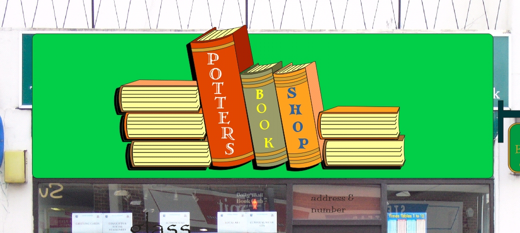
anyways, here’s the latest rendition, have added a slight outline on the letters to pick them out a litle better, also better facilitate the use of a polished gold if i go that route, the bindings could easily be raised with foamex glued down, as could the leading shelf edge,
have also changed orientation of the book ‘titles’
thoughts ?
Attachments:
-
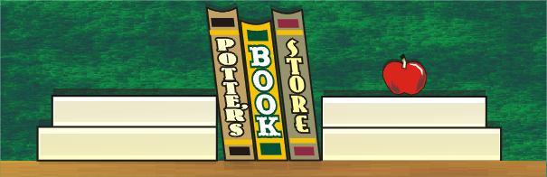
Here’s another way to lay it out if you are going to use paint & vinyl.
(just some clipart)But maybe it will give you some other ideas Hugh
if they don’t go for the higher-end HDU dimensional look.Leigh
Attachments:
-
I love that lighting effect Leigh, the whole idea is ‘lifted’ very nicely by it.
-
What can i say Leigh ? but WOW !
i’ve already submitted the designs now, and i’m not sue he (or rather his mrs) will go with the books, she thinks too expensive (despite not having a price at time of seeing design !).
however, i love the concept, i’m not sure how the dark corners would be achieved (i’ve not used paint before !) but the rest is do-able, the overall look is great, and certainly something for meto think on for future reference,
thank you for taking the time to do that, i’m guessing it wasn’t a five minute job !
-
Brilliant Leigh! Thats a super sign, Re; another discussion thread about the functions of signs, I think this is the most impactful way to do this Hugh, you still have all the elements and wow factor of your original but the business name hits you between the eyeballs as a result of the layout.
-
As always Leigh, your work is stellar.
The background is rich looking and could easily be achieved with paint,
and the name stands out so well.
Excellent.
love….Jill -

Bravo Leigh. I reeeeaaaally love the design
Doesn’t get much better than high praise from your peers.
Can’t say much more than has been said.
Yet another valueable contributor to these forums.
Cheers
-
Hey thanks everyone 😳
🙂
Now that I look at it in the morning and not at like 2am (I told John I was staying up to design, I just didn’t say for whom 😉 )
welllll it def. looks like clipart 😀 but it’s an idea Hugh
and you could use a flat panel with just paint and vinylBut,
Hugh I have no friggin’ idea how to actually get the background to look like that with paint either…
I would have asked Jill 😉
or just mucked around until I got something close….blending the black into green and then swirling some light yellow (thinned) in the center.
Or yeah,,,asked Jill :lol1:sorry I was late Hugh
damn taxes 😉 -
quote Leigh:Hey thanks everyone 😳
🙂
Now that I look at it in the morning and not at like 2am (I told John I was staying up to design, I just didn’t say for whom 😉 )
welllll it def. looks like clipart 😀 but it’s an idea Hugh
and you could use a flat panel with just paint and vinylBut,
Hugh I have no friggin’ idea how to actually get the background to look like that with paint either…
I would have asked Jill 😉
or just mucked around until I got something close….blending the black into green and then swirling some light yellow (thinned) in the center.
Or yeah,,,asked Jill :lol1:sorry I was late Hugh
damn taxes 😉Leigh, it may look a little clip arty, but dont let that worry you, it’s amazing, if you don’t mind, i’ll forward them the design (without taking the credit !) and see what they say, i guess the fade could possibly be done with orint on clear and laminated ? anyone ? the light and books wouldn’t be any more trouble than my books,
may if show them ? i’ll see you get a drink/% if they go for it !
-
Hell take the credit Hugh – I don’t care bout’ that :lol1:
don’t be silly
even if they did like it, I’m sure it’s going to be changed around and altered….if they decide to go with this type of layout
I can just send you the file to play around with
(hmmmmm have to figure out if I can email or pm you through here
to get your email address) -
thanks leigh, i know if i did, i should change a few things, but i think it’s great as it s, i can’t see owt (anything!) i’d want to change, wouldnt take the credit for it though, have just emailed it to the guy, said a top international designer made it !!
thanks for the offer of the file, that would be great if we can figure it out ! even if not this time, the concept may work for other things too !
thanks again,
Log in to reply.
