Activity Feed › Forums › Sign Making Discussions › Graphic Design Help › Design for a mate’s van…what do you think?
-
Design for a mate’s van…what do you think?
Posted by Joe McNamara on December 4, 2005 at 4:30 pmHi all,
This one’s for a mate of mine and it’s a freebie!
He helps me out a lot and may even drop in on these boards soon.
Anyway, he needs his van re-doing as someone else did it and he don’t like it!
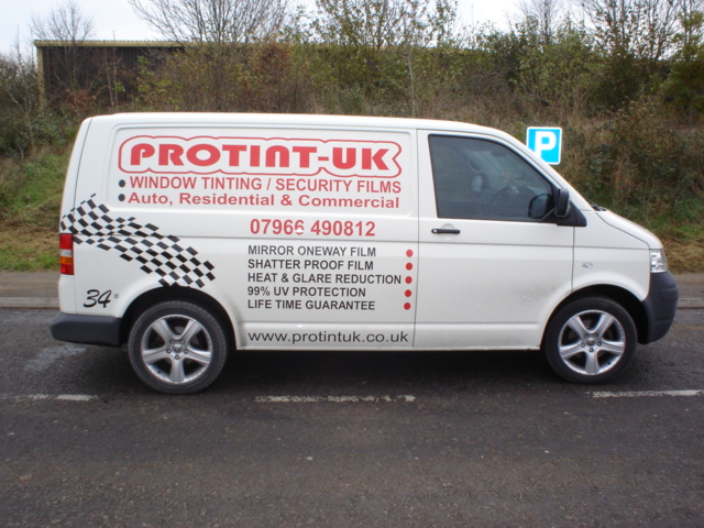
The before picture is here as well.
Attachments:
 autosign replied 18 years, 5 months ago 10 Members · 14 Replies
 -
14 Replies
-

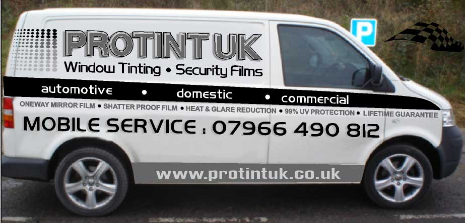
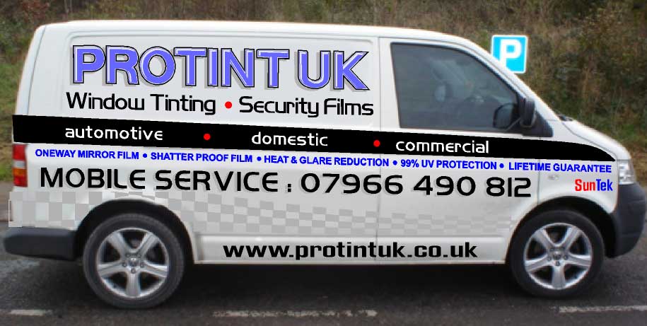
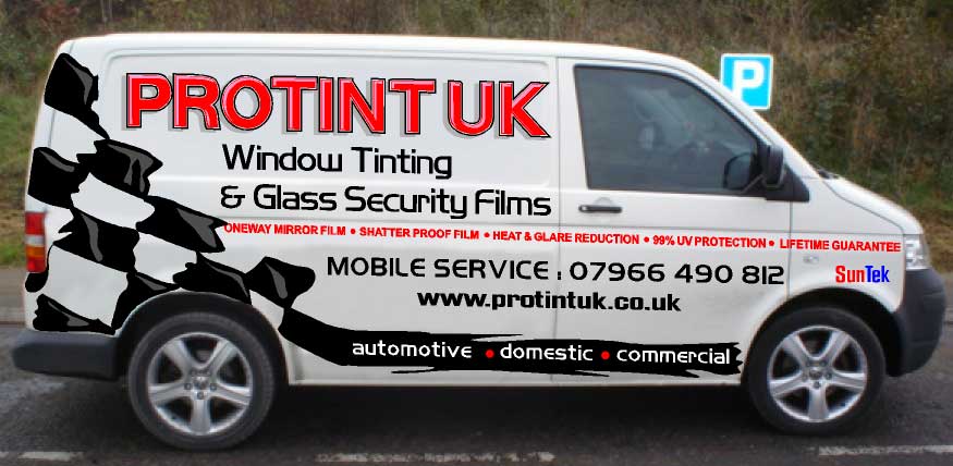
This is my favourite as he wanted a chequered flag effect…..
Attachments:
-

Hi Joe
I like the last one but I prefer it in blue, I also like the one with the checkers running along the bottom. not keen on the www right at the bottom though I find text down that low gets very dirty especially at this time of year. Are you sure it’s wise to give him so many choice’s ? 🙄Lynn
-

hi joe, i like the last one best too, in either red or blue!!
not too sure about the long line of text though, detailing what he does, looks a little difficult to read.
cheers
stephen -

Hi Joe..
Of all of them, I prefer #6, BUT
I would change the header to caps & lower case as it is very hard to decipher.
Love….Jill -

#6 here too. One little thing. The drop shadow on the main copy should be going to the right. You have the highlights on the left hand side of the lettering, so the shadow should on the right. Keep in mind that the light source is coming from the upper left.
It’s looking good!Stevo
-
😮
Ops..
Thanks or pointng out he shadow Steve!
Ches
Joe -

I think they are all good, hope you dont give your paying customers this much choice, They would never be able to make up their minds!!
Peter
-

Joe I like the layout of the last one but find my eye drawn to the black chequers instead of the name, perhaps make them dark grey instead of black.
How about having PROTINT in a graduated white to black bottom to top thus sublimally showing what the company does and put UK written vertically in grey. Sorry I am at home so can’t show.
Dave
-

will you be MY FRIEND Joe? I have a van that needs signing and I could do with a freebie! :lol1:
#6 for me too, not much more to add tho 😉
-

Hi Joe, what great designs, but the thing that screams out to me is to increase the kerning on the name.
For some reason the large chequers don’t look right to me, the shape of each chequer, I think.
#4 for me. (same blue for name as you have used on writing with bullet points)
I like the idea of graduated shading, perhaps you could use that in the chequers, darker at one end?
I think they would all look great though….. 😀
-

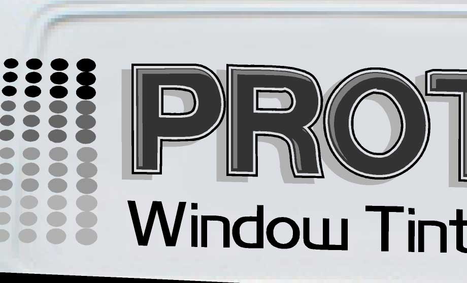
I like the logo idea on the first one with the graduating dots – says ‘tints’ to me more than the checkers.
But the text is way too big and too busy on all of them so I would tone it down a little.


Log in to reply.
