Activity Feed › Forums › Sign Making Discussions › Graphic Design Help › Can anyone come up with any suggestions for this van?
-
Can anyone come up with any suggestions for this van?
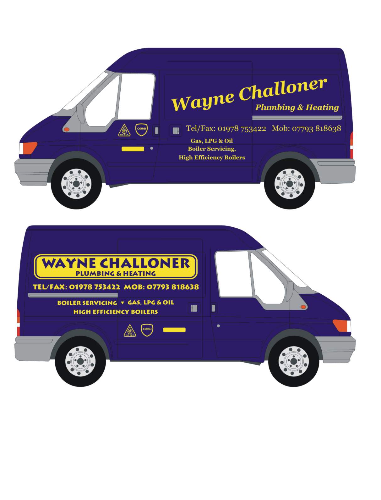
Posted by Jayne Marsh on November 16, 2005 at 1:23 pmCan anyone come up with any suggestions for this for me. Ive posted two versions of my design which to be honest is a little unimaginative.
The brief is as follows:
Everything is to be in gold, no other colours, the guy wants someting a bit different and does not want block lettering.
I am struggling to find a font that is different but still conveys the feeling that the guy is a proffessional and not a "boy racer"
The plain yellow rectangle represents another sticker which is going to be yell.com I think.
Any suggestions much appreciated
Attachments:
 Jayne Marsh replied 18 years, 6 months ago 11 Members · 21 Replies
 -
21 Replies
-

Hi Jayne
I just wanted to quickly tell you to try not to use that second font.
We have a customer who wanted that font, and well it truly looks horrible.
It’s difficult to read and does not convey a sense of professionalism.
I cringe everytime I have to do something new for him 😉ONLY gold huh?
not even an outline/inline here or there? -

Thanks for the advice Leigh, yeah I think we can have an outline and any other design bits and bobs but only in gold 😀 He was very adament on that!
-

Why just gold Jayne? it would be far more eyecatching if you were allowed to use at least one other colour, what about the Logos? Are you going to do those in gold as well as corgi might not be to happy about you changing their colours.
Just a thought, if he is a plumber you could just use his initials!!!! -
It seems like the guy is very stuck on wanting gold on everything and wont be persuaded otherwise. I posted a topic about putting corgi logos etc in gold and I think I will do as Shane has suggested and get the customer to write his requests down and sign them along with the order and then hopefully the onus will be on him. I will of course advise him not to do those in gold!
-
quote martin:Just a thought, if he is a plumber you could just use his initials!!!!
now that’s a good idea! 😀
would def. get some attention too -

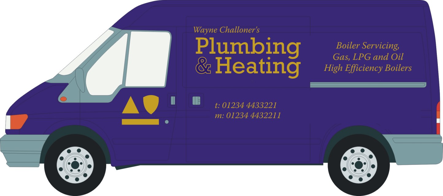
Hi Jayne,
Had a few moments and whipped a layout for you. I like to use big strong typefaces for vehicles. And being that this is a plumbing and heating company it does convey a stronger image. Getting too fancy or cartoony with letterstyles doesn’t really fit the image of the pipe wrench weilding, butt crack showing plumber.Copy priority was a little tough on this one because of the use of one color for everything. So you have to rely on the weights of the letterstyles. I tried to have the heating and plumbing the boldest and used a script for his name for abit of character. Another bold letterstyle for the phone numbers and a lighter weight one for his services. I did drop the “tel/fax” (dont think too many folks have fax machines in their car or while sitting in the pub as they see it drive by) and also dropped the “mobile”. People know what to do with these numbers.
I also used a very subtle graphic of a pipe wrench to sit in the background to add abit of interest and color.
Hope this may give you some ideas!
Stevo
Attachments:

-
Hi Stevo,
That looks ace! Can you please tell me the name of the typestyles you used? I also like the idea of the wrench (I’ll have to look in my clipart for something similar) I might be able to sell the customer the idea of something like that in the background.
Thanks loads for the input it is much appreciated -

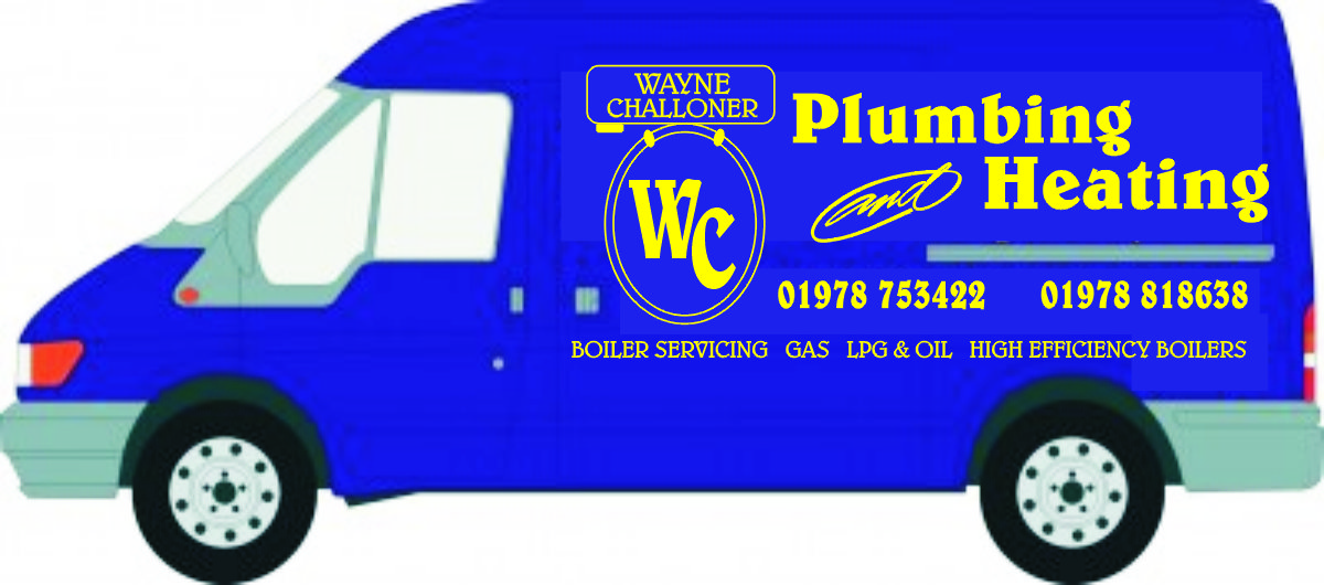
Hi Jayne
Just a quick go from me.
Regards Martin
Attachments:

-

Have you been eating too much ice cream Jayne?
That makes me get brain freeze.
Here is what I came up with, a play on his initials….
WC = water closet…..
Just a thought.
Love…..Jill
Attachments:
-

I like Jills the best. Plumbing & heating comes across as the main message (as it does with Martin & Stevo). Presumably this is what the guy does – so this really should be the main message (not his name – sorry Jayne 😕 (Mind you I do this all the time – give the wrong priority to the text message)).
Sticking with just the one colour does make it difficult though and maybe you should persuade the client to take notice of Stevo’s suggestion to have the “monkey wrench” in the background.
Martin – If I was designing this I would have come up with something similar to what you have done. But overall, Jills design wins it for me 😀
-

Although it needs some tweeking (vertical spacing) I would go for Martins design, its clean and would look nice in gold I guess.
I think Jills design is a bit to much(/messy), but I could be wrong. -

I think Martin’s basic design wins my vote.
Anyway, my late hour attempt but I only like about half of it
Attachments:
-
Thanks guys and girls for all the helpful suggestions, I like bits and pieces of them all. I really like the monkey wrench, I dont suppose you have that in vector form that you could post for me could you please stevo. I have had a look in my clipart and dont have anything anywhere near as good. I think I will take a little of each and put it together.
Thanks again -
Thought you all might like to see this,
There’s no accounting for customers tastes, I have just spent an hour with this guy and he did an about turn and is having everything in ultra silver and I had to stop him filling every mortal space with wording. This is what he is happy with and I will be doing this job in the next 2 weeks. I showed him every ones take on the design of his van but he wanted his name HUGE 😮 -

As long as the customer is happy at the end of the day Jayne. You can only do so much, especially when the customer knows exactly what they want and will not budge an inch to think differently.
😀
-
Hi Jayne!
I was just about to answer your font questions and email you the wrench but it looks like a done deal now.We all want to put out those great looking designs and have fun with it. It does benefit the customer alot more than they think (and satisfies our creative urges). When I worked for commercial sign shops I wanted every design, sign or vehicle too look its best and have some fun with designing and making the CLIENT look good. So I would try and try to educate the client on IMAGE. You are giving them an image, not just a sign! “ohhhh I dont want that it looks too nice”. It’ll turn some heads and make people notice your company. “ohhh but it looks too nice”. Any businessman with half a brain knows that image is very important these days. The other half just want that POWER over you to design there garbage ideas. So you gotta cave in sometimes and give them the crap they want.
No offense Jayne but this design he likes is not exactly too beneficial for him. All I see is his name which is barely legible. I know you would’ve done a heck of alot better job. It’s now HIS design and not yours.
It’s frustrating, isn’t it??? As Jill always says “The only taste a Customer has is in there mouth!!”
Take the money and run!
Rant over! 😀
Here’s the fonts anyways. Sante Fe Script from Sign DNA “Wayne Ch…” and Convecta from Letterhead fonts. “Heating, Plumbing and Vehicle Graphics”
Stevo
-
At least his name’s not “Wayne King”. Cos that’s what I think of him – T0sser :lol1:
-

Some people, unfortunately, allow ego to get the better of them. Unless you have a outstanding reputation and are known by name for your work, it is pointless it being the dominant item in your advertising I reckon.
But WE know that anyway, don’t we?
It’s a bit of a habit with tradesmen to want to see their names in lights I think. 🙂
-
Andy I couldn’t agree more what is it with these people.
It seems to me plumbers are the worst, if they could put their name in
neon on a van they would.Jayne, I would be embarrassed to drive a van with my personal name
that large. But then again I’m not a plumber although I wish I was,
not many Corgi registered poor plumbers about.Finally, Phil I used to have a customer called ‘Wayne King’ still got his
business card somewhere.
I remember being on a corporate golf day which he was on, I think he
won about 3 prizes, when he was called up each time to collect his prize
the 40 or so players were cracking up. Poor bloke, I think I would have
headed straight for the Depoll office when I realized what my name
meant, that’s if I didn’t go away first for shooting my parents. (:) -
Thanks Stevo, he did like the script font that you had used but decided on something different. He had seen a van somewhere that he liked the look of and wanted his to be bigger, better and louder. As you say it is difficult to see what he actually does, but oh well, he’s a happy bunny and can take ALL the credit for this one :lol1:
I think his name should be Wayne King :lol1: :lol1: :lol1:

Log in to reply.
