Activity Feed › Forums › Sign Making Discussions › Graphic Design Help › need help please on designing new layout for vehicles?
-
need help please on designing new layout for vehicles?
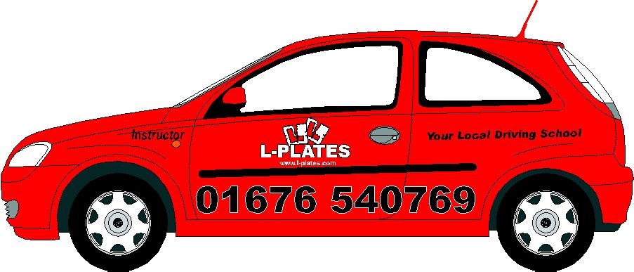
Posted by Cheryl Tissington on December 12, 2005 at 10:52 pmHi there,
I’m renewing our entire driving school fleet in the new year and need some fresh ideas.
If anyones got a few minutes to spare, I’d be very grateful :pray:I’m finding it very difficult to come up with a new, contemporary idea.
The vauxhall corsas will all be red with shiney alloy wheels.
Using crome, black, white & red vinyl at the moment.
The L-Plates logo has to stay cos it’s our company name & trademark.
Everything else is completely flexible :car:
Any help really appreciated.
Many thanks,
Cheryl 😀P.S. I’m struggling to put up a picture on the thread, but have attached an ai file. Many thanks
Dennis Van Der Lingen replied 18 years, 4 months ago 14 Members · 35 Replies -
35 Replies
-

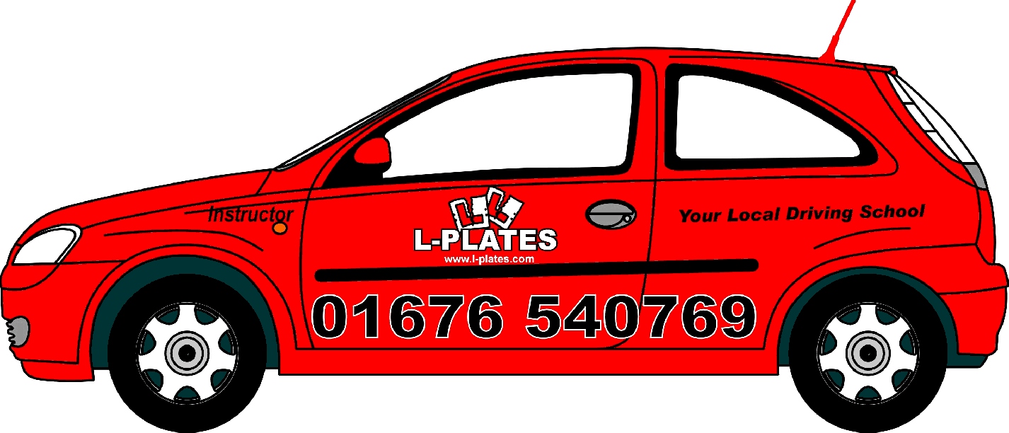
Just had a look, is that a rubber strip on the side (?) if it is then struggling for room 😕
-

Please be so kind as to post a .jpg too.
Love….Jill -

Hi Nick,
yes it’s a dreadful black strip.They always get in the way.
Thats one of the reasons I’m struggling.
With the design, nothing carved in stone though. As long as the L-Plates and the name stay together, thats what gives us the corporate logo bit !
Cheers,
Cheryl -

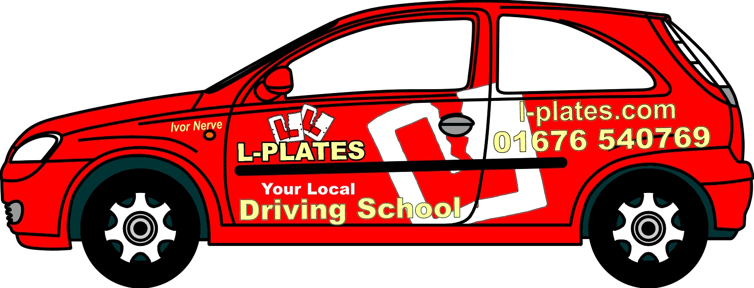
Done it for you cheryl
Hope you dont mind, gotta do it when jills creative juices are flowingPeter
Attachments:
-

Cheyrl I think that is probably bright red ? cause that does make a differance in the design ?
Lynn
-
Hi Jill, hope this works
Cheryl 😕
Attachments:
-
OOPS, so you can do it Cheryl! and heres us guys trying to help!
Peter
-
Phew !!! that was hard. I think the file must have been too big.
Thanks everyone 😀
It’s a Ladies prerogative to be a little late Lynn, wouldn’t you agree ! :lol1:
-
absolutely Cheryl we always take more care ?
Lynn
-
Here ya go.
I personally do not think it wise to use black copy on a red vehicle as it lacks contrast.
Love….Jill
Attachments:

-

I think the torn L plates above the name works really well… nice one
-
Cheers Dave, I’ve been using the same logo for the last 25 years.
I just need to jazz the image of the Driving School up a bit.
Thanks for the design Jill, I like it. I like the bigger play on “driving School”
Regards,
Cheryl
-

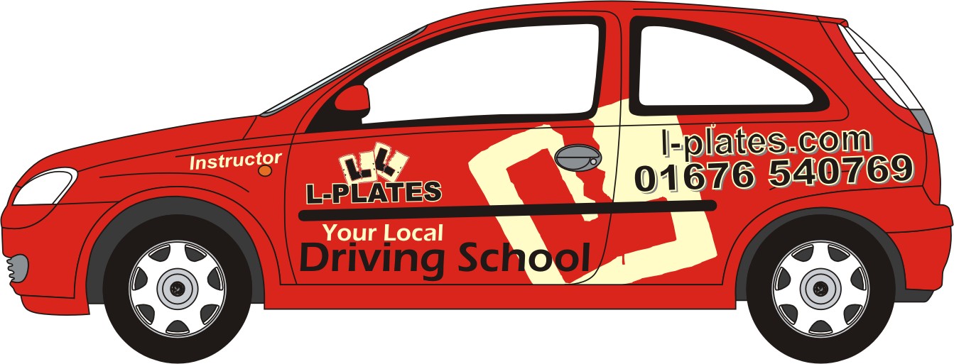
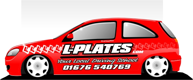
Just a quick one.
2 colour based.
Maybe being the light grey=silver or even chrome?? I tried cream and liked it too!
I didn’t go for other strong color like yellow or white, etc coz’ i think red already as enough “power” if you no what i mean?
In fact i think Silver/Chrome or Cream would give the red a sober but hi-class look, or maybe i’m just to tired already 😀Cheers
Vitor Brito
Attachments:
-
I like that Vitor, the big plate works really well 😀
-
Hi Vitor,
many thanks for putting that up.
I really love the big L-Plate on the side.
I think it would look great in crome and its certainly got the wow factor ! 😮
Many thanks once again 🙂
Cheryl
-
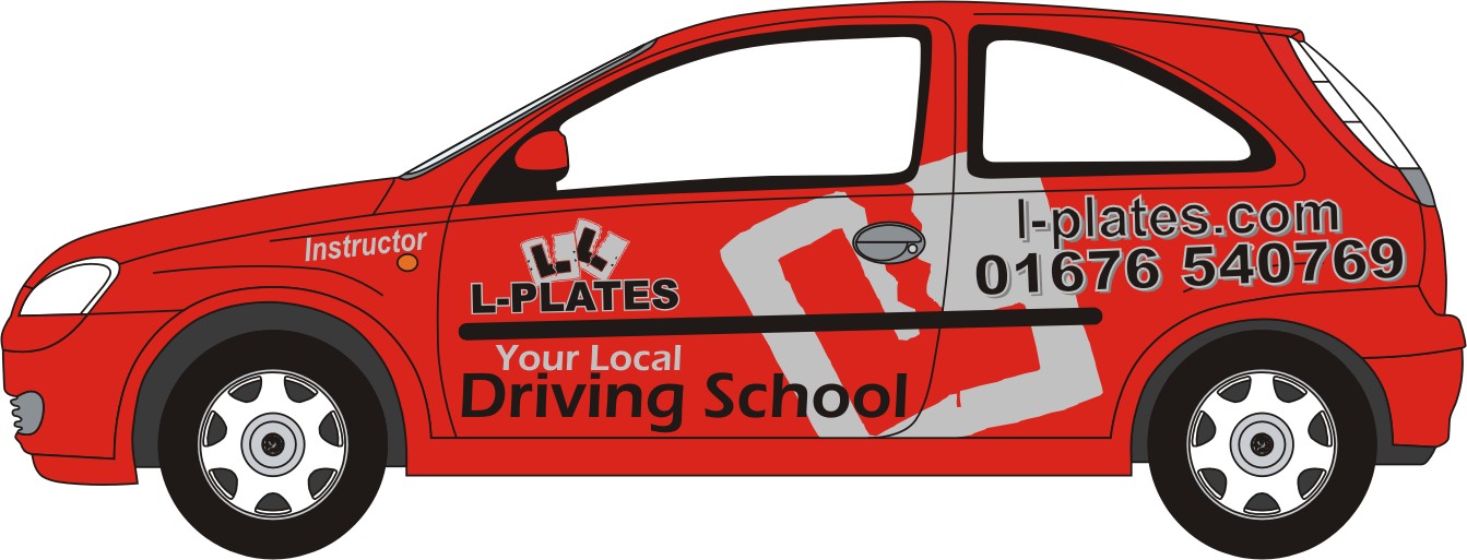
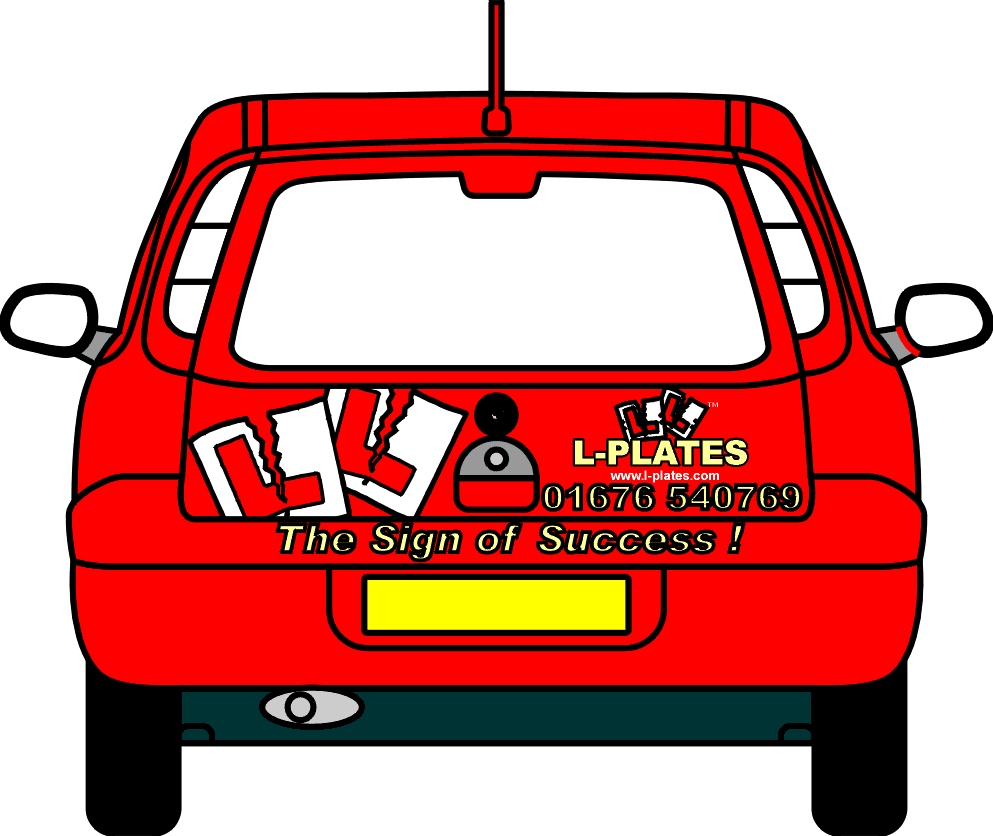
Hi,
what do you think to the rear of the vehicle and also doing it in cream with a black outline ? (and crome or white l-plates)Thanks,
Cheryl 🙂
Attachments:
-

black outline makes it look blurry to my tired old eyes!!!!
-
Hmm, should have gone anywhere!
Glasses prescription in my bag from several weeks ago-just don’t want to wear glasses! 😥 😳
-
Thx 4 the kind words Nick & Cheryl.
I’m not into the black outlines, i think you have enough contrast already between black and red but i would like to see those outlines with the chrome or cream aswell, being the letters black or even red of course.
I would like to have a play tonight with the rear of the car, if you want me too but i don’t have an AI file for that.
Don’t forget to post the pictures after doing it. 😉
Vitor Brito
-
Hi Vitor,
yes, you’re absolutely right about the black. It doesn’t look good.We’ve used crome vinyl on our black & red corsas in the past. They really looked stunning.
After a while the crome gets a nice burnished effect and looks great.
Heres the ai. file – Feel free to play around when you have some free time.
Thanks for all your help, I really do appreciate it 🙂
-
Constructive crits….there are other more effective alphabets than Helvetica.
The copy has no “flow” to me.
I love Vitor’s idea of the super graphic.
Love….Jill -
How about on the back…
“If you can read this, your a frig gin’ idiot, keep your distance or pay the consequences.”
-

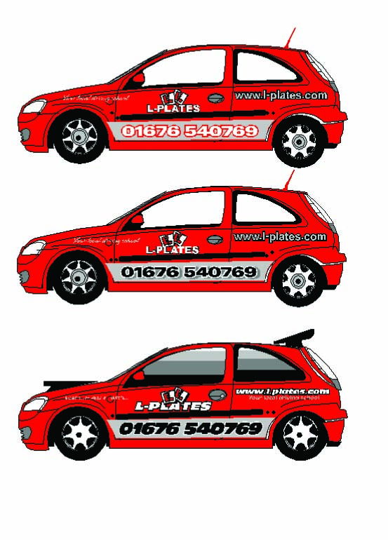
Here’s mine. Just goofing around, couldn’t resist sprucing up the car a little.
Stevo
Attachments:
-
Better late then never. 😉
Hard to get something diferent coz’ i’m assuming you can’t cover windows etc… not sure about your rules about this.
Soo it goes along the same line of the previous one.Stevo – Nice job! The fading L plates are really nice.
Attachments:

-
Thanks for having a play around with that Vitor, it’s very much appreciated.
You’re right about the windows. We’re not allowed to cover any part of them. Learner drivers have enough problems. 🙄
Thanks again,
Cheryl x -

So ive had a play in signlab with the ai file and so now how do i turn it into a jpg to post
ive rendered to bitmap and tried to open in pshop and corel and nothing works
ive sorted the emailing with cute thingy,turning things into PDFs but cant post on here
tell me o wise onescorsa must be doing sumat wrong..what
Terry -

terry can you upload it on this server and ill change it for you?
if not open it on your screen mate… then press print screen on keyboard and open paint shop of something and then click file- new- paste -
Well i dont know how i done it or how its come out but here goes
the grey is silver , the dots just take the rounded shape from the end of the
body trim and extend itTerry
Attachments:
-

stevo, again a fabulous design! How would you make those ‘L’ in the background fade away?
bart
-
gotten jiggy with it
i mabey went a bit over the top but it was to much fun to stop
Attachments:


Log in to reply.
