Activity Feed › Forums › Sign Making Discussions › Graphic Design Help › Can I get some input on my logo design/card layout please?
-
Can I get some input on my logo design/card layout please?
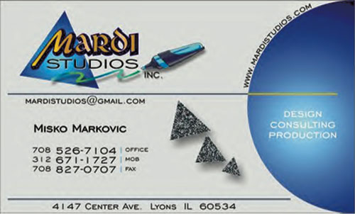
Posted by Misko on January 26, 2006 at 9:09 pmCan I get some input on my logo design/card layout
from you?Thanks
Attachments:
 Shane Drew replied 18 years, 3 months ago 18 Members · 35 Replies
 -
35 Replies
-

I like it how it is mate. Although I think the shadow is a bit deep on the name. ….
…. and your 3 little ‘stone’ triangles look a bit out of place, would rather see them in the blue theme because they don’t really marry up with anything else…
just my opinion, looks good though.
-

Love it, although I would agree with Shane about the shadow. I like the triangles, as I feel they draw your eye towards what the studio does, i.e.design, consulting, production.
Cheers
Dave
-

I feel that you need to play up the name, and tone down that big blue ball.
Prioritize….what is the most important part?
Emphasize that!
Love…..Jill -

I like the main layout of the card but I’m not keen on the choice of font you’ve used for your name & phone numbers etc.
I just feel using another font could have the card looking more professional – even something basic like Arial
-

Thank you all….
Wow, I got so many comments altogether! I had the layout posted on couple of other design boards for variety of opinions, I am going back to drawing board. Got to finish this and send out for printing ASAP.
When I am done (this afternoon) I will post the revision.
Cheers!!!
-

Im going to be the fly in the ointment here , and bear in mind this is just MY opinion and I don’t mean at all to offend.
It’s way too “abstract” and a very busy card that says nothing about your company and its products at all. Its very hard to even see the byline in that ball and your web addy and mail are 2 diff places. (it would also be better if you could use something like misko@mardistudios.com as your mail addy , redirect it to your other one , seems odd you have a .com but no mail to there?)
There’s text and disjointed elements all over the place , I don’t get the connection of the flying pyramids , the gradient faded ball or the highlighter pen thing. Even after reading it , I have no idea of what you actually do??
I believe your card should instantly say what you are or what you do , its often used to judge what type of business you have etc and is also often the first “official” communication you have with another and forms their first impression.
You need to simplify it , it has to put your message across instantly as that is the service you are selling your clients , putting *their* message across effectively and quickly. -

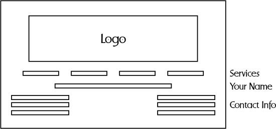
I agree with Rodney too. There is no flow or copy priority to your layout. I’m attaching a quick guideline for you. This is how I typically layout business cards with the main focus being your logo.
Hope this may help you some. 😀Stevo
Attachments:
-

well i did like it… i thought it was okay… however designing business cards can be very easy task… but how does a letter head look? how does a windows sign look? and maybe a website, can elements in your design be translated to other promotion materials?
-

Im not sure that the design really works, its too busy for me and the type is all over the place and so that makes it difficult to read. Just my opinion,
I think that Stevo’s guidelines are a really good idea and are basically the sort of layout I tend to lean towards. 😀 -

Just to say I thought it looks brilliant. the only thing I would change is the size of the shadow.
I don’t want to sound out of place but, the only thing wrong with following ‘guidelines’ is that everything is samey.
I really like it because it’s different. I like to think if the design is good enough it will make you read the card/sign & take it in, rather than a big logo that you read but don’t take in.
Of course there are exceptions and different designs suit different applications.
Just my opinion
Stuart
-

Hi mate
Thanks for taking the time to post your work on the boards… much appreciated.As way of constructive crit:
Not meant as way of flaming you in anyway, i will agree with some others like Rodney, Stevo etc
I won’t dwell on what has already been said, but… instant feeling on looking at the design was…
Creative, some nice effects…. but… overall i found my eyes darting here and there aimlessly. i would loose the globe, tie the design together more, alignment would be good too.like i said, please do not take text in the wrong way. its a nice design, just think it could be improved and a few areas.
-
Me too. I hope I didnt come off as being a bully.
There are reasons why basic rules and guidelines of layout should always be used. I adhere to these everyday and the reason I use them is simply because they work! I dont think every business card looks “samey”, but with every break of a guideline to be different you will lose the effectiveness and communication to the reader. Copy priority is always crucial!!A business card is a powerful communication tool and if it appears highly ineffective and hard to read, then what’s the point.
Keep us posted on your progress.
No offense intended here either. 😀
Stevo
-

I quite like it….! The only crit I would have is the font and shadow on the company name, I’m not keen on that. But the design is away from the norm and that’s what I quite like, it’s eye catching.
If it was for an exterior sign I’d say no, but for a business card it would stand out from the other mundane cards that most people hand out.Not that my opinion is worth much … 😕
-

For me a business card should be kept simple.
like Stevos layout.I have collected thousands over the years, they all get chucked in a box.
I do however make a note of the memorable or useful people who gave me the card.The card is only a way of passing on your details and inevitably, it will either sit in a box and never be seen again, Or the person you give it to will remember you for what you are…and make a proper note of your contact details.
The only time I would notice a card, is if it was extraordinary, and by that, I mean like made out of solid gold!!!
so as long as its got the basic details on it, and is readable. that’s all it needs.
Of course the people who sell cards will tell you different..
Peter
-
you know, posts like this really help educate folk.
i is good to get veiws from everyone….
thanks folks! 😀
-
quote Marcella:Not that my opinion is worth much … 😕
Now Marcella, comments like that make me really cross 👿 Personally, I value your comment as high as anyone. 😛 … even for a women 😮 (my wife just saw me type that and gave me a clip under the ear… mumbling something like ‘that’s for Marcella 🙁 )
For what it is worth, I gave up giving out business cards a long time ago. I now use fridge magnets or as I call them ‘cabinet magnets’. Every office has a filing cabinet, and my magnets from 5 years ago are still sitting in offices I cold called, and they still get me work.
They don’t get put away in a card file and forgotten. Just a thought. It works very well for me.
Another thing I am doing is my name on pens. I am just starting to get calls this week from people who’s pens need replacing, asking I send some more.
Got my first call from a pen recipient yesterady giving me a job to re sign his entire shop. He loved the pen when I gave it to him, went straight in his top pocket. He tells me cards always end up in the wash because he forgets to emplty his pockets before his wife does the washing 😕
-
Wow ppl. ….. such a big spectrum of opinions!
Thank you so very much. None of critique has been taken with any offense, on the contrary. Gosh that is exactly what I asked for!
Bottom line is that the card is back on drawing board, and is being worked on. I can not believe how much time it is taking me, mostly ‘cose my mind is cluttered with other aspects of business right now and I find it hard to focus. 🙁
Please be patient with me and I will post my revisions here in few days.
Cheers!
-
quote Misko:Please be patient with me …
Cheers!
We are not going anywhere Misko…. :lol1:
-
quote Peter Normington:The only time I would notice a card, is if it was extraordinary, and by that, I mean like made out of solid gold!!!
That’s why I print my business cards onto gold finish aluminium
Jim -
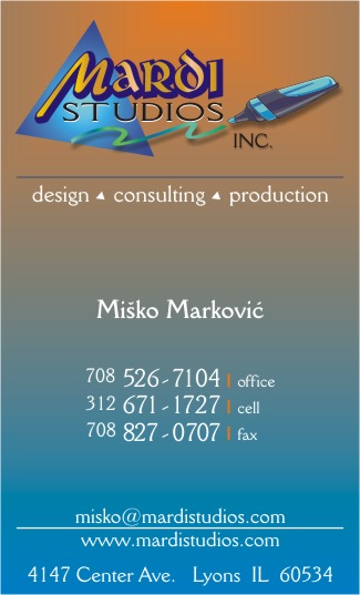
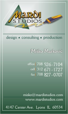
I re-did everything about it…
I probably just opened a new can of worms. 😳
Attachments:
-
quick reply, i would say thats a massive improvement on the first card mate. 😉
-

I like it a lot better as well, but I still think you need to add something to it. If I was given this card on the street I would not know what you designed. Maybe add signs on there somewhere?
Just my opinion.
-Marek -
quote Misko:Marek,
back of the card will contain list of services
Perfect! 😀
Thanks for posting up both of the designs. It has been a great discussion so far.
-Marek -
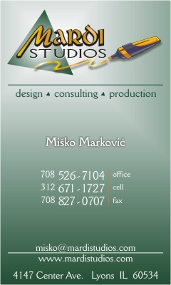
Some more tweaks….
Can I get some comments/suggestions for the background color?
I will go with 4c printing so anything goes.Thanks
Attachments:
-
Loads better!, I really like the last one you posted, so much more together and readable, vast improvement 😀
-
I’m with Jayne on this one. I’d go with this or just a blue fade and no orange..
Well done…
-
A vast improvement.
Love…..Jill
(I’m not huge on orange, but the way I learned it in high school, orange and blue ARE complimentary colors….I’d go with that one cuz it’s different.) -

I like the orange/blue one- the green card looks a bit washed out to me.
I liked the original card, but felt much as some of the others….nice design, but not informative. This one gets to the point! (I know what I mean 🙄 )
-
Here is another version….trying to tigten it up and send to the printer
Attachments:
-

I wouldn’t go with a fine line close to the edge.
Cutting cards down on a guillotine spot on is a knack. If they are even slightly out the line will look pi$$ed so I try and gets clients away from it unless the line is well inside the edge.The orange fading into blue is nice. But I feel from my own experience it will look a messy colour where the 2 mix. As it is.
Tim.
-
I’d drop the line too, same as tim says about the cutting, but it doesn’t need at anyhow 😉
Log in to reply.
