Activity Feed › Forums › Sign Making Discussions › Graphic Design Help › can anyone help with layout for my own van?
-
can anyone help with layout for my own van?
Posted by Ian Higgins on June 22, 2006 at 8:05 pmHi Folks,
The usual…. Can do customers vans all day long, comes to our new one and can not get anything to flow!!!
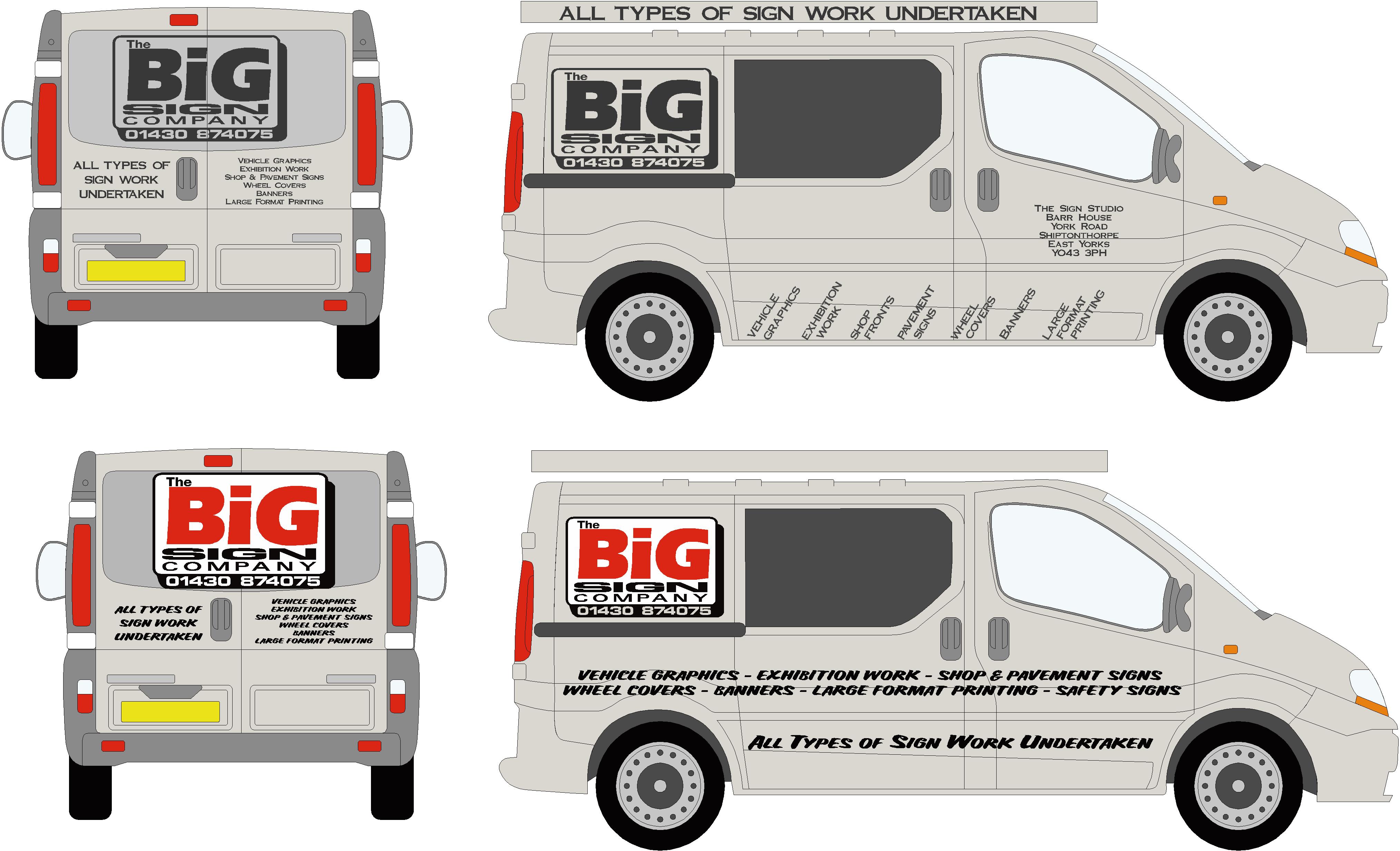
Have a Renault Trafic SWB crew bus.. light silver, Our company logo is a bit of a pig when it comes to vehicles, It is great when we make small stickers for peoples vans but it just does not flow in any design.
It is usually black, white and red but I was thinking of doing it in a Hexis dark grey sparkle on the van. Do not know wether to cover side windows in contra-vision or leave them.
I was going to do a part wrap but have had all the trims etc colour coded so do not really want to wrap them as I have just paid to have them painted!!!
Should I go brash and loud or subtle?
Any Ideas on design would be greatly appreciated and hopefully some additional input will get my creative juices flowing
Attachments:
 Lynn Normington replied 17 years, 10 months ago 17 Members · 37 Replies
 -
37 Replies
-

I know what you mean – doing your own van is a nightmare. It’s got to be right or you’ll regret it.
I like the red version more. Can you post the vector file so we can have a play about?
Cheers
Dave
-

-

Prefer the bottom one, but like you say the logo doesn’t lend itself well – especially on the back door.
Do like the informal brush scripty type that youv’e used compliments the logo nicely. -

The red layout is far better, has a better flow.
Please do post an outline or something….I’m bored!
(not by your van tho, just bored)
love….Jill -
Hi jill,
I hope you don’t come up with anything to good as I would feel real guilty as I already use a business card using 80% of your ideas…. Will just have to put Designed by Jill Welsh on all our Stuff :lol1:
Cheers
Ian -
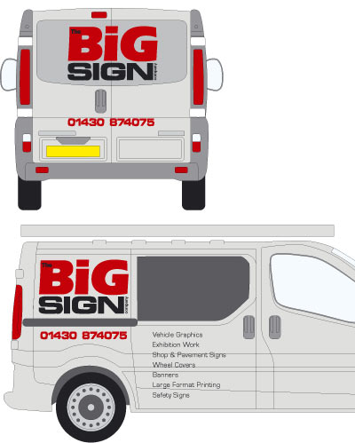
Here is what I came up with by simply rearranging your info.
Leave the list of services for the back if you can.
love….Jill
Attachments:
-
Had a wee play about – might try another later on.
Dave
Attachments:
-
Thanks folks,
Jill… That was what I thought of first off as this is similar to our old van..David… Some nice ideas cheers..
Told you the logo was a pain… May have to re think it..
thanks again folks -
And another one…
inspired by Jill (always good ideas) 😀
Yup, you logo is a pain!! (Sorry about chopping it up a bit…) 😕
Dave
Attachments:
-
Cheers Dave,
Chopping it up is no problem… I nay even do away with as it is being such a pain to work around.
Cheers
Ian -
Cheers Martin…
I like that… That is the beauty of this site everyone has a different slant on things, would have never thought of laying a background.. Cheers
Ian -

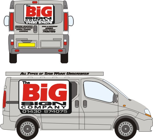
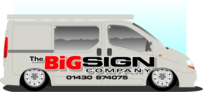
Here’s my attempt, trying to keep it simple.
Rob
Attachments:
-
Cheers Rob..
I am getting some good ideas so should be able to start playing soon.
Cheers
Again
Ian -

a quicky…keeping to the big theme 😀
nik
Attachments:

-

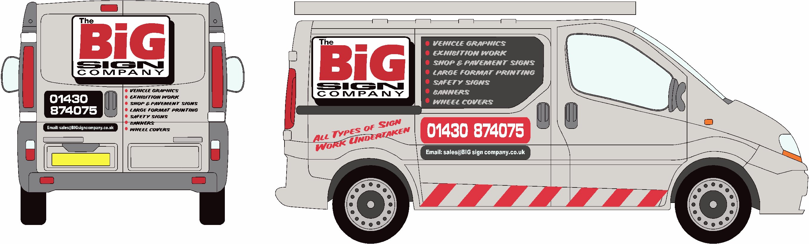
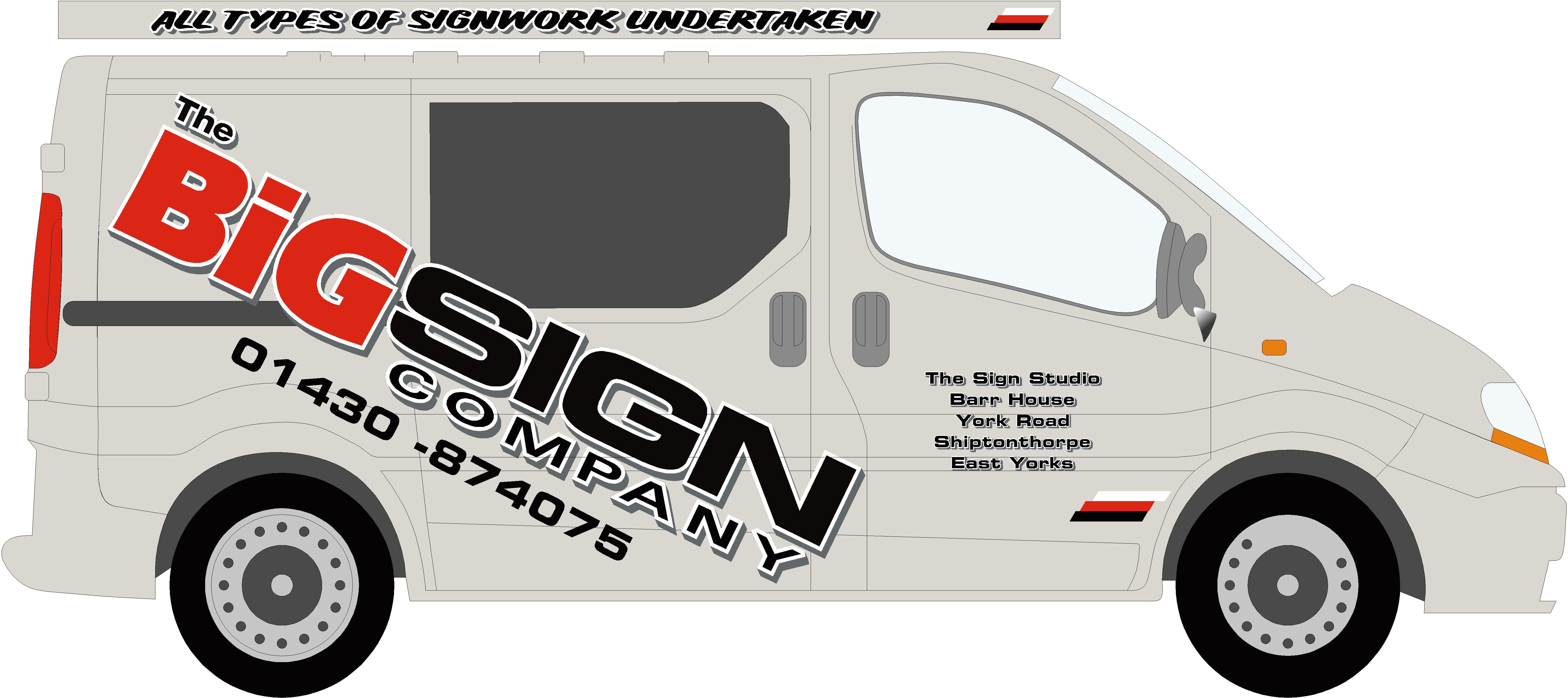
Hi Ian,
I think the word Big is to BIG! I’d like to see more emphasis on the word Sign. It is what you do, and driving by all I would see is Big. Big what?
I tried to keep this more on the simpler side and rearranged the copy in your logo.
Didn’t have time to do something for the back but that’s where I’d list all your services.
Hope this sparks some idears for ya! 😀Stevo
Attachments:
-
Hi…
Yes Phill I am coming to that conclusion my self..Stevo that is great.. Just bought the alloys and side steps for it so now I guess I am going to have to have it chopped and lowered!!!! 😀
Heres a daft one for you.. A SWB trafic with bulkhead only has 2.1m loading length…. Yet the crew bus which has extra seats and is built on the exact same chassis can carry a 2.4m sheet!!! crazy I know but true.
Cheers for all the help, I am going to spend some time over the weekend working on it and will post my designs next week
Thanks again folks
Ian -
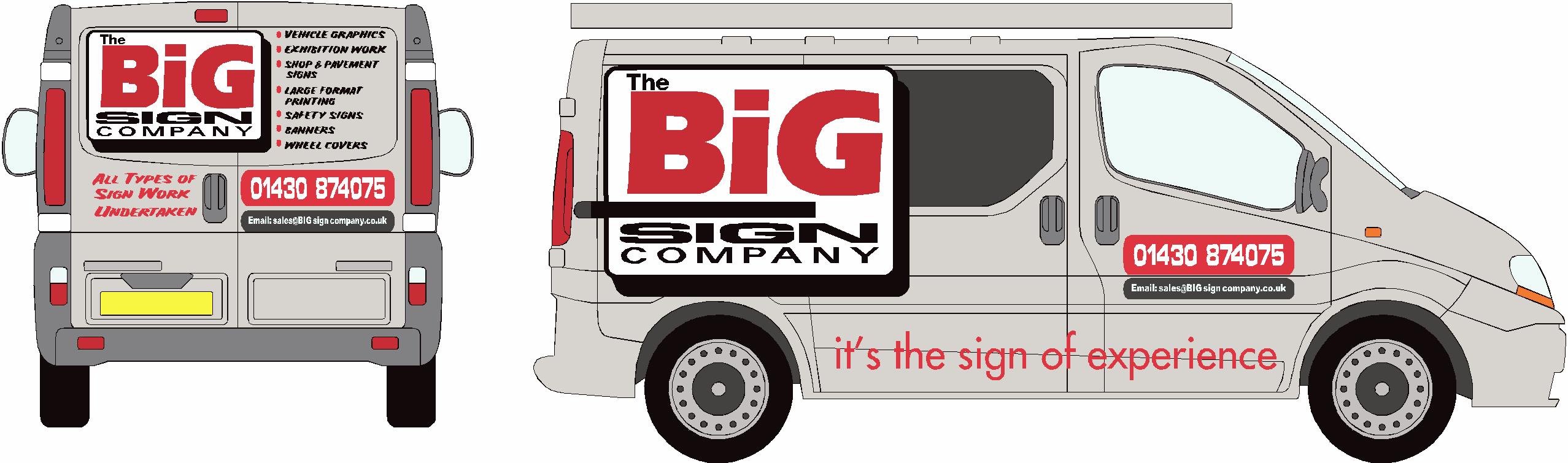
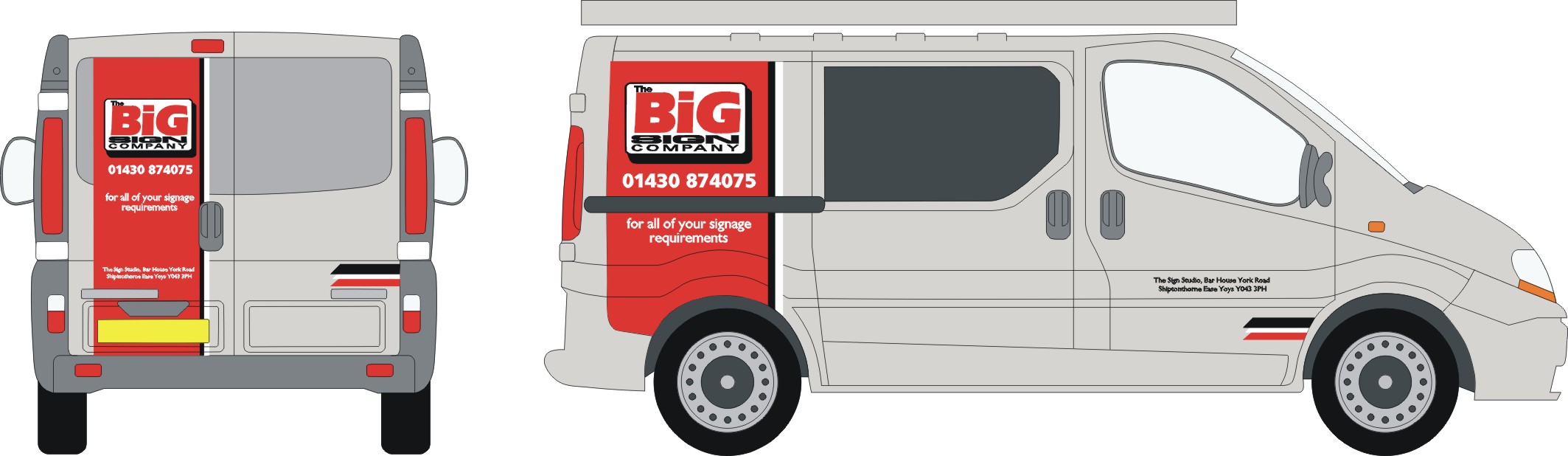
Hi..
Quick update..Using Stevos layout with a different slant… May do the word big printe with an eye candy effect to show we do colour prints etc..
Comments please
Cheers
Ian
Attachments:
-
 quote Higgi29:Just a quickie..
Tacky ????
with a capital T :lol1:
-
quote Higgi29:Hi..
Quick update..Using Stevos layout with a different slant… May do the word big printe with an eye candy effect to show we do colour prints etc..
Comments please
Cheers
Iandon’t mind this tho. 😉
-
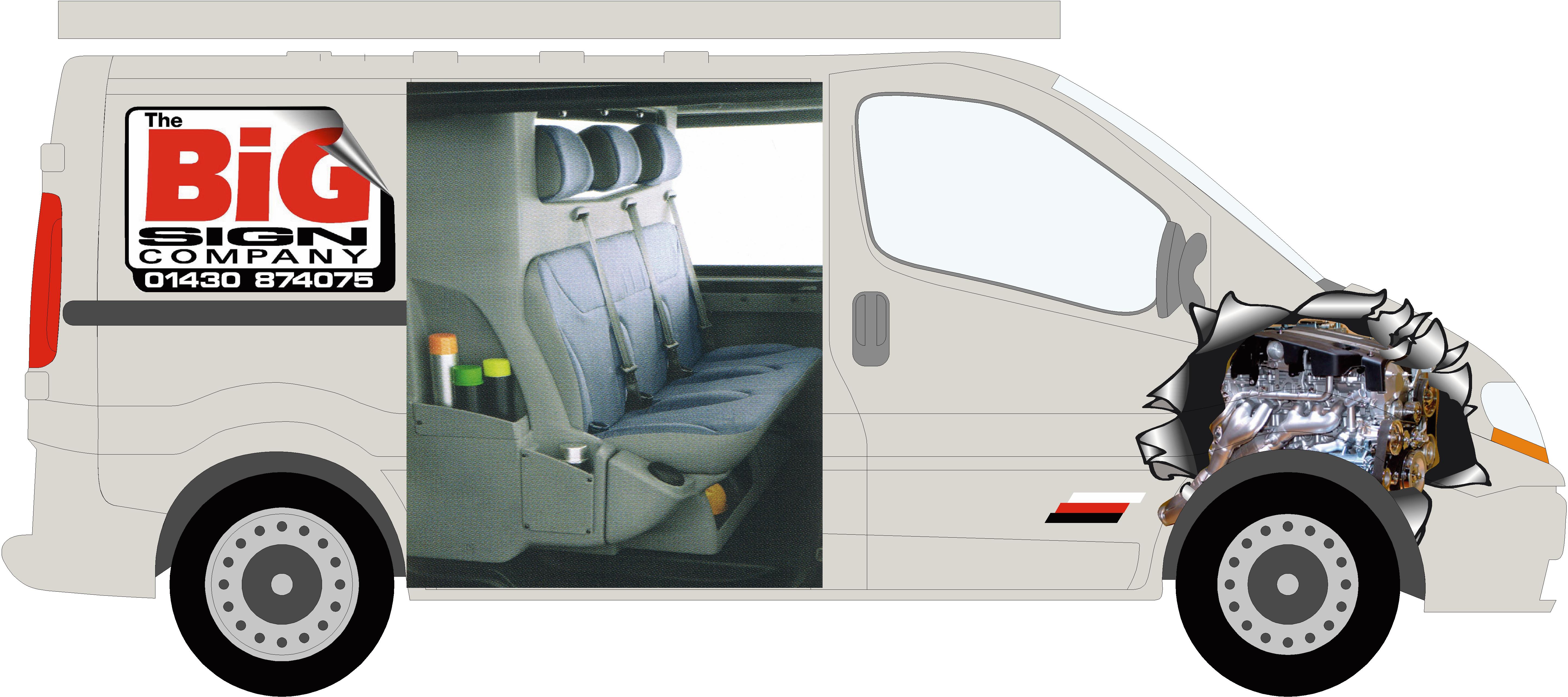
Hi Folks,
Van arrived today!!Can not bring myself to put red and black on it.
I think I am going to go with the different silvers and gun metal effect to keep it subtle…
Not 100% sure though..I HATE DESIGNING MY OWN STUFF!!! 👿
Attachments:
-

Liking the silver & gunmetal one mate.
Nice Van.Cheers
Joe -
I like the silver one too.
Not really keen on that angle though, looks like it’s just thrown on there and it’s not flowing with the body lines.
How about making it straight across the upper left, going over the window?
Or decreasing that angle?
It’s looking better for sure.
And I hate designing my own stuff too! I’m never satisfied!
You’re doing well though!Stevo
-
Hi Steve,
Will give it a try with your suggestion and see what I think.
Hope you don’t mind me using your concept of breaking up the logo..Cheers
Ian -
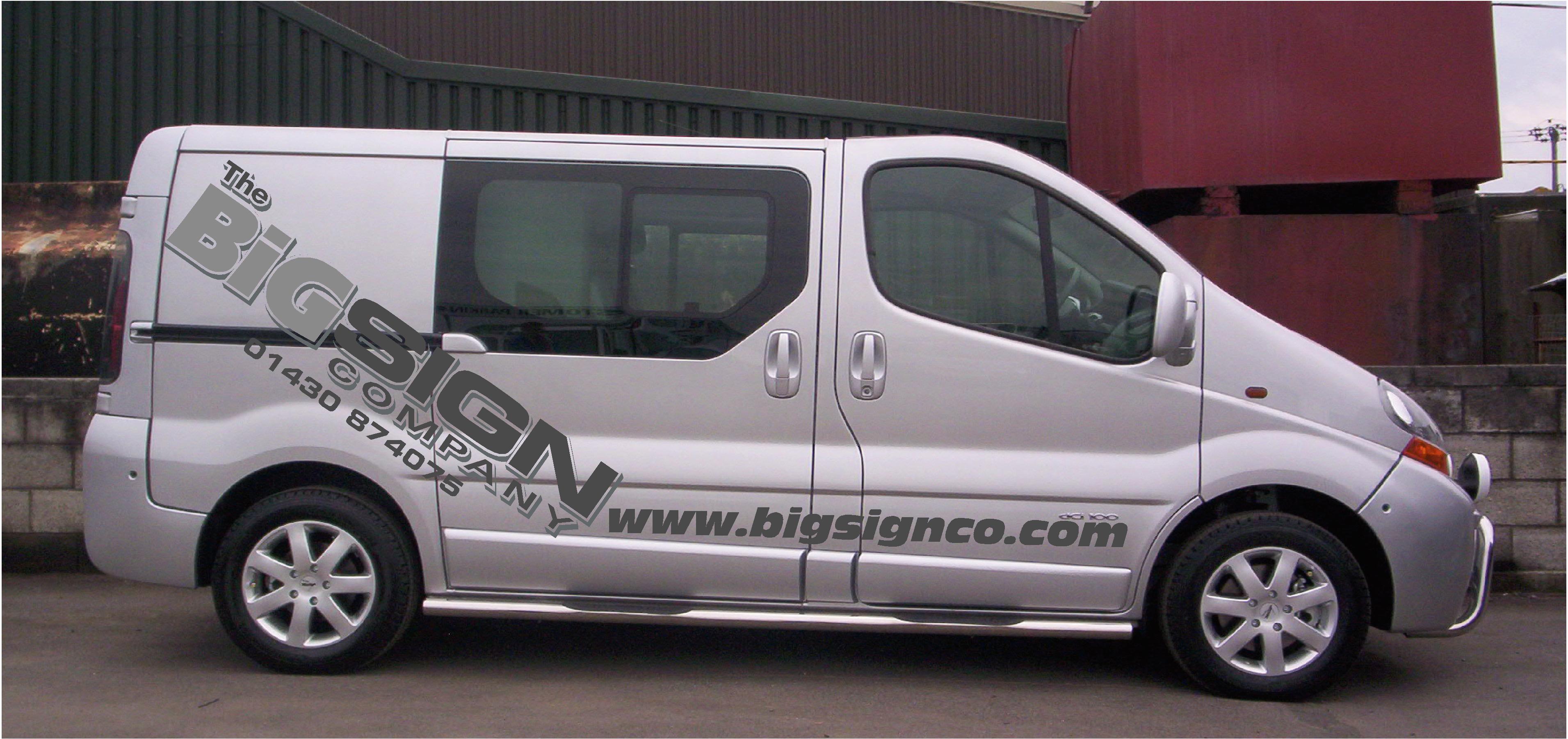
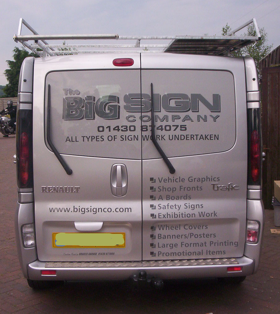
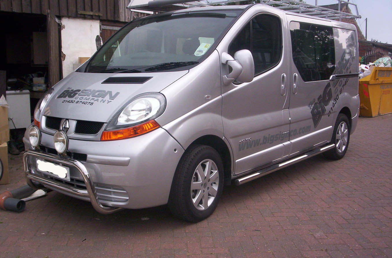
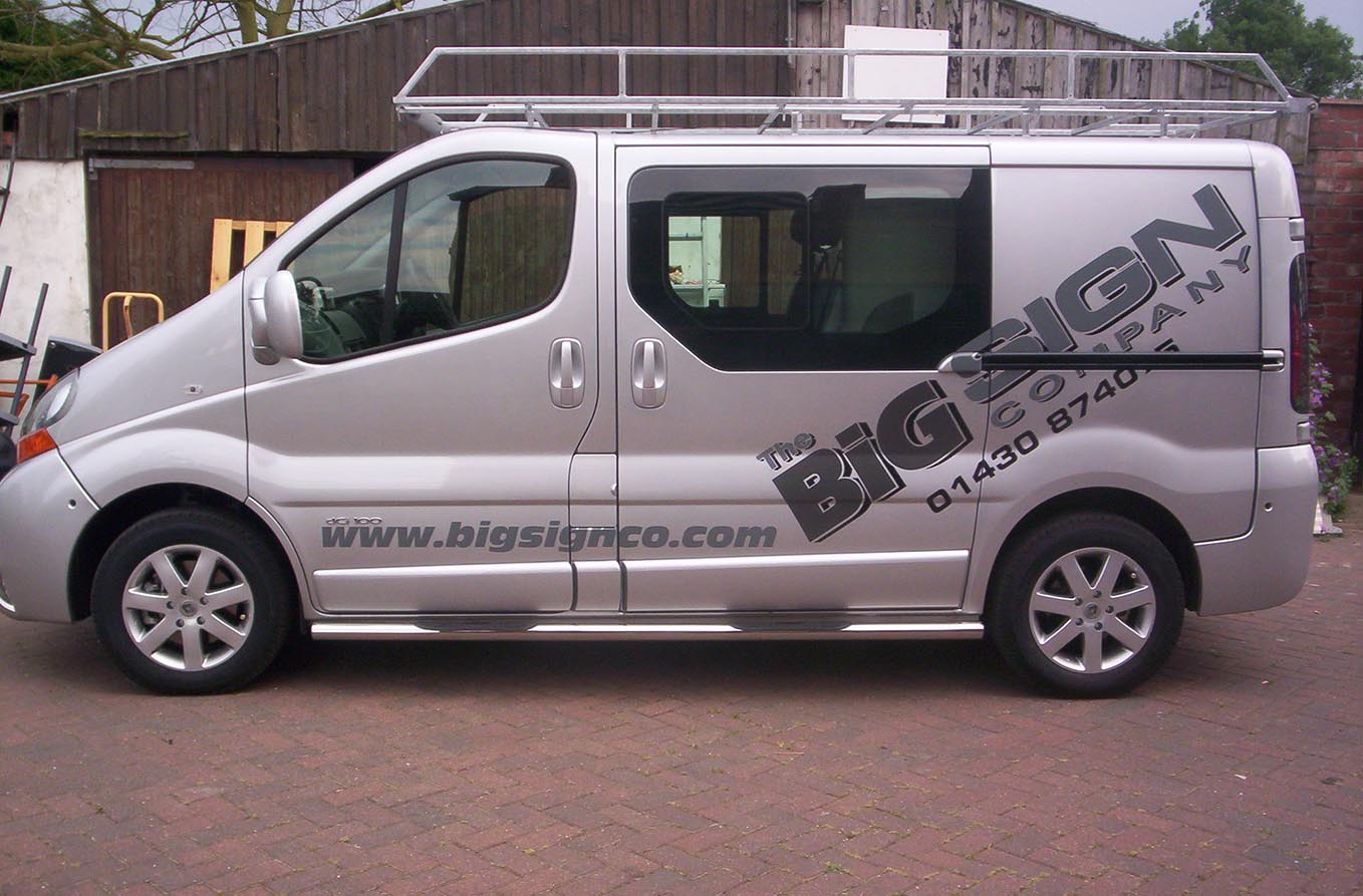
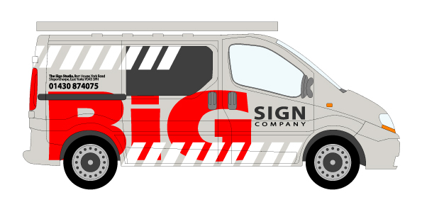
Hi Folks..
Just a big thanks for everyones input. It all helped, I eventually went with breaking up my logo and used Stevos basic idea but it ended up looking better on the angle ( In my opinion).Thought I would post a couple of pics… Still plan to put sides on the roofrack when I get time. I have already picked up 3 jobs from it so I am very pleased.
Once again thanks
Ian
Attachments:
-

Looks very smart Ian,
Is that contravision, on the back windows? if so, did you laminate?
Peter -
Hi Peter,
Yes it is Contra vision on the rear, it is not laminated so I will see how long it lasts. I did a sample laminated but could not see through it properley so have just done it without… Time will tell.
Cheers
Ian -

It’s a shame those wipers are so large on the rear. I would take them off for now and put them back on once the weather gets bad. Oh wait, it’s the U.K., it’s always bad. 😕
Nice job on the van. I think you will get lots of looks with it.
-Marek
Log in to reply.
