Activity Feed › Forums › Sign Making Discussions › Gallery › Vehicle Graphics – Company Van
-
Vehicle Graphics – Company Van
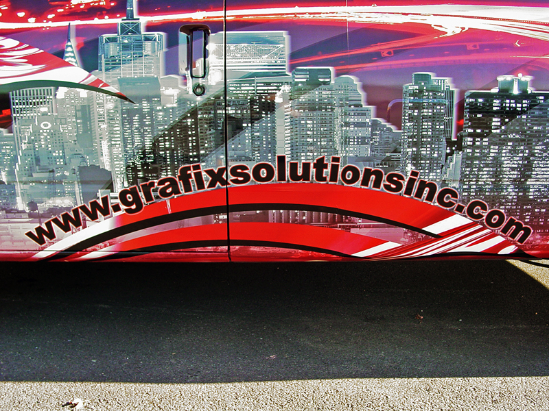
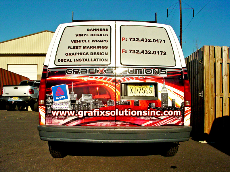
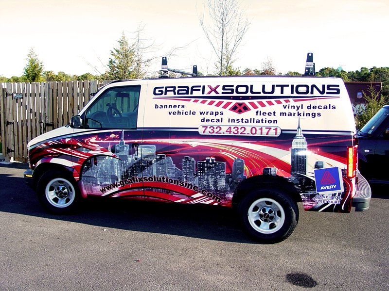
Posted by George Kern on November 26, 2006 at 2:53 amThis is the design I have created for our company fleet, I only have pictures of the van right now since the car and the box truck are on the road, but I will post the rest later on. I know the design is very busy but that was the intention. You get drawn into the busy design and are forced to look at the company name (which is why its only on a white background)
Mindaugas replied 17 years, 5 months ago 4 Members · 5 Replies -
5 Replies
-
nice work mate, very american looking vehicle and graphics.
constructive crit:
i agree it is a bit busy… i would maybe have scaled down the top text by about 20% to give the info a bit more breathing space. as you said the lower section will do the attention grabbing.
on the rear ide have kept the name on the top section like the sides. -
At least this one is readable (on the sides). I do agree with Robert on some more negative space, but I still can’t figure out why people put images that don’t even pertain to their business on wrap designs. In this case a city scape scene.
There’s a local sign guy here that has a huge image of a monster truck on his vans, and this is for a sign shop? People think it’s for a toy store or monster truck team.
I really don’t mean to be hard on ya, but the first impression I got was that the image looks like it could be used for a phone company.
It really is nice work and like I said is readable, compared to wraps I see out there. I just don’t really think the photo portrays an image of a sign shop. But that’s just me.Stevo 😀
-
i agree with stevo on this too mate… with regards to the image/picture.
ill be honest i never took allot of notice of what the actual image was as i never clicked to blow it up in size. i just looked at the overall image and spotted the avery badge, assuming it tied in with the colourful graphics. by that i mean i thought the image was something avery connected.
like steve, we have local firms with monkeys on their vehicle?, another with terminator images… totally unconnected and although attention grabbing to a point. they do not spell signs to the reader. in most cases it completely throws you off…
ide say the image would maybe more suited for dave rogers as his company is called CitySigns.like stevo im not knocking the work mate, just giving some views.
thanks for taking the time to post your work.
-
I probably should have told the story behind the images used before i posted 🙄 lol The boss wanted to portray our business that we are located next to some of the biggest cities in the tri-state area (New York, Philadelphia, Camden, Newark) and that our shops are located right off of the major highways so it is easily accessible to bring fleets of vehicles to our facilitys (hence the highway picture in the background) The tribal as overused as it is, was touched up a little by adding some custom texturing inside it, and this was to cater to the race teams around us because there are 3 major racetracks within 25 miles of us (40.25km) so we wanted to be able to cater to the racers as well. Basically the entire message my boss likes to get across is we are big enough and have the equipment to handle the large corporate accounts, yet caring enough to handle the smaller walk in jobs because we have two employees just for doing so.
Log in to reply.


