Activity Feed › Forums › Sign Making Discussions › Graphic Design Help › Design help needed with my own logo.
-
Design help needed with my own logo.
Posted by Ian Pople on August 9, 2008 at 6:25 pmHello all,
mod-edit please dont question admin/mod activity
well I’m trying to sort out my own logo / fonts to use.
This is driving me mad. The company name is Signtaztic and am looking through hundreds of fonts and messing around with Coral and cannot get a design any way close to anything i like. I have deleted them all and am stuck. New start up and this decision will follow me for ever. I need some help.
Please help me.
Ian
Ian Pople replied 12 years, 9 months ago 22 Members · 84 Replies -
84 Replies
-

Its a common problem, one which has been discussed on here before. one that I suffered with too. Try a search and you should find the discussions that have taken place. This might lead you to an answer.
Sorry I can’t help further, this one is going to have to be (mostly) down to you….
Gareth
-

Hi Ian, do you have anything else to go on?
We have the name, what type of work will you be doing? Can you reflect this in the logo e.g possibly take an existing font which you think represents your company in terms of structure and then adjust this to highlight letters within the company name.
Have you decided on colours yet as this is also a good starting point.
If you are purely vinyl based it may be worth thinking of something which reflects the vinyl dimension?????This is quite a difficult decision but also very exciting, you must try and promote the quality of your work through your identity, but above all it is important to sell your creativity through this.
Good Luck
Jason
-

Its difficult,but the best way is to post a couple of your own designs and bounce them round. Once up you will find members will either tweak what you have done or completely redesign. Either way it will get your creative side flowing…………..Just have a go :lol1: :lol1:
-

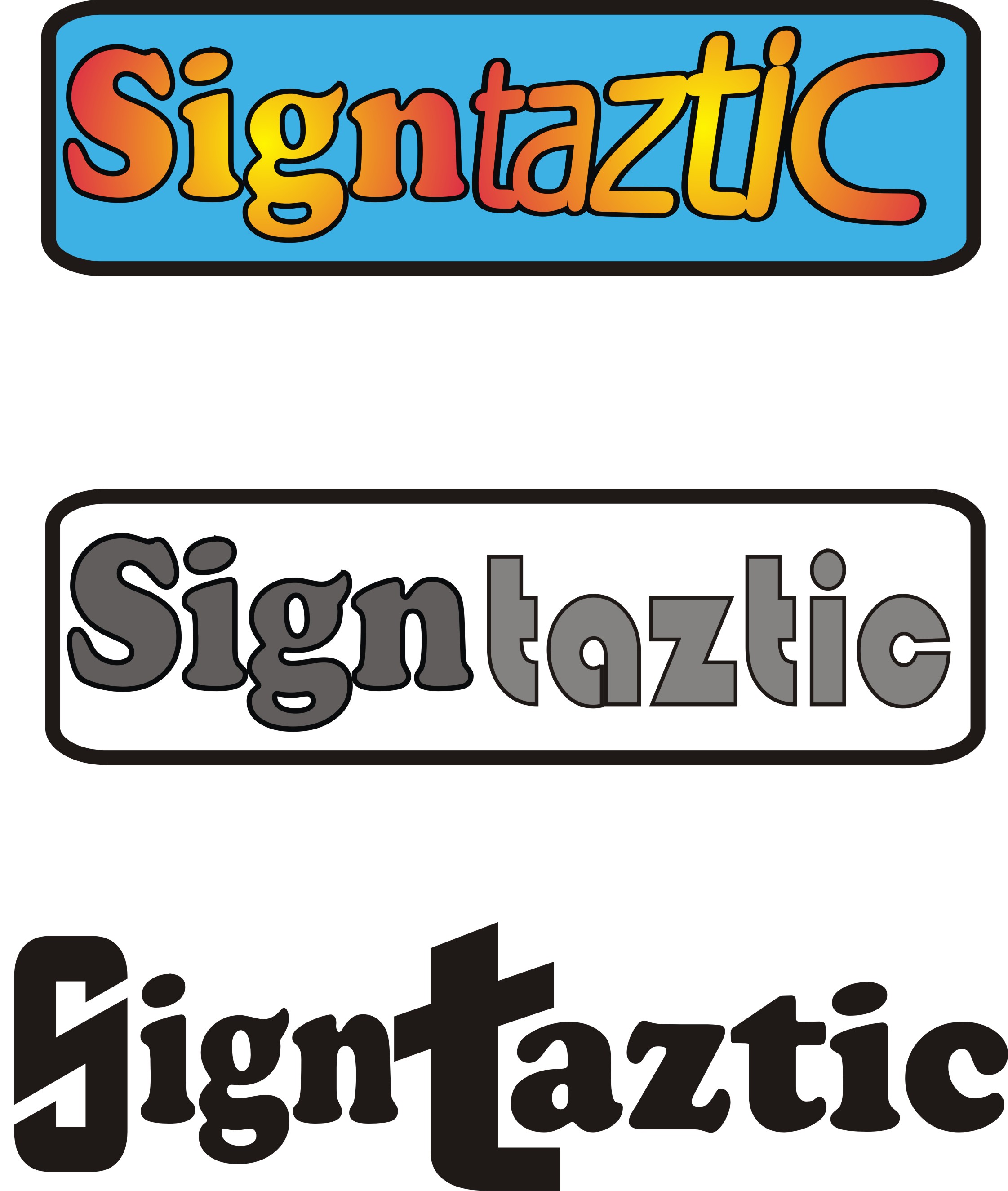
i will stick me neck out and start it off.
your own is the hardest but it must be your own.
chris
Attachments:
-
Graeme – love the storybook effect for your gallery!
Ian, it has been mentioned that it can be helpful to get any logo looking ‘right’ in simple black and white before you go looking for colour choices. I think the thinking is that if a logo looks good in b/w it will work in most other colours (but might not neccessarily work the other way round).
Cheers!
-
quote Gareth Lewis:Graeme – love the storybook effect for your gallery!
Cheers!
Wasn’t 100% sure on its professionalism, but it seems to work. Its one of the options supplied through 1and1. Its dead easy to manage and expand.
-

honest opinion based on first impressions….
It looks a bit dated to me with the outline……. It looks a little hard to read aswell and I would give some thought as to how Chris has separated the words even though they run into each other
There just seems to be a lot going for such a simple design if that makes sense
-

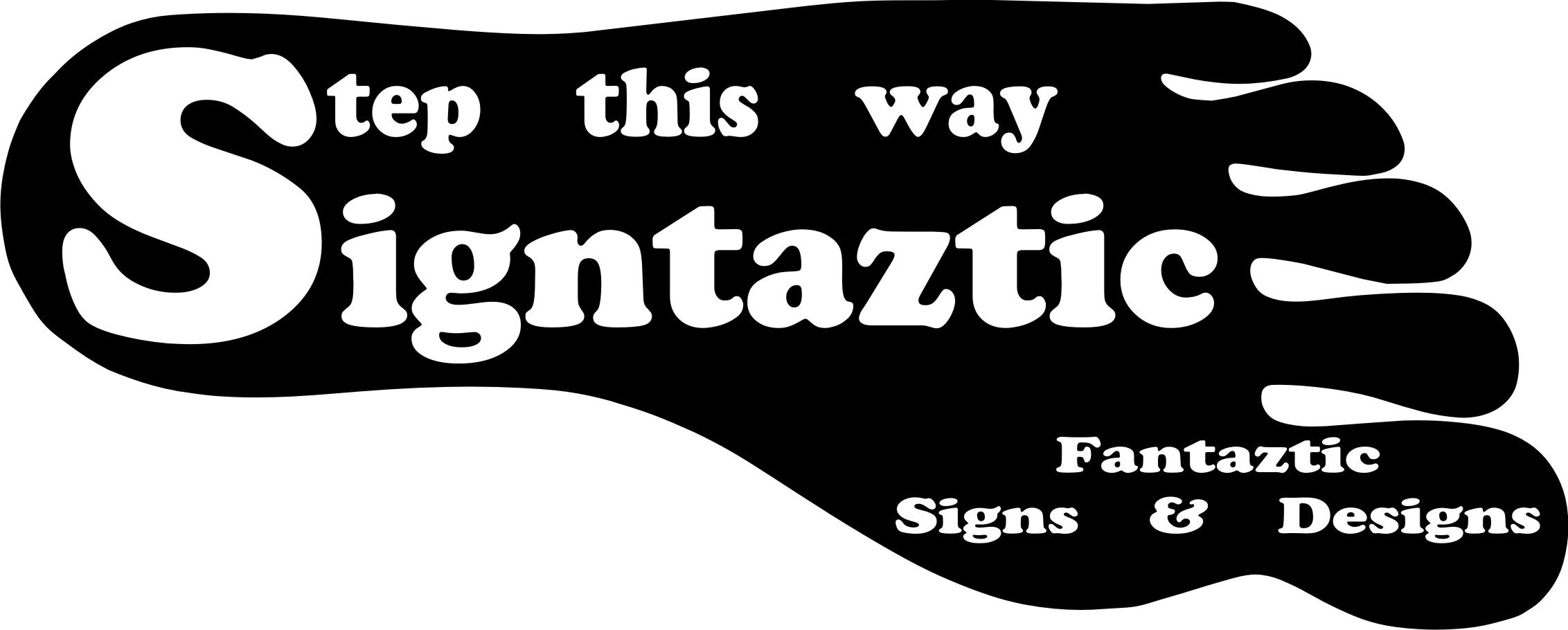
Yeh, your own logo can be a killer!
Not too keen on your first go…just lacks any ‘ooomph’ or flair (ie. not very ‘taztic)
The kerning off, outline a bit ‘dated’ as already said, the ALL CAPS aspect ‘tries too hard’ and the horizontal lines don’t convey or add much to the overall ‘feel’.
Will have a play myself – no point in offering crit if I can’t offer some ideas!!
Dave
Attachments:
-
Have a play with Chris’s idea where the two word are separated by different fonts, but remain as one word
-

I got a lot to learn on the design front I think.
This is a very quick design.
Attachments:
-
Ian – look round you, at appliance logos, company logos…anything.
See what you LIKE in a logo…and pay homage to it 😉
If you like clean simple lines…go with it.
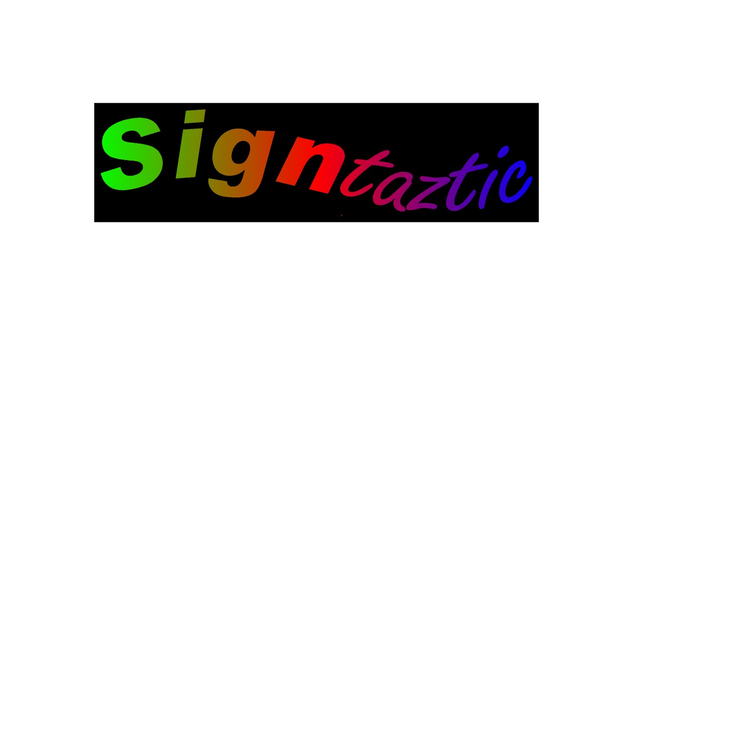
If it’s BIG, BOLD and BRIGHT colours…go with that.
your name should be reflected in the image – so it’ll HAVE to be both ‘sign worthy’ and ‘fantastic’. ie. it HAS to make a big first impression. The rainbow fade on black…half of the text fades out to the background and gets progressively smaller – like it’s hiding!
Dave -
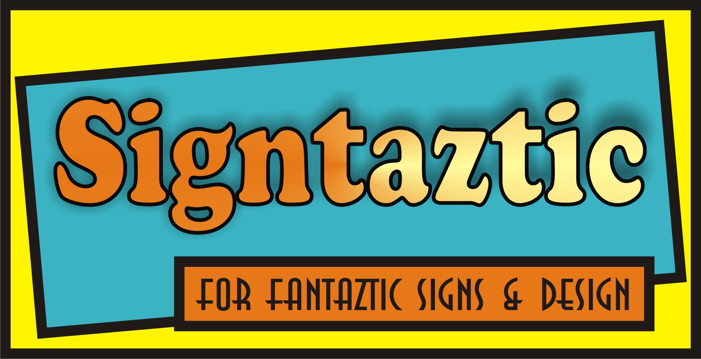
forget the colours but does this sort of thing work
Attachments:
-
I think the (top) blue one shows promise…the others a bit hard to read & weird mis-matched fonts.
The last one (yell/blk)…just doesn’t do it for me (forgive me) but, a bit amateur…um, can’t put my finger on it…just nah…
Of course I realise you ARE an amateur at designing by your own admission, and I don’t want to offend.
The best bit of advice i can give you is get the images full screen & walk across the room to take a look at them…not just sitting in front of the screen…does it still ‘work’, where does the emphasis lie…
Even looking at some work you’ve done for others – or trawling the forum (search) for logo or name ideas/design.
Dave
-

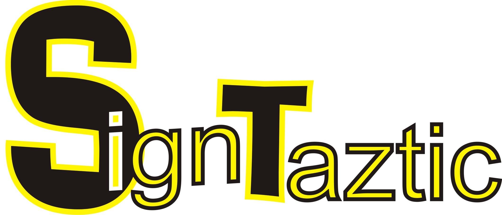
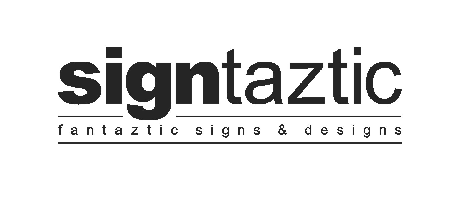
I think we’ve been thinking along the similar lines Glenn – All lower case with "sign" in bold, "taztic" in regular. 😀
-
aye….yours works better than mine though…yours would go with any colour scheme
-
hehe….now you tell us after you’ve designed ones with fades and dropped shadows :lol1:
-
I know but I can get the full colour ones done by the nice people on this site.
-
no sorry about it, you are starting to get there and looking better
ps.
normally a oblong goes with an eclipse not 2 eclipses.keep at it
chris
-
You were almost there one design back…clean, simple to cut & easy to read…yet actually well proportioned. Star a little bit too prominent…reminiscent of a (Canadian) maple leaf…
…and my wife really likes it…likes the symmetry.
Last one is just too many ovals – a bit cluttered. Take Chris Wool’s advice, a nice rectangle may compliment the oval and give an air of ‘traditional’ about it.
-
Just a quick stab, you can stick the star back on yourself :lol1:
Attachments:
-

You’ve been given some good suggestions.
But I suggest before you begin designing you try reading a few book such as:
http://www.amazon.com/Mastering-Layout- … pd_sim_b_1
Or these:
http://www.amazon.com/Logo-Design-Small … y_b_text_b
by Dan Antonelli:
http://www.graphicd-signs.com/html/articles.htmYou need to learn how to design before you can offer it as a service. We all start somewhere, I wish someone would have told me about these books (especially the Mike Stevens one) when I was getting started.
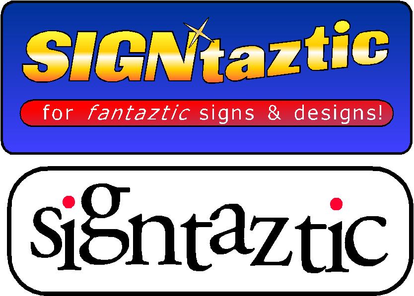
Here’s a quick suggestion, fonts are A&S Valentino Script and LHF Wade Dynamic.
Love….Jill
Attachments:
-

Really like that one Jill, thought Phil’s worked well too. Why are your own logo’s always the worst?? 👿
-
Ian………which one have you been happiest with so far?
I would narrow it down to your favourite and then start tweaking
personally I think your last couple have been difficult to read after a couple of promising ones in the middle
-
"…back away from the fancy fonts collection…slowly…I don’t want to have to shoot you…" :lol1:

There’s a LOT to be said for keeping it easy to read. It’s a ‘classic’ trap that ‘fancy or ‘interesting’ = good.
90% of the suggestions by other people are using fairly contemporary font styles. Most established companies use…fairy contemporary font styles. And the ones that elicit the most positive responses that you’ve done are the simpler, cleaner ones.
Simple sells…
-
I know I know I found an old cd with fonts on it. I think Ill play around with the black and white curves one.
Thanks
Ian
-

Jillbeans’s is the best looking one in this thread imo. 😎
-
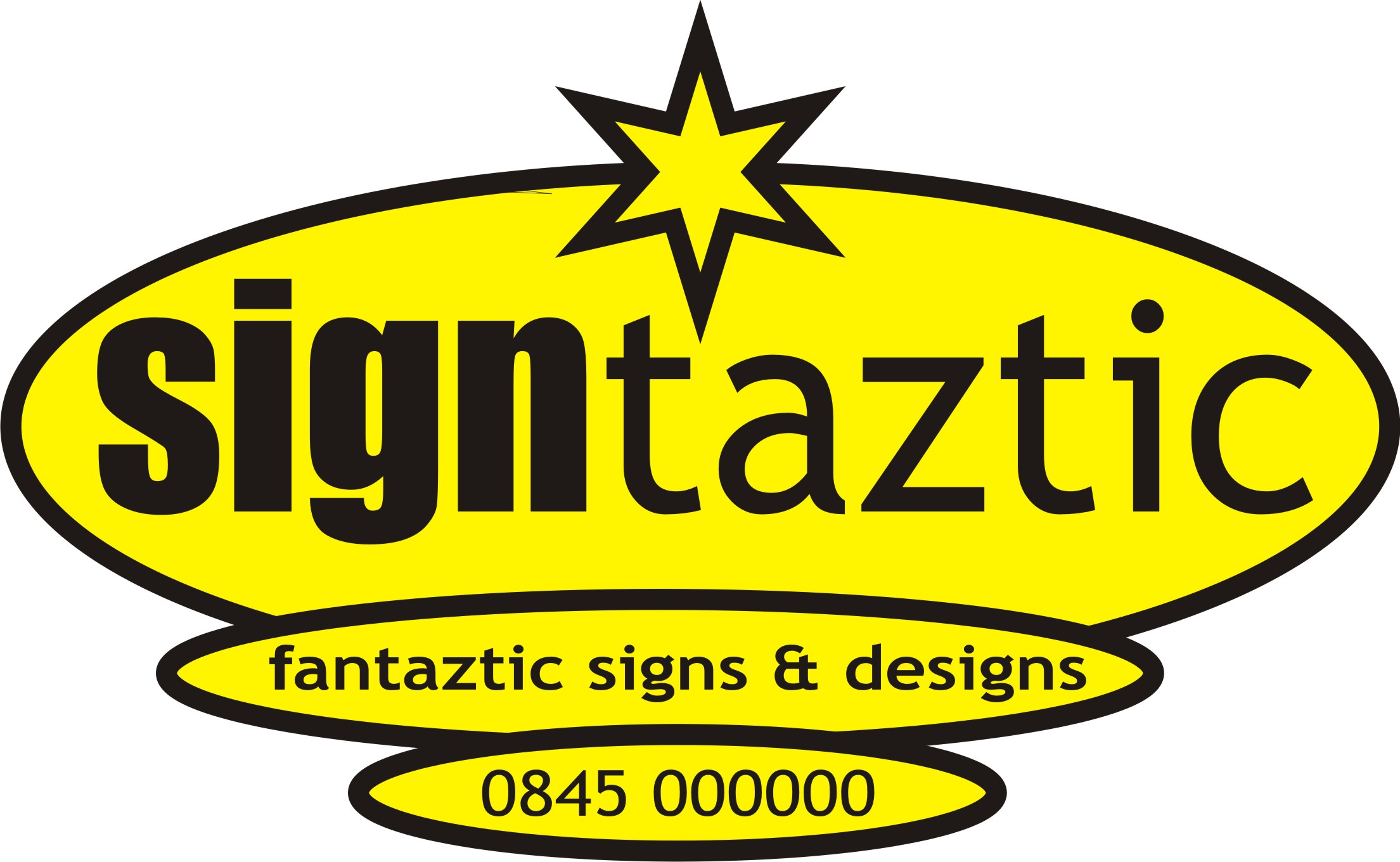
I tend not to include a phone number in a logo.
Bottom one of those last posted uses all caps in a display font, a big no-no.
Love….Jill -
The top two of the four are the most pleasing IMHO.
Just watch your ‘borders / margins’ and square everything up a bit and it’ll be fine.
Dave
-
PS
Thanks for noticing, Brian, you are a sweetie.
😉
Love…Jill -

sorry I haven’t had time to give any suggestions but I also think Jills is the best so far and think it looks really good. A phone number should not be part of your logo so leave it off and design something with just the name.
If I get a chance I will contribute 😳
Warren
-
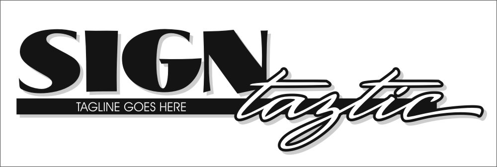
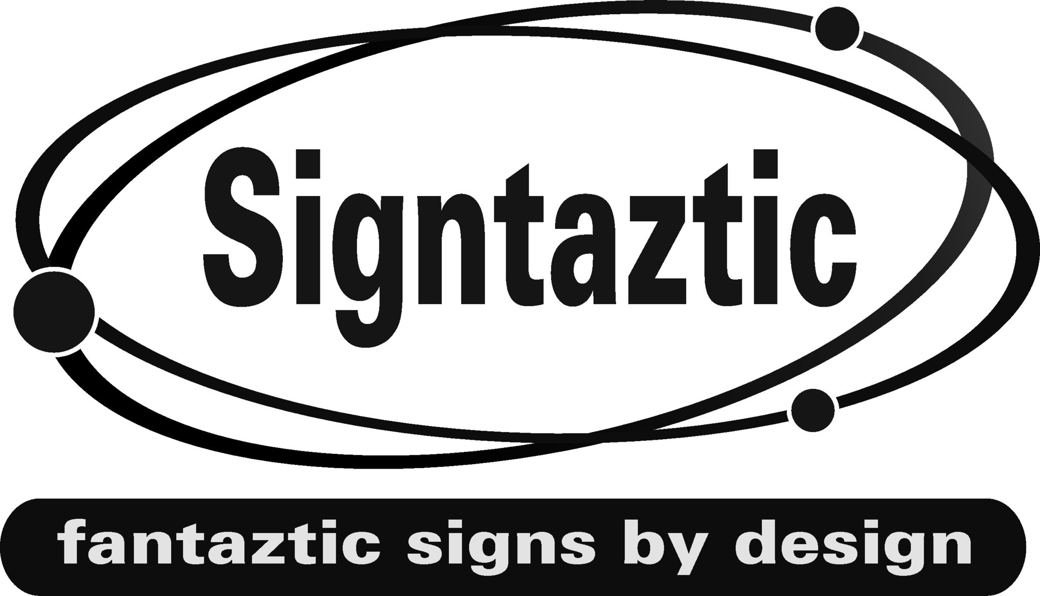
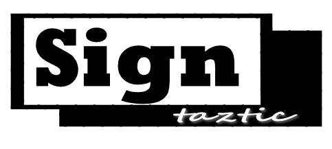
I also think Jill’s design is the most pleasing.

I have tried to analyse the design to try and determine what makes it look so pleasing to the eye, my conclusion is as follows:-
1/ Line value – there are big contrasts in line value. Even the dominant font "SIGNS" exhibits a big contrast in line value between the vertical component and horizontal component.
2/ Priority – there is a clear priority of text – in this case "Sign – " is the main message (foreground), "Tazstic" is the secondary message (middleground) , and the "Tag line" is the tertiary message (background).
Because of this nothing is competing for attention – the eye is led through the design to read it in the order – "Sign" "Taztic" and finally "Tagline".
3/ Contrast – there is a large amount of contrast between the word "Sign" (big bold and dominant ) and the tagline (tiny lettering in comparison – this contrast gives the design interest.
The layout is 3 dimensional – everything sits in different planes (Foreground, middleground, and background).
4/ Margin space (negative space) – if you look at the design you will notice that none of the lettering touches the edges – this is because deliberate margin space has been designed into the layout. Also all of the margins are greater than any of the spaces between the groups making up the layout.
I’m sure there is much more that I have missed.
I hope this analysis doesn’t come across as pretentious of me. I am merely interpreting what I have seen based on the teachings of Mike Stevens’s book understanding layout.
As Jill has already said – you should get a copy of this book and study it.
-
Hi,
Book is on order but again rip off prices this side of the pond. £26 and in the USA $26.
Thanks to every one for the help I would never thought of having the word split into two.
Thanks
Ian
-
Ian,
Here is a link to a thread from last year. This might get you the book for ever so slightly less than £26, but I may be wrong…
http://www.handover.co.uk/acatalog/A_S_ … s_746.html
(plus the usual carriage! gnn)
Cheers!
-
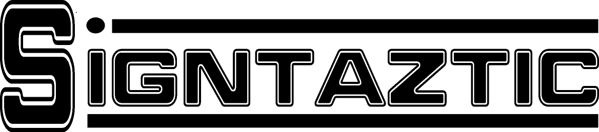
This is where design becomes so subjective I think…….
I totally agree that Jills design is very attractive to the eye but I think it only works when looking close up…..whereas Phill’s may not be as pleasing on the eye but does the job it’s intended to do from close up or from a distance
Jill, please don’t take this personally …….
I just wanted to try and show that two very good designs, that follow all the rules can still behave very differently depending on where they are viewed from.
Attachments:

-
Well spotted, Glenn.
Mine doesn’t pass the squint test as well.
But I would still say that in both layouts "SIGN" can be seen from far off, the rest is just fru-fru.
And Phill, I just laid it out, I never thought about it in depth. That’s what happens after you get used to the Mike Stevens method.
What I find very sad about this topic is that the original poster is complaining about the cost of a learning tool which he obviously is badly in need of.
Learning good layout, to me, is as important as buying good equipment, quality materials and attractive fonts.
The book pays for itself after one reading.
Love….Jill -
quote Jillbeans:But I would still say that in both layouts “SIGN” can be seen from far off, the rest is just fru-fru.
I agree to a point Jill but if every plumbers van clearly read PLUMBER but you couldn’t distinguish the names there’d be a right kerfuffle remembering who they were 😀
-
Hi,
I’m not complaining about the cost of the book just pointing out the difference between both country’s.
-
Glenn with plumbers and most contractors I do highlight the name.
😳
Love…Jill
😉 -

Just another very quick idea 😀 The blue has come out a bit bright, I originally had it a shade or so darker
Attachments:

-

Some good contrasting designs from everyone.
Here’s an effort from me.Is it me or or we only getting a lot fewer posts per page 😕
Attachments:
-
just class martin.
waiting for a customer just for fun don’t take it seriously people.
chris
Attachments:
-
Fabulous Chris – what software did you use – was that Signlabs eyecandy feature?
-
thanks
photoshop & corel – styles – tweaks and layers.
not every body’s cup of tea but i enjoy doing it.chris
-
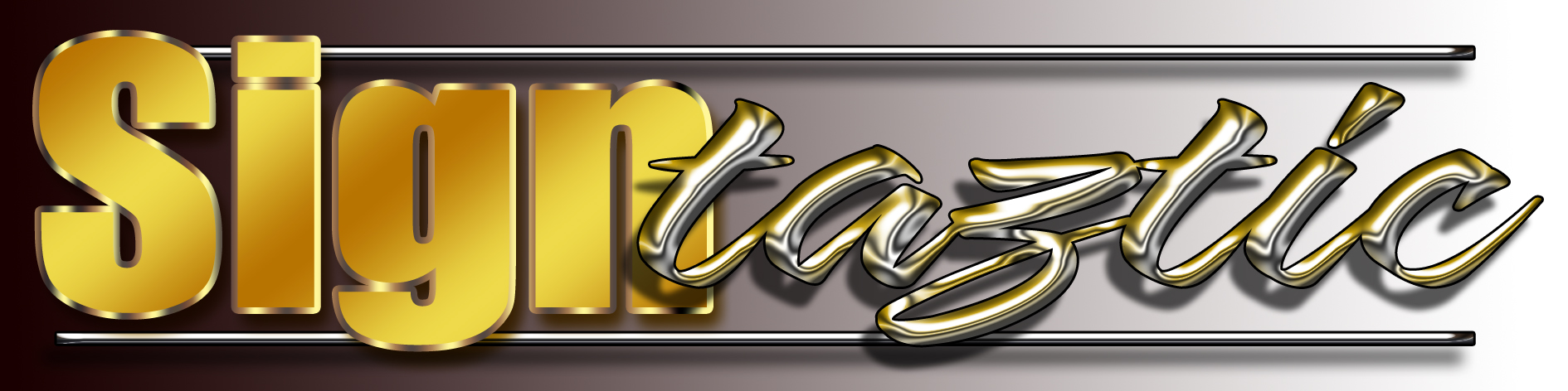
Just seen that Chris,
Very clever, it’s really well done. Seems everyone is into the less is more approach these days but this throws it out the window.
It’s great to see how software can create stunning effects if used properly.
M
-

No disrespect meant at all…. I don’t like the name mate, sorry…. i began to have a go at this but the name just keeps disagreeing with me. 😕
have you been trading with this name for long?
-
OK, had a quick go at this one… still not convinced by the name, but thats more a self preference thing. anyway, this is just another option…

.
-

I was just going to say how good it looked till…………….fantasic………still looks good though Rob. :lol1:
-
quote Steve McAdie:I was just going to say how good it looked till…………….fantasic………still looks good though Rob. :lol1:
you know, Ive only just noticed that after reading your post about 5 times mate. o couldn’t work out what you meant. 😳 :lol1: :lol1:
-

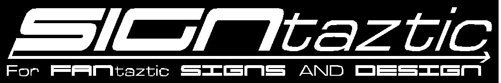
For what it’s worth I whipped up something quick for ya.
I do really like Robert’s clean modern style. Nice work!Stevo
Attachments:
-
I would like to say thank you all for your help with this. Loads of ideas.
-

Hi What design did you decide on?
I know its a few months old But I thought I would ask.
-
 quote David Rogers:Yeh, your own logo can be a killer!
Not too keen on your first go…just lacks any ‘ooomph’ or flair (ie. not very ‘taztic)
The kerning off, outline a bit ‘dated’ as already said, the ALL CAPS aspect ‘tries too hard’ and the horizontal lines don’t convey or add much to the overall ‘feel’.
Will have a play myself – no point in offering crit if I can’t offer some ideas!!
Dave
Dave i like the second one i think it looks great.
neil
-
Oops i didnt realise quotes didnt include the pics. Dave its your second design i meant.
-
Just had a wee quick go for a bit of fun whilst waiting on something cutting.
Attachments:
-
Hi all,
Just to update and thank you all for your help I know it was a long time ago.
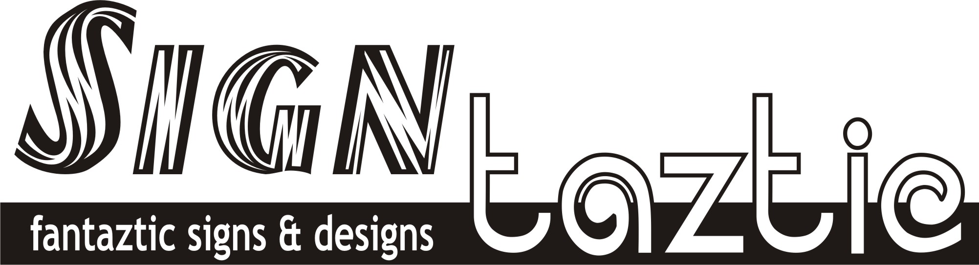
A very simple design, I have seen a similar one on the net a while ago.
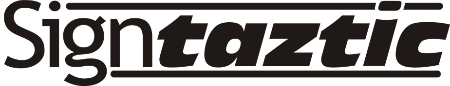
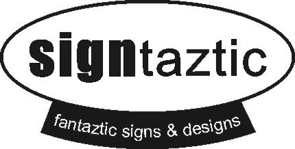
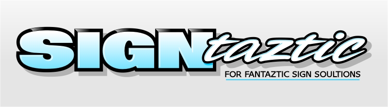
My logo is finished I like it because its very simple, one color no frills.
Ian
Attachments:

Log in to reply.
