Activity Feed › Forums › Sign Making Discussions › Graphic Design Help › Help / suggestions with van design
-
Help / suggestions with van design
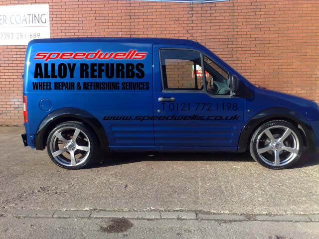
Posted by Ibrar Jabbar on April 14, 2009 at 10:57 pmI have briefly designed a layout for my van, what are your thoughts on my design and any suggestions on improving this are most welcome.
I wanted to add an outline of a 5 spoke alloy but don’t know how to 😳
Attachments:
 Ibrar Jabbar replied 15 years, 1 month ago 5 Members · 10 Replies
 -
10 Replies
-

It really lacks contrast.
You could help this by:
1-putting a white outline on everything
2-changing the black parts to white or even metallic silver
Love….Jill -

As Jill says……
Black direct on most darker blues looks pants. Id be tempted to use chrome vinyl as an outline adding a sense of "polished" to the "ALLOY REFURBS" and then use silver on the remaining black text. You might also get away with dropping the www on the web address and the ‘T’ on the phone number……….use small icons instead……
-

Points taken on board, I like the idea of a chrome outline on the black text, any more suggestions?
-
quote Ibrar Jabbar:Points taken on board, I like the idea of a chrome outline on the black text, any more suggestions?
Dont go overboard with the chrome. Id only use it on the "ALLOY REFURBS" and only a thin outline, probably no more than 5-10% the with of the text stroke.
I used the chrome foil from Grafityp and it gives an near mirror finish………….provided the surface is 100% smooth, otherwise it highlights any defect in the underlying surface………. :lol1:
-

Oh I see!!
There are plenty of books out there which will help you with layouts etc but Mastering Layout by Mike Stevens is very good and well worth the investment.
Gary
-
quote Gary Birch:Oh I see!!
There are plenty of books out there which will help you with layouts etc but Mastering Layout by Mike Stevens is very good and well worth the investment.
Gary
Ill second that, one of the best books Ive bought for sign making (layout)
-

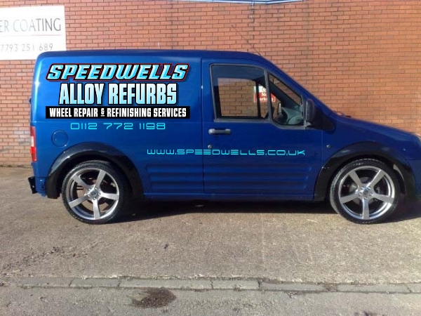
Just a quick mock up for ya regarding color and layout.
😀Stevo
Attachments:
-
…notice he lined up the phone number nicely and did not put a "T" before it!
😉
I do like the idea of using chrome vinyl as an outline, but I loathe working with that stuff. -
Thanks Steveo.
I like that, I wanted to add an outline of 1/4 of a 5 spoke alloy in chrome on the top rear corner any ideas on this?
-
quote Jillbeans:…notice he lined up the phone number nicely and did not put a “T” before it!
😉
I do like the idea of using chrome vinyl as an outline, but I loathe working with that stuff.I know what you mean about chrome it’s not the nicest of vinyls to work with, especially when you are a beginnerr like me 😕
Log in to reply.
