Activity Feed › Forums › Sign Making Discussions › Graphic Design Help › Logo inspiration needed please for a joinery business?
-
Logo inspiration needed please for a joinery business?
Posted by Marcella Ross on July 20, 2006 at 10:45 amHelp!
I think the recent hot weather has melted my brain.
I am trying to come up with a new logo for a customer. His previous one was yellow and black and very in your face, one he had done himself. Now he wants a complete change to something modern, plain and upmarket looking. Preferable colours blue/silver or dark blue/lightblue.
It is a joinery business and the company name that I have to work with is
RBJ
that’s it.It’s just not happening for me ……. 😕
Marcella Ross replied 17 years, 9 months ago 8 Members · 14 Replies -
14 Replies
-

Right then, I’m not suggesting you steal anything but I sometimes look at this bloke’s logo work for inspiration. He’s a bit of a logo god, I reckon.
May give you some ideas……
-

Andy,
that’s a great wee source of inspiration right enough. He’s got some lovely stuff and certainly given me some food for thought!
thanks! 😀
-
Ah, but actually I was giving Marcella someone else’s brains to pick.
So there. 😛
-

Does sound like abit of a tough one to do.
Dan Antonelli’s work is great!! I go there as well for some ideas and have got some great feeback and encouragement from him. He does have that nice clean look going that works great ,and a modern feel to it. I can always see abit of that sign guy come through on most of his work.
I like how just a simple graphic can speak alot for a logo. Especially for a real simple name like this one.
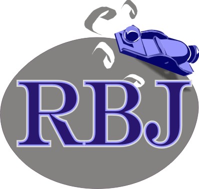
This was a really quick idea I had for you.
Stevo 🙂
Attachments:

-
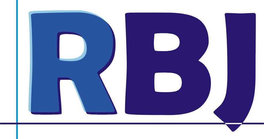
Stevo,
that’s a lovely logo, thanks! i like the plane.
it makes my efforts look pathetic! ……….
see what I mean 😳
Attachments:
-

yours isn’t too bad Marcella but I do like Stevo’s, would it fit with the rest of your design ?? I would like the r + b to be in line at the bottom though
but apart from that any carpenter would go ape for that 😎Lynn
-
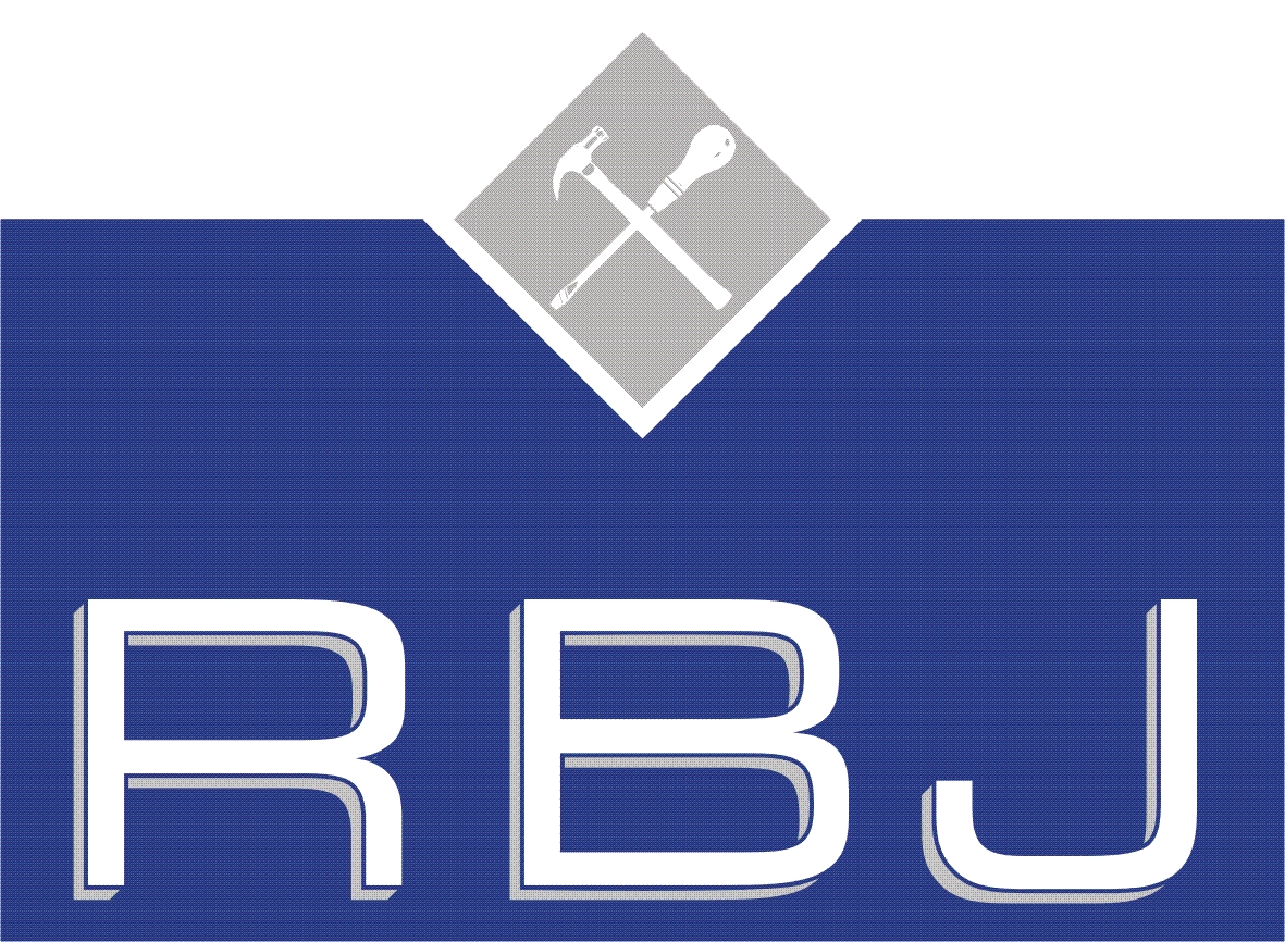
I dont think it’s that bad either Marcella.
I think you need to tighten things up abit. The diamond looks a little detached from the lettering.Stevo
Attachments:
-

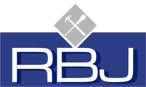
adapted a logo to go with typeface?… sorry not much time…
Cheers
Andrew
Attachments:

-
thanks Andrew, I like that. that’s got a very contemporary feel to it which would appeal to the client!
-
:2thumbs:
thanks everyone, some great ideas among this lot!
Log in to reply.
