-
Help with haulage logo?
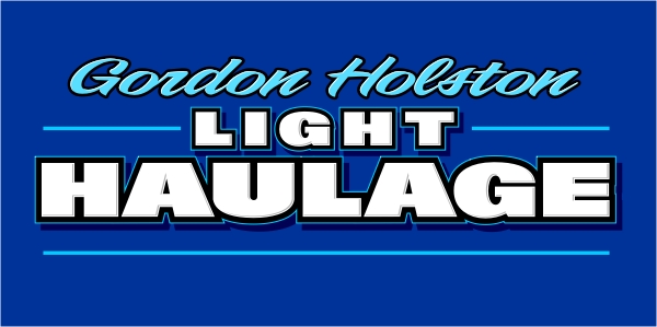
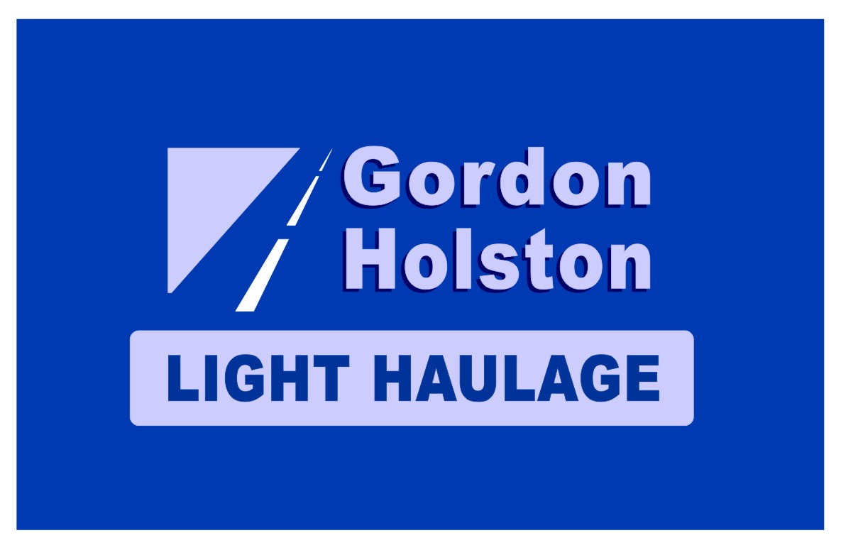
hi,
I put together a logo for a haulage company and was happy with colours but now i find it has to go on a blue vehicle as well. not keen on putting a white box around it so i have played with the colours.
2 problems….im not sure what colours to do it that doesnt look odd with the blue, i think the one below is a bit plain. I’m worried it looks abit to old fashioned?
secondly i need to get Light Haulage in there, have tried putting Light above the haulage part and altering the spacing to cover the whole width but being such a short word in the first place it just doesnt look right
any ideas welcomed even if completely different, ignore the tag line its just to balance the design at mo, will be changed
thanks in advance
garyEDIt the blue has come out different on the JPEG conversion imagine a mid blue!!
Attachments:


Log in to reply.
