Activity Feed › Forums › Sign Making Discussions › Graphic Design Help › need a new logo and i dont know where to start?
-
need a new logo and i dont know where to start?
Posted by James@MP on September 16, 2004 at 1:11 amThought i would contact the professionals. Im looking to create an eye catching logo not only to replace the one on our website but one we can use every where, Preferably not to tall and fairly wide, so would work with most things we print then.
I have a no imagination when it comes to this sort of thing. I have seen some of the work you lot do and its very good.
Any help people would be very gratefully received. The logos we currently have just dont have the right feeling to me at the moment, i think its see it, like and think yes i like that.
Steve Broughton replied 19 years, 9 months ago 21 Members · 51 Replies -
51 Replies
-

Hello,
Tell me a bit more about what you do, the nature of your business and maybe supply a web address so I can take a look and get a clearer idea of a start point. Once that is a known then I would be more than happy to do you a mulitfunctional logo that you can translate across yout business needs.
Looking forward to stretching my logo creation skills!
Keith
-
A few fiddles later, and sort of following a theme, this is what I have come up with… maybe COMPLETELY off the track you imagined? Anyways, here we go…
VERSION 1
-

I also prefer KNilsen’s version 3
Here are my efforts:
Attachments:
-

Nice designs there folks.
If I may ask a daft question, when designing a company logo what do you first need to look at and then how do you put it altogeher to come up with something as good as these (?)
Kev
-
To answer your question Kev…
I tend to look at the nature of the business first. With that is a bit of research into the whole business, including looking at what that company is presently using as a logo. Then I look at the name of the company and see if there is any associated trading tie-in.
Then, and only then, do I begin coming up with ideas. The initial ideas are very sketchy, but form the basis of a final idea. Once I have three designs I am relatively happy with I narrow it down to being somehow a combination of all the good points of those individual designs.
From there I create a semi-final version of the design, which then serves as the basis for a further three spin-off designs. It is these last three designs that the customer gets given as a selection. This process is clearly obvious from the 3 designs I have submitted in this forum.
As a final thought though, it always pays to keep in mind what you are designing toward. A funeral home CANNOT contain Cooper Black or Brush Script for example. Likewise a bouncy castle hire CANNOT be in Old English or Times Roman (although I am sure both of these have examples alive and well in the world somewhere!!)
It is logical what layout and feel will go with your clients needs. In the long run you just know when you are on the right track. Many times also it pays to design and walk away. Leave it alone for a few hours, and then come back to it. Invariably you will make instant changes that are just somehow right!!
…and thats it really!
Or you could just ask someone to do it for you!
-
Firstly Thank you keith those 3 are good but a bit cliparty, thanks ever so, Kev Boy, i like yours a lot but its a shame i can’t really use it cause cogs dont really play a bit part in our business. Lee thank you for your efforts, out of the 3 i like the 3rd one most but i think they contain too much and would come out clear when small. Kinda hard in a way to ask for a logo when i come to think of it cause you know you will like a logo when you see but untill you do can say what you want. Sorry if im rambling on.
A few ideas, could the logo primarily just be the name of the company but with something special done to it. i thought about the name being in the shape of a car or a boat, but thought it might look a little weird.
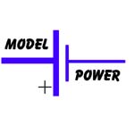
Looking again i think that keiths no1 could go somewhere if the battery was a white battery with model in blue and power in red with out the spark and maybe the plus and the minus at either end of the battery and a little bit smaller.
-

James
Here’s my suggestion for what it’s worth – as you can see I believe in the k.i.s.s principle
Cheers
Alan
Attachments:
-

i like them all very creative and not cliparty atall – when people are designing these photoshoped type designs how often do they think of the i want it 4 foot high on my van – so often i strugle to get the resolution up enough cos it was done at card size 75 dpi any more ideas
chris
-
Good point Chris, I always keep the preferences, preset resolutions in photoshop/corel set at 300 dpi, all scanned or imported images likewise. Its then far easier to drop the resolution down for any web work, or smaller prints. Made mistakes in the past, but hopefully I have learnt from them, I think !
-
Hey Chris,
It is for that very reason of resizing that I tend to stick to my designing as vector artwork. As such it is scalable to any size you ever want with absolutely no loss of clarity at all.
The issue of quality comes into play when working with photographic or other jpeg file formats. In that case I would agree, and ALWAYS start with artwork that is way above what you may need in terms of resolutions.
A good idea generally is to work to worst case scenarios – after all you can always work downsizing, but hardly ever upsizing!
K
-
KNilsen
Thanks for the info…..
Its about time we had some kind of logo (then we can slap it all over our van :lol1: :lol1: ) so its off to the drawing board and see what we can come up withCheers
kev -

😉
I like this last one best but of course my opinion is quite biased. (love1)
love….jill -
Never tried this design thing, but what the heck give it a go anyway :lol1:
Kev
Attachments:
-

Well, if you’re all going to do one, I’m ‘avin a go!
Attachments:
-
hahaha….here’s my feeble attempt.
You DID mention a boat….
Attachments:
-
I like it, Jill. I just would like to see the word ‘model’ a little clearer, perhaps bolder. It’s a bit “matchsticky”. (Real word, probably.) 🙂
-
That’s cuz it’s just a cruddy cut-n-paste from GA.
I dunno how to do Corel. 😳
Was going for that old-time “steamline” look.
Yes, matchsticky IS a word! I use it all the time.
thanks & luv….jill -
I see there so much talent here with lots more imagination than i have got. Sorry if i offended anyone in my last post, Kev i like the your logo mate, for your first its a good one. Big G I like yours too esp the electricty 🙂 I have got some serious thought ahead of me, thank you for all coming to my aid. Will post again later on
-
hi James
this is a bit late but here my effort

Patrick
-
patrick
that is class some tips on how created pleasechris
-
Ooooo lads n lassies looks like we have a Photoshop wizard on our hands 🙂 Patrick 11 out of 10 for that one mate 😎
-
thanks guys 😳
I don’t know about wizard, Apprentice maybe
Patrick
-
Yep that is so cool 🙂
how do i make it out of cut vinyl ? hehe only joking
-

:thumbup2: :thumbup2: :thumbup2:
that’s tidy!! 😛 😛
Nik
-
Been comunicating with patrick, over the car he has done, and it is sure a very good graphic. It would ideal if we producing big decals, and would be ideal for promotional work, but the stuff we primarily produce needs something easily noticed when very small, which unofrtunately our name wouldn’t be recognisable on the product.
We have been having thoughts here over a few different things, we thought along the ideas of a battery man, cause at events we do people say go and visit the battery men, something like the michalin man, we thought maybe made out of batteries.
So we are still looking for logo ideas, and our thanks go out to all the people that have submited ideas to us.
-
 quote James@MP:So we are still looking for logo ideas, and our thanks go out to all the people that have submited ideas to us.
As long as it’s free 😕
-
the hit on head the nail
rearange for a famouse saying 🙄
-

Yeah! That’s real cool Patrick
especially the battery powered headlamps 😀
Bet you felt a little drained after spending so much time on thatWorth charging for though!
Although its got some negatives its gotta loads of positivesJohn
-
Just out of curiosity, what do people generally charge for logo creation in their individual businesses? I am sure most of you charge at least a set-up or design fee of some sort? My personal day rate is £200 (Rob, please delete if this is construed as advertising!) for design, which I KNOW is cheap, and I post here because I love helping out people in the same business as us.
BUT, while I understand that this board is full of genuinely nice and helpful people, I can’t help but wonder if there are also some who are quite willing to ride along on that generosity and benefit from it while not truly contributing. Of course I understand that this site is about information exchange, and helping our fellow signmakers, but there is a point where helping out crosses into exploiting.
As an example I have seen some requests on this particlar board for the most simple graphics, which any self-respecting signmaker should be able to create with minimal effort or skill. Surely if you spent an hour trying to create your graphic, you would feel a sense of personal achievement at doing so. Further down the line you will also become more creative and ultimately better at your craft through the practise!
I may well be opening a can of worms here, but it is just a point noticed, and I felt it was well worth mentioning. Nodody ever got good at something by asking others to do it for them all the time, did they?
-
quote :As an example I have seen some requests on this particlar board for the most simple graphics, which any self-respecting signmaker should be able to create with minimal effort or skill. Surely if you spent an hour trying to create your graphic, you would feel a sense of personal achievement at doing so. Further down the line you will also become more creative and ultimately better at your craft through the practise!
this is a push button life and didgitizing aint part of it i still use a tablet from time to time most new comers wont know what that is raster to vector converions are still not that good although they have there uses – perhaps a demo req of at least where to put nodes to start with looking around at other stuff it makes me cringe at the poor quality of some didgitizing
chris -
KNilsen makes a point that has crossed my mind a few times. I’m all for sharing and helping others, but there are a lot of requests from people asking for the simplest of images to be provided for them. Some of which are so simple it makes me wonder whether these people are in the right job.
As for Mrsticker’s comment, digitizing definitely is part of it. This is a highly skilled industry we are in. I don’t just push a button and let the computer do all the work for me. I do agree though, that some back-to-basics demos wouldn’t go amiss, judging by some recent posts.
-
:appl:
well said.
Love….Jill
(I charge at least $75/hour for logo design AND digitizing!) -
Got to agree also and as to the design charging comments I charge £20 per half hour design and digitizing, the average graphic designer would charge a damn sight more, I know of one thats £20 per 15 minutes.
a few months ago when we had a much missed member he would only offer help with other peoples designs IF they posted their own ideas first, perhaps it would be better if we went back to that then the person requesting help might see their own ideas being developed instead of using others? -
Can’t see any of KNilson’s designs seem’s everyone else can why is that?
-
you need to be logged in before you can see the pics.
Dan
-
I agree with the points of people asking for simple designs is not necessarily ethical or correct but…..
I have been in the sign business less than2 years but I can’t keep up with the amount of work I have, I employ people to weed and tape graphics, I sub out as much of the work as I can but finding time to make images is hard.
I work for myself and have never been taught by anyone else so in my opinion if someone has already made a design that you can use its more money in your pocket.
I’m not saying I don’t do designs, I do, and if I can help others I will but with less time in the game you have less to give, I hope soon I will be offering help to newbies aswell.
-

yep.. to veiw images you need to be logged in.. but.. if logged in, are you sure your veiwing the correct page on this thread. this thread is now 4 pages long?
quote :perhaps it would be better if we went back to that then the person requesting help might see their own ideas being developed instead of using others?go back… i thought that IS the idea? :lol1:
hense why 2 files are allowed to be loaded these days. one to show an image of what the poster has come up with and the second to allow the poster to load the vector also, should others wish to tweak/alter it.i have seen one or two posts starting from scratch asking for help or a design, although i think anyone seeking help and advice should at least give it a go themself, show us what they have come up with and allowed us to pass advice on how to improve or simply come up with one ourself, (if we have time, or choose too)
if nothing else. posting something you have come up with gives a good topic starter.. works a treat once one or two get the ball rolling.. 😉 -
I think Steve offers a great solution… it brings the boards help back to being a help facility.
I certainly don’t mind spending some of my time assisting others who may not have my range of experience, but only by encouraging people to do some of their own work can they ultimately gain the same level of experience that I can attest to.
After all, it is only through trying and trying again that you learn how to do things well, both according to your own business demands and personal talents.
So, I second the route Steve has suggested. If people want designs, lets at least see SOME effort before we do all the work for them! Failing that, my rates are available upon request!! Lol!
-
Firstly to set things right,
rightsigns – im not looking for freebies, i never said i was. We will quite happily pay for any logo we use.
Big G – As you may have noticed im not in the sign industry or the graphic design area,
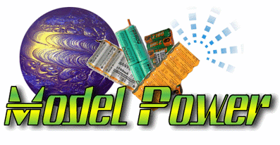
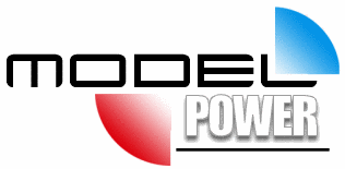
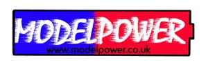
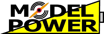
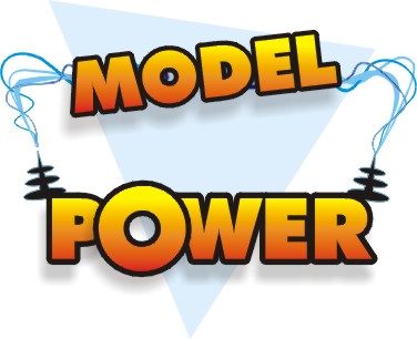
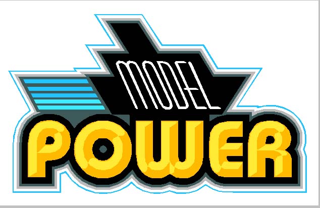
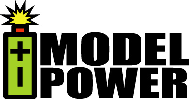
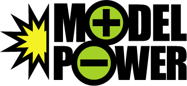
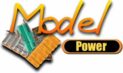
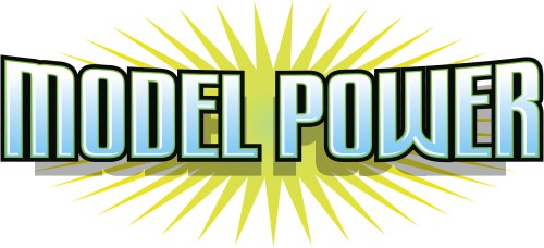
Steve Broughton – hiya steve i do also agree with your statement there, the current ones we have used in the past and currently have been attached to this post,
Robert L – Sorry for the long thread, i didnt think this thread was going to get as big as this, its interesting to see how big it has got though.
We did have a old tif drawing of a cartoon style battery man but when it was printed it wasnt as clear and crisp as we would have liked, I would of posted it on here but alas it is lost when we changed computer systems.
Just to finish, if i offended anyone with any comments i have made i hear by apologise,
Attachments:
-
Fair do’s. I didn’t necessarily have you in mind when I was making those comments. Your post just developed into a discussion of this matter. I had actually noticed that you had posted reference to an existing logo which is a fair start for someone asking for assistance, and I was glad to post my efforts in order to help.
-
quote James@MP:rightsigns – im not looking for freebies, i never said i was. We will quite happily pay for any logo we use.
I’m sure you would, meanwhile you are looking for members of this board to churn out (free of charge) ideas for you until you finaly find something you like and will offer to pay for. There has already been a great many excellent suggestions put forward yet still you you want more
The idea behind the design forum is to help out fellow signmakers and to develop each others skillls – not to offer a service to someone who has no connection with the sign business.
The reason I made my comment in the first instance was because I used to offer up speculative designs to clients in the past 😕 However, it is very noticeable how much more easily satisfied the client is when he is paying for the time spent offering up suggestions :lol1:
-
[quote="James@MP"]
Steve Broughton – hiya steve i do also agree with your statement there, the current ones we have used in the past and currently have been attached to this post,James you missed my point entirely as Phil said the point of this forum is to help other signmakers develop their own design skills not do it entirely for them, you draw something to give US an idea of what you want first then we’ll show YOU how to develop it doesn’t matter if you aren’t great at drawing anything is better than nothing and it shows willing on your part to have a go, we won’t laugh, its no good saying “ah thats very nice but not quite what I want!” group telepathy ain’t one of our strong points 😀 and as for Phil well he has enough problems with english as he’s from nort of the border (Phil 😉 ) 😛
Here’s something I forgot about a page from Signcraft on logo design
http://www.signcraft.com/Antonelli133.pdf
Log in to reply.