Activity Feed › Forums › Sign Making Discussions › Off Topic Chat › HOMEWORK! Just for fun!
-
HOMEWORK! Just for fun!
Posted by Jill Marie Welsh on January 7, 2005 at 2:26 pmYour assignment, should you choose to try it:
Let’s design a sign for a fictitious law firm.
It can be vehicle lettering, a carved sign, vinyl on Correx,
window lettering, an awning, sandblasted, handpainted,
whatever blows your hair back.The name of the business is:
DEWI, ROCKHAM, & HOWEDesign their sign and then upload your image here.
This is not a contest. There is no time limit, as this thread
will probably go over like the proverbial turd in a punchbowl!
Show us your ideas!
Love….Jill 😉
PS
Sorry Dewi! And my brother is a lawyer, so I don’t hate them.Carrie Brown replied 19 years, 5 months ago 9 Members · 14 Replies -
14 Replies
-

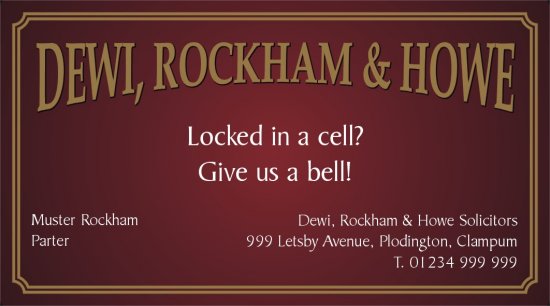
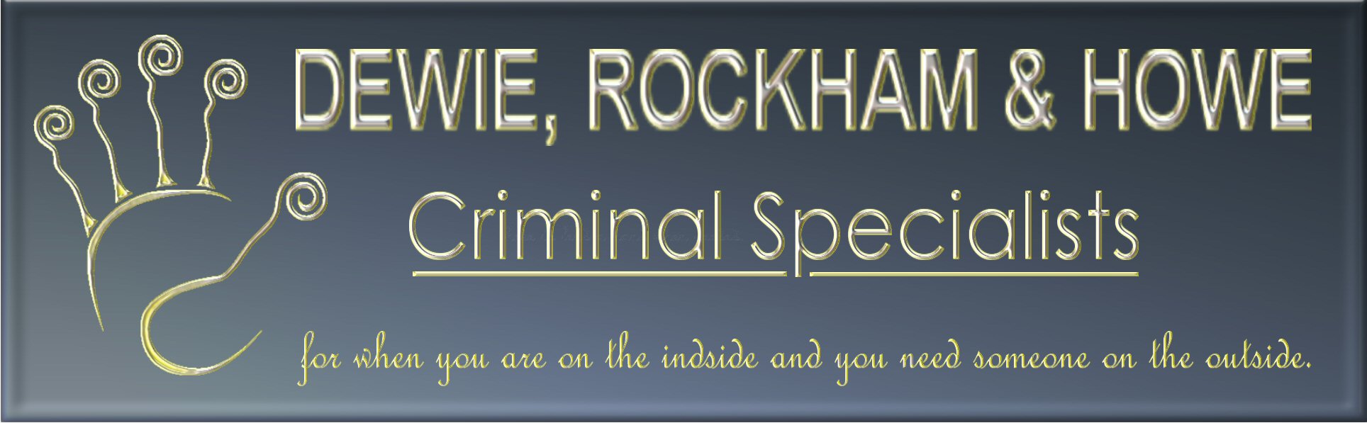
No worries 😀 Done my homework like a good boy, although I chose a business card – could be a sign I s’pose 😕
Cheers, Dewi
Attachments:
-

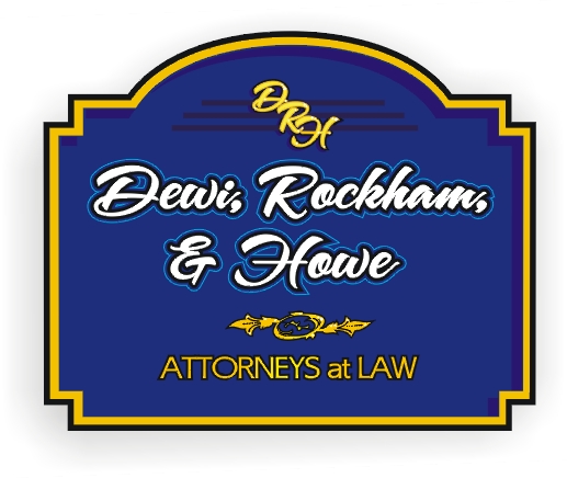
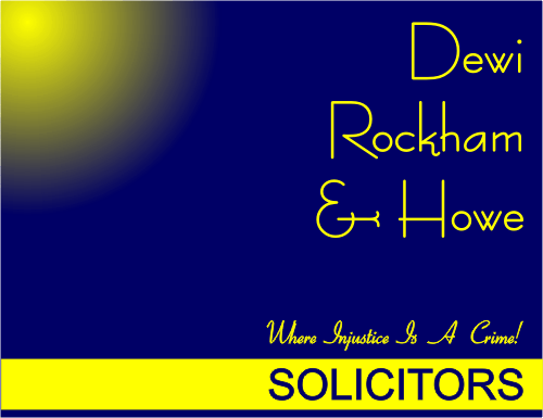
Yay! Thanks, Dewi. Nice job!
I knew I could count on you. Forgot the biz card one!
Here’s what I came up with, it helped to pass the morning. Any others?
Attachments:
-

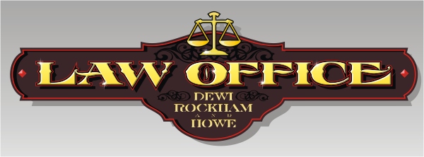
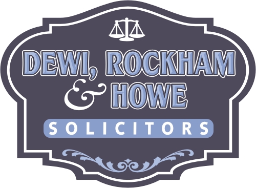
Here’s mine. Dimensional gilded letters for the main copy and surface gilded sub text. The scales will be dimensional too standing off the sign.
Stevo
Attachments:
-

my effort… not sure what it is at the moment.. i just had a play. 😕 :lol1:
Attachments:
-

coz im waiting and its more constructive than online gaming.
Attachments:
-

I think it would be nice if everyone stated what prog they had used.
It might temp me to port over to something better 😀 -
i only use signlab and photoshop mate. never ever see the need for anything else.
photoshop is pricey, corel has just as many if not more features and its better priced.
i use signlab for all vector work, photoshop for images.
hope this helps…
p.s.
if anyone else is replying, try keep this thread as it originated on design. maybe steve, dewi etc could edit their message box in their upload to show software.. not sure. just a thought. i didnt want this thread to drift onto software as the design submitions are good topic for this time of year. -
no no no mate… never meant it like that sorry! 😕
ANY REPLY in the site is welcomed… the reason i said this is… you gave GOOD comment… so much so ide expect folk like JILL, DEWI. STEVO AND MORE TO REPLY TO THIS. )sprry caps) anyway… many threads can sway off topic and my new years rez was to keep things in better order.. :lol1: :lol1:
jings, ive goofed aleady :lol1:
thanks for the contructive reply mate… no worries… honest 😉
-
just came back online after a short sleep…
had a look at this design i had done and thought…..eeeekkkkkk 😮not going back i=on my tatse, just think the design is absolute crap for this sorta company.
who says a few glasses of wine give you food for thought :lol1: :lol1: :lol1:
off to bed now. maybe have another go tomomorrow 😀
-
 quote Robert Lambie:just came back online after a short sleep…
had a look at this design i had done and thought…..eeeekkkkkk 😮not going back i=on my tatse, just think the design is absolute crap for this sorta company.
who says a few glasses of wine give you food for thought :lol1: :lol1: :lol1:
off to bed now. maybe have another go tomomorrow 😀
Don’t be too hard on yourself mate. I thought it looked pretty good.
You were obviously going for the minimilust corporate look :lol1:
Cheers
-
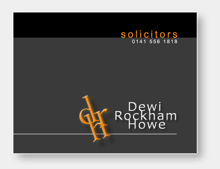
What the heck, had some time to kill and I was in Corel anyway. 😉
Attachments:
-

just a quick play this am
all designed in signlab
Attachments:
-

Brushed stainless steel case with raised s/s diamond shape
Flat cut acrylic lettering, raised for company name
Flat cut acrylic lettering, not raised for all other lettering & logo
It would be a double sided sign and illuminated from below:lol1: :lol1: I thought I would just add the details above so you dont just think its a grey sign 😛
Carrie 😀 …. almost got really carried away and started designing the sign base, grass and everything 😮 :lol1:
Attachments:

Log in to reply.
