Activity Feed › Forums › Sign Making Discussions › Graphic Design Help › what can i do with me new company logo?
-
what can i do with me new company logo?
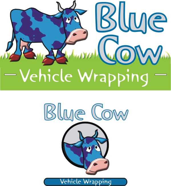
Posted by Blue Cow on October 9, 2004 at 11:04 pmHi People,
Just wondered what you thought of this logo design and weather you guys & gals my have any ideas to throw in!?
An comments on name as well as design also appreciated!
Cheers
Blue Cow!
Shane Drew replied 19 years, 7 months ago 9 Members · 36 Replies -
36 Replies
-

files way too big mate.. ide delete it and resize at 600pixels wide max…
😉 -

2 things immediately spring to mind: make the image about a thousand times smaller so it fits on my monitor, and lose the page curl. Other than that it looks quite chirpy, but will be easier to comment on when I can see it all at once. 🙂
-
from what i can see i would make the whole cow blue…. hence the name… i know it loses cow pattern effect but still looks 100% like a cow 😕
-

😮 Yup, please shrink it.
Normally big things are fun…but….
Now that my eyes have stopped bleeding,
*Please don’t make the letters in Blue Cow look like the cow.
(it seems redundant)
*The cow is cute, but can you make it wrapping something?
(that’s why I guess that edge is “peeling up”?
But to me, it suggests that your wraps will lift)
*The font for Vehicle Wrapping does not “go” with the blue cow font.
(it is far too formal, also italics are harder to read)…..just a bit of constructive criticism. I think your idea does have potential!
love….Jill -
ok i like the cow but would prefer it all blue.. horns a horn colour :lol1:
like jill says.. fonts are off… ide use the same font family.. not sure what one though.. e.g. helvetica bold BLUE COW helvetica vehicle wrapping..
that sorta thing..had too many beers nbow to think straight on this one lol
-
oh nearly forgot ide loose the curl of the vinyl like jill & G says.. gives impression your work curls back.. a wrappers biggest nightmare
-
Ok, now that I can finally see the durn thing
(thanks for resizing!!!)
I don’t like the off-center cow.
Hellvetica SUCKS!!!!!
Rob was merely suggesting using the same family…
I mean, I can’t presume to know what he was thinking, but,
I doubt he’d recommend Helvetica, even after a case of beer!
Pick a “fun” yet readable font.
Maybe just a lighter weight of what you have in “Blue Cow”.
I still like the “cloudy” cow.
But he needs to be connected to the lettering not
floating above it like a balloon in the Macy’s parade.
Think of how you wrap a package, with someone holding the string
down on the box with their finger. Could the cow be holding
down a knot on the “E” of blue, as if he was tying it up?
Love…jill -
Oops! forgot to add…
Perhaps placing the VEHICLE WRAPPING in a panel,
reverse cut, would be good, as it gives the words
“blue cow” something to rest on.
You’re trying to balance it now with those blue lines.
And I guess a cow WOULD have a hard time
wrapping something with its hooves…
Heck, now I need a beer!
J.
(drink1) -

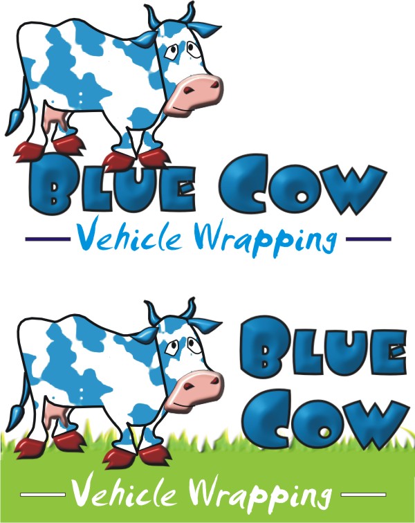
Thanks for comments Jill like the ideas!
How are these one’s?
Attachments:
-
lasy one looks good mate :point:
just being nosey
wheres the name blue cow come from (!)
-
Back again.
I like Kev’s cow.
While I like the grass idea,
the font on “vehicle wrapping”
is just nasty. It’s too trendy and illegible.
See how “readable” Kev’s is.
Altho I would still go with a bouncier font.
I’ve just woken up, and when I design,
I have to do it in GA cuz I’ve never
figgered out Corel. So if I do make something,
my cow will be different. I might just scan
a sketch if I can find where the kids put my markers.
Love….Jill -

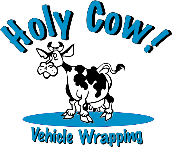
Call me thick, but what does the name ‘blue cow’ stand for?
I mean, I have nothing against the name in general, but will it confuse the public, the relationship to blue cows and vehicle wraps?
If you must go with the cow, it needs to be on grass or a base of some sort, otherwise it looks like some sort of hot air balloon!!
Have you thought of changing it to:
Holy Cow!
Vehicle Wrapping.It was just a thought… sorry!
Attachments:
-
Ok here’s my suggestion.
The Vehicle wrapping font is from The Fontry.
It’s black & white because I believe that
one should design in that style first,
if the design works the colors can come in second.
Just a capture screen from GA, hence the blurriness.
Love….Jill
Attachments:

-
some great stuff here you guys & Jill are great going to do some more work and post some more ideas!
-
Right some good designs there, i got some work to do!
Whats your views on the name not keen on that holy cow it seems to be missing a halo!! :lol1:
Just through any ideas down the name ain’t set we just thought it would work! cows normally black & White but we are doing something unusual eye catching and imaginative! we also just wanted to incorporate an animal for the purpose of a logo! can you kind of see were we came from!?
Did play around with the name “Dragonfly”
The one thing that worries me is if it sound professional enough?
Views?
Cheers
Blue Cow
-

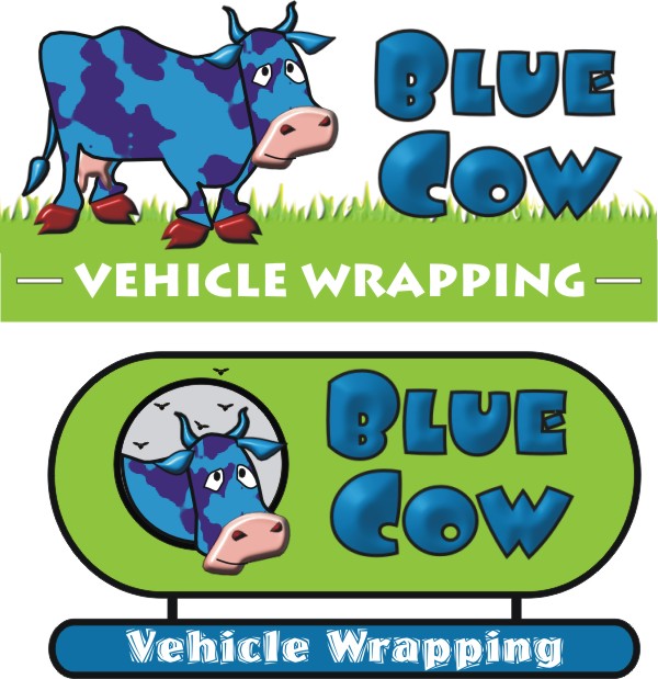
Here’s one.
When designing this I took into account your name and gave it that cartoon feel. It definetly has a fun name and cartoons are highly effective for catching attention. Hope it gives you some ideas.
Stevo
Attachments:

-
Good one Stevo. I always prefer logos that are ‘self contained’ like this.
-
hahahahahhahah Kev! Lesbian cows! The one cow needs some bull horns on it or just add some sort of apparatus(sp). 😮
Stevo
-

Kev :lol1: scrolling down and that was the last thing I was expecting to see!
Stevos looks good 😀
Everytime I see your name the childrens prog Story Makers jumps in my head … it has a main cartoon character called Blue Cow ….. she goes on an adventure in a magical bus every series, its on 3 times a day on CBeebies.
Carrie 😀
-
😮
:lol1: :lol1: :lol1:
im saying nothing…
oh of course its just a drunk cow getting helped home by its freind? 😕
what? 😮
.
-
:lol1: :lol1: I know I may have sounded a bit loopy back there but honest look…..
http://www.bbc.co.uk/cbeebies/storycirc … ow_s.shtml
Not hijacking the post or anything … sorry 😀 just thought I would mention my thoughts …. not always the best idea, but I did think I couldnt possibly go wrong or dig myself in any big holes with this one 😛
Carrie 😀
-
Too many farmers round us here Kev if i had the on a van they would never get any work done!
Hows about these ones!?
Any one got any ideas on a different name that they think may work?
Cheers
Signboarders!
Attachments:

-
ide say so far i like the very last you have done and stevos…
the one above the last and some others give me the impression of a milk carton. 😕 sorry….
i know where your coming from when you have come up with this name but im not 100% that it ties with this sort of thing. wrapping i mean…
the name could be over trendy if thats the way to put it… im not making sense i know… 😕if you only wanted to deal with our trade & only our trade then i think the name would work.
but… i would imagine you want the public to hire you as well.. e.g. the guy down the road wants his van wrapped. hes seen it done on other vans but doesnt know where to get it?
this is were your name etc will not do you justice. the logo and name do not spell out what you do. vehicle wrapping could mean anything to joe bloggs.,.. the cow will through them further off…
what i am trying to say is.. you need something that spells out what you do to the guy sitting behind you at the traffic lights reading your van… -
I like the last version…(MUCH nicer)
but with the first font, possibly arched over the cow head.
Make the vehicle wrapping panel bigger and closer.
Still don’t like that font.
Tighten it up.
The cow is not the priority.
(of course I prefer Stevo’s but I am biased)
Love….Jill -
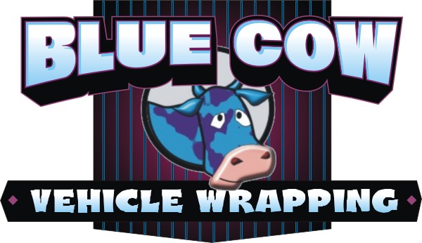
The last one is getting there Mr. Cow. I do have some more suggestions for you.
I find that letterstyle you’re using to be “wimpy”, so a nice bold font I think would work. Dont be afraid to be loud! We do want to get noticed.
Here Ive used a really bold font and pushed it out even further with a perspective block shade. Your version is really loose looking with nothing really tying them together so I opted to try a panel in the back to put them together. I did have a bit of a struggle with the cow in the circle it leaves alot of space on each side of it and when you put it in between your copy it breaks it up way too much.
I’d like to see if you could maybe put it off to the side like I did in my earlier version to group up the text more. Your name and what you do should be a bigger priority than the cow.
Well I hope this helps you out more Blue Cow.
Good Luck in your new venture.
Attachments:
-
Some great ideas here.
I don’t blame you on the holy cow name in retrospect. It was midnight here when I came up with that brain storm. Needless to say that I don’t think well when I am tired. Forgive me.
I love the cartoon style logos that have been done. I think Stevo has some good ideas. Your right to include a graphic. If you are in a farming community, cows probably relate well.
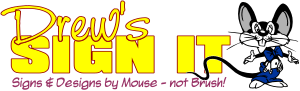
I use a mouse as my logo. It is a play on words.
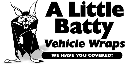
With wrapping in mind, have you thought of a bat? the way it wraps itself up with its wings. Stay with me people, it is getting late here, but I am hoping my brain is still in reasonable shape at this hour.
Shoot me down in flames if you like. I can take it. I am married after all!
Cheers
-
This is my logo as an example of the bat thought! 🙄
Attachments:
-
Me again, now it is getting late, but I thought the bat theme could go something like this 😛 😳
Attachments:
-
Love the bat!
Great stuff dsi i will head back to the drawing room and nail down the name with the other partner and re-look at the logo’s, any more stuff/advice you guys/gals can give would be much appreciated always listening!
Will show you more designs etc soon so keep checking’ as i will be!
Regards
Blue Cow
-
Thanks BC
The bat is from the Beeline disc.
cheers
Shane


Log in to reply.
