Margaret Calvert – a retrospective and a new railway design
The work of the iconic designers of post-war Britain is the topic of a new exhibition, not just looking back at her work, but forward as she has designed a new font to be used by Network Rail.
Margaret Calvert is one of those legendary figures in design, and long before architects had worked out crowd flow through buildings, she was designing wayfinding signs and working out the best way of communicating information to already overloaded brains.
She famously started work in the post-war years as the government decided it wanted to clean up the miss-mash of random street sign designs as part of the exciting new future of the motor car and the motorway.
In that sense, there can be few people who have had as big an impact on how the UK looks than she has. Her fingerprint is on every street corner across the land, in every railway station, in the airports and hospitals. A miasma of design that flows unnoticed yet essential around our daily lives.
The road signs that go far beyond simple wayfinding – and over time become familiar, even friendly landmarks along a journey. They may say, Doncaster, Services, A1M, Lossimouth – but what they really mean is “just 30 mins to granny, nearly at the football match, phew busting for the toilet”.
The ease of finding a toilet in an airport, or a hospital, or on the railway — the familiar ideograms that we see without noticing and yet are so familiar that we immediately know what they mean and take action at an often subconscious level.

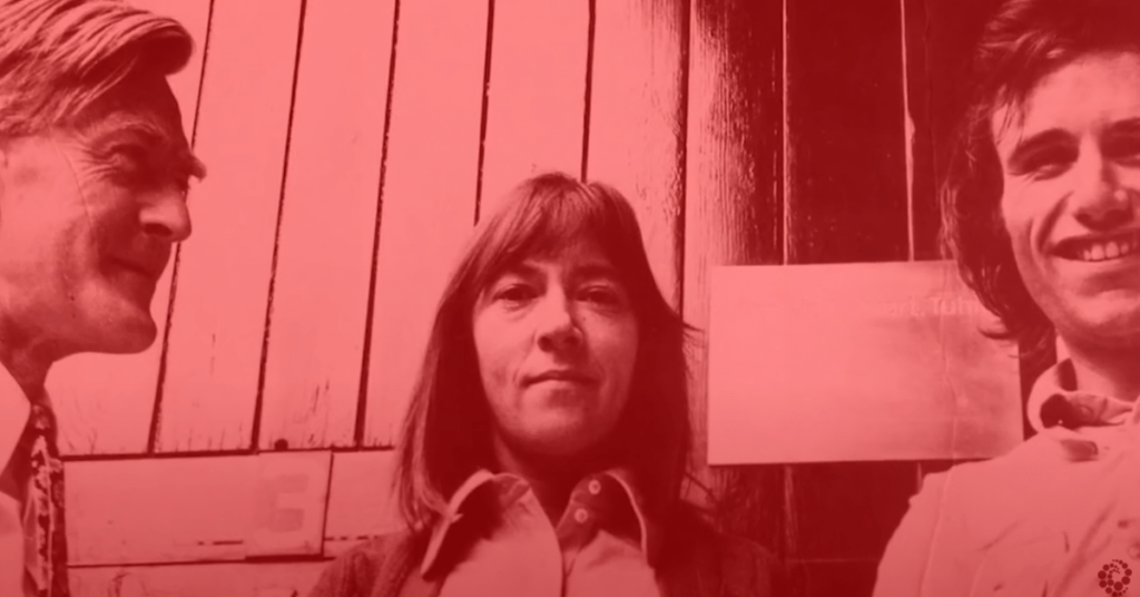
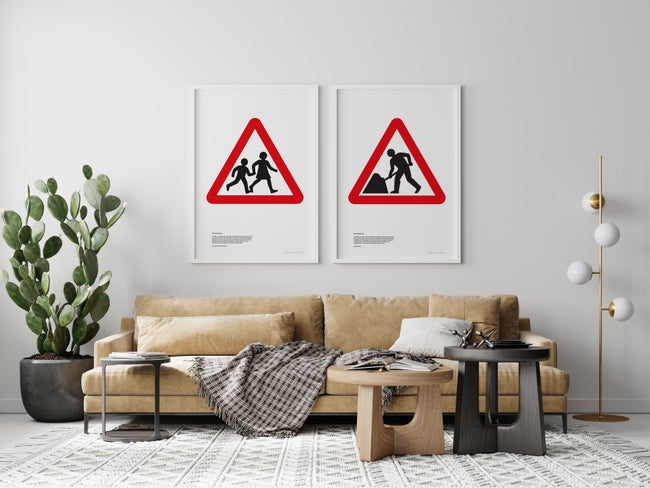
She even features in one of them — as the little girl in the warning sign for children.
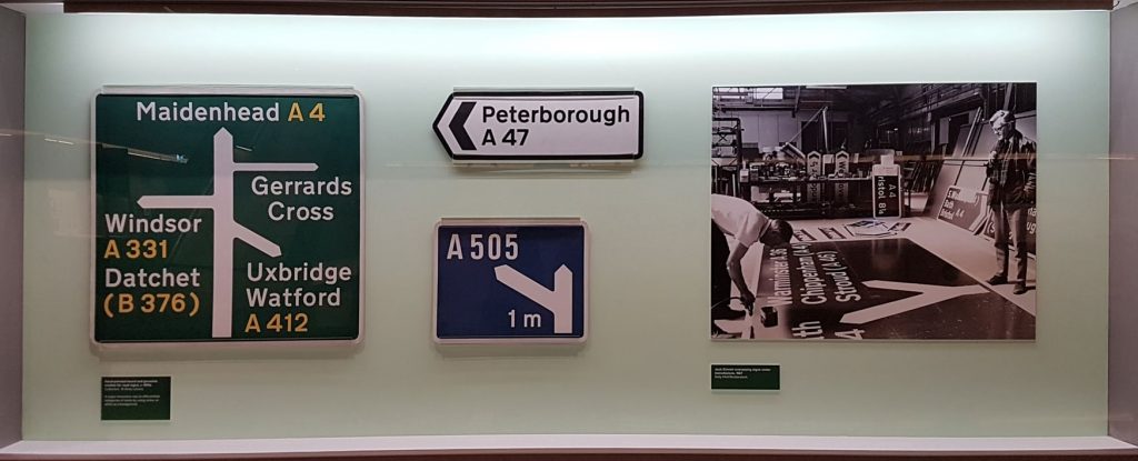
The exhibition trots through all these, from the early days winning the commission for the motorway signs, alongside insights into why some designs work, and others failed. A page open in a book shows the terrifying mess of road signs she cleaned up.
A video of the day she drove along the M1 for a preview reveals that she got so excited about the signs that the car overshot the end of the motorway and ended up in a field.
For many people, it’s the railway wayfinding that she’s most famous for, and was so good that it was used by the NHS before British Rail had started to roll it out. Work done in that golden age of British Rail, that has slowly diminished over time as style guides were increasingly ignored by fractured organisations.

But a hurrah – for design, if not entirely neglected, was maybe a bit overlooked in the late 20th century is making a comeback in the railways of the 21st century.
There’s a small amusing note about the signs used in the display for the original Rail Alphabet, that they couldn’t use that font for their display because it’s not compatible with their digital sign making. And that is part of the reason why Network Rail commissioned Rail Alphabet 2, to tidy up an old wayfinding system, but make to make the font work on computers.
And Margaret Calvert was asked to design it.
This exhibition is also, therefore, the launch of a revamped wayfinding system for Network Rail – Rail Alphabet 2.
Many of the subtle changes are shown here for the first time, the sort of things that would be difficult to notice unless pointed out but make you nod in appreciation as to why they’ve been done. You’d probably never notice that many of the curved rectangles in the symbols match the p and d in the letters, but in doing so, a coherent design from icons to letters is created.
New icons were needed. They didn’t have hire bikes, or vaping, or Wi-Fi in the 1960s, and even existing icons have had a slight revamp — the taxi looks a bit more modern, the baby changing sign doesn’t assume it’s only women’s work.
It’ll take time to roll out to the entire Network Rail estate — likely to be Liverpool Street first — and with luck, no one will even notice the change. Fewer people looking around for where something is the impact the new wayfinding will have. It’s clever enough to make a difference but subtle enough to be instantly familiar and comfortable.
And that’s the best design
The exhibition, Margaret Calvert: Woman at Work is open at the Design Museum from the end of lockdown until 10th January. As it’s only open Mon & Tues unless you are also visiting the Electronic Music exhibition, best to reserve a ticket early.
Just as the original British Rail corporate identity manual can be bought, I hope the new Network Rail manual is also made available one day.
One comment on “Margart Calvert – a retropective and a new railway design”
J.P. Says:
From the fonts in Fleet Street at Saint Bride’s to the clarity of Calvert, I’m back in the basement at school with the “padush, padush” of the aged playbill printing machine. Also back in the back of the car on a Christmas car journey. Joyful!
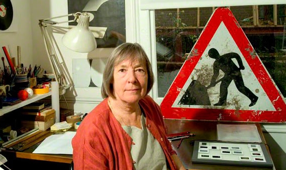
Margaret Calvert’s simple signage looks effortless but probably wasn’t.
As for NR ‘dot matrix 2.0’ not being able to recreate it as clearly, it must be a question of cost and finesse. Or are we (just) still ahead of the robots?
Not sure that the new symbols aren’t a little childish as a result though.
Think that the bus symbol looks like a luggage trolley even though there’s the sign for one just by it in the example. And where’s the motorbike flying over the taxi?
Source:
Ian Mansfield
ianvisits.co.uk

Responses