Working with colours in sign design


When starting a new design I always begin by designing it in black and white. Then later once the design has been finalised I bring it to life with the use of colour.
Colours really do make a big difference. Poor colour choice can ruin what may otherwise have been a perfectly good layout (unfortunately, the reverse is not true – colours cannot fix a layout that is fundamentally flawed by being poorly set out).
Fortunately, we all have a natural instinct as to what are good colour choices. We instinctively know when something is wrong (this is not the case when it comes to producing layouts. This is a skill that has to be learned).
A good guide to choosing colours is to copy what we see in nature. When something looks wrong it is often because it is a colour combination that doesn’t occur naturally
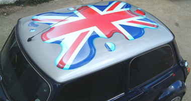
A fundamental mistake is to use red and blue together
Picture 1
The result is obviously wrong, and anyone who is colour-blind would probably just see a dark rectangle.
However, this colour combination can be easily fixed by separating the two colours with the addition of a white outline.
Picture 2
Not only have we cured the problem, but the colour combinations we have used actually look very good together. This demonstrates the importance of using context in colours.
Individual colours are perceived differently depending on their context i.e. the placement of other colours in the design
In the next example, we have a similar problem.
Picture 3
Mike Stevens (Author of “Mastering Layout”) said “Poor contrast in value (lights and darks) is the most common error in the use of colour”
In this extreme case, the problem is down to a lack of contrast. The yellow colour is too weak to be easily seen against the white background
But again this can be easily fixed with the addition of another colour in the form of a black shadow. Demonstrating again the importance of context when placing colours in a design
Picture 4
In the next example, we have attempted to fix a lack of contrast with the addition of a white shadow
Picture 5
The reason why this looks so wrong is because this would never happen in nature A shadow can never be lighter than the background that it is cast upon (Any shadow will always darken the background as in the next example).
Picture 6
Next a practical demonstration of a problem I faced last week. I was asked to add a telephone number and a website address onto the side of a double-decker playbus. The owner wanted it to stand out and be reasonably large, the problem was that the playbus had already been wrapped leaving little clear space to place the lettering. I decided instead to place it over the existing graphics but was faced with the dilemma of what colour to use.
Applying black lettering would leave little contrast in places
Picture 7
Applying white lettering would be even worse as in some areas there was no contrast at all (i.e white lettering on a white background)
Picture 8
The solution once again was to apply an outline of contrasting colours. In this case, a white outline around black lettering results in legible lettering throughout
Picture 9
Finally – I am often asked to advise on what colour combinations to use for maximum intensity and legibility. Below is the top 10 series of colour combinations (foreground and background) this is listed in descending order and based on scientific study. (Now you know why British car number plates are designed black on yellow)
Picture 10
I hope this demo is of some use to you…
Phill