How to make your Graphics look Weathered or Old, using cut vinyl.


When creating a design based on an eroded or weathered theme, I edit the actual text on screen using freehand shapes and welding. The most stunning results are achieved by employing reason and ‘real-life’ dynamics…let me explain…
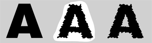
The easiest thing to do would be to take our letter ‘A’ (below left) and draw a freehand squiggle all around it (below centre) and then weld the two together to leave a ‘ragged’ letter (below right). The problem with this is that it just doesn’t look right as no real thought has gone into it – remember things often look right because they are right!
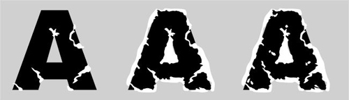
Let’s start again. This time consider what happens when the real damage occurs to lettering. The heaviest damage often occurs at the inside and outside corners and in the form of large impacts, whole pieces break away or large tears appear. (below left). The edge receives the most general wear but not all of it – many areas escape damage (below centre). Lastly, damage occurs across the face of the letter as well as at the edge (below right).
Here we see the result of our labour (below left) and it looks pretty convincing for all the right reasons. Remember that we read text by scanning familiar shapes and envelopes – not by interpreting individual characters. If we degrade these shapes too much then legibility suffers and the text is not easy to read. For this reason, do not erode the outer edges of the characters too much. There are various forms of erosion – sometimes it occurs by repeated abrasion from one direction and even from one side or angle (below centre). Some forms of erosion are severe (below right) and take the form of total fragmenting of part of the letter, various fissures and splits and maybe even large areas missing! Where the latter occurs – try to maintain the shape of the original character by leaving certain edge pieces…With only a little practice each letter can be completed in less than 30 seconds.

Here’s one example of a general weathered pattern. There is more damage to the face area of each letter than to the edges – thus maintaining legibility.
Here’s an example of a phrase that has received lateral erosion to both the text and the shadow – note the shadow is not a simple offset copy of the text but has been worn sympathetically to that damage shown on the text.

both of which have then had highlights and lowlights applied for added effect…
I hope this general description of weathering has helped with the task at hand and with future projects too…