-
wrapping own van what do you think of the design?
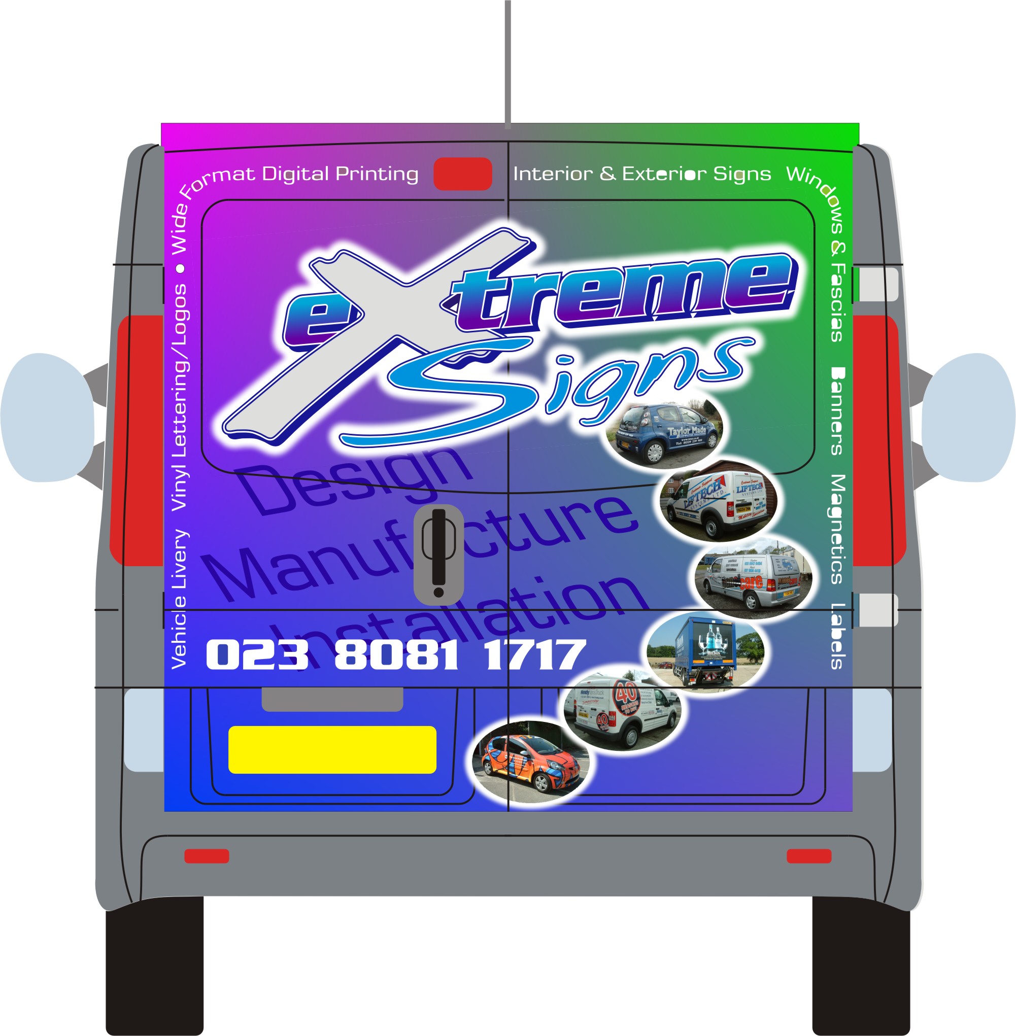
Hi
now that I have upgrade membership, I figure I should make use of the facilities, so here goes
Before we print this, can I get your comments please!! (good or bad)
Attachments:
Log in to reply.

Hi
now that I have upgrade membership, I figure I should make use of the facilities, so here goes
Before we print this, can I get your comments please!! (good or bad)
Attachments:
Log in to reply.
Please confirm you want to block this member.
You will no longer be able to:
Please note: This action will also remove this member from your connections and send a report to the site admin. Please allow a few minutes for this process to complete.