Activity Feed › Forums › Sign Making Discussions › Graphic Design Help › would like your comments on this layout please?
-
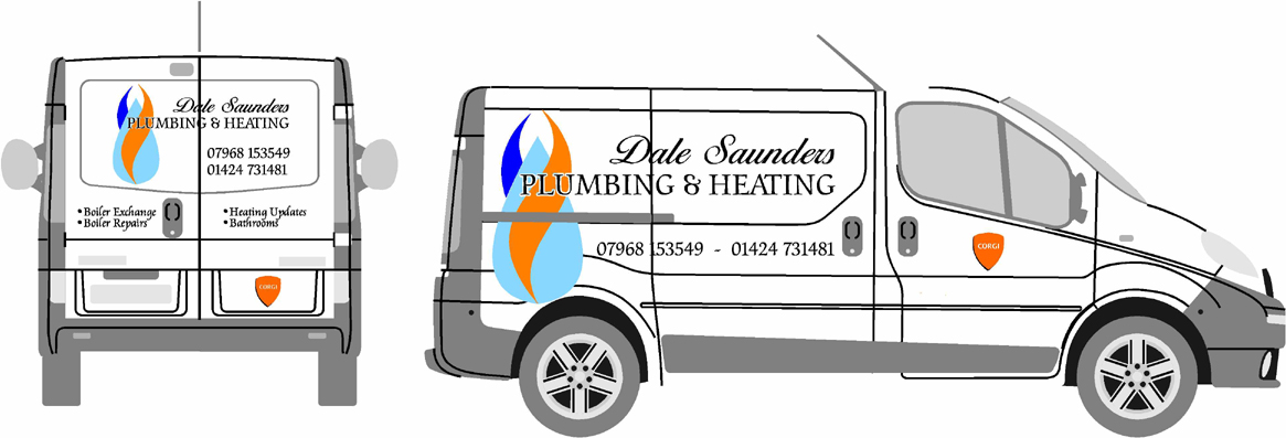
would like your comments on this layout please?
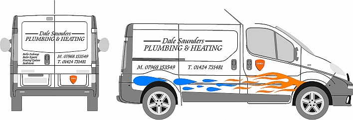
Posted by Matt Hards on October 12, 2007 at 3:28 pmHi there,
would like your comments on this layout.
his old van that i did was very plain text only,
wanted to try and liven it all up alittle.
let me know what you thinks, cheers matt
Attachments:
 Glenn Sharp replied 16 years, 6 months ago 11 Members · 16 Replies
 -
16 Replies
-

Works for me!
Looks classy yet contemporary.
Love….Jill -

thanks jill,
if you say it works then it must do, lol
i just hope the customer agrees, quite looking forward to doing it now,:)matt
-

I like it too Matt,
The flames and water is that meant to be a boiler blowing up. You could write, "give me a call if this happens" underneath.
Nice font too
Steve
-

sorry to go against the grain mate but I’m not keen on it.
the font has too much of a slant on it. if not just on the main text ide at least drop it on the contact details etc.
in my honest opinion, the flames etc just make it look like boy racer versions of hot-rod graphics… sorry, i know that’s probably coming over as pretty negative, I’m not trying to be rude, just not sure how else to explain it.
If nothing else ide do away with the flames and water…
a much more subtle approach on water and flames would be far better and more company like… -

Hi matt
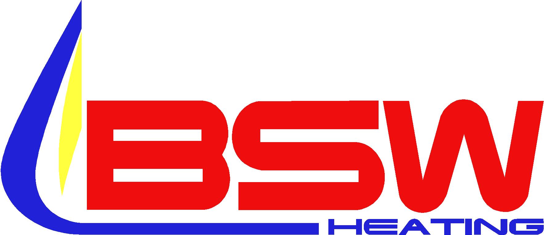
I have to agree with Rob on this one, if I were the owner of this business or a customer in need of plumbing and heating I would also think a jack the lad boy racer and very unprofessional image for a plumber. I can see a flame being used as I have done of a company of heating engineers please see an example
This is just my opinionRich
Attachments:
-

I agree with Rob & Rich….sorry
The layout sort of works because you have kept it simple, although I don’t think the font & the angle of it works with the flames & water as Rob has said.
I’d be carefull because even though you are pleased with it & your customer may even love it…. I just don’t think the majority of the public will…as has been said it looks a bit jack the lad & unproffessional to me
-

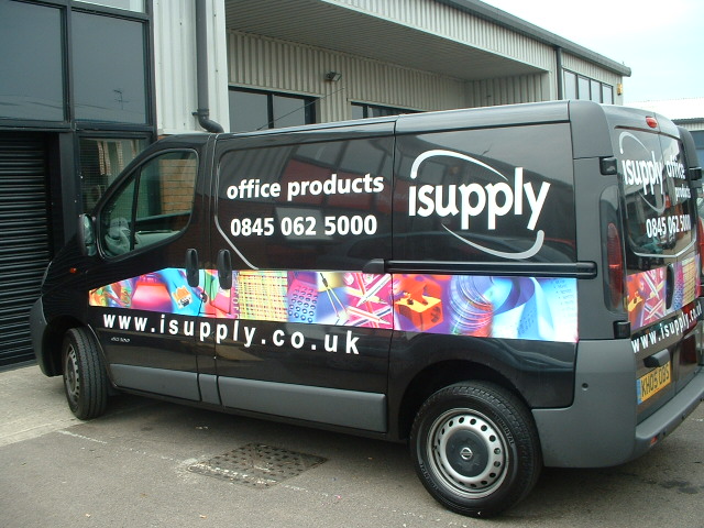
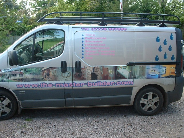
couple of vivaro’s I have done, instead of plain text a portfolio of their work down the sides, hope it helps a bit!
Attachments:
-

chris
builder
pink
?????????????
i often joke with the customer and say
colours sir what takes your fancy a nice shade of pink then, or hot pink.always a smile
-
all his choice not mine, he wears pink shirts too!!!
in fact i deleted from my website at one time, like the walk round portfolio though -
I really like the isupply one……clear, legible & contempary
-

One of my heating engineer customers told me never to use red. That signifies a dirty flame and inefficient combustion. Gas flames should be blue.
-
hey guys, taken on board what you have said, so have scrapped the flmes, and i have come up with this logo, and layout, is this better do you think?
matt
Attachments:
-
Matt…I think that one works much better……the only thing is ….the first thing I saw when looking at the logo was a viking helmet….sorry 😳
when John mentioned the blue flame I imagined something like this…
Attachments:

Log in to reply.
