Activity Feed › Forums › Sign Making Discussions › Graphic Design Help › would like some comments on my company logo please?
-
would like some comments on my company logo please?
Posted by Warren Beard on January 19, 2007 at 10:50 pmHi Guys
I am new to this sign stuff, so new in fact that I haven’t even produced my first job yet.
I would really like some comments on my company logo and I would like to explain about it.
I wanted to keep it simple and bold and fairly contemporary, I thought that doing this "simple" style it can be used in any and many different colour combinations and it can developed in the future.
The graphic images won’t always be used and only the black background with blue text will be the main logo. (for a sign I’m thinking of a gloss backboard with illuminated blue raised blue logo, I think it will look very contemporary)
Is this a bad way to do it as I know your company sign is your advert and should be really striking and get potential customers to notice you and want to use you.
How far off the mark am I? I have had many ideas about a major complicated logo that would have to be printed instead of just cut.
I’m babbling on here so I will leave it to comments and take it from there.
Thanks for your help.
Warren
Attachments:
 Martin Pearson replied 17 years, 3 months ago 24 Members · 82 Replies
 -
82 Replies
-

You have done well. LOVE the tag line! My choice would be logo2 business card. Not sold on the font though.
It is a good start tho. 😉
-

Thanks for the response Shane
I’m not to sure about the vehicle layout, I can’t afford to sell this car as it is only 6 months old (got it for sales position at my full time job) I would lose too much money if I sold it now, so I have to live with it for a while. I’m not too sure what else I can do with it besides keeping it really really simple or do you think this looks OK?
Thanks Mate
Warren
-

its friday mate, im drinking :lol1: i cant think straight… im relaxing 😳 :lol1: :lol1: :lol1:
ide say forget the gun thing/gimmik
nothing wrong with it and just is curiosity, how did you come up with the name?
-
quote Robert Lambie:its friday mate, im drinking :lol1: i cant think straight… im relaxing 😳 :lol1: :lol1: :lol1:
ide say forget the gun thing/gimmik (That’s what I thought but it tied in to the “don’t hold up customer” part, I think I will lose it though, guns are a big no no here, unlike SA)
nothing wrong with it and just is curiosity, how did you come up with the name?
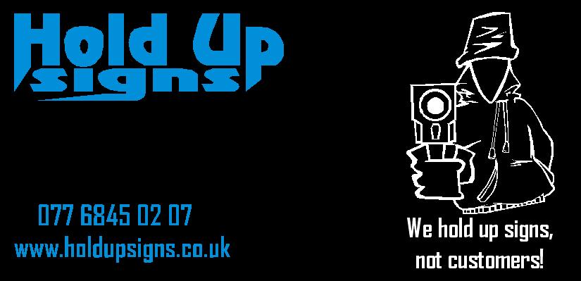
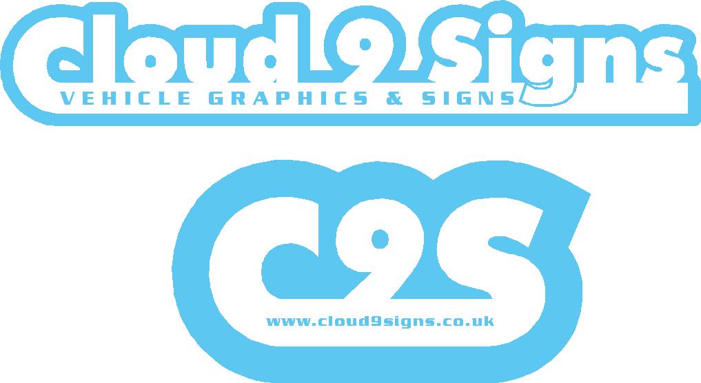
My first company name ( artwork attached) was going to be "Cloud 9 Signs" OR "C9S" for a short logo, then I came across the picture of the hoodie man with the gun and thought up the slogan "We hold up signs, not customers", the slogan then turned in to the name when I thought it was a good play on words to "Hold up signs" and the "hold up customers" gimmick?
Why —– GOOD or BAD ????? 😮
Attachments:
-
quote Robert Lambie:its friday mate, im drinking :lol1: i cant think straight… im relaxing 😳 :lol1: :lol1: :lol1:
Oh and I’m really very sorry about that mate but have a moment of silence for me………………….I’m allergic to alcohol , I get bad rashes and high temperature with bad sweating if I touch the stuff (Had to sneak appletiser into my champagne glass at my wedding for the toasts, I’m so sad I know. 🙁 🙁 🙁 😮
-
These are the others I came up with, the black and blue ones in my first post are my latest and the ones I have based my website on, I can change it though as I do it all myself.
I really appreciate all the comments guys and sorry to disturb the drinking 🙄
-

Warren,
no need to be nervous, the people on the boards are like a family, and if you ask for advice, I and others will offer it as best we can.I think Rob was referring to "hold up" it does infer to a percentage of people, robbery. So to be quite honest, although i can see the logic, in how you came to choosing the name, it may be a wrong choice. If only 10% of potential customers have thoughts that are similar, then that’s 10% loss of business.
Having said that, its now hard to comment on a logo that, in my opinion has the wrong wording to start with.
Is it too late to change your trading name?Sorry to be blunt
I could be way of the mark, wait for other opinions
Peter
-

I like the Name Cloud 9 Signs better too. But my main gripe with the Hold Up Signs is the font ……. 🙁 I hate that font. Sorry.
-
 quote Warren Beard:I’m allergic to alcohol , I get bad rashes and high temperature with bad sweating if I touch the stuff
god i wish i was ur such a lucky thing……… :lol1:
nik
-
quote Nicola Rowlands:quote Warren Beard:I’m allergic to alcohol , I get bad rashes and high temperature with bad sweating if I touch the stuff
god i wish i was ur such a lucky thing……… :lol1:
nik
You’re allergic to being sober!
-
quote Marcella:You’re allergic to being sober!
emmmm…….who was drinkin coffee tonight? :yikes: and who was drinking voddie 😀
sorry warren…back to thread yes i have to agree with the choice of font also, dont worry you’ll get there 😉
nik
-
im also with andy and marcella on this 1, the cloud 9 much better than the hold up, wife wears hold ups but thats another story 😛
-
quote Alan Wharton:im also with andy and marcella on this 1, the cloud 9 much better than the hold up, wife wears hold ups but thats another story 😛
Suspender Signs 😮
-
I disagree with the comments against the implied ‘robbery theme’. Its all about standing out from the crowd after all. You want people to make a comment either way, that’s the way to be remembered. I have a mouse as my logo after all, plenty of people thought it was stupid, but 6 years on, everyone in my area knows me by my ‘stupid logo’. Mine of course is a play on the computer mouse.
I prefer the option with the graphic actually holding up some signs – the gun theme WOULD reinforce the robbery aspect which would be a negative. But, that graphic is enough to explain the name quickly in ones mind. So what if people take it the wrong way. It WILL be noticed. You’ll find, like I do, that people will pull you aside and ask what the name (or logo) means . It will give you a good opportunity to talk to a potential client then..
I still hate the font though.
Cloud 9 does not work for me at all. Bit too feminine for my tastes. Just my 2c’s though.
-
quote Warren Beard:I get bad rashes and high temperature with bad sweating if I touch the stuff
so does rob, after the third breezer 😉
-

i like the second business card for hold up signs.
In my opinion you should change the font make it simple, but keep the illustration and tag line.
The blue and black looks good also.
-

Maybe you should think about your target market.
I can’t see big corporates being impressed with a jokey name, as it can give the impression that you aren’t taking their business seriously when, to them, it’s life and death.
Cloud 9 might give the impression that you operate in a dream.
Sorry to be negative, I know how difficult choosing a name can be.
Cloud 9 is the best of the two though. imho.
-
Hi and thanks for all the responses.
I understand and agree with all the comments, I’m not sure how "jokey" the name actually comes across but is a good point.
Shane did make a good point though about being different and many people have commented about it being "catchy" and different, maybe there is a balance between "catchy" and "jokey"
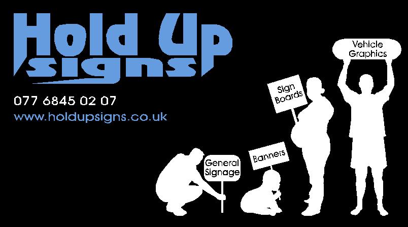
Personally I like the name and think I need to steer clear of the "gun" gimmick and stick to "people holding up signs" (New artwork attached)
With reference to "robbery" if the catch line is read it will clearly state that we DO NOT hold up customers, only signs, I think it might entice the customer to believe that they will get a competitive rate as that is what I am ultimately advertising in my slogan.
Like I said, I’m new to this so really do appreciate all the comments good or bad.
Oh, and a new font!
Thanks again everybody, more comments welcome.
Attachments:

-

I like the way you’ve contrasted a bold heavy font in the name (Hold Up signs) with a regular fine font for the contact details. This contrast in the font weights I always find very appealing to my eye.
I can’t decide if I like the name or not. There’s nothing wrong with it, but it could be miss interpreted. It’s almost a slur on other sign companies in your area (we don’t hold up customers – by implication others do?). I’m convinced you don’t mean it that way but your local competition may not look upon it too favourably and it doesn’t harm to stay on friendly terms with your competition.
Yes, on reflection I would go with another name but stick with the style of the design you have developed.
Good work though – well done.
-
quote Phill:I can’t decide if I like the name or not. There’s nothing wrong with it, but it could be miss interpreted. It’s almost a slur on other sign companies in your area (we don’t hold up customers – by implication others do?). I’m convinced you don’t mean it that way but your local competition may not look upon it too favourably and it doesn’t harm to stay on friendly terms with your competition.
Hi Phill
Thanks for your input Phill, you have a good point there, I will be needing my local sign companies for digital prints and so on and they might take offence to it (although if it gave me the upper hand is that not what we all like to have?)
Maybe I should do away with the slogan and rather only have reference to "signs being held up" in various ways instead of the criminal side of being held up?
Maybe a slogan like " Hold Up your sign with Pride!"
or
"We help you Hold Up Signs!"Cheers
Warren -

I would have to agree with Phill, as I am not to sure about the name either. Defiantly better with the graphic you now have but wonder also if this may limit your inquiries because people may think you specialise in this sort of thing rather than normal types of signage like vehicle livery, shop fronts etc.
I know it is nit picking and your adverts will include these sort of things but sometimes the customers don’t take the time to read the small print. -

if hold up signs is the way its going to go and not cloud nine, why repeat the name in the tag line, maybe something like ‘raising your image’ – anyway good luck with everything, i know how it feels mate, 2 weeks to go in my present job and then im going solo too, then you can be the veteren in the job and help me out 😀
-

Personally – I like the name ‘Hold Up’ better than ‘cloud 9’ as it sounds too ‘designery’ and ‘airey fairy’.
Like a few others – that font is not my favourite & on the black background the white characters show out more than the logo…and it just doesn’t ‘float my boat’ as far as the connection to a general sign company goes. If you were only making placards then the image is perfect…but it might dissuade potential customers who take a quick glance.
I’ve knocked up a couple of ideas – just my thoughts, with a bold font & simple colour scheme and strap lines to convey the customer getting something proud to hold up & getting good value.
Dave
Attachments:
-

I like the top one of your three Dave, the middle seems to say either courier or airline to me(but then it is saturday afternoon and my brain has turned to mush) 😀 😀
-
Hi and thanks again guys
Dave I like what you have done and it has got me thinking outside the box a little bit as I have been fairly stuck with focusing on the same elements. I also liked the top one most, I like simple plain things and that is right up my street, I was toying with the idea of red but sometimes red on black at night or in light can blend too much together so blue was my next choice which I still like!
I will more than likely drop all the images, it is getting over complicated and you don’t need them.
I have done a few other options to look at.
Thanks again guys and keep them coming, I think we might be getting somewhere.
Attachments:
-
Bottom one out of that batch for me mate…the top one takes too much ‘effort’ to read all the information.
A good tip – and I use this with nearly all of my vehicle livery / shop fascia customers is stand 6 to 8 feet away from the monitor…which one does it now?
Whether a business card, car or shop front, it’s got to perform a few basic functions:
1. Who you are
2. What you do
3. How to contactYou have all the elements, you just might be making it hard work for the punters to read!!
Think about reflective (even just halos) for the vehicle to really punch it out in bright sun or at night (what I did with my van).
Dave
-

Hello,
In your tag line it’s makes it sound like you hold up your signs, while everyone else fixes theirs to walls…
I also agree on the robbery theme of your name… your name needs to be more professional than jokey in this game.. unless you want the boy racers who wants a sticker of a mouse flipping the bird kind of customer…
That’s £2.50 please sir…..
-

Warren I also like the bottom one and I’m glad you have gone away from the placard thing, as people seeing that will just assume that’s all you do, I’ve been watching and the name seems to be growing on me, I wasn’t keen on cloud 9( maybe if you open a massage parlor as well you have the name 😉 ) have you figured out how it will fit on to your vehicle as well ? cause once you decide you will need to transform it to all your advertising media. I’t always easier to do it for a customer than yourself 🙄 looks like you are getting there.
Lynn
-
quote lifesigns:Hello,
In your tag line it’s makes it sound like you hold up your signs, while everyone else fixes theirs to walls…
I also agree on the robbery theme of your name… your name needs to be more professional than jokey in this game.. unless you want the boy racers who wants a sticker of a mouse flipping the bird kind of customer…
That’s £2.50 please sir…..
Hi Mate
Firstly, a tag line does not have to be literal, it is a play on words and if anybody thinks that all our signs have to be held up and not fixed to walls then I don’t know mate.
As for jokey names, I do not actually see my name as jokey or should I say any more jokey than many others out there, I am in no way knocking anybody’s names here but look at many of the others, a few off the top of my head,
"Lifesigns" !!!!!!
Star Signs
Signs of the times
D Signs
etc…these are all acconotations or play on words, I agree if I market my name as a jokey name it will be taken that way and that is why I am redesigning it to leave all the jokey bits out. Look at the new designs I’ve done and you can see the direction I am taking.
Thanks for the comments anyway mate
anybody else?
cheers
Warren -
quote Lynn:Warren I also like the bottom one and I’m glad you have gone away from the placard thing, as people seeing that will just assume that’s all you do, I’ve been watching and the name seems to be growing on me, I wasn’t keen on cloud 9( maybe if you open a massage parlor as well you have the name 😉 ) have you figured out how it will fit on to your vehicle as well ? cause once you decide you will need to transform it to all your advertising media. I’t always easier to do it for a customer than yourself 🙄 looks like you are getting there.
Lynn
Hi Lynn
Thanks for positive comments.
My thoughts where that if I keep it fairly simple it can be adapted fairly easy to other areas (ie: vehicle and stationary) If I can eventually get to a basic idea I will start adapting and see how it goes.
FYI: cloud 9 came about because my wife was trying to start her own business a while back and it was called "Cloud 9 Events", it was an event co-ordination business but never took off as she has found something she enjoys more.
Thanks again for the comments
Cheers
Warren -

first off mate i would like to say you have done very well
i like the designs you have come up with and the best part , giving it a go
i also like the design that David has come up withnow for the negative as i said what you have done is really very good i just hate the name
i don’t think it will do you many favors at all
however if it works you will always be rememberedand if you want work from companies that hoody and gun thing are sooooooo bad it may get you work from the street boys and there racing cars but that’s so not a good image
hope you don’t take this in the wrong way as its just my opinion -
quote Richard Urquhart:first off mate i would like to say you have done very well
i like the designs you have come up with and the best part , giving it a go
i also like the design that David has come up withnow for the negative as i said what you have done is really very good i just hate the name
i don’t think it will do you many favors at all
however if it works you will always be rememberedand if you want work from companies that hoody and gun thing are sooooooo bad it may get you work from the street boys and there racing cars but that’s so not a good image
hope you don’t take this in the wrong way as its just my opinionHi Richard
Thanks for the comments
I agree with you 100% and that is why I have now dropped all those pictures and the catch Fraze.
Even though I like the name it does not mean I can’t change now before it’s too late (Although I have bought the web names and web space) other than that it would not be a huge fuss.
I think I am going to delete the original posts as they are now totally out and people are getting the wrong idea
Thanks again
more comments are more than welcome, I do not get offended easily
cheers mate
Warren
-
quote Warren Beard:quote lifesigns:Hello,
In your tag line it’s makes it sound like you hold up your signs, while everyone else fixes theirs to walls…
I also agree on the robbery theme of your name… your name needs to be more professional than jokey in this game.. unless you want the boy racers who wants a sticker of a mouse flipping the bird kind of customer…
That’s £2.50 please sir…..
Hi Mate
Firstly, a tag line does not have to be literal, it is a play on words and if anybody thinks that all our signs have to be held up and not fixed to walls then I don’t know mate.
As for jokey names, I do not actually see my name as jokey or should I say any more jokey than many others out there, I am in no way knocking anybody’s names here but look at many of the others, a few off the top of my head,
“Lifesigns” !!!!!!
Star Signs
Signs of the times
D Signs
etc…these are all acconotations or play on words, I agree if I market my name as a jokey name it will be taken that way and that is why I am redesigning it to leave all the jokey bits out. Look at the new designs I’ve done and you can see the direction I am taking.
Thanks for the comments anyway mate
anybody else?
cheers
WarrenHi Warren,
Dont get me wrong.. my company name isnt LifeSigns thats my user name on here… If I used that name as my company name everyone would thing I was a part of Bupa… lol
😀
-
Sorry… THINK…. this wine is starting to make my fingers go funny
-
quote :Hi Warren,
Dont get me wrong.. my company name isnt LifeSigns thats my user name on here… If I used that name as my company name everyone would thing I was a part of Bupa… lollol :lol1: good point, but you get my meaning don’t you regarding names? It may not be the best but it’s the best that I could think of, all the others I thought of had been taken already.
easy on the wine mate 😀
-
Warren – I would’ve suggested you left the early posts so people can see the development and variety…sure some might still pick up on non-relevant topics, but on the whole it’s better to maintain whole threads and amend further down, maybe not as flattering as it can show some design work you might no longer be pleased with!
I suppose it’s only the first few that are gone.
Dave
-
quote David Rogers:Warren – I would’ve suggested you left the early posts so people can see the development and variety…sure some might still pick up on non-relevant topics, but on the whole it’s better to maintain whole threads and amend further down, maybe not as flattering as it can show some design work you might no longer be pleased with!
I suppose it’s only the first few that are gone.
Dave
Hi Dave
I know what you saying but I have done it for 1 reason,
The problem was that those first designs where giving people the impression that I am now trying to avoid and they only got that impression because they saw those designs, just like I would not like my customer to see them and get the wrong impression. I am hoping that I will get more comments on it as it is and get to see what people think of it now that they have not seen the others.
Hope that makes sense. ( I will put them back when logo is finalised to make thread complete)
Cheers
Warren -
quote :I am hoping that I will get more comments on it as it is and get to see what people think of it now that they have not seen the others.
hi warren you will find…people will give more input to your thread during the week…weekends are sort of ‘chill times’ for folk, well it is for me 😉
nik
-
quote Nicola Rowlands:quote :I am hoping that I will get more comments on it as it is and get to see what people think of it now that they have not seen the others.
hi warren you will find…people will give more input to your thread during the week…weekends are sort of ‘chill times’ for folk, well it is for me 😉
nik
Thanks Nicola
Something for me to look forward to then 😉
Cheers
Warren -
quote Nicola Rowlands:…..hi warren you will find…people will give more input to your thread during the week…weekends are sort of ‘chill times’ for folk, well it is for me 😉
nik
Yeh, only the die-hards* are on ‘after hours’, friday/saturday nights & 2am on a Sunday….
*replace with any words you deem fit….
….gonna top up my glass *drink*
-
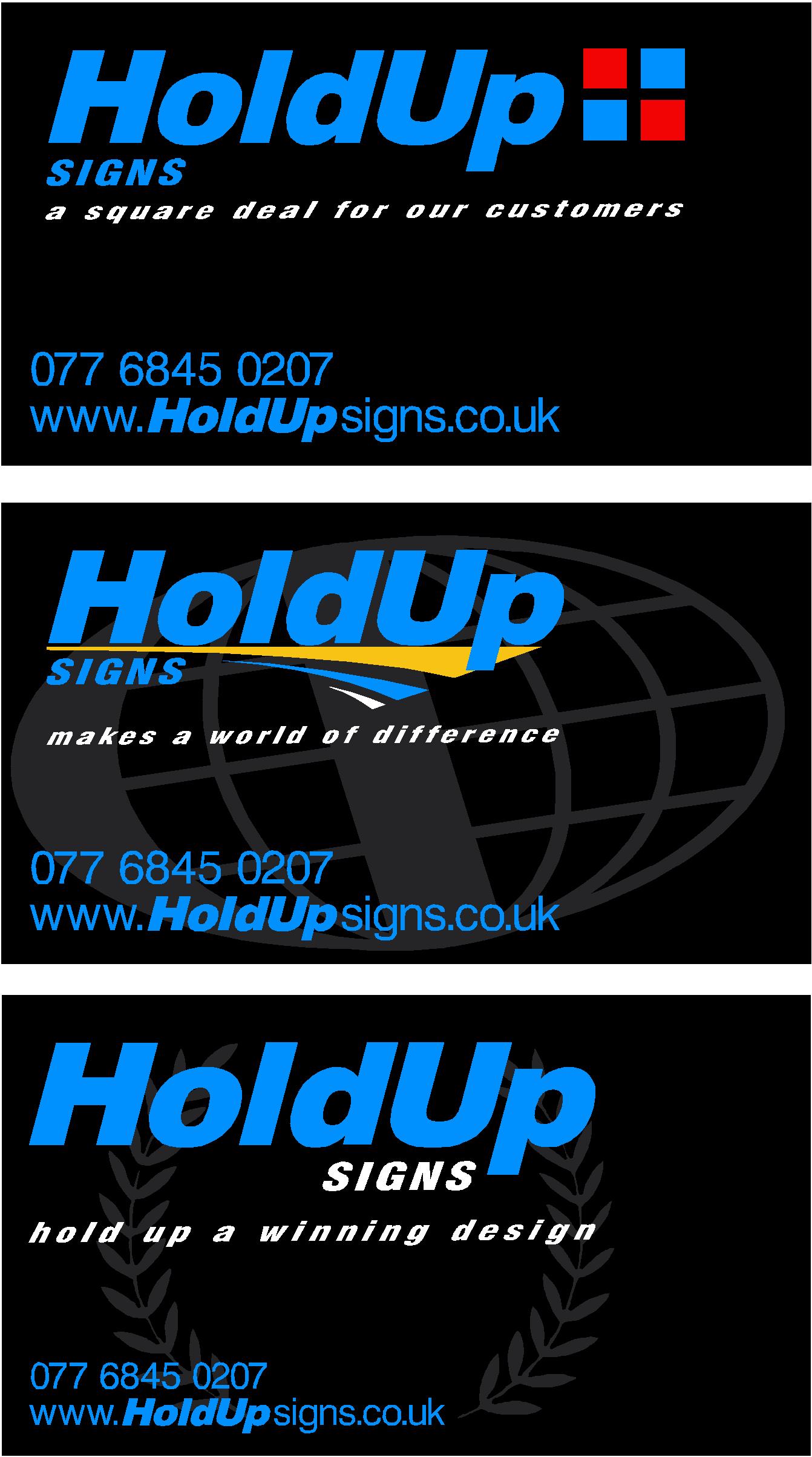
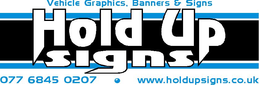
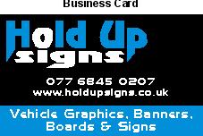
Hi Guys
These are my latest offerings, as you can see I am not having much luck with totally redesigning the logo but I somehow like the way this concept looks.
For all those who saw the first few please blank those from your minds as there will never be any reference to any of those old pictures or slogans and catch frases.
Please comment as your comments are really appreciated.
Thanks a lot
Warren
Attachments:
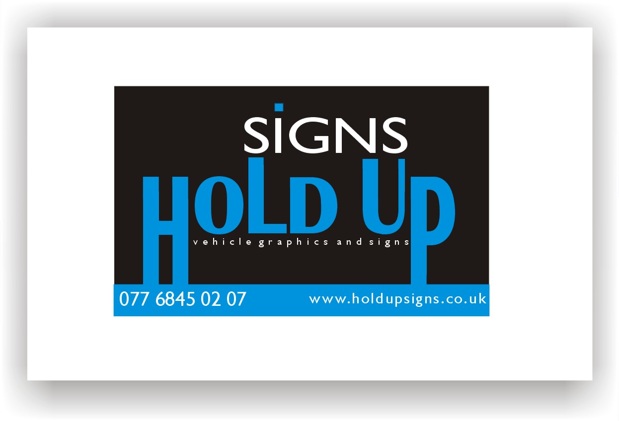
-
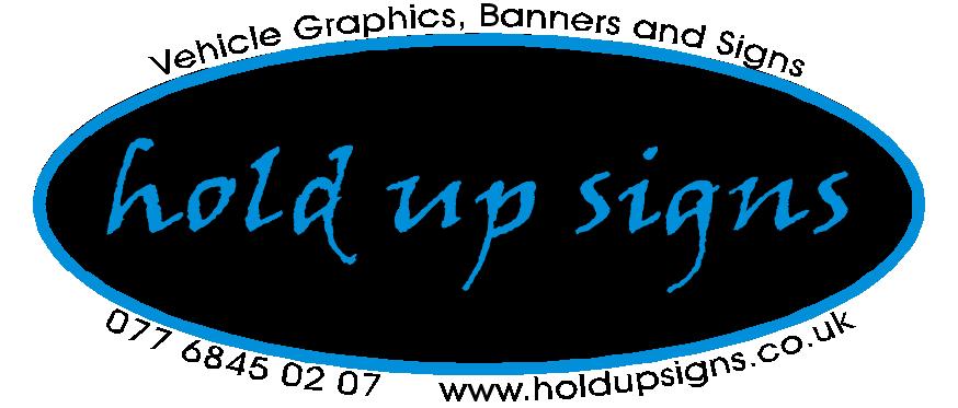
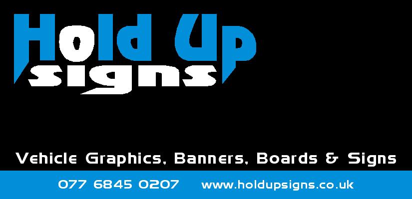
Hi Martin
Wow, I really do like that one. The only thing I don’t like about it is the "signs" above "Hold Up" it just doesn’t read right for my liking but I think it’s really really nice.
These are my last submissions then I need to choose one and move ahead with other stationary and sign my vehicle.
Thanks again to everybody who helped, it has been a roller coaster of emotions 😮 :lol1:
Warren
Attachments:


-

Hi Warren, I’ve been doing this on my own for 2 years and I’ve changed my logo twice (tch!). I feel particularly strongly that the lettering for the type of business has to be at least as big and clear as (if not bigger) the rest of the company name. I see quite often, for example ‘DAVID JONES’ in huge letters with ‘plumbers’ underneath in tiny letters.
So I can see from your last few examples you have the word ‘signs’ nice and large and clear which is good. I really like the ‘ovals’ design. I would go with that one, no problem.
Also, try not to worry if you have a similar or the same name as other companies, as long as you aren’t in the same road. I thought I was being hugely original when I thought up my company name but now know of at least 6 others with the same name, through mixed up deliveries from suppliers and ‘googling’ the name. It hasn’t made the slightest difference to me, as far as I know.
Good luck,
Gareth (and Isaac)
-
Hi Gareth
Thanks for the comments mate.
If you look at the posts before these I was trying to get the word "Signs" to stand out more than the rest of the text and I think they came out nice and bold in the white, however as you mentioned the last few are a little more creative and I also like the circle one (so does the wife 😳 ) I am leaning towards this one as it is also easy to cut and apply, I do however do also like logo option 6.
Thanks again
Warren
-
Warren do not forget to tell people what you do !!! that is almost as important as your name 😀 the examples do not put enough stress on what you are offering apart from your self jmho
Lynn
-
quote David Rogers:Warren – I would’ve suggested you left the early posts so people can see the development and variety…sure some might still pick up on non-relevant topics, but on the whole it’s better to maintain whole threads and amend further down, maybe not as flattering as it can show some design work you might no longer be pleased with!
I suppose it’s only the first few that are gone.
Dave
Makes my first post look a bit naff though 😕
-
Warren – of the ones you have produced – I prefer version 5, it’s the least cluttered & easiest to read. "Does exactly what it says on the tin".
The last batch may be visually ‘more interesting’ but your name is getting lost amidst shapes & text outlines.
You want it to hit the customer, first time, every time…not even half a second "eh?…what’s that?"
eg. Martin’s example – simple, stylish & effective. Gets SIGNS out in front, a big plus advertising point.
Dave
ps. try a few wild ideas, look on ‘brandsoftheworld.com’ for inspiration. Type in a letter or a word & see what it spits up!
-

I would suggest using a different font, as the "o" in the one you have reminds me of a toilet seat!
Your last effort has more impact, but still needs a bit of tweaking.
Something about the two ovals is bugging me.
It is a good deal better than the first design, however. The thin blue lettering could be virtually illegible in certain circumstances.
Love….Jill -
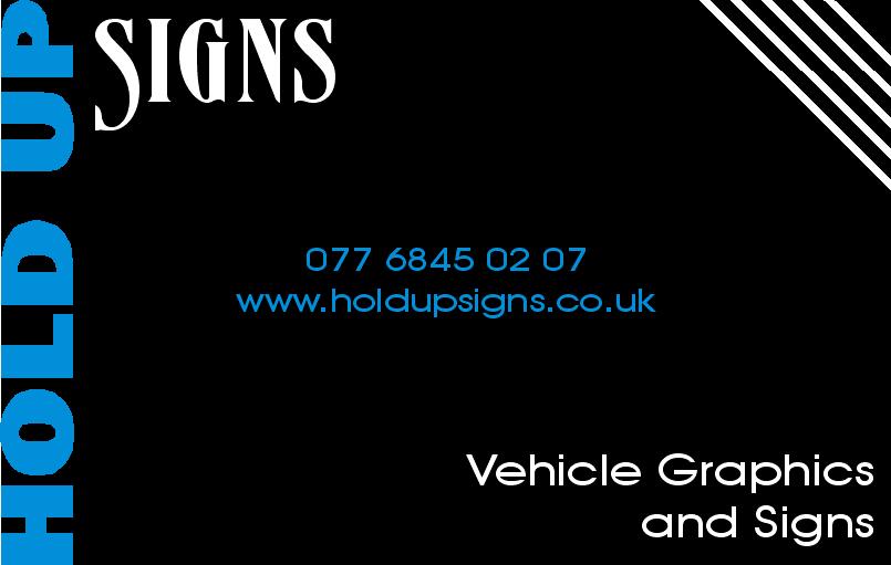
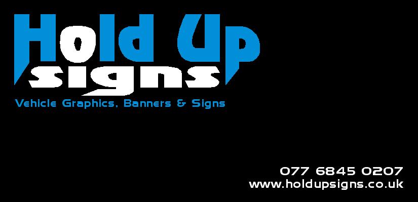
Hi Guys
Thanks for all the comments, I have decided that this is what I am going to go with for now. I think that even down the road if I tweak it slightly it won’t be hugely different so will be recognised as the same company.
I will however appreciate any other comments as like I said I will more than likely tweak it down the road. Unfortunately I need to make a decision and move forward and not get too hung up on this any longer, can’t make any money while sitting here doing 500 designs for my logo.
Thanks again everybody, I know I have a much much better design now that I have had all your inputs.
Warren
Attachments:
-

Blimey Warren, your head must be spinning after all that designing of one logo……I liked em ALL!!!! Go Get Em!
-
Warren, you seem to have kept with the same font for "Hold Up" through out most of your designs. A few people have said that they are not keen on it so maybe it might be worth trying a different font for your main text.
I would suspect that you quite like this font yourself which is why you have stuck with it and that is a personal thing. If you do try another font you will still get people saying they are not keen on it plus you will get others saying they preferred the original font !!!
On the bright side there is a world of difference from what you started with and you have been prepared to listen to others comments and make changes which shows you are keen to learn and get on. People like that will find they get a lot of help from this forum so you have made a good start.
Fortunately designing for other people is a lot easier than designing for yourself so after this everything will be downhill !!!!!! ……."NOT" -
you’ll probably get some Dick Turpin jokes tho xx
you can imagine what I get with GoGirl Signs Lol! -
Hi Martin
The reason why I like this font is only because of the layout of the words I created. I personally like the way it is with the "Signs" tucked in under the "Hold Up" Then when I changed the "Signs" to white it made what I do (ie: make signs) stand out predominantly and also incorporate the "O" of Hold" as the dot of the "i" in "Signs"
(Phew, some big words there 😮 )
I did try other fonts and layout but kept coming back to this, I had to try find a balance between everything everybody was saying as there was a bit of a 50/50 on all of them. The most important thing is I think I got all the elements right. What I do stands out (ie: signs in bold white) In bold white text states are the products I do and my clear contact details.
I hope it will be OK for now and if in the future I need to change it a bit I don’t mind doing it at all. Besides slight variations are acceptable because different items will need it to be adapted to it (ie: just like my stationary attached)
The people on this board are great and I respect everything they say as you guys are the ones out there doing it, I want to be one of those and one day be able to give somebody else the great advice all of you guys have given me.
Shane, your posts no longer look Naff as I put back the original designs :lol1:
Thanks again everyone, it has been much appreciated.
Attachments:


-
Ever since Jill pointed it out, all I can see now is the toilet seat 😕
-
quote Phill:Ever since Jill pointed it out, all I can see now is the toilet seat 😕
😳 me too 🙁
-

I really like the white and blue on the black background. But my only thought was how will you transfer your white / blue on black logo onto a piece of white paper i.e. for headed paper?
-
Please ignore that last post!
My browser updated when I posted my reply and lo and behold, right above my post is the answer to my question…..
-
sorry binnes, can you explain, I dont see a problem….
Peter -
quote Binnes:I really like the white and blue on the black background. But my only thought was how will you transfer your white / blue on black logo onto a piece of white paper i.e. for headed paper?
If you scroll up from this post you’ll see an example of how to put a black background onto a letter head printed on white paper!
-
Sorry Binnes
still cant see the issue, all of the posts above would print on paper, am a I missing something? -
Basically I was wondering how he intended to translate the graphic into a letter head, so I typed a reply and posted it, but as soon as I hit submit my browser updated and I saw the picture of the graphic as a letterhead…
I’m not sure I’m explaining myself to well!
-
quote Binnes:Basically I was wondering how he intended to translate the graphic into a letter head, so I typed a reply and posted it, but as soon as I hit submit my browser updated and I saw the picture of the graphic as a letterhead…
I’m not sure I’m explaining myself to well!
dont worry binnes i understand you ok…same thing happens to me all the time 😀
nik
-
Ignore me
I have senior moments, bit like nik, 😀 😉Peter
-
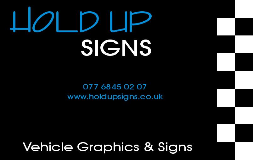
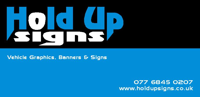
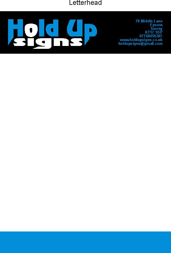
Hi Guys
Thought I updated my last design after the "toilet seat" incident 😮
The logo I have been using is attached and I’m very happy with it. I have put some basic signage on my wife’s car for the moment and will post a pic soon.
Thanks again to everybody who helped.
Cheers
Warren
Attachments:

-

One comment about your Letter Head / Comp slip. The address will not stand out as there is not enough contrast between the black and the blue text. What ever way you print it Litho or digital I personally feel it wont work with the solid black background unless you put some white shadow or outline.
Just my 2p worth.
Tim.
-
quote Tim Painter:One comment about your Letter Head / Comp slip. The address will not stand out as there is not enough contrast between the black and the blue text. What ever way you print it Litho or digital I personally feel it wont work with the solid black background unless you put some white shadow or outline.
Just my 2p worth.
Tim.
Hi Tim
The blue is not actually as dark as it comes up on the PC, it is clear on the printed stationary. I have worked in print for 13 years so made sure I made it acceptable.
Warren
-
Thank you from the "bottom" of my heart for getting rid of the toilet seat!
Looks much better now.
Love….Jill -
quote Jillbeans:Thank you from the “bottom” of my heart for getting rid of the toilet seat!
Looks much better now.
Love….Jill:lol1:
Thanks Jill, I also only noticed it once you pointed it out, I also think it looks much nicer now as it emphasises the "O" of the word "hold" and the dot of the "i"
Attached is a picture of my wife’s car I put some basic temporary signage and I like the way "signs" is very bold.
Warren
Attachments:

-
quote Jillbeans:Thank you from the “bottom” of my heart for getting rid of the toilet seat!
Looks much better now.
Love….Jilldon’t you mean from "the heart of your bottom," Jill
😉
pedro
-
quote Peter Normington:quote Jillbeans:Thank you from the “bottom” of my heart for getting rid of the toilet seat!
Looks much better now.
Love….Jilldon’t you mean from “the heart of your bottom,” Jill
😉
pedro
Hey Peter, leave Jill alone, I bet her heart is as sweet as her bottom 🙂 :lol1: 😳
Warren
-
Warren, it looks OK to me, its neat and tidy, gives the potential customer all the info they need, took you a while to get to what you have now but as this will be with you for some time it is worth taking a bit more time over and getting it right. As I said before designing for yourself is always much harder than designing for someone else.
One comment and this again is really personal choice, I would have used silver rather than white on your wifes car, I always think white looks a bit cheap and silver gives a much better image.
-
quote martin:Warren, it looks OK to me, its neat and tidy, gives the potential customer all the info they need, took you a while to get to what you have now but as this will be with you for some time it is worth taking a bit more time over and getting it right. As I said before designing for yourself is always much harder than designing for someone else.
One comment and this again is really personal choice, I would have used silver rather than white on your wifes car, I always think white looks a bit cheap and silver gives a much better image.
Hi Martin
Thanks for that, I only used black and white because that is what I had, I reversed the "Hld Up" part out so it would be red. When I do the signing for my vehicle I am planning on using white reflective for the word "signs". Silver is a good idea for the balance of the white but this also won’t be the layout I use for my vehicle, I’m still working in that.
Thanks again
Warren
-
Warren there is absolutely nothing wrong with what you have done and it’s not wrong to use white at all. As I said in the other post it is a personal thing and I am sure some people will come along and say it looks better in white than it would in silver, thats the nature of this business.
As for the reflective white that has a sort of silvery look to it anyway but just remember that if you put your logo on the back of your vehicle you are not suppose to use reflective white as it is classed as showing a white light at the rear of the vehicle which is an offence. -
quote martin:if you put your logo on the back of your vehicle you are not suppose to use reflective white as it is classed as showing a white light at the rear of the vehicle which is an offence.
Hi Martin
Thanks for the advice, i suppose in that case reflective for the sides only then!
I know everybody has their own personal opinions and I would still be doing design options for my logo if I didn’t just decide what I wanted (with advice from others) and move forward. I am happy with the design of my logo although still have my doubts about the name now. I will see how it goes and hope my work speaks for itself and people won’t care what the company is called, I still like it anyway.
I might have to add a new catch phrase to make it clear
" Our signs hold up your company name!" or something along those lines.
Cheers
Warren
-
My bottom is very soft and mushy, but my heart is very hard! 😳
Love….Jill -
Re: Reflective white on the rear / Red on the front.
Reflective IS classified as a light source under the vehicle lighting regs but many large companies use reflective white logos all over their vans. BT used to, GE still does, Telewest does…until they change to Virgin media 🙄 .
Unless you have a big band of white ‘class1’ on the rear that may confuse following motorists I’d say you can use it without fear of plod giving you a hard time.
Dave
-
Dave you are probably right but I think that bigger companies are more likely to get away with it than smaller ones. I honestly wonder if anybody really knows the regulations as I have done red and white chevrons on the rear doors of quite a lot of vans because the customer insisted on it. The first ones I did were for a company that did escort work for abnormal loads when the Police stopped doing it. The guy came to me with a specification which he said had to be adhered to, over the last 3 or 4 years I have done about half a dozen vans (maybe more) for the guy and he is all over the country and works very closely with the Police in a lot of different areas of the country.
Log in to reply.
