Activity Feed › Forums › Sign Making Discussions › Graphic Design Help › would it be possible to improve the quality of this logo?
-
would it be possible to improve the quality of this logo?
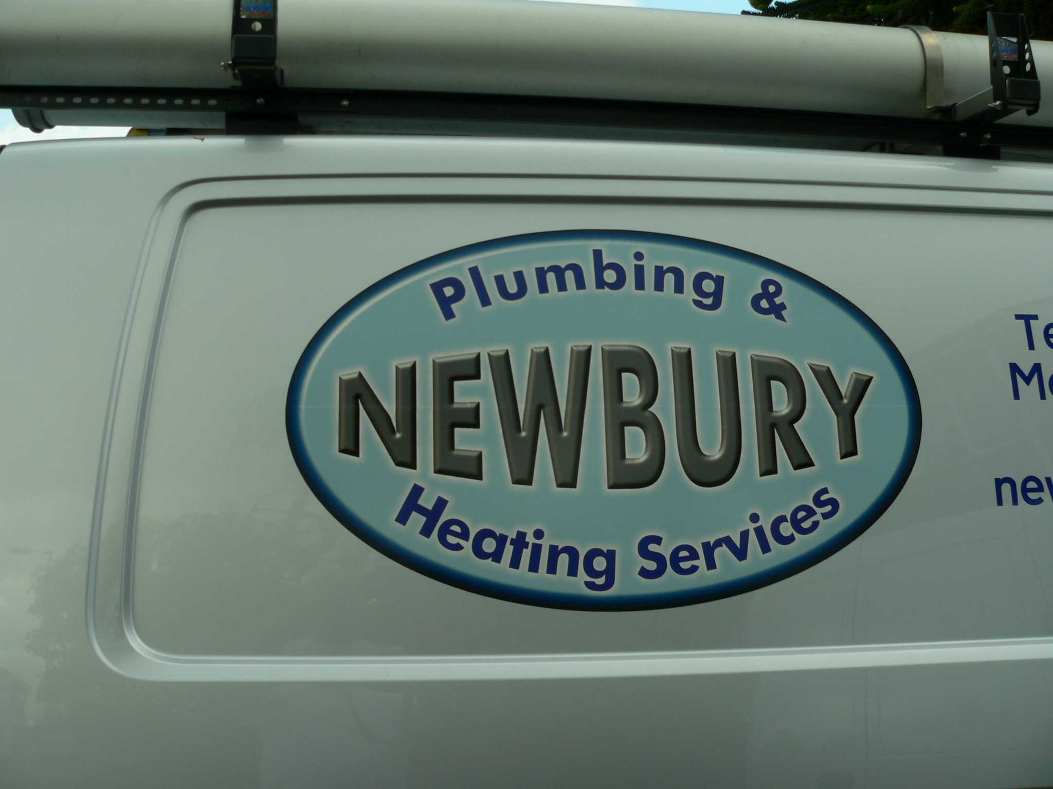
Posted by Lynn Normington on July 4, 2005 at 8:38 amHi Can anybody help with this, the image below is all I have, Is it possible to improve the quality, so it will print out about 400-500mm high?
Lynn
Attachments:
 Iain Gordon replied 18 years, 9 months ago 9 Members · 17 Replies
 -
17 Replies
-

Seems like a pretty straight forward image, i would remake the logo myself as a vector and charge them a fee. All you need to do is draw an oval, shadow it, fill with the colour going white to the centre. Insert the text, white outline and bobs your uncle.
Stephen
-

you could run it thru a program called ‘photozoom pro’ I think they have a trial version on the web.
It is about the only option you have, but it will still look pretty average given the original is so small.
Is it going to be seen from a distance or up close?
Shane
-

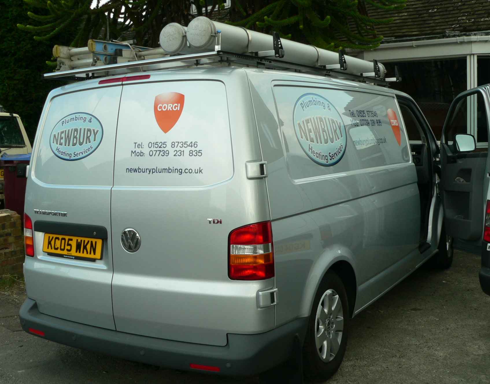
Its to go on the side of a van,
Stephen Its not quite as simple as that, not a staigth forward gradient fill, and the main text has a bevel effect and highlights.
Flippin clients, Wish the wouldn’t try and do their own stuff
Lynn -

You should be able to recreate that fill in Photoshop as it looks similar to one of the standard “button” styles that are amongst the presets in photoshop. Just a thought 😀
-
Thanks Jem but i only have coral and I don’t think it’s got any pre sets
Lynn
-

Lynn,
You probably don’t want to hear this, but enhancing bad artwork is all but impossible. As you know, we can reduce the resolution of a file with no problem but even the smartest bit of software won’t be able to put back information that isn’t there in the first place.
We get this sort of thing all the time and usually end up telling the customer that they will either have to provide a better image or pay to have it re-created.
Sorry I can’t say anything more positive. 🙁
-
Thanks John
I thought that would be the case, but you never know, with technology advancing so fast, I Thought something might have come along to enhance stuff like this.Lynn
-

I would use Signlab Find out what font it is Make the text the size larger than you need take it into photoshop bevel emboss at the at the larger size export as tiff or png (no compression) into signlab contour cut the original text slightly smaller than the tiff make a path with it (no pixilated edges if you do this)
Clip the tiff with the contour cut path) for the oval more of the same ensure the clean contour cut clips the edge of the oval by a couple of mm and over lay with the text and printsurely you can do it this way in other programs as well. The contour cut being smaller and taken from a vector really improves the bitmap print no end well I think so anyway. Forgot to mention just overlay then contour cut the whole thing.Goop
-
Thanks goop,
I changed the design, and did it all in signlab, printed on gerber customer was happy.
Lynn
Attachments:
-

Lynn,
I see that the print is two panels (don’t worry, it’s not noticable, I just know the max print area on the Edge is 12″). How much of an overlap do you do on them? I think ours is set at .1″, just wondering if you do it different.
-Marek -
Marek, We normally leave 5mm overlap it shows close up, but then again any overlaps do.
Lynn -

Looks good Lynn, and not a million miles away from the original
iain
Log in to reply.
