Activity Feed › Forums › Sign Making Discussions › Graphic Design Help › Worse than doing my own logo…..
-
Worse than doing my own logo…..
Posted by John Wilson on February 24, 2009 at 7:44 pm…. is doing a logo for a good friend that has helped me rebuild my workshop who has asked if I could create a logo for him now that he’s running his own business after his father has retired 😮
Gees I thought it was hard trying to come up with my own logo :lol1:
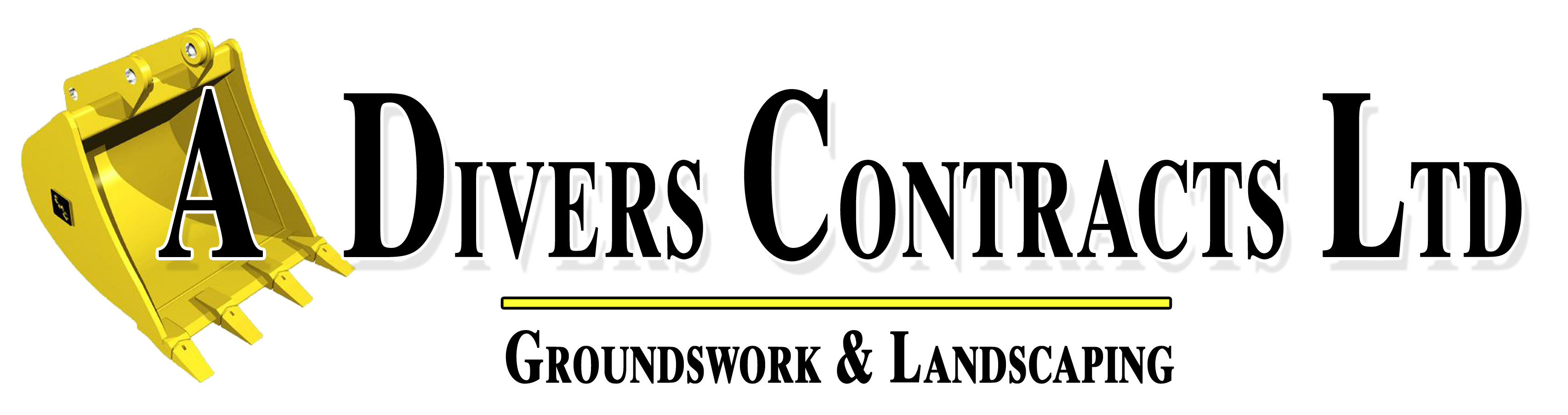
Looking for something that can be digitally printed rather than just plain colour
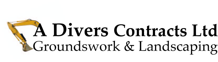
His company is called "A Divers Contracts Ltd" so I had the idea of using the A as the side of a excavator if that makes sense? or does that should lame?
Opinions please 😎
Shane Drew replied 15 years, 2 months ago 19 Members · 38 Replies -
38 Replies
-
 quote Peter Normington:well go on John, make a start,
Peter
I’m just trying to find the right image from iStock to use at the moment so give me 2 minutes 😀
-

Is Divers his last name (A. Divers)
or is it the archaic spelling of diverse, or is he a deep-sea diver?
Love….Jill -
quote Jillbeans:Is Divers his last name (A. Divers)
or is it the archaic spelling of diverse, or is he a deep-sea diver?
Love….JillDivers is his last name
It’s a Groundswork & Landscaping company
-

I might be barking up wrong street John but if it’s a logo for his business then would it not be better as a simple 1-2-3 colour logo rather than digi print from point of view of his administration stuff e.g. invoices that may be photo copied into black and white by his customers as one example? A multi-colour usually turns to ‘mush’ at the stationary end of things.
Ian :lol1:
-
I’ll be doing all his stuff so I’ll just need to make sure I do it well…. just throwing something together the now for review
-
Trying to figure out in illustrator how to remove parts of a jpeg so I only see what I need
-
 quote John Wilson:Trying to figure out in illustrator how to remove parts of a jpeg so I only see what I need
use the pen tool to draw around the area you want to see and then make a clipping mask.
-
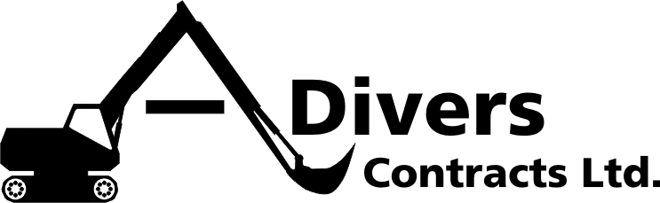
Rough and simple
Or should I scrap this idea?
Attachments:
-
 quote John Wilson:…. is doing a logo for a good friend that has helped me rebuild my workshop who has asked if I could create a logo for him now that he’s running his own business after his father has retired 😮
Gees I thought it was hard trying to come up with my own logo :lol1:
Looking for something that can be digitally printed rather than just plain colour
His company is called “A Divers Contracts Ltd” so I had the idea of using the A as the side of a excavator if that makes sense? or does that should lame?
Opinions please 😎
Hi John,
With his name being Divers id avoid that too as it could cause confusion. Why not ADC ltd
If i wasn’t so tired id try and come up with something.
.
-
He wants it to be "A Divers Contracts Ltd" I’ve tried to get him to use something else but he won’t budge as it used to be "D Divers Contracts Ltd" when his dad run it :lol1:
There’s no budging him either 🙁
-

sorry John A Divers sounds too much like deep sea diving stuff, not ground works etc. I know it’s his name 🙄 no help at all
Lynn
-

I like that Neil……..the texts too stretched for me personally but I think that is very nice
-

Hi John,
Try designing it in black and white first, if it works on this level it has more of a chance when introducing colour.
I agree with Lynn about the Divers, i also taught "deep sea" so if he will not go with ADC ltd i think he will need a symbol/ image similar to Neils or Ians.
Maybe take a slice off the wheel tracks with the text to the right… -
or use his full name then and not just "A"
ie: Andrew Divers Contracts Ltd
I know it’s longer but sounds and looks better 🙄
cheers
Warren
-
quote Warren Beard:or use his full name then and not just “A”
ie: Andrew Divers Contracts Ltd
I know it’s longer but sounds and looks better 🙄
cheers
Warren
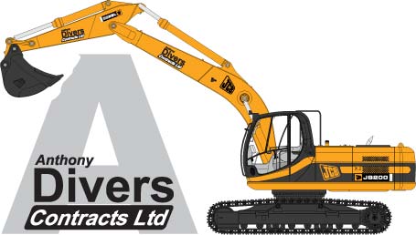
Longer isn’t the word for it….. Anthony Divers Contracts Ltd
I’m going to let him read this tomorrow so he can see where i’m coming from
Cheers so far people 😎
-

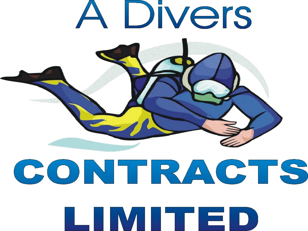
Here’s my go..
..Have I missed something? 😕
Attachments:
-
 quote Phill:Here’s my go..
..Have I missed something? 😕
yes, hes not diving… looks like hes trying to hide his homework. :lol1:
-

It also looks like he’s followed through after a bad curry.
-
 quote Paul Humble:It also looks like he’s followed through after a bad curry.
LOL 😀 😀 😀
-
 quote Nigel Hindley:With his name being Divers id avoid that too as it could cause confusion. Why not ADC ltd
If i wasn’t so tired id try and come up with something.
Could be just my twisted imagination, but when I read that, my first thought was a school uniform and a logo like this:
Attachments:

-
 quote Otto Peltonen:quote Nigel Hindley:With his name being Divers id avoid that too as it could cause confusion. Why not ADC ltd
If i wasn’t so tired id try and come up with something.
Could be just my twisted imagination, but when I read that, my first thought was a school uniform and a logo like this:
I think ACDC would have something to say about that one Otto 😀
-
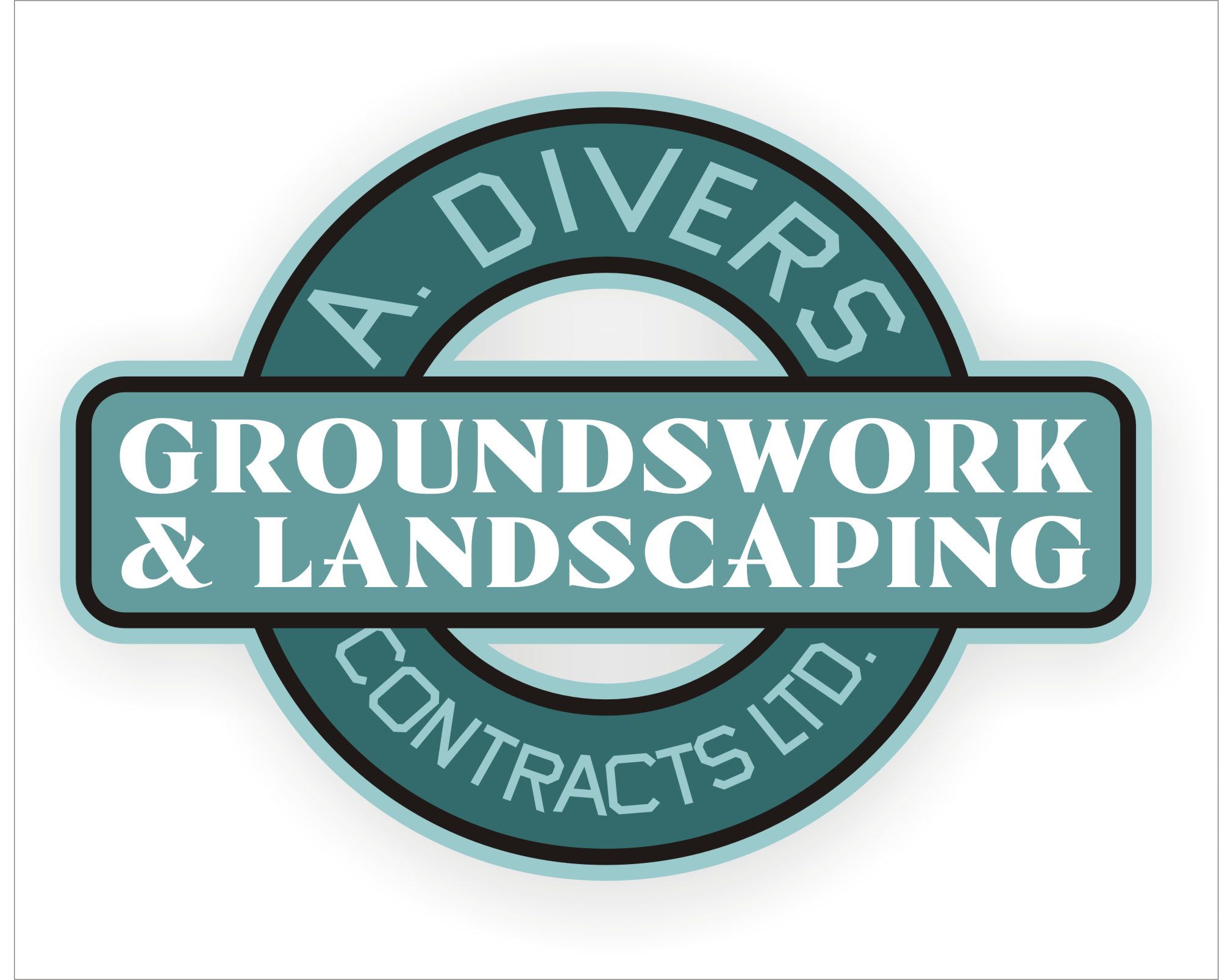
Here’s a way of making his name recede and his service stand out. Ignore the horrible fit text to paths and the gay color scheme.
This is an old idea but it might be a good option.
Attachments:
-

I like that idea Jill.
I would personally change the circle to a slightly diff shape, too much London Underground look about it otherwise.
Just my 2p’s worth.
Tim.
-
quote Tim Painter:I like that idea Jill.
I would personally change the circle to a slightly diff shape, too much London Underground look about it otherwise.
Just my 2p’s worth.
Tim.
Thats just what i was thinking – but then he is going underground! Now otto will do a Jam based logo
-
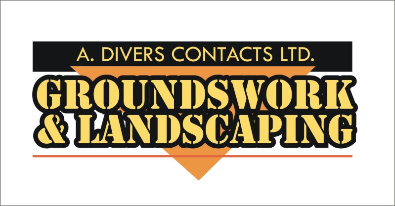
Oops! I forgot about that.
OK, how about this?
Attachments:
-
I like that one Jill, even the missing "R" doesn’t bother me… 😀
-
Hahaha
Time to call it a day I guess.
The biznames of the UK companies often confuse me.
Over here it would be "Dr. Landscape"
or "A-1 Landscaping" or the dreaded "Landscapes & More"
:lol1: -
hey Jill, seeing someone I regard as the consummate professional make a mistake like that makes me feel so much better 😉
-
Shane, I make mistakes on a daily basis.
I usually just don’t post them on the world wide web!
(hot) -
quote Jillbeans:Shane, I make mistakes on a daily basis.
I usually just don’t post them on the world wide web!
(hot)me too, but I don’t worry about remembering them because my wife kindly does that for me 😳
-
I guess I am darn lucky I don’t have a wife then.
I suppose it would be handy for laundry and dishes. -
quote Jillbeans:laundry and dishes.
Isn’t that what kids are for?
Log in to reply.
