Activity Feed › Forums › Sign Making Discussions › Graphic Design Help › Why is it so hard to design your own signs?
-
Why is it so hard to design your own signs?
Posted by Joe McNamara on November 15, 2005 at 5:36 pmHi all,
I’m working in the sign business full time again now and have got hold of an escort van for running round in.
Anyway I’m concentrating on a mobile service as I’m working from home studio at present, and have added window tinting to the portfolio after some experience with it in the last couple of years.
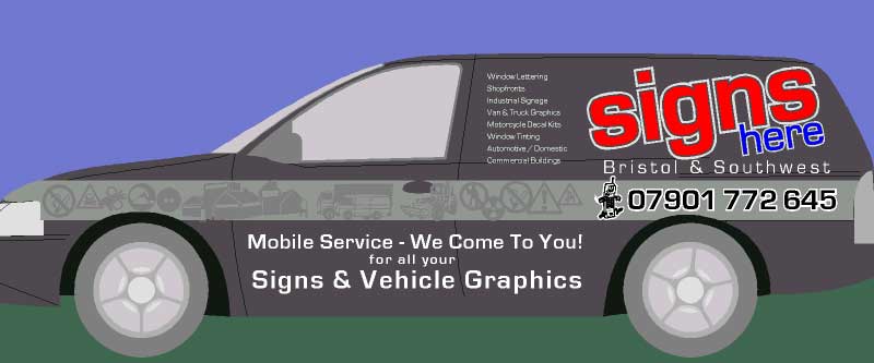
Anyway I want the van to have a bit of a franchise type look and am not sure whether I’m happy with what I’ve done so far – what do you guys think?
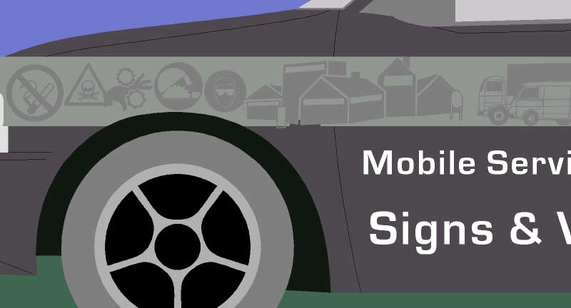
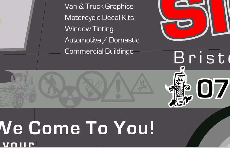
There is a silver stripe that runs the length with graphite metallic images of signs and vehicles ghosted on ( the two colours are quite close to each other, if that makes sense).
Anyway criticism welcome as the van’s going into the bodyshop to have a couple of dings done next week so I won’t be cutting any vinyl for a couple of weeks.
Cheers
Joe
Attachments:
 Lorraine Clinch replied 18 years, 5 months ago 10 Members · 15 Replies
 -
15 Replies
-

Joe, you get a gold star for NOT using “tel”…. I like the little cellphone guy.
On the side, I would put “signs” closer to the window, with the list of services behind it.
I like the fact that you’ve tilted “signs here” too. Adds interest.
The bottom part is what bugs me, not sure if I like the caps & lower case or the varying sizes of the text.
Too lazy today to make a mock-up for ya.
Love…..Jill
PS
I do like the stripe idea, and have done that before, kinda subliminal. -

Hi Jill and thanks for the quick reply!
I did have the “signs” like you suggested but moved it to balance up with the phone number.
I”ll play about with the other lettering ( different sizes).
********************************************************
PLEASE NOTE EVERYONE: I don’t want anyone to waste their time recreating designs for me – I don’t want people taking up their time on this – Everyone’s time is valuable – but a quick comment would be appreciated!
Cheers
Joe
[/i] -

Joe, first thing… I didn’t realise your a local competitor, thought you was in ireland or something like that…
Another competitor called Blu* Ora*g* in my local nearby town, they have used all the safety looking clipart on their vans recently…
My advice is to make it look stunning, but there is no need to focus on all aspects of your business… you could just leave the company name on the side even.
-

Joe – my advice is to get a different van.
Escort vans are rubbish – get a Renault Traffic instead 😛 :lol1:
-

I’m having the same trouble as Joe, new van and can’t decide what to do.
Phill’s right, if you want something eye catching, get a different van.
I could have sold you my old one. A fiesta van with RS Turbo bodykit, RS Turbo interior, suspension as low as it could go and a noisy exhaust.
totally impractical, but looked good 😀Now I have a VW Golf van, quite rare I’m told, lot more practical and I love it. The only problem is it looks to good to put vinyl on, would need to be tastefully done.
-
Right lads!
Here goes for the answers:Andrew – yes it’s metallic black ( ford ash black from new – very rare apparently)
Dave – Don’t worry mate – I’m not a competitor to you in sunny Devon – I only work about a 20 mile radius round Bristol. And I’ve put the small text to say what we do because when I’ve just had “signs” on it in the past I’ve missed out on jobs because people say ” I didn’t know you did …… as well”
Phil -( you cheeky bugger) Escort vans are crap! ….but this is a stopgap that I got practically for free and it’s very tidy so it’ll do for the winter – I’m looking for a renault master or mercedes vito to put a full mobile sign & tint shop in – cutter, laptop, generator etc Business on wheels if you like – I service van dealers round bristol mostly if that makes sense.
Andrew – The golf van is a rare beast indeed – good luck with it mate!
Thanks to everyone who’s replied so far !
Cheers
Joe -

Joe I thought you were in Ireland 🙄
yes it is very hard to do your own stuff we stripped our van ages ago to re-do it we have done one side!!!!! when a customer comes in it is no problem ,our customers are driving around in smart vehicles why can’t we do our own 🙄Lynn
-

hmmm… mr mcnamara… ive seen lots of your work & i know you got better upstairs. 😉 not keen on card, looks too busy mate.
the idea behind the van i think is noce, subtle shades in metalic etc should look good. but… on flat picture above on the outline doesnt do it justice.
im not sure, the base colours dificult to work with at kick off. ive been designing our vans for months now, every time im about to starts i say nah… thats crap and start again. its very hard doing your own van so i understand your frustration trying to get this right mate. -
Rob, can we have two flags next to our names…
e.g.
Robert Lambie who is an
 in
in 
its getting a tag confusing the meaning of teh flag
oh, I was Escort Mad when I was young, I had 2 and eventually a RS lookalike blue Van. Glad I got out of that phase those rust buckets.
-

I like the strip running along the side. I would like to see the list of stuff you can do removed. I think the logo would look nice if kept level not at an angle and be on the rear panel by itself. I would change the text along the lower door about the mobile bit to:
Mobile Sign & Graphic Service ….
We Come To You!!Other than that its fine :lol1:
It is difficult doing your own stuff …… our van was ok I found that quite easy to do as we wanted to keep it simple and eye catching. Just did our yp advert in a hurry and now Im not so sure … again we wanted simple and eye catching but Im not so sure on it now 😕
-

joe, just a thought, as the van is black, could you do something with black reflective, as I think Jill has said recently, it shines up white in the dark? I’m kind of thinking of the stripe images, as you have them as a ‘watermark’ type of thing 🙄 hopeless at explaining.
Log in to reply.
