Activity Feed › Forums › Sign Making Discussions › Graphic Design Help › Which van layout do you prefer best?
-
Which van layout do you prefer best?
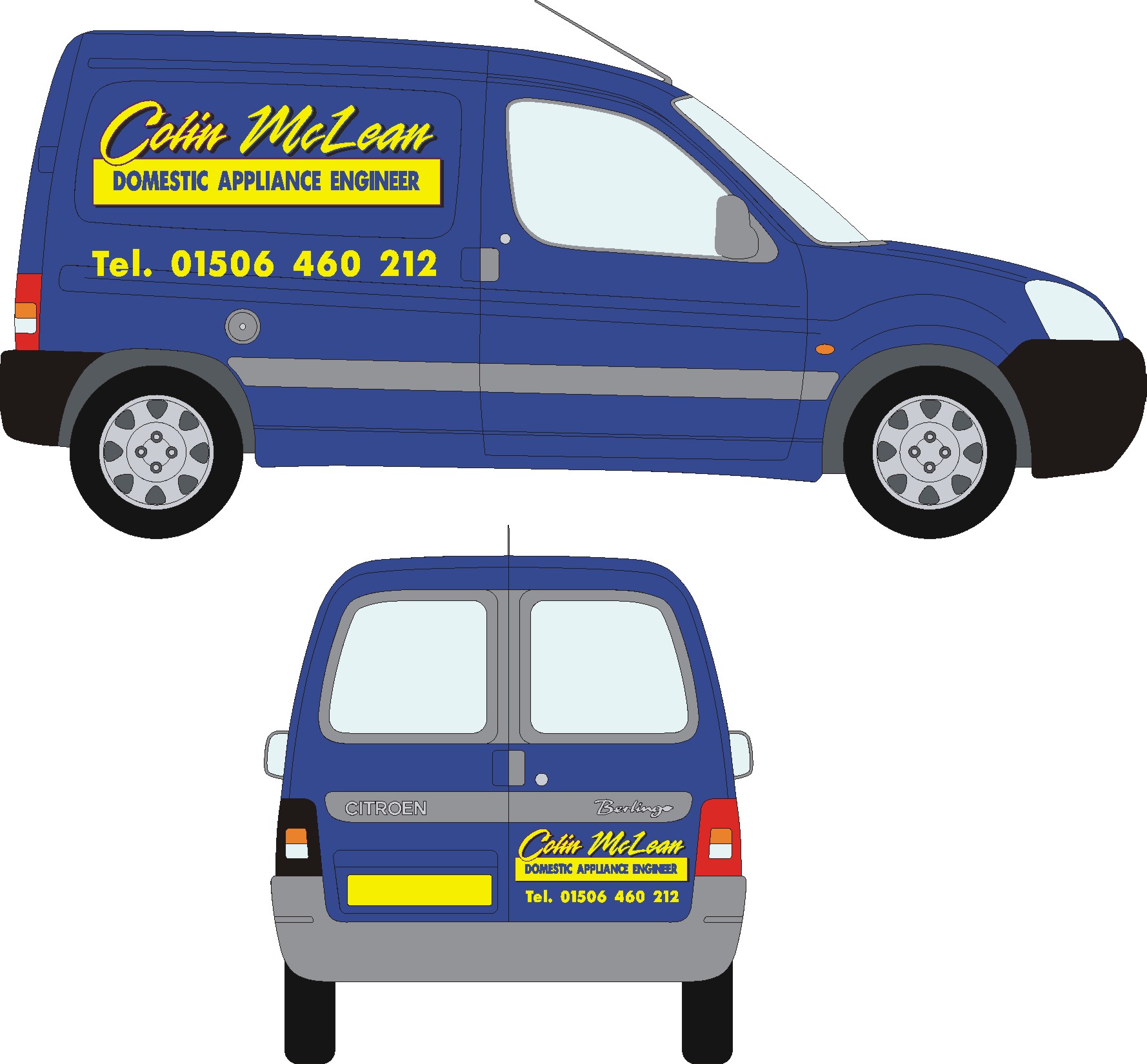
Posted by Phill Fenton on September 11, 2007 at 1:20 pmOne was designed by Alison – the other under duress (instructions given by the client) 😕
Which one would you prefer?
Attachments:

 Peter Mindham replied 16 years, 7 months ago 25 Members · 32 Replies
 -
32 Replies
-

bottom one too out of the two, just not sure about the panel angles……….. 😕
-

Bottom one.
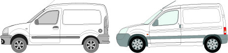
Hate berlingos and their stupid angles….
-
 quote Harry Cleary:I prefer Alison’s one!!! 😀 😀
What the bottom one!!! 😛 :lol1:
-
 quote Harry Cleary:I prefer Alison’s one!!! 😀 😀
:lol1: :lol1: :lol1: :lol1:
-

If I had to make a choice between the 2 it would be the bottom one, I am another one who hates Berlingos because of the body lines
-

The bottom one is fab and I would just drop the right hand down as a happy medium
rich -

Bottom one.
But align the text on the lower panels with the black body moulding. It might look a bit strange on a drawing, but in real life, from any sort of distance, the swages tend to fade away and it’s the moulding that holds your attention. Any text that isn’t aligned with that looks cock-eyed.
Unfortunately, that isn’t a cast iron rule, and there are exceptions, but it works in the majority of cases.
-

think you may be doing the btm one. which is very nice
-

Bottom one. But add a small radius to the corners of the rectangle.
-
quote :Has anyone said the bottom one?
no they are all sitting on the fence, except one 😉
-

bottem gets my vote aswell . . if you are printing this see what a light yellow to orange gradient / fade on the top text ( top to bottom ) looks like. If its only going to be cut vinyl forget I said that 🙂
-

bottom one too…and make the rectangle and wording & tel. no smaller, so the company name stands out more…and round the corners as jonmo mentioned earlier 😀
nik
-
 quote Steve Underhill:The middle one.
:lol1:
Bottom one, but as said above, align it with the black body moulding. Berlingo’s are pretty similar to Kangoo’s aren’t they?
-
quote Kenny Ramsey:Berlingo’s are pretty similar to Kangoo’s aren’t they?
Nope. Give me a Kangaroo every time.
Much more signwriter friendly. 😀
Attachments:
-
 quote Jillbeans:Bottom layout with the top script.
Love….JillIs that Jill recommending a script font? :lol1: :lol1: :lol1: only teasing, I know it’s not brush script :lol1:
-

Alison originally came up with the bottom design.
The customer decided he didn’t like it very much and after looking at a few different fonts he described the top layout to us as how he wanted the van to be set out.
This (the top example) is what has now been approved by the customer and we are doing this van tomorrow.
Both Alison and I would have much preferred to do the original design (bottom layout) – but he doesn’t like it and he’s the one that’s paying us 😕
Incidentally – we always run the lettering level with the bump strip along the side (as John has already suggested) and find this always looks fine on these vans
-

I like the bottom one best phill..
Top one looks to disjointed, if you know what I mean?
The bottom design is tied together better.
The panel below the text seems a bit deep to me. Ide maybe make it less deep, but that’s maybe just me mate…
An idea might be to even make the panel white with weeded out text. Or perhaps a pinstripe line of the shape of the boxes with solid text in middle? Again just ideas… -

So this doesn’t mean that Alison does better designs then you Phill?
-

unmistakable yet looks like it could be so many other things as well.
-
quote Dave Rowland:why does that pic remind me of marcella?
yeah I wish!!!!!!!!!!!!!!!!!! 😮 If my ass was that small I’d have it as my avatar!
-
 quote Dave Rowland:why does that pic remind me of marcella?
Reminded me of Lambie after ten tequilas and five lagers. A bit of an arse!!! 😀 😀 😀
Peter

Log in to reply.
