Activity Feed › Forums › Sign Making Discussions › Graphic Design Help › Which one do you like best?
-
Which one do you like best?
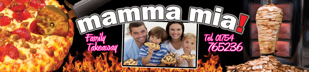
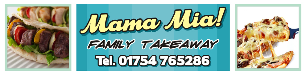
Posted by Pryam Carter on November 10, 2009 at 1:40 pmThe job is a fascia sign for a takeaway – size is 5900x1380mm.
Print Only fitted to existing fascia panels.One of the designs is mine, the other is the customers.
He wants his design and i want mine. We are both stubborn and don’t like each others designs, he wants a vote so i thought i’d ask the professionals.
I’m not going to say whos is whos!!
Say what you like by the way, we won’t be offended! 🙂
Attachments:
 Pryam Carter replied 14 years, 5 months ago 15 Members · 17 Replies
 -
17 Replies
-

I like yours, wondered what it would look like if you lost the flames.
Something just isn’t gelling quite.
Tim.
-

I like prefer the bottom one, cleaner and fresher and easier to read.
top one is nice but not as nice.
cheers
Warren
-

Bottom one for me but I don’t like the blue…not very foodie
-

first look 2 votes for the btm one.
then loose the pic and flames & text in the top one but use the text from the btm one ?
chris
-

bottom one for me too, maybe change the family takeaway font? 😀
-

Top one for me – I wouldn’t associate blue with food.
-

Bottom one but even so it looks like 3 separate signs. It all needs tying together a bit more IMHO.
The top one is so sickly sweet that the only thing missing is starbursts on their teeth.
-
 quote Harry Cleary::lol1: my
 off at !
Changed me mind…this bottom one! 😉
-

Bottom one, change the background in the center part to a red/maroon as blue is not a popular "food" color.
Lose the "tel". 😉
Love….Jill
Log in to reply.
