Activity Feed › Forums › Sign Making Discussions › Graphic Design Help › which logo do you prefer the top or bottom one?
-
which logo do you prefer the top or bottom one?
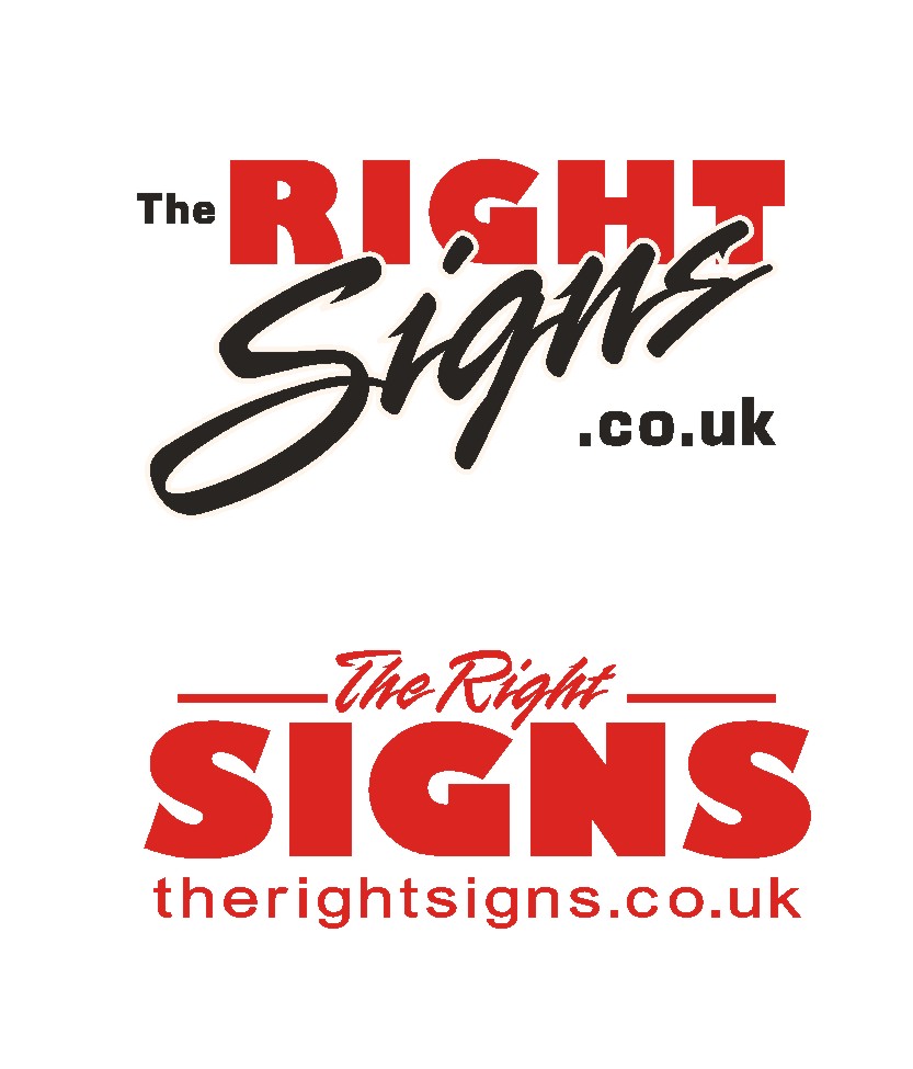
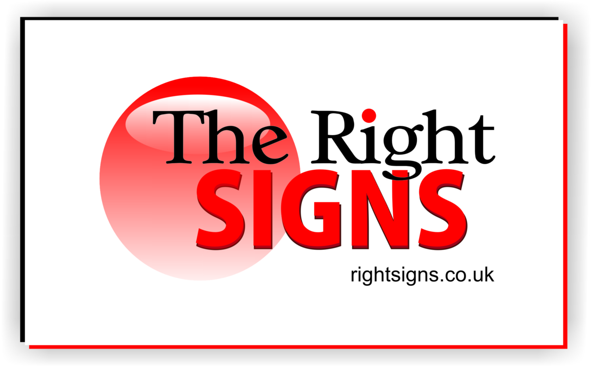
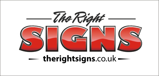
Posted by Phill Fenton on November 8, 2007 at 12:42 pmWell it’s a competition between me and Alison actually.
We are thinking of changing our "Logo" and have come up with an idea each. I prefer mine, and Alison prefers hers – so we thought we would let "the team" decide. I won’t tell you which is which cos I know you’ll all vote for Alison’s design 😕
Anyway – which do you prefer Top or Bottom?
Any suggestions to improve upon either?
Attachments:
 Phill Fenton replied 16 years, 6 months ago 27 Members · 60 Replies
 -
60 Replies
-

don’t beat about the bush, Jill !!!
but yeah, bottom one for me too !
-

I’d change from such a ‘blocky’ font in the top one, and that would be my choice then. Don’t like the font so don’t like either at the mo… sorry mate…
The bottom one looks like it has too many different fonts to me, definitely would use a more modern style though 😳
I’ll get me coat shall I?
-

yeah…fair point Shane….I don’t like that block font either….that is one ugly looking S
-

I sort of prefer the top one as it is a little more fancy and creative looking but not sure about the word "the" and the ".co.uk" but I quiet like the two main words.
The bottom one if I remember correctly looks very similar to what you have at present, nice bold and clear but a little plain for me, I think customers will either be excited by your logo or not, so it’s in the eye of the beholder a bit 😕
enough babbling
cheers
Warren
-

Same comment from me..
Bottom one with a second colour
:lol1: bet yours is the top one???
-

of the two, i prefer the lower one. but it needs something more… im not keen on the heavy font.
the top one is a bit too disjointed, if that makes sense? the overall design doesn’t flow/connect for me… -

Phil, they are both pretty good in different ways but ……
after much deliberation I’m going for the bottom one, I think ….. -

Bottom one.
Move the lines up a bit and justify with the ends of "signs".
Change "The Right" and the web address to black.
A slightly less heavy font for "signs". -

Phil, Try add a second color in the bottom one. Like the top one.
-

bottom one with a less heavy font (still bold though) and another colour added
Lynn
-

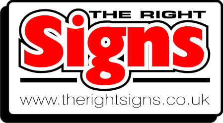
Prefer the bottom one, but as I was bored couldn’t resist having a go at one myself.
Attachments:
-

Thanks Phil – I like that
Here’s another version of the Bottom example – this was done a few days ago after seeing a post made by Andy.
(Alison’s fuming by the way 😉 )
Attachments:
-
Still think it needs "www." in it, the "the" going straight into an R doesn’t look quite right somehow – adding the www. takes your eye away from it a bit.
Just my two bobs worth, overall a lot better :thumbup2:
-

I prefer Phil Hallings,
But given the choice of the 2 I would go for the top one.
Regards
Roy.
-

Well, I would miss out any reference to .co.uk as your website was last updated three years ago. :peek:
Apart from that, I like Phil Halling’s best, followed by the bottom one.
I do think that the final choice should be made with your intended market in mind. If you want the boy racer customer then go for the fancy shaded print option. If you want corporate business then go for something more staid, reassuring and comforting.
Just my opinion. 😀
-
quote John Childs:If you want the boy racer customer then go for the fancy shaded print option. If you want corporate business then go for something more staid, reassuring and comforting.
Just my opinion. 😀
maybe a tweed pattern print ? :lol1:
-

what was the prize?????
bottom in pink & cyan blue….
mmmmmmmmm
roffs
-
Phill,
Can I ask what is the font used in ‘Signs’ on the top one? I’ve a client that wants their vehicle livery continued, they used a different signwriter before.
Cheers
JP.S. I’d go for the bottom one with another colour added.
-
Had a go myself… again, apologies for lack of fonts on my system. i really need to get something done about it… :lol1: 🙄
[c]
 [/c]
[/c].
-
 quote Phill:Thanks Phil – I like that
Here’s another version of the Bottom example – this was done a few days ago after seeing a post made by Andy.
(Alison’s fuming by the way 😉 )
Phil just my humble, the black outline in "the right" is spoiling the legibility, it seems far to thick, maybe its the jpeg though, but if not, I would reduce, or leave it off.
Peter
-
quote JonnyAnnett:Phill,
Can I ask what is the font used in ‘Signs’ on the top one? I’ve a client that wants their vehicle livery continued, they used a different signwriter before.
Cheers
JP.S. I’d go for the bottom one with another colour added.
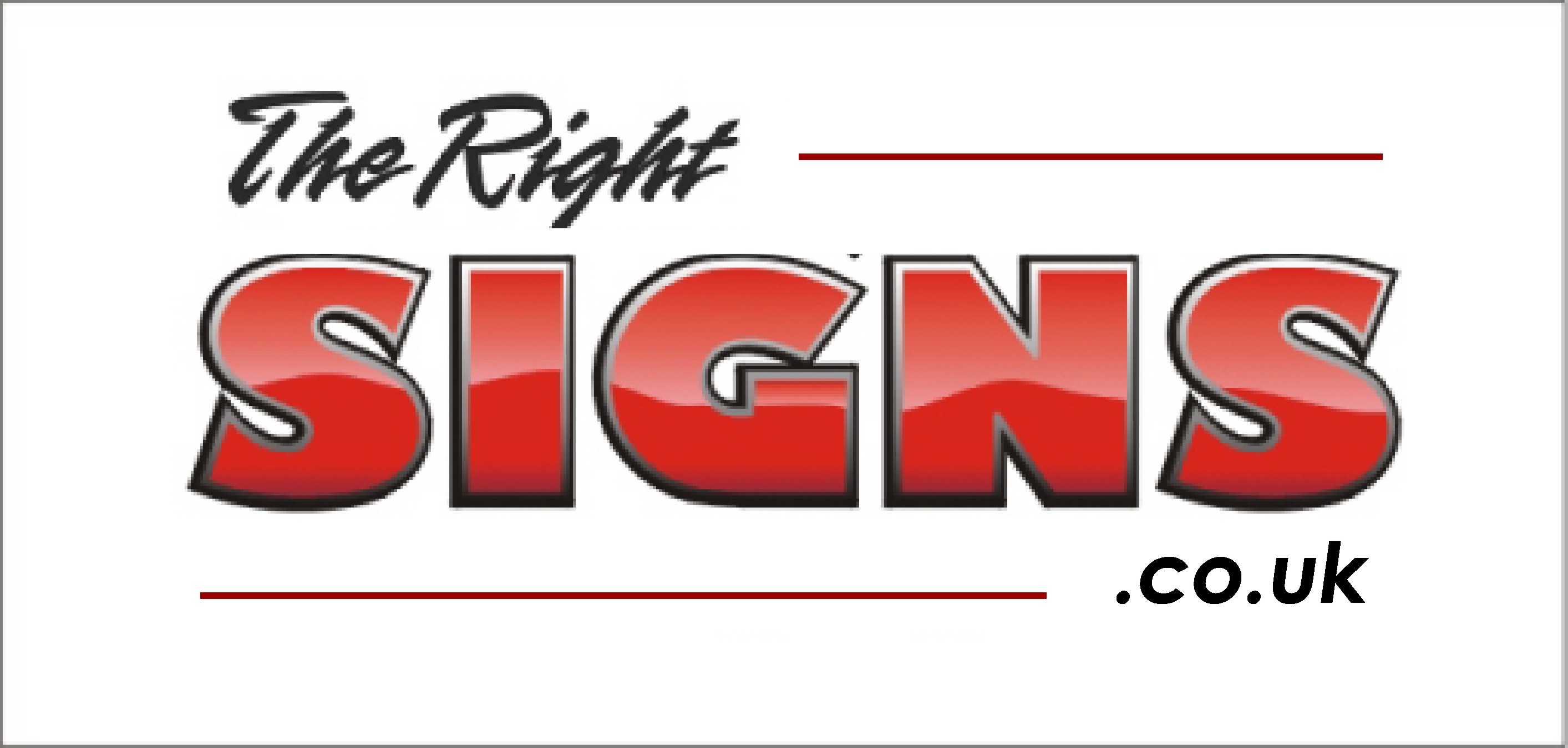
The font is called Rapier in Signlab – it’s also used for "The Right" on the bottom example. To explain a bit further – I wanted something that would look very similar to what we have used for the last 11 years (But with the main message being "Signs" rather than "Right" which is the case just now)

Existing "Logo"– Whereas Alison wanted us to try something completely different, Hence the Top example was hers, the bottom one mine.
Thanks for your suggestion too Rob – that’s a much more corporate image and I take on board what John has said about trying to appeal to our target market.
Peter – thanks for pointing that out – yes I can see now that the outline is too thick.
-
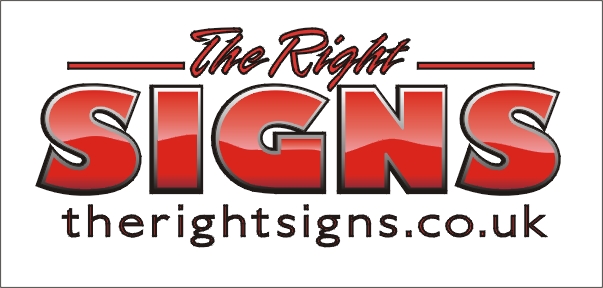
Here’s the latest version after listening to your suggestions
Attachments:
-

agree with phils suggestion with the www but the right signs still doesnt seem right, the font and the size 😕
nik
-

If you go that way Phill I think the web address may be better a little smaller………… small big small 😕
Attachments:

-
its getting there, but personally I think "www" should now be dropped in all web addresses, its not needed and just takes up space. I always advise my customers to leave it out,
Peter
-
quote Peter Normington:its getting there, but personally I think “www” should now be dropped in all web addresses, its not needed and just takes up space. I always advise my customers to leave it out,
Peteri agree with you too peter…..but every design is different…so in this instance the www is needed…its all in the eye 😉
nik
-
auwwwww you forgot the mascara to make it stand out :lol1: :lol1:
nik
-

Bottom one for me. I like the latest one best, with the www text smaller as in Andrew’s version. These days I think using the www, or not, depends on look and balance rather than necessity.
-
quote Peter Normington:don’t wear it Nick
ive got brown eyes 😉
nik
-
quote Bill McMurtry:Bottom one for me. I like the latest one best, with the www text smaller as in Andrew’s version. These days I think using the www, or not, depends on look and balance rather than necessity.
Look and balance can’t be based on www or not, its only because we expect to see it, Its like the tel: telephone: phone: thing,
sorry completely off topic subject, but it would make a good discussion on its own.
Peter
-
quote Peter Normington:don’t wear it Nick
Peter
I don’t wear it Nick.
is what I meant to say…. -
I agree certain words look better with the www. some without.
Phill’s looks balanced with….in my opinion (?) -

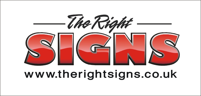
Your latest version for me too.
I like Andrew’s use of the web address better. Just not over struck on the Rapier font Phill, a nice purchased script would suit better I feel.Couldn’t resist a dabble anyway 😀
Attachments:
-
quote Peter Normington:I don’t wear it Nick.
is what I meant to say….😉
nik
-
the www can be done away with and still have balance, with or without the dashes?
Peter
Attachments:
-
Thanks Andrew – it looks better the way you have done it – regular/Bold/Regular
-
quote Andrew Boyle:nonsense… 😀
[my reply to Peter not to you Phill] 😀i have to agree too………………… 😀
nik
-
quote Andrew Boyle:nonsense… 😀
[my reply to Peter not to you Phill] 😀True, but why do you need the www to make it work, you’re the expert,
cant you do it without? it just seems old hat to put www in front of a web address, and totally unnecessary,Peter
-
www. or not, I still think it depends on what follows. I still read phill’s address as theright signs instead of the right signs, unless of course his name is Phill Theright.
-
quote Nicola Rowlands:i agree with you too peter…..but every design is different…so in this instance the www is needed…its all in the eye 😉
nikits been said already not only by me……… 😉
nik
-
quote Phil Halling:Grieves me to say it but I prefer Robs version 🙄
I agree, Robs take is excellent (notice no www)
But I think a version of Alison and Phils logo is more desirable for them, as it is based on their own design.Peter
-
no www. and balanced 😀 😀 different starting point 😀 I agree :lol1:
-
I dont think a web address should be included in the logo anyway, most people would just google " the right signs" anyway, and phils company comes up top.
Maybe different if your business is web based, like confused.com
Peter
-
Peter, what if including a web address (or a phone number even though you’re in the book) generates more sales enquiries? Isn’t that a good thing?
-
Bill, anything that generates more business is a good thing, ten years ago it would have been important to get the fact that you had a web address, across. I’m not so sure it’s needed now though, as most people would use a search engine to look up a company name, or make an educated guess that it was the business name+ the dot extension.
I’m not saying a web address is not needed, just it doesn’t need advertising with your name. as it is only saying things twice, maybe "The
Right Signs" and then a strap line would be better? leaving web address and contact details to be placed elswhere in the copy.Just my thoughts
Peter
-
After all this debate what was the bloody prize and who won it?
-
quote Phil Halling:After all this debate what was the bloody prize and who won it?
There is no prize – it was a competition between me and Alison 😛

Log in to reply.
