Activity Feed › Forums › Sign Making Discussions › File Swapping › which font do you think i should use?
-
which font do you think i should use?
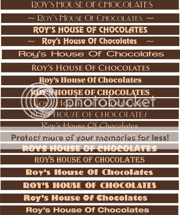
Posted by Steve Underhill on December 5, 2007 at 11:29 amHi all.
Bit limited as to what I can do here as the board is only
190mm high and 3560mm wide no way I can make it bigger or smaller as Its painted ply going over existing wood to cover it.
I just used a few fonts here that I thought looked suitable, (forgive the Algerian one but the owner seemed to like it)
Anyway what do you lot think, or do you have any other suggestions, I have so many similar looking fonts I just picked a few that looked kind of suitable and put those on, I owuld have liked a fancy script on there but with the Y and F etc they dont fit in very well.
I have also capitalised some, the little Tildes ~ were just to make up space.
Negative space will be an issue on this board but like I said Im stuck for space on this one.
Open to suggestions.
Steve
 Steve Underhill replied 16 years, 4 months ago 7 Members · 18 Replies
 -
18 Replies
-

7th one down for me Steve but don’t capitalise the "Of".
Reason for my choice?
The very name suggests Traditional, so no fancy fonts.
-

Aha, now you know Im glad you said that, the font is called utopia, and its what I used in his hanging sign above the shop.
Like you say, not capitalising the o Looks better
thanks -

if you’ve already used a font, stay with it, … uniformity is an important ingredient in a good sign. A bit like making chocolate really. If you vary things from one mix to the other, something will not look right. 😕
-
I agree Shane, I just thought I would ask around and see what other people thought, the signs are quite far apart so may have gotten away with a different font in the sense that the sign is 14 feet above the one in the street, but I agree that uniformity is good, and looking at it again now It does look right and I don’t have to go through loads of font options with him.
Anyone think I need something at the sides like a flourish or so to add a little on the ends as there is quite a big gap using that font.
Thanks for the ideas folks.And yes Peter , you must be psychic. 😮
In fact its quite good that out of all those fonts you picked the one I already used, given the design of the sign it was also a hard font choice to make.
I’ll post it when I get a finished picture -

I was going to say 7th or 8th one down, which look like the same font.
So that’s a bit weird.
-
Yea they’re just capitals and one is lower case
man everyone here is psychic.
Even me because I used it in the first place. 😀 -

Perhaps we are just drawing from what is lodged in our deep rooted memories?
This font looks very similar and your initial choice was well made.
-
I tried some of the guys chocolate the other day, If anyone ever comes to Looe go get some, Ive never tasted anything like it before, its so different, also not as fattening as he doesnt use saturated fats and such like, he uses a cocoa bean blend specially made for him, he even has his own separate number on the big bags he buys.
All produced in house too, Swiss master chocolatier.
Thats my Xmas presents sorted.
Once again Thanks for choosing that font, reassuring that was. -

Hi Steve,
A bit late, I know, I must have missed this one but just looked and, spookily, my eyes were drawn to the 7th one down.
None of the others did what that one did do, they didn’t
So number 7 for me.
Cheers,
ps. thanks for the flakes the other day, worked a treat!
Gareth
Hooray 300 posts!
-
 quote Gareth Lewis:Hooray 300 posts!
not another one…that likes to blow their own trumpet :lol1: :lol1: :lol1:
nik
-
Lucky number 7 eh, wierd how I put it there seeing as it was the one I used on his swing sign and should have been 1st.
At least its all positive.
😀 -
Nic,
I think reaching 300 (301 now – hooray again) is a definite cause for celebration. Maybe only a small celebration involving just me and a trumpet (and an announcement by me on this thread) but a celebration none the less. I’ll see if I can get to 1000 or so, though, without a peep about it, although I’ll find it hard at 500. Ahem.
Trumpets ahoy!
Cheers!
Gareth
Steve, sorry for going off topic.
-
Go as off topic as you like now, it seems sorted.
😀 -
quote Gareth Lewis:Nic,
I think reaching 300 (301 now – hooray again) is a definite cause for celebration. Maybe only a small celebration involving just me and a trumpet (and an announcement by me on this thread) but a celebration none the less. I’ll see if I can get to 1000 or so, though, without a peep about it, although I’ll find it hard at 500. Ahem.
Trumpets ahoy!
Cheers!
Gareth
Steve, sorry for going off topic.
you’ll get there quickly if you are quiet and shy like me Gareth. Congratulations from me anyhow. At least your obviously contributing, which is what makes this place tick….
-

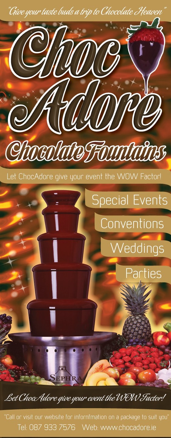
Heres something I did a while back as a pop up banner!
Pm me if you want the font.
Attachments:
-
Its all up now thanks I fitted it yesterday, customer loves it and I have to admit Im very pleased with it, That strawberry I think is the most widely used image in the chocolate fountain game, a guy down here uses it on all his literature also.
Thanks for the font offer though.
Log in to reply.
