Activity Feed › Forums › Sign Making Discussions › Graphic Design Help › which company logo do you think looks the best?
-
which company logo do you think looks the best?
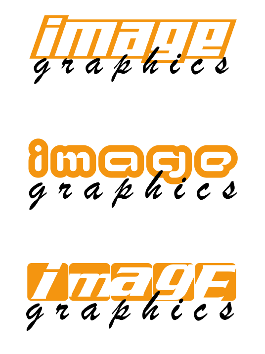
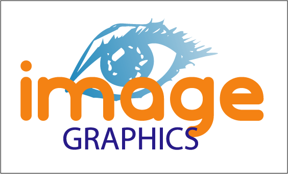
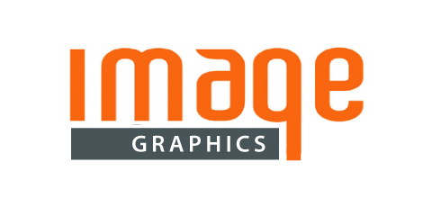
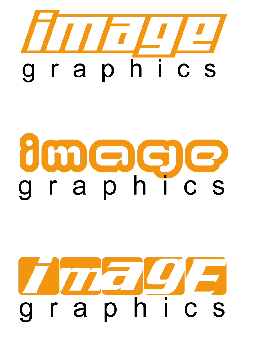
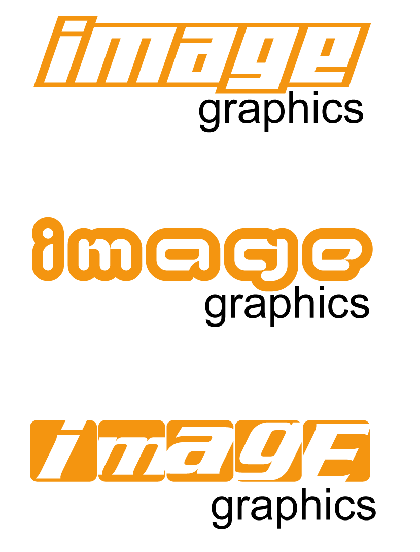
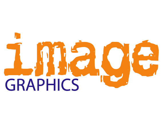
Posted by noviceDan on March 17, 2006 at 10:58 amNew company logo… Which one do you all think looks best. Any suggestions improvements welcome.
Dan
Attachments:
 Paul Rollason replied 18 years, 1 month ago 11 Members · 39 Replies
 -
39 Replies
-

not keen on the script so far apart. This efect looks better with an arial or block style font
the 3rd ‘ímage’ looks good tho.
-

I like the third one best out of the three
But as Shane said loose the script maybe a eurostile of bank gothic font would work
dreckly
paul r
-

I agree with Shane about the script text – If you are determined to stick with it, I suggest you join it up, make it about half the width of the “image” and right adjust it.
I prefer the second “image” but I think it would look better connected rather than spaced out 😛
-
Try using capitol letters for the graphics bit.
dreckly
paul r
Attachments:
-
I like the third one still.
perhaps reduce the font height a bit more, and could you try capitals? might take away that uneven finish if you know what I mean.
-
great minds paul? I’d ather see the GRAPHICS smaller and to the right like the lower case sample, but upper case
-

The third one is only an evaluation text so i have no actual font. I cant change cap height or edit it. Its called Regal bob. So i think its between the 1st two, unless anyones got tyhe font, or can come up with something better.
Thanks again
Dan -
Just had a second thought but I’m struggling to visualise what it would look like.
Use the second “image” & use the same font for the “graphics” but without the thick outline – you should be able to break the font to curves & just use the middle bit.
I know what I’m trying to say & reading that back dosn’t make much sense 😮
-
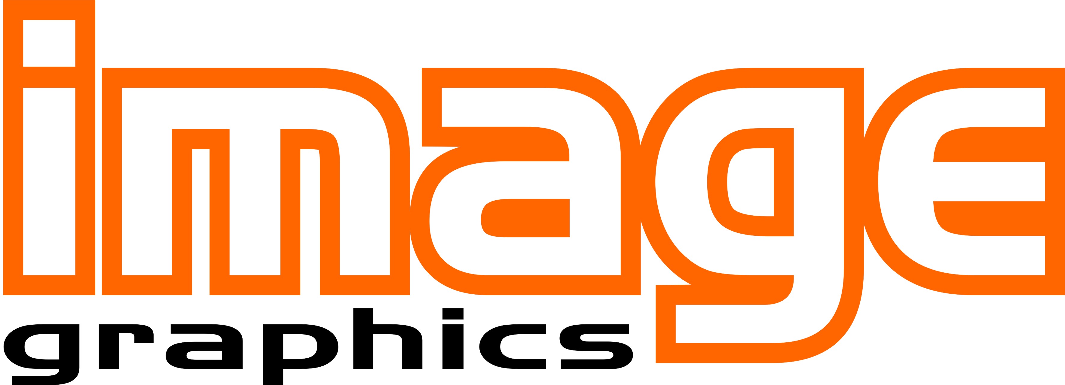
Hi Dan,
This is not an easy one! Trying to fit the ‘graphics’ in without upsetting the balance is tricky.
Anyhow, here’s something I knocked up – a smaller ‘GRAPHICS’ nestled under ‘image’ in the same font but white with an orange bevel/shadow to give it accent.
Mark
Attachments:

-
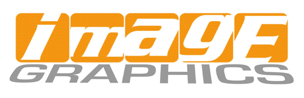
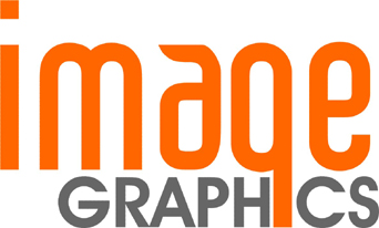
That looks good. Here is another then.
Not sure what one to go for.
Dan
Attachments:
-

I like the top one of your third attept.
If you would have used disconnected Brush Script I may have had to come over there and flog you with a stiff fitch.
I would make the text all-caps Avant Garde tho, no distortion.
Remember that just because your program can distort text doesn’t mean you must.
With an outline style “image”, you are going to lose impact.
I’d make it straight orange, with the “graphics” part in a reflex blue.
It is nice when the top line is lower case, with the bottom all caps,
as it has a nice even edge in the space between.
Love….Jill -
quote Jill Marie Welsh:If you would have used disconnected Brush Script I may have had to come over there and flog you with a stiff fitch.
Love….JillI was going to suggest that Jill, but you have such a better way with words than me 😛
-
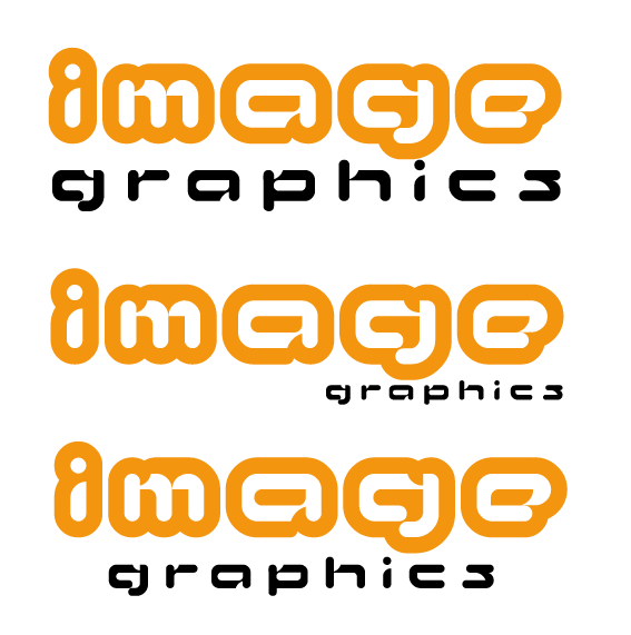
Here’s a 2-minute quickie, I’m late for work.
Love….Jill
Attachments:
-
I like that jil, thanks. have you got an ai file for it?
Dan -
Dan,
I like the top one of your third attemt but have you tried it with the “image” kerned in so the orange border touches on each letter.
This would reduce the width of the logo so you could bring in the spacing between the “graphics” letters
-
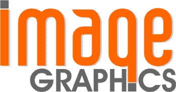
I like that mate. This?
God im so confused….. 😕
Attachments:
-

#5 looks ‘arty’ (Jill 😛 ) and well presented, just watch the ‘a’ of image being lost though.
#6 really not my taste, looks too amateurish (like you’ve looked at one to many crazy fonts), most people call based on what they see. If you pick a middle of the road concept it’ll offend less / attract more.
Look to the core of your business – who’s your bread & butter. If it’s all boy racers & cowboys builders any old carp will do, otherwise aim for the money and make it as timeless as possible not getting stuck with eg. a cool ’70s design or minimalist ’90s. Try to avoid difficult to read styles, after all you’re trying to SELL your name.
Several fonts are almost ‘out of fashion’ at the moment and should only be used very carefully. Brush, Slippery – (my pet hates) and all caps Old English styles especially! -

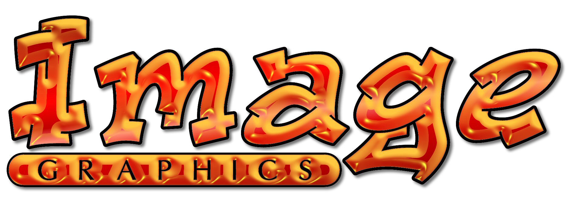
liked Paul’s one…….would maybe change it a wee bit (!)
Attachments:
-
I like the choppy one.
It looks interesting to me, and appealing.
Here’s a Corel 9 version of mine, no time for an .ai, but is is converted to curves.
Love….Jill -
quote noviceDan:Thanks for all this guys.
Which ones the choppy one?
DanI think jill means Untitled-6.png
-
That’d be it, Shane!
Be a bear to weed tho, but I do like the look of it,
kind of “cutting edge” so to speak.
:lol1:
Love….Jill -

I like Paul’s last one…would just play with it a bit to work out the ‘look’
and how the g feeds into the i of graphics.
think it looks interesting myself -
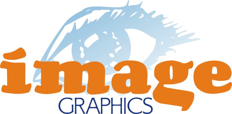
stealing my eye thinghy here are we people? :lol1: hahaha just joking
i would advice to take all the logo’s on the thread an put them next to each other and combine them, take what was good and leave what was bad, set rules for yourself, work with what’s good and don’t overdo it,
the mayor problem with designing your own logo is that where to good at it, we have software that has endless possibilitis and an imagination to match giving us the ability to make an endless amounts of variations and wanting to cram it all in that one logo wich gives us the problem of not seeing what is best for us, for a client it’s easy….just realize their idea, but for us it’s difficult…we don’t have one idea,…we have many, to many
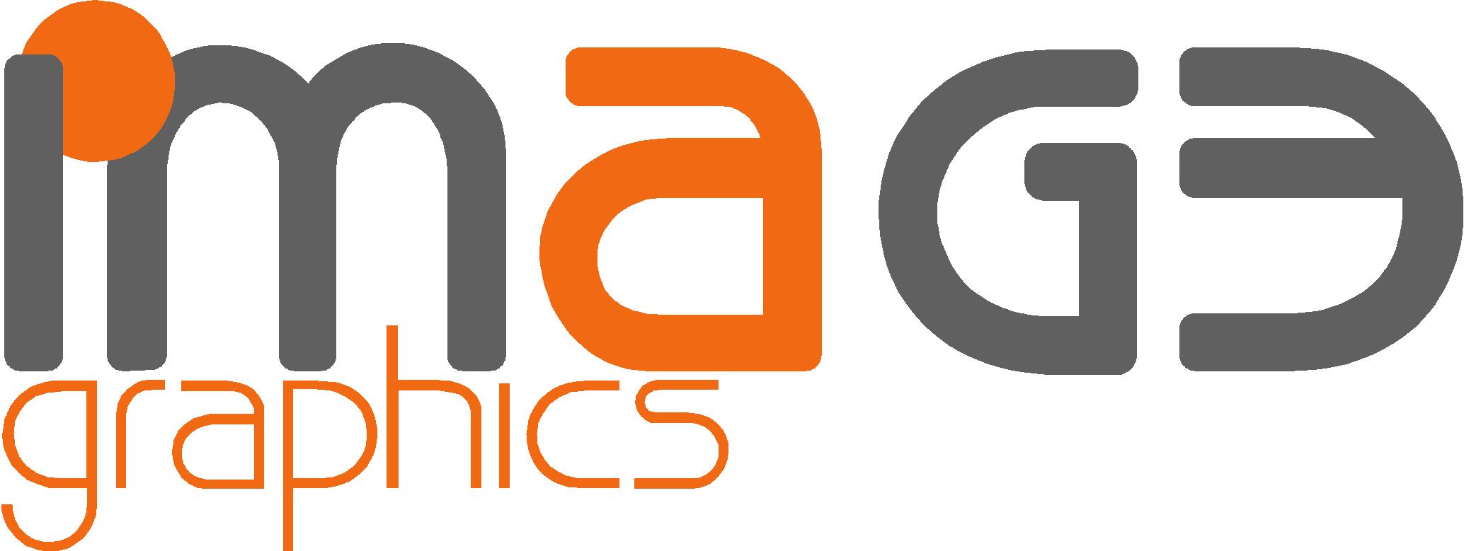
anyway i’ll post my logo to give you an suggestion and hopefully give you the right idea for your logo
my logo was also designed using the help of the members here (and what great help they are, couldn’t have thought of it without them)
oh yeah almost forgot:
i like the bottom “image” of the first post you made 😉
Attachments:
-

image graphics…hmmm may wanna check the companies house website if u plan to go limited, got a feeling there is a few “image” related sign businesses espcially in kent as i used to work for one of them yrs ago.
where u based dan?
-
I have checked with company house. Its fine to use it. Im located in Bicester near oxford.
Dan (hot)
-
that looks great, could i have that as an ai file?
Cheers matey
-
You should be able to upload an ai file to this site the same way as you uploaded the jpg
dreckly
paul r
Log in to reply.
