Activity Feed › Forums › Sign Making Discussions › Graphic Design Help › what would be the best way to letter this vehicle?
-
what would be the best way to letter this vehicle?
Posted by LeeMorris on November 28, 2006 at 4:43 pmJust been having a play with what to but on my car.
I think its best to keep it simple or should i put more on to make it stand out?
I know the fonts naff i need to buy some better ones.
any ideas greatly received
Cheers
LeeJill Marie Welsh replied 17 years, 5 months ago 12 Members · 23 Replies -
23 Replies
-

Hi Lee
With van design/vehicle design, especially when its your own vehicle it has to be spot on. Its good to combine some sign making styles and some different materials so it can be a bit of an advert and example board when you go to see customers. Things such as going in a recess, matt vinyl, gloss vinyl, maybe a touch of reflective, and if you can manage it in this day and age some printed media.
Go for less as too many words and colours make you look like a desperate ice cream van.
Post your ideas up and I am sure you will get some contructive advice from people.
Best Wishes
-

Lee,
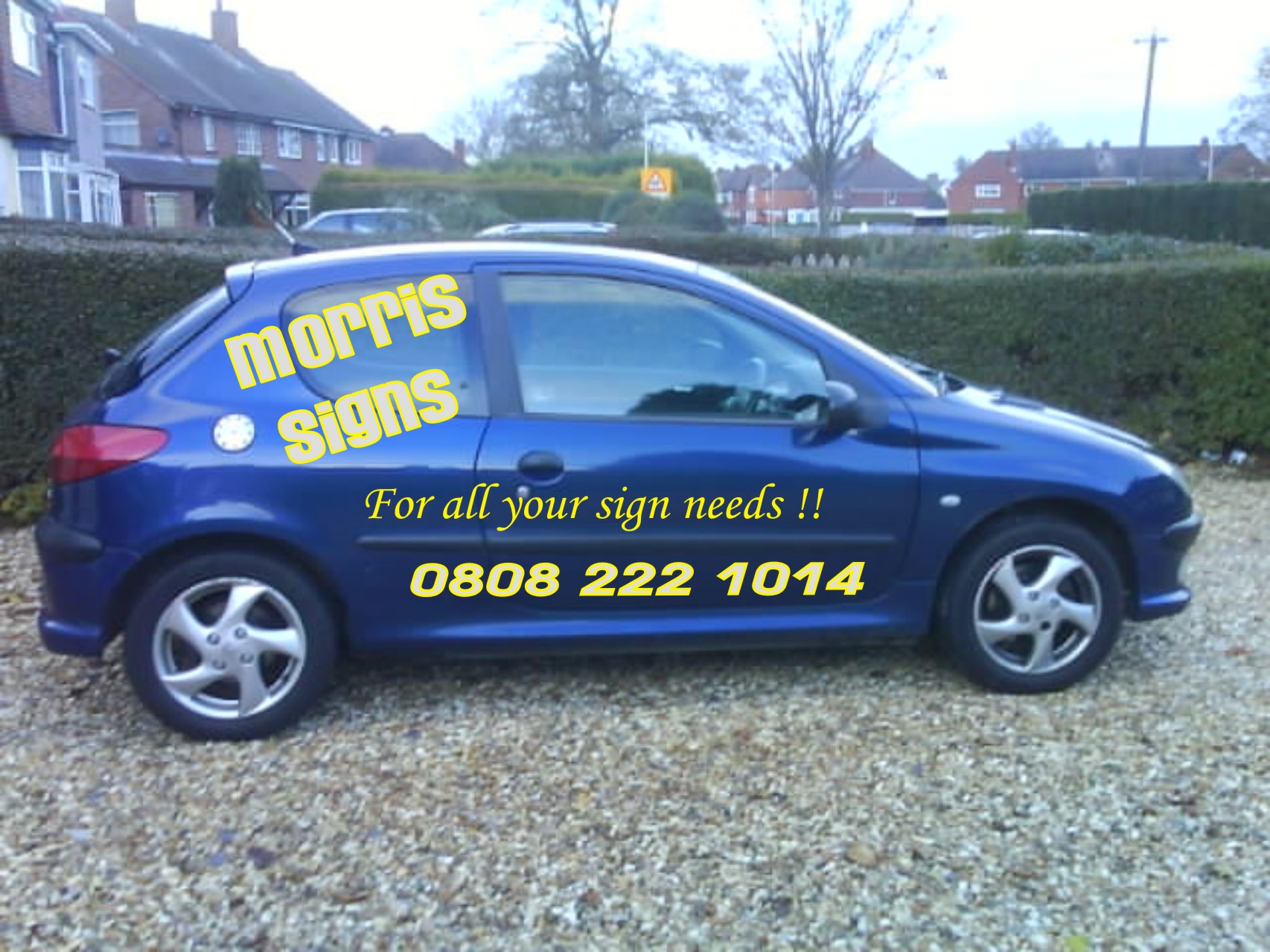
ok its plain and simple, and to the point.
And as you are just starting, I would say its a good first project.
You will learn the basics of cutting, applying vinyl and how to layer. Give it a go, and dont get to bogged down with the design just yet, If you get that on your car, first time, and with only one cut, without any bubbles and all aligned nicely. then go for something more elaborate.Peter
-

So if i do that and want to change it and practise more hows the best way to get the vinyl off.
Cheers
Lee -
Lee, any good vinyl will peel off quite easily.
And dont forget, tother side is different..
Peter
-

Go out and buy a Dewalt heat gun. The one with the Variable temperature control. Set the temperature to Low-Med, put your hand infront of the nozzle for a second or two. . it should be hot but bearable if it burns your hand it’ll burn your car ! :lol1:
Warm the area around the vinyl ( not the vinyl directly ) then lift the corners of the vinyl with a plastic squeegee / old creditcard. Any glue left on the bodywork needs to be cleaned off with Meths / Glue & Tar remover.
If the vinyl hasn’t been on the car for very long it should come off without too much fuss.
Rather than stripping your design off each time why not consider adding to it. Trying to design in extras like outlines around the text etc etc. .
have fun.
-
Thats not bad for a first design, its not too cluttered or fussy. Daves advice of adding to it is a good one too, trick of this game is practice you need plenty of it to get the feel of the vinyl, once you have that you will maybe fancy taking on some more tricky designs.
Have a look in the gallery if you need some ideas too, there are some pretty mad designs 🙂
-

Let us know how you get on Lee.
Oh, and change that Zapf Chancery font(or whatever it is) to a nice one. I hate that bleeding font.
When you’re ready to buy some nicer fonts have a look at http://www.letterheadfonts.com They have some real beauts on there, and show some really nice examples of how to use them.
Your layout looks OK – if you’re anything like me you’ll get bored with it in a few days and change it anyway. 🙂
-
Just had a look at letterhead fonts and you are right, there are some cracking fonts on that site 😀
-

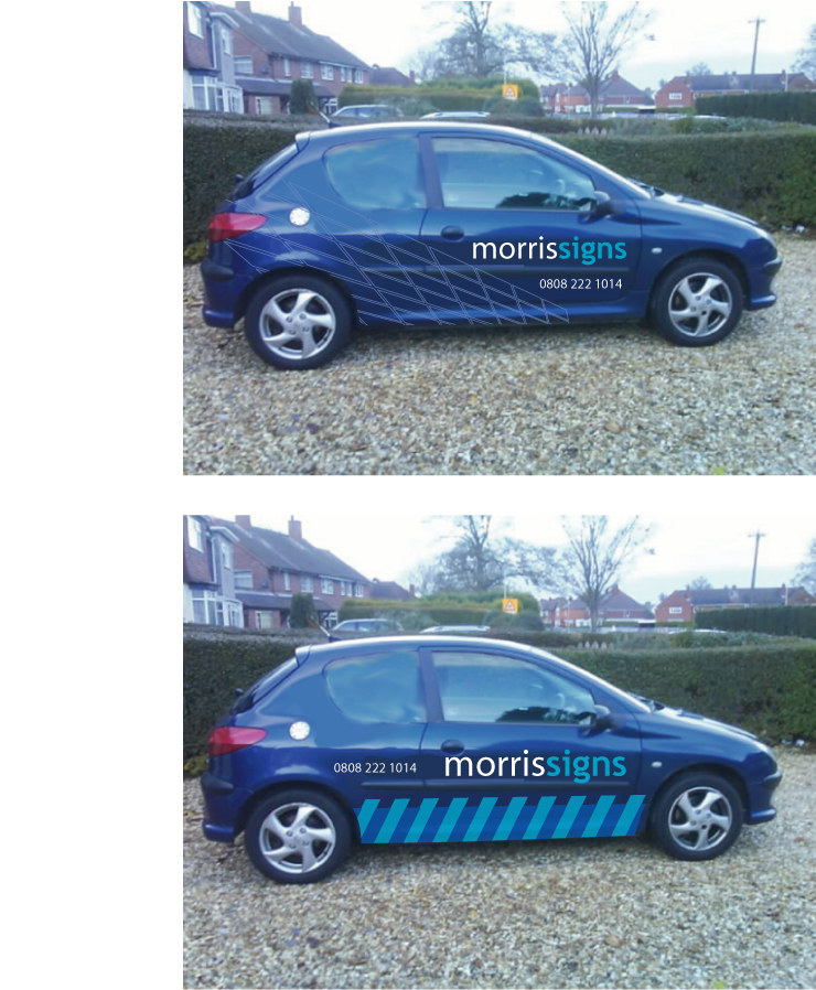
i’d personally move the word ‘signs’ a little to the right, just to centre it up under ‘morris’, and i always prefer the word ‘signage’ to ‘sign’ when telling people you can accomodate their requirements, ie, for all your signage needs,
hope that makes sense ! a 18mnths ago i’d not have a had a clue about alot of what i just said, hell, a year ago even, but listen to this lot, most of em know what they’re talking about !
good luck.
-
Hi Lee
I have just had a close look at your picture and think I can notice some outlining on the text, is this deliberate? If so what other colour are you thinking of using with the yellow? When using outlines unless going for something really subtle then consider making a bit more of a contrast. Also when designing its worth thinking about your whole corporate image, i.e. stationery etc
-

Lee,
I think Lloyd just made a great point. To keep your brand image / identity you are going to want to keep things uniform. Your company letterhead should resemble your company business card which should resemble your website etc. You want to make everything as streamlined as possible this way your customer feels your sense of organization. Colours are a one key to this but there are many. Fonts play another role in this. The last thing someone wants to do is read something that is in 10 different fonts, it starts looking like a ransom note rather then a piece of art.
-

I think you should work on the colours and maybe do something a little more daring………. I would also avoid the window using colours elsewhere…..maybe even the curved shape used in the earlier thread
Not saying this is correct …..but a quick idea how you could do things without using window 😀 😀 😀 [had rectangles and chevrons from a Tilers van]
Attachments:
-
 quote Nicola Rowlands:love the first one andrew 😀
nik
Agreed, the first one is REALLY slick!!
-
I’ll third that,
Andrew, great designs, Lee will will be pleased.Peter
-
Hi Andrew
I really like the first one .
That’s a look that I’ve seen before and liked but was more chequers than empty rectangles.
I will have to see if i can create that in coreldraw.Its funny really when you see someones idea and wonder why didn’t i think of that.
Cheers
Lee -
Andrew anyone every tell you, you look like him i thought it the other day.
Back to the car, if i was to put something like that on my car how would be the best way to apply those rectangles.
Lee
-

well go on Lee who does Andrew look like 🙄
oh and I also agree cracking designs Andrew no matter who you look like 😀Lynn
-
quote leemorris:Andrew anyone every tell you, you look like him i thought it the other day.
Back to the car, if i was to put something like that on my car how would be the best way to apply those rectangles.
Lee
Lee, I really admire your enthusiasm,
One off offer, never to be repeated….. rather than try and explain it all, if you are anywhere near Luton, or have a spare day, call in (by prior arrangement) and I will show you all the basics, design, cut, apply.No dis, but it will be easier than trying to answer all your basic questions one at a time
Peter
-
Kevin Cosner 😛
trust me I’ve seen Andrew after the night before 😉 😉Lynn
-

I like that Lee.
All you need to do is tighten up the morris and signs so that there is less space between them.
Not keen on the zapf either.
You could put that line in a reverse panel using the same font as your name.
As for Andrew, I think he’s handsome!
Way better looking than old KC.
Love….Jill
Log in to reply.
