Activity Feed › Forums › Sign Making Discussions › Graphic Design Help › what way can i lay out this garage design?
-
what way can i lay out this garage design?
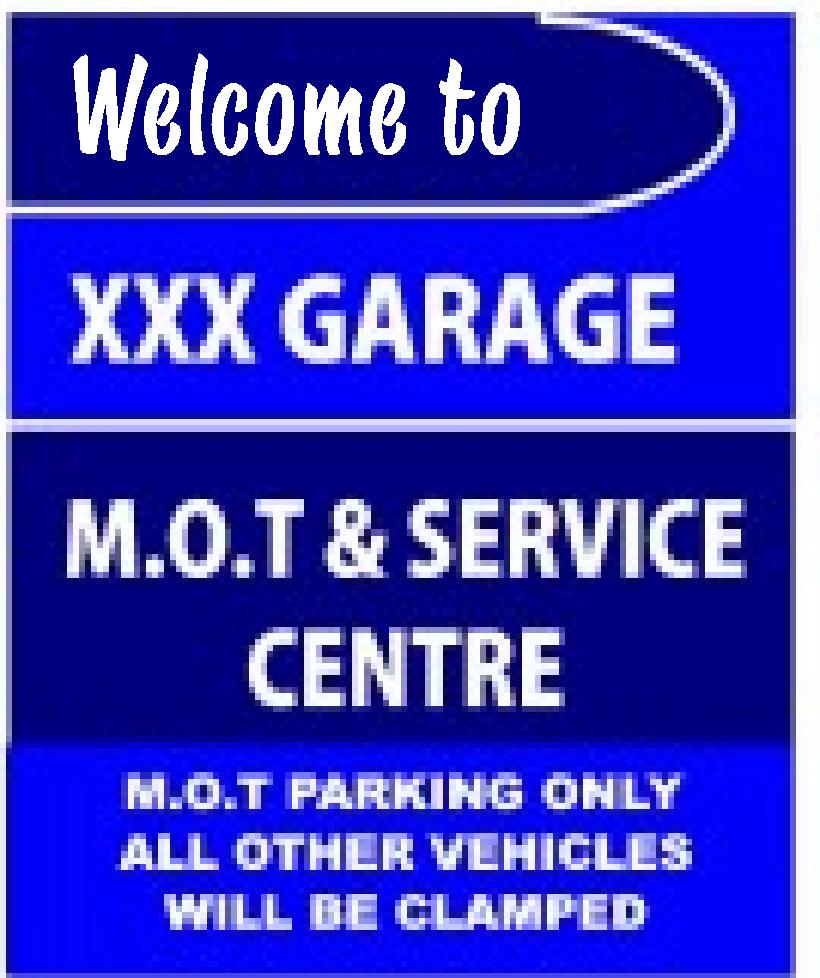
Posted by Richard Urquhart on June 18, 2008 at 7:39 pmhi all free hand on this one
only one condition blue di bond sheet materialnot sure on the rule of red on blue??
and running out of ideas oh sorry cant use yellowif you have some time please can i have some ideas to go on
thanks richoh the xxx is the same as the correct name just didnt want to shout it out
thanks rich
Attachments:
 Richard Urquhart replied 15 years, 11 months ago 9 Members · 42 Replies
 -
42 Replies

-

give us a clue Rich 😀
sorry posted before the pic’s apearedLynn 😳
-

sorry had to do a bit of editing
all up there now
thanks rich 😀 -

I would not advise using red with blue, it can make the eyes vibrate.
Love….Jill -
Hi Jill I remember you saying this before and that’s why I asked is it a rule as such or just you dont like it ???
What colour would you suggest,
thanks Rich -

red on blue or vice versa makes it very hard to see, the letters etc look like they are moving off the substrate, jumping around etc.
also a very bad colour clash, yellow with blue goes ok, but you cant use that so I would go with white, or a shade of very light blue/grey with the letters cut out of the shape.
If its ral 5013 dibond then white and light blue go very well with that one, (depending on font and layout choice obviously) -
Actually if you give the red part a white top and bottom border it would be OK.
Love…Jill -

My rule of thumb Rich, is if in doubt get the cyan out, any medium to dark blue works well with cyan. :wink[/img]
-
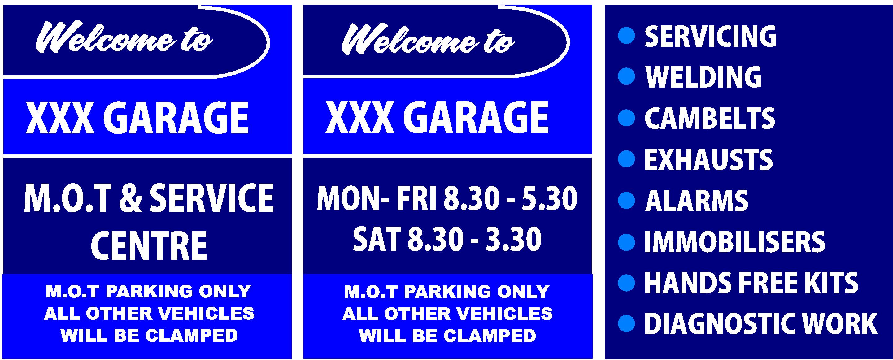
Hi Andrew
no the panels are in 3 places although not close to each other 2 will been seen at the same time but it will be one with the welcome to and the list of services they offer
thanks Rich 😀 😀 -

I’d make ‘Welcome to’ smaller and maybe use a script, I’d also centre the list of service and add some light blue.
-
Better!
Now make the Welcome To a bit smaller, perhaps in a nice script, and move that bottom info up away from the edge.
I think the list of services might look better with a border in that new blue, with the text center-justified.
And in from all the edges.
Love….Jill -
Does the triple X garage show porn while you wait?
I suppose its a novel take on the truckers mags and the 3 year old auto trader thats usually there -
quote Jillbeans:ACK!
Harry you are psychic!
Love….Jill
😮😀 😀
-
just seeing what your thoughts were regarding the last post thanks rich 🙁
-
Looks good. Welcome to is still a bit big.
Love….Jill -

I’m not to keen on the thick border on the third one Richard..
I can see why Harry suggested centering the text but I think it would look good right adjust but with light blue bullet points (circles)…I think that would make the ‘alarms and immobilisers’ read a bit better
I like the theme of it all though
-

One more thing about the line "Alarms & Immobilisers". Since it’s broken on two lines and is part of a list, I would reduce the leading a little bit just for that one. It will read a little bit better as an individual thought.
-
I also don’t like the blue line around the 3rd. board and would sooner see it left justified and as alarms and immobilisers are two separate things you don’t need "and" the welcome smaller and maybe in a bolder font on the other two
Lynn
-
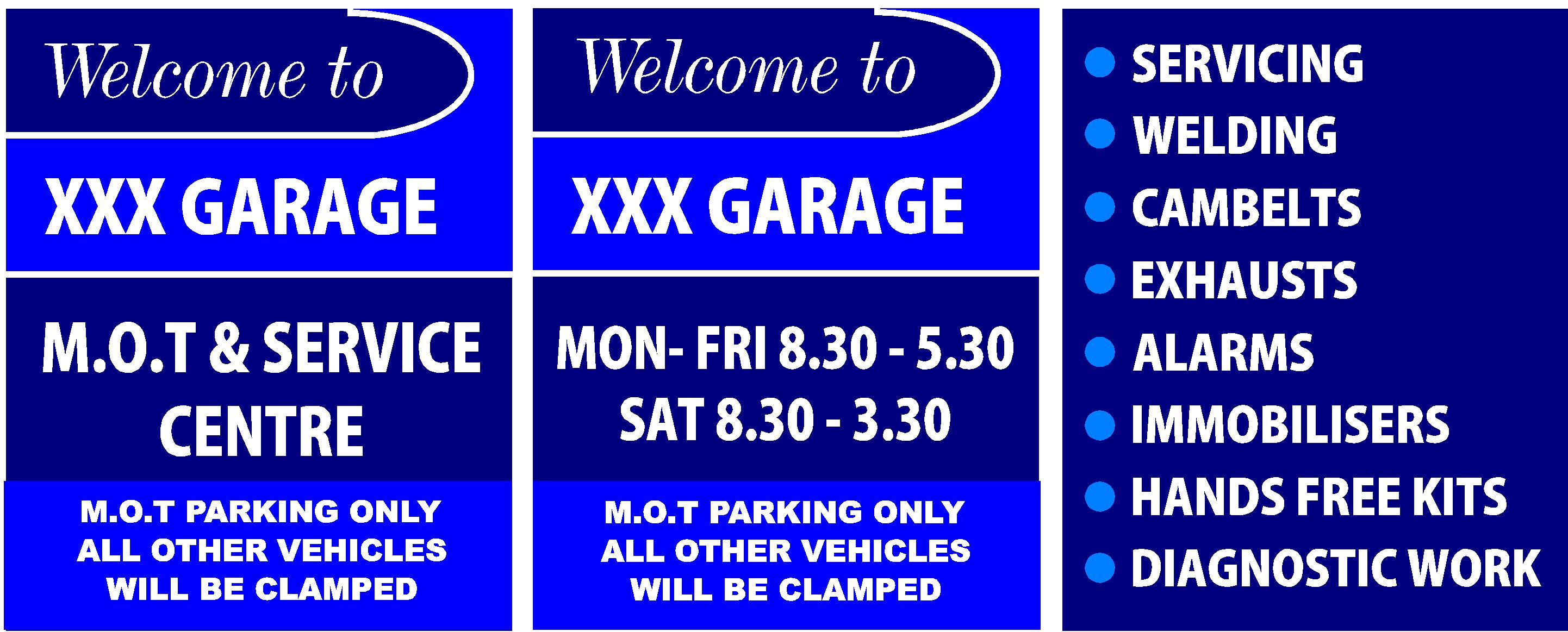
well after your help I think this is the one we shall run with
thanks for all the pointers. I so hate doing lists of thing !!
please give my your thoughts on this finished
Attachments:

-
still would like the welcome a tad smaller in a more friendly font, not really keen on Italics
Lynn
-
Hi Lynn
rubbish with fonts do you have a suggestion for one that may work
thanks rich -
is there a difference Rich between the last one before mine and about 3 up???
Lynn
-
something like this it is a letter head font I am fond of
Lynn
Attachments:
-
Sorry Lynn dont like it
how about LHF Samster Script dont have it but I really like it
Rich -
how about using AS Blaze
like this as i have this font
Attachments:
-
Stick a fork in them, they are done. Now go make them.
Love….Jill -
Glen thanks for reminding me thats the sort of thing that happens
rich 😀 😀


Log in to reply.
