Activity Feed › Forums › Sign Making Discussions › Graphic Design Help › what way can i lay out this design?
-
what way can i lay out this design?
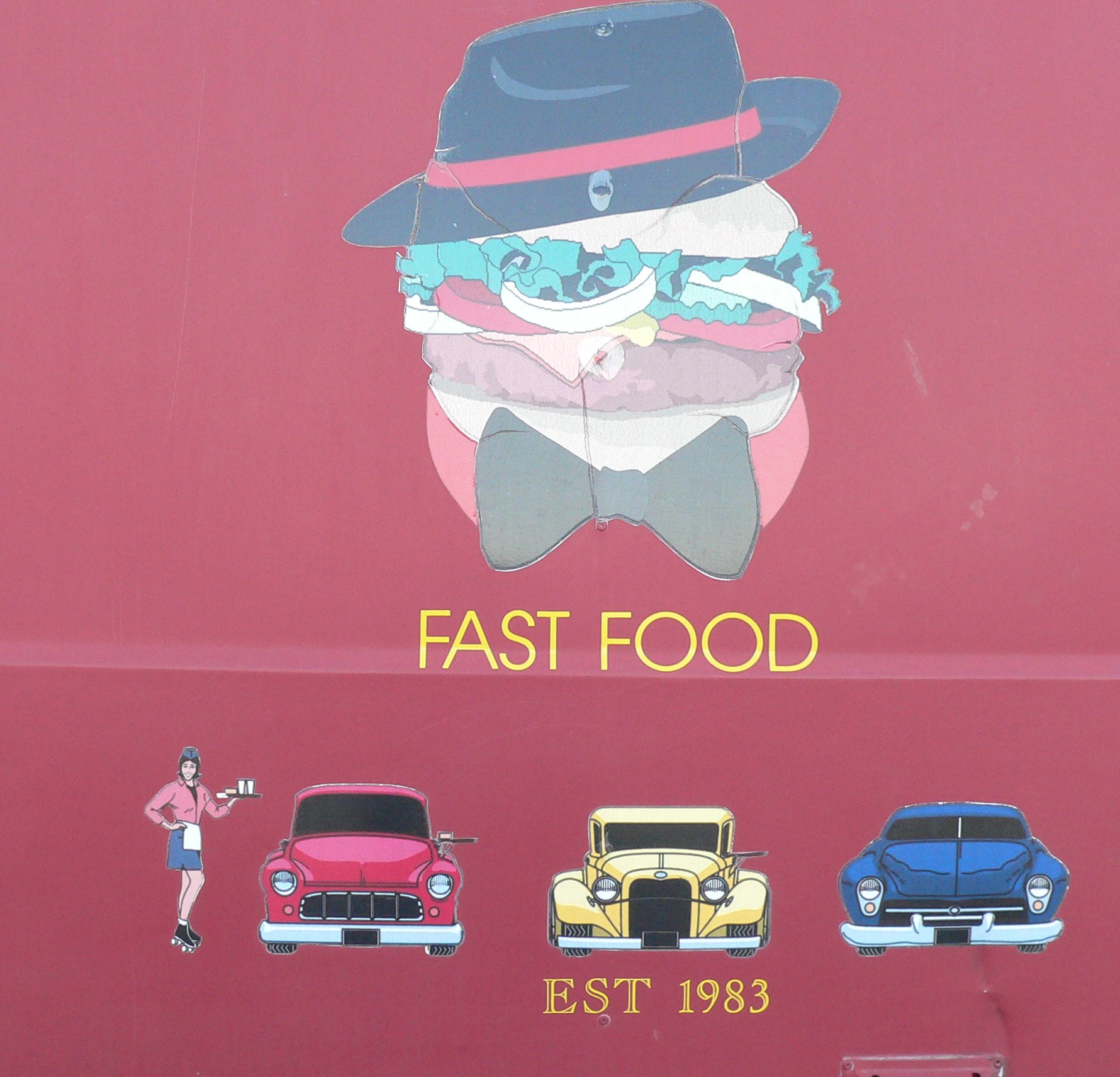
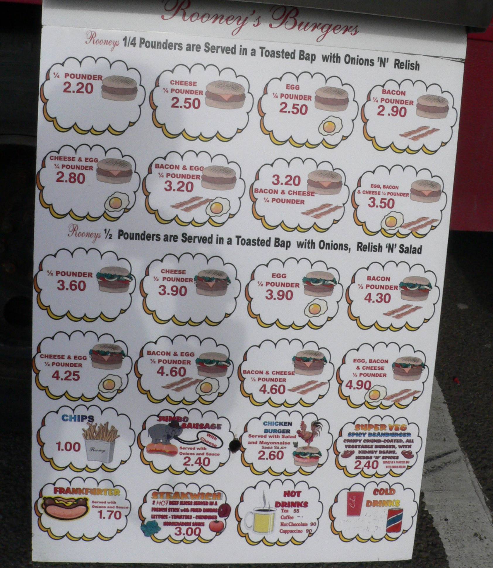
Posted by Peter Normington on March 10, 2007 at 10:55 pmI have to revamp some very badly done, but I think fun menus.
they are quite old and I suspect printed on an early PC60They look just like in the pictures, but with a bit of work, can be easily redrawn and brought up to date
The customer wants to keep this format, because after 25 years trading, believes it works for him, The signage is to be fitted on his new van, and its costing £56k!!
thoughts comments and advice welcome..
Peter
Attachments:

 Robert Lambie replied 17 years, 2 months ago 9 Members · 12 Replies
 -
12 Replies
-

It all looks awful IMO.
I’d suggest he has something totally new. And what is costing £56k? His new van?
-
 quote autosign:It all looks awful IMO.
I’d suggest he has something totally new. And what is costing £56k? His new van?
no… just the signs
…. I wish
Peter
-

i would try to go against what he "thinks" is working for him.
i dont like buying food from mobile food vans… when you sell food i believe everything should appear fresh, clean etc
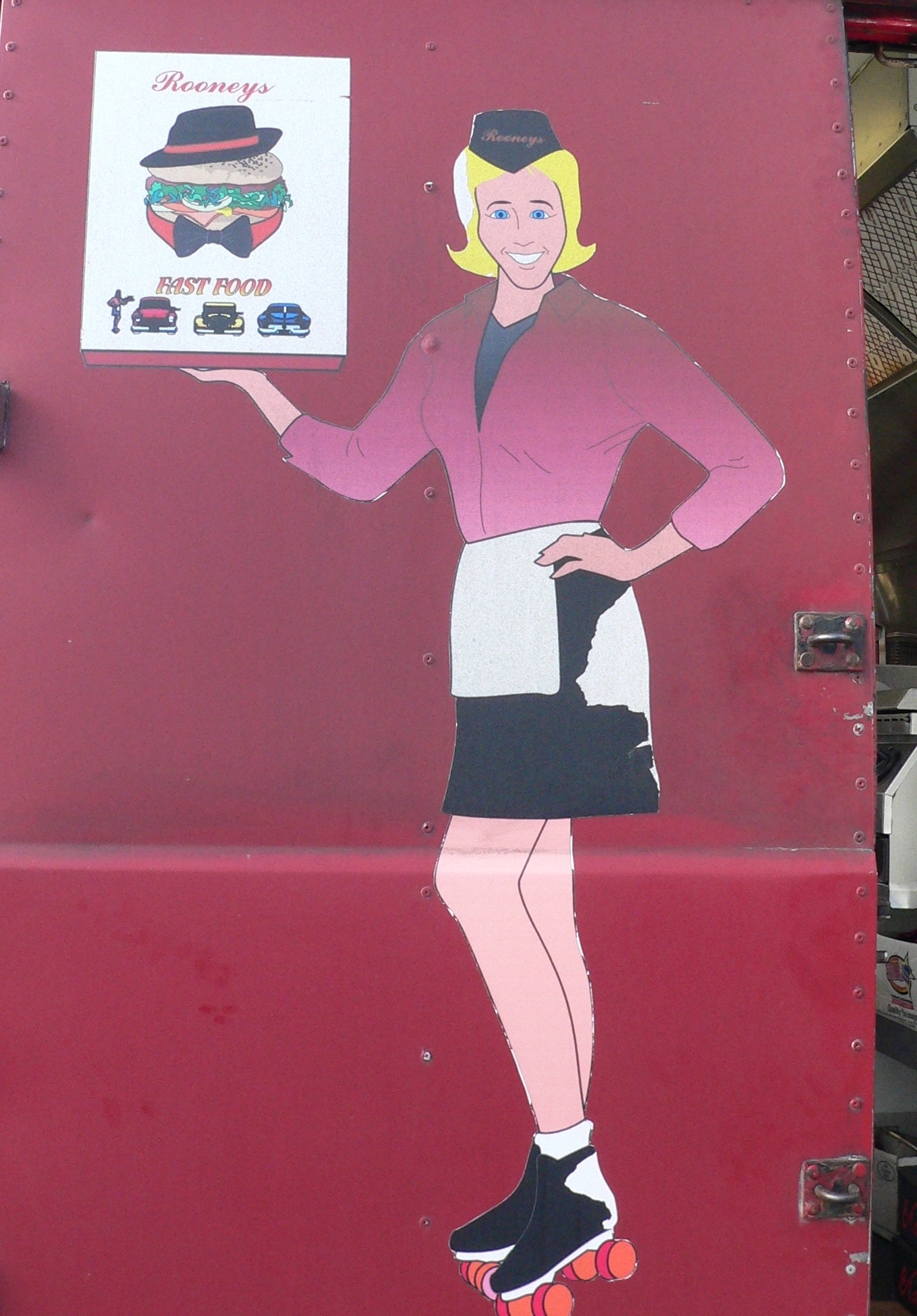
replace the images with actual food images… change the layout of the menu.. fine have a waitress on skates, but dont use the shemale cartoon. use an actual picture of a waitress…
you have all the kit to really make something nice and up your own sale. -
 quote Robert Lambie:i would try to go against what he “thinks” is working for him.
i dont like buying food from mobile food vans… when you sell food i believe everything should appear fresh, clean etc
replace the images with actual food images… change the layout of the menu.. fine have a waitress on skates, but dont use the shemale cartoon. use an actual picture of a waitress…
you have all the kit to really make something nice and up your own sale.I agree with that Rob. To convince him, do a mockup and show him, because he may not have the ability to picture it in his mind.
Plenty of good stock photos you could use I’m sure. Signing a new van, in old pics is such a waste. A fresh clean image would be ideal.
You don’t see McD’s or Pizza Hut staying with old stuff, they are always updating to look fresh and vibrant.
-

Peter I can understand why the customer is reluctant to change if he has been trading successfully for 25 years but I would agree with the others that it really needs to be brought up to date. In fact if he has been using this for 25 years I would have thought it was dated when he started, looks more like a 50s sort of style to me.
As Robert says you could keep the basic elements the same but just bring it into the 21st Century by changing the graphics, modern printed waitress, up to date printed food images, modern looking cars etc. it shouldn’t take to much to dig out some up to date images to show them what it could look like. I would think that what he wants will look totally out of place on a modern van, much better suited to an old van that has been reconditioned.
-
what colour and type of van is he getting now peter?
that looks like the old style merc van. -

I think Daphne would look better on the van rather than Fred
https://www.uksignboards.com/files/thumbs/t_skater_106.jpg
You could call it the Scooby Snack Bar
-

the ‘waitress’ is a lady boy!!!!!!!! that’s scary…………. 😮
I think if your customer just wants a little updating of what has worked for him before then why not give the man what he wants……….
BUT ………. give him another design too 😀 Hopefully he’ll come to his senses.
At the end of the day, if he’s happy and he pays you, then it’s a good job done! -
I did suggest modern cars, real pictures of food etc. But I think the customer is stuck in a time warp. The new van will be a trailer, so a bit better to lay out as it will have flat sides. I talked him out off using the ladyboy, but he knows all the reasons of his success.! (having the same van for nigh on twenty five years is obviously one of them..not) The new unit will be painted exactly the same colour of burgundy, although he did point out to me that it was "red" for a reason…
anyway I have over a month to change his ways, thanks for the comments, I now have a bid of work to do, I will give him a modern look as alternative, once he sees it superimposed on his nice new modern unit I’m sure he will change his mind.peter
-

Peter, if done properly, that van could look great and sell even more food for the guy.
Look at what my friend Jeff did using one of Arthur Vanson’s fonts.
These have to be some of the nicest-looking menu signs I’ve ever seen:
http://buckssigns.co.uk/jefflang.html
Love….Jill -
some very nice work there by jeff, jill. i like the font too…
it does give the age feel to it also… bit like big als menu in happy days :D.in all honesty, i can appreciate where the guy is coming from.
i still think you can push the years established, keep a traditional "feel" but still go modern.
as much as "the idea" of the waitress and meal deals is old, its more a sort of american drive through done bad. the very fact its done with a pc60, with burger and waitress clipart shows the guy is willing to move with the times, i think.probably hard to get hold of the right picture but you could have a large "old style" waitress head to waiste holding a food/food tray in trational clothing. digitally printed with some nice tradional font. pushing the year established.
easy for me to say i know, but hard to discribe what i mean also…
i see some tasteful pancake trailers on the go just now. done in forrest green with cream and gold text. very clean and modern looking but still having the tradional feel to them. i saw one in cardiff (i think it was) the other day that was particularly nice.
Log in to reply.
