Activity Feed › Forums › Sign Making Discussions › Graphic Design Help › what way can i add these logos to company van?
-
what way can i add these logos to company van?
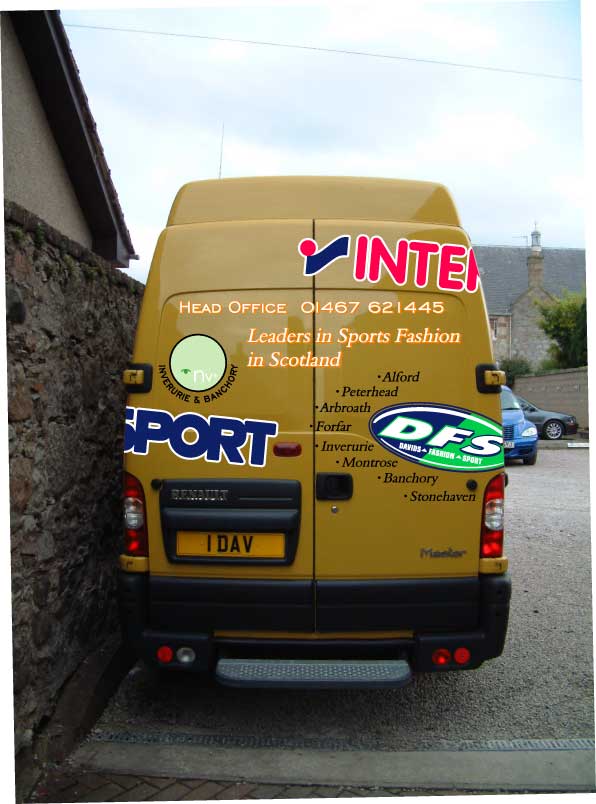
Posted by Gordon Forbes on September 27, 2005 at 6:23 pmHave this job to do and I have let the customer see this design and he likes it but wants the logos straight and less writing.
Likes the idea of the logo wrapping round the sides of the van so its a start anyway.Thanks for any help or critisism I am thik skinned LOL
Goop
I will add eps files if anyone needs them
This thing is huge uses a lorry chassis with small tyres to beat the tacho laws in this country when you buy them 160 bhp apparently but it lets him do his run all in one go.
Attachments:
 David Rowland replied 18 years, 7 months ago 7 Members · 14 Replies
 -
14 Replies
-

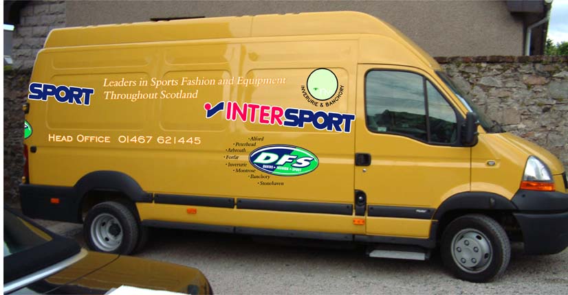
The back don’t match up with the side? I would make the logos big, and take off the smaller text..
Simon
-

Hi Goop have to agree with the customer they have to be straight, they don’t look right at that angle, and the wrap around is too small to work. If you must put them at an angle at least 30 – 45 degrees.
sorry Goop like the rest though 🙄Lynn
-
Post up the file, and see what people come up with
Simon
-

Goop, I think the oval logo is throwing everything out. Perhaps it could be moved?
Its just my preference but if text is at an angle I like it low left high right
Peter -

Yes I have to agree with everyone else Gordon – I’m afraid it’s just not working. The only way to get the effect your trying to achieve is to make the logos much more dominant. As it is there is no real main message coming over – every group is too similar in size. Try varying the sizes much more – aim for a foreground (Main message) middle ground (secondary message) and finally back ground (all the other stuff that is there but is of lesser importance.
-

Looks like ya threw logos on to the thing.
No prioritization of copy.
If you put up an .ai or something I might have a go,
tho you probably wouldn’t like what I did anyway.
Love….Jill -

Dunno why You think that Jill I have liked some of your stuff.
Thanks for the comments.
Originally the customer didn’t want ANYTHING on the sides and NO TEXT apart from Head Office and the the branch names on the front and rear only.
I know it looks like the logos are stuck on thats why I posted it. Given the wants of the customer I don’t have a lot of lee way.
At least now he is leaning towards getting the sides done but the last time I spoke to him still just the Head Office text and phone number.
I’m struggling to make it look any different.Goop
-

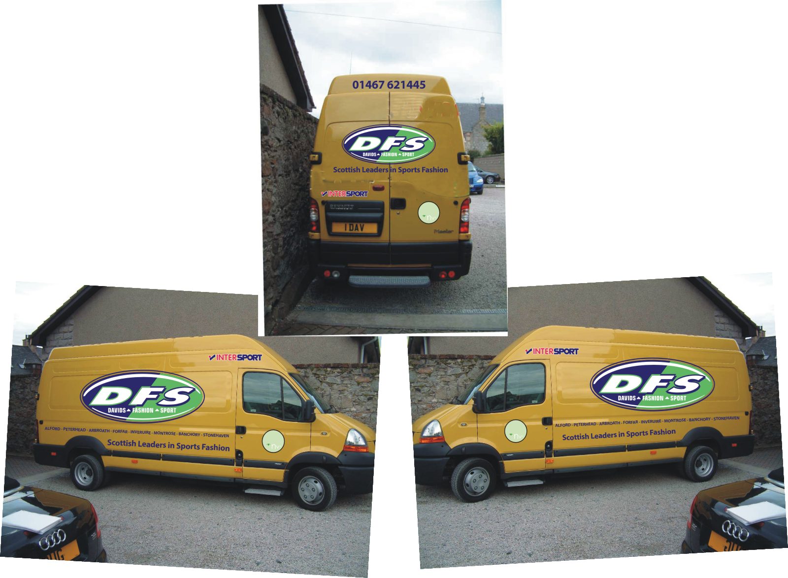
Hi, Goop. Personally I didn’t like it much, it looked a bit too slapped together, it is important to see things from a distance and if you cant see it from the small preview then it is not working, I am no expert but trying to just simplify the job, I find simple to be effective. I came up with something but not spent time on fonts/positions and logos, just wanted to see what could be done. I am guessing the DFS logo is the company name. I know what InterSport is but no idea what NVs is.
Also, the customer has NO say in how his van should look, he/she should give you ideas for you to come up with a plan.
Also, I can see that they have a lot of shops, 8 on the van, is there going to be room for new shops or if they close down?
Just a quick go… have fun with it
Attachments:
-
Aw Goop I was just being crabby.
The other day I did something that I thought was nice
(for someone else) and nobody liked it!
Dave, you little witch, you did exactly what I was going to do!
(Only thing I’d change would be to make the store locations inside
some sort of panel, like a stripe that would wrap around the whole van)
Looks great, has a focal point, well done.
Love….Jill -
Please, don’t be meanie to me Jill.
You post yours then, i just placed text and thats it -
Witch is a term of endearment.
My sister calls me that all the time.
I just tried, but the eps is too pixillated for me to play with.
Yours is exactly what I would do, but for the panel.
I’d probably make the panel purple and the letters white.
You know I like you, Davie.
Love…..Jill -
hey, like Steve’s/Bryan’s thread, we teach the americans a few words and now we learn a few american words.
If a man said that to a girl in this country, we would get slapped!
Oh Jill, 😳 what is you designer program?, if Corel then EPS needs the “Postscript Interpreted” filter and not the standard EPS format, seems to be created in FlexiSign
-
No No No….it’s not standard.
You’d get slapped here too.
(It’s just me & my sister’s term of endearment)
I tried in Corel.
My sign software is Gerber GA 6.2
Too tired tonight anyway & I love what you did.
j. -
I have GA here too.. since u going to bed we leave it. Anyway, just off to get my plane tickets so Jill can slap me :praise1: !
Night night Jill
Log in to reply.
