Activity Feed › Forums › Sign Making Discussions › Off Topic Chat › What talent!
-
What talent!
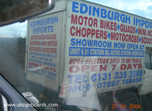
Posted by Robert Lambie on February 27, 2006 at 10:35 pmwhile out on my travels today i spotted this little beauty sitting in a traffic jam while in Edinburgh. as my heart sank, i let out a little sigh and thought… what talent, they must be so proud. 🙄
Attachments:
 Lorraine Clinch replied 18 years, 2 months ago 15 Members · 37 Replies
 -
37 Replies
-

wooo… 😀
ive heard of covering empty spaces…. 😉
nik
-

*customer looking over sign makers shoulder* “oh… you missed a bit” 😉
andy, they are out my league mate :lol1:
-

That might cause a wreck as folks pause in traffic to read it.
At least they used alternating colors to break it up.
Now where did I put my barf bag?
Love…..Jill -

lots of info, reads ok. artistic and creative? its a SIGN
you noticed enough to take a photo Rob, So it did its job!
Peter
-

how did they get all that white vinyl on a blue van ???????
-
quote Peter Normington:lots of info, reads ok. artistic and creative? its a SIGN
you noticed enough to take a photo Rob, So it did its job!
Peter
i didnt want me to read it, i couldnt.
it spelled cheap and tacky to me, as it will the customer.
its not a sign, a sign is meant to be read.
the sign maker, as well as the customer, hadnt a clue what they were doing. 😕 -
Yup, Peter, it’s a sign but it looks like shit!
Nothing like running everything to the edges.
Even a knock-off sign should be readable.
I’d notice this one only because it’s so bad.
I think the only person who likes it is the guy who probably paid $250 for the job.
Love…..Jill -
Ok, Jill/Rob
didnt you notice my big tongue in me cheek?
😀
Peter -

There’s some rubbish being made these days 🙄
This is precisely the sort of junk that gives signmakers a bad name.
-

what a beauty the flowing of the letters the spacing the color wawwww. Ok who created it lol.
-
Now heres a question,
how would you guys have incorporated so much info in the space available? 😀Critism is fine if you can show an alternative.
😉
I’ve still got me tongue in me cheek, btw
Peter
-
ohhhh mr normington loves that big spoon :lol1: :lol1: :lol1:
could be a bit of fun? 😉
-
As to show respect for Peter I think you should go first .
Don’t worry about your tongue lol show us an alternative. lol @ 11:41pm
Nancy -
quote wannousnancy:As to show respect for Peter I think you should go first .
Don’t worry about your tongue lol show us an alternative. lol @ 11:41pm
Nancy:appl:
-

what wrongs with it?
they are conveying an image of cheapness as they are importers, so therefore cheap and tacky signage.
-
quote Dave Rowland:what wrongs with it?
they are conveying an image of cheapness as they are importers, so therefore cheap and tacky signage.dahhh!!! 😀
nik
-
well Dave my Dave its bad
For me i would not present my business with cheap and tacky signage lol
-

You would need a little while trying to read all that while driving!! 😮
I think Peters suggestion isnt a bad one …. when bad signs are seen then put it into design help forum for other peeps to show what they would have done … but they have to use all the info that is on the present sign … no getting rid of any of it???
😀
-
I actually agree with dave ( makes a change) but the image is pile em high… sell em cheap, and the sign conveys that message, so the project is to get all that info in the space, make it look cheap, and also within a very tight budget.
Given those parameters, design time is limited to 5 minutes.
I confess, I coudnt come up with anything better, and cheaper, with those constraints, could YOU? 😀peter
-
Thats Quite a nice site, thats if you are into Teddys Dave.
Dont think thats anything to do with the van though?
Peter -

Took longer than 5 minutes just to type out all that info.
Not fantastic, but I tried.
-Marek
Attachments:

-
:lol1: :lol1: bless lynn
marek, there still space on the van! -
i think it good marek space is better then crowded
-

You’re all missing the key point here!
It’s a pure work of genius – how clever!
Simply take the width of the van and multiply it by the height and then mulitply it by 2.5 (2 sides and back) and there you have it!
You know instantly how many square metres of vinyl the job will take 😉
Rob, I think you could run a pricing tutorial based on this philosophy.
Mark
-
Awww…come on. I figured a few would have a go at re-designing it.
-Marek -

I think they missed a bit, there’s nothing on the cab! :lol1:
-
quote Phill:Hey Marek – You spelt Edinburgh wrong 🙁
Yeah, but the guy wasn’t paying me much so I didn’t care. 😉
I noticed it after I flattened it to post and didn’t feel like going back to change it.
-Marek -

Well done Marek, at least you had the balls to give it a go!
-
Lorraine – You spelt Balls wrong..
The proper spelling is testicles…. 😕
Log in to reply.
