Activity Feed › Forums › Sign Making Discussions › Graphic Design Help › what does everyone think of this revised logo?
-
what does everyone think of this revised logo?
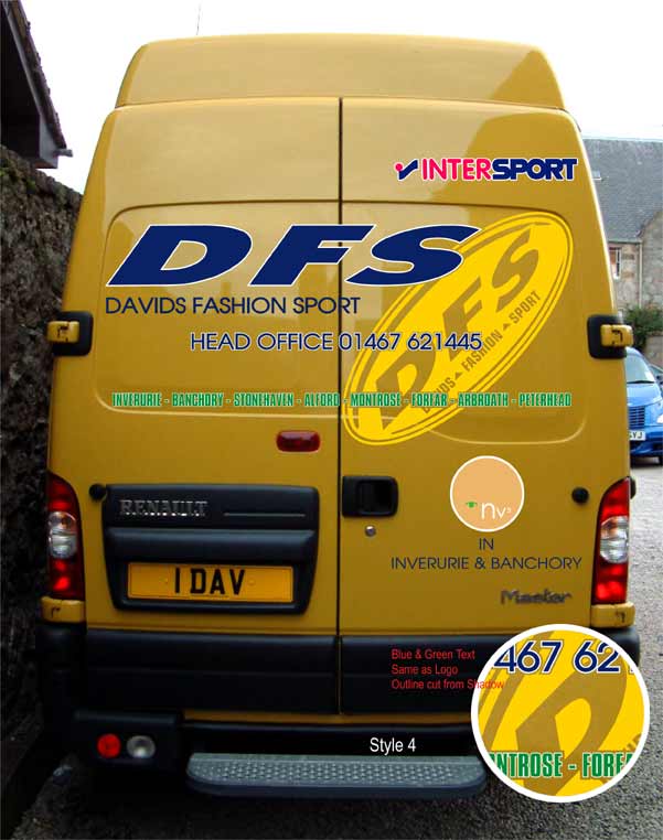
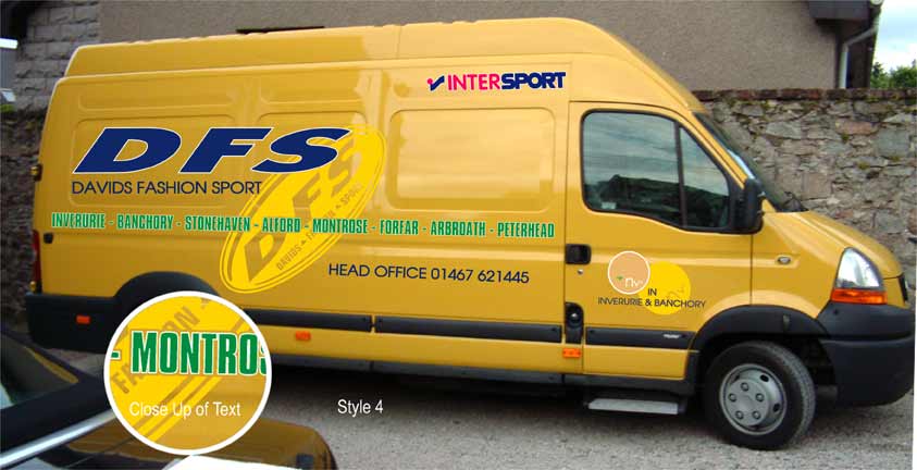
Posted by Gordon Forbes on October 1, 2005 at 1:47 pmRevised and took on board what was said from the last post
Gulp
Goop
Attachments:
 Dave Bruce replied 18 years, 7 months ago 6 Members · 6 Replies
 -
6 Replies
-

Much better Gordon. I like the way you’ve prioritised the text. I also like the way the large yellow oval shaped logo appears in the background 😀
-

Thats more like it 😀 I like the yellow oval in the back ground and the lay out
Lynn
-

not being sarcastice here mate, exactly what do they sell?
only had time last week for a quickie look at your design, as others say. this ones much better. will elaborate tommorrow. having a beer just now and waiting on a curry coming 😛 -

Jesus Rob, you start early!
I like that design much better, looks a lot cleaner.
Steve
-

Rob they Sell branded fashin clothes for the younger people as well as sports equipment eg Blend Nike Goddigga Adidas etc etc oh and shoes trainers etc.
Thanks for the comments now I will have to see if He likes it.Goop (well his wife apparently so the word goes)
-

Rob, try fashion sports gear, exactly as it says on the tin!
Stop drinking the beer it is affecting the grey matter :lol1:
Dave
Yep I too like the oval in the back ground, much better.
Log in to reply.
