Activity Feed › Forums › Sign Making Discussions › Graphic Design Help › What do you think of this T’shirt design
-
What do you think of this T’shirt design
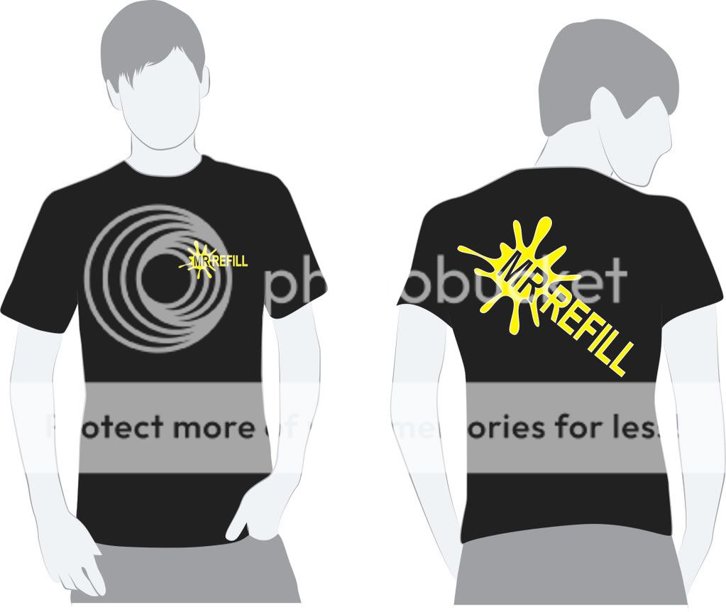
Posted by Aaron Powell on February 28, 2009 at 11:03 amThere is a slight outline in white for the yellow to stand out more.
I’m thinking about putting more info on the back but do you think it will be to much??
I.e Website address, Phone number,Prices.
 Aaron Powell replied 15 years, 2 months ago 8 Members · 17 Replies
 -
17 Replies
-

Nice design, i would use a different font though, something a bit livelier.
-

Yeh – agree with Neil, font is a bit too straight forward.
Is this a vinyl, sub or screen printed job?.
Cheers John
-
Will you by able to get the postition on your yellow when you layer the vinyl on the back? – it looks really close.
John
-

Yeah i know it looks close but with a 2mm outline i should be able to get it
😕
-

defo font change, love the template though, is it available?
-
Done plenty of t’shirts with vinyl but the only real multi-coloured ones were hi viz vests – 5 colours and they were a nightmare. Material expanded and contracted when hot/cold and layering up was a total nightmare.
Good luck with your 2mm border :lol1: I’d take the white off completely.
John
-
The white looks great – just thought it might have been a little bit awkward. Love to see the finished job.
John
-
Here you go


1 sleeve
2 chest
3 backSorry Rubbish Camera It looks better than the pictures…
-

looks good but only crit is the inside of the "R" should have been cut out.
otherwise looks attractive 😉
-
Looks good – but the 2mm white overlap on the front hasn’t quite registered. 😉
John
-

Yellow is a lot better in my opinion…. is shirt for an inkjet guy or for an employee who comes round topping up the coffee cups Aaron?
Ian :lol1:
-

Nice design Aaron. What about adding contact numbers etc on the rear?
Also take on board previous advice. If you’re doing a run of these, screenprint has to be the way to go. We’ve just had an enquiry for 1000 T-Shirts this evening and told them the same thing. There’s no way I’m going to be weeding so much vinyl for the same margin a screenprint will give.
-
quote Ian Muir:Yellow is a lot better in my opinion…. is shirt for an inkjet guy or for an employee who comes round topping up the coffee cups Aaron?
Ian :lol1:
lol Why you want a refill of coffee ?
Log in to reply.
