Activity Feed › Forums › Sign Making Discussions › Graphic Design Help › what do you think of this logo?
-
what do you think of this logo?
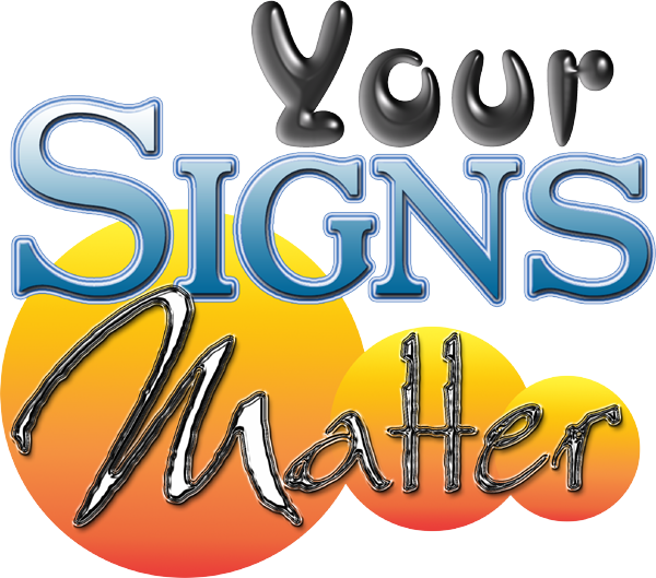
Posted by Gordon Forbes on February 10, 2004 at 9:11 pmTrying to design my own logo
What do you think of this??These are going to be digitally printed of course.
Goop
Attachments:
 Dave Bruce replied 20 years, 1 month ago 11 Members · 18 Replies
 -
18 Replies
-

i like the effects you have created mate.. but my persoanl opinion is it needs tied together more.. each font is different, styles and colours etc..
ive just glanced at it and this was my thought.. not meaning to be rude by any manner. ill try add to other replies as they come in. 🙄 -

Forbie…..
I like the slogan.
But in my opinion, this just looks like a few slick computer tricks, not like a logo.
Like Rob sez, it needs tied together.
It reminds me of a lady wearing big gobby earrings, a pretty floral blouse, and plaid trousers.
I like the colors in the circles. Pardon me if I sound snotty, I’m fresh back from a Letterhead meet! 😳
Love…JILL 😉 -

Hi Goop,
Blimey, you’ve gone a little crazy with the effects haven’t you? 😉 😀
The font choice for the SIGN and MATTERS work okay to me, but I think the YOUR is out on a limb a little bit. Maybe by closing the gap between the SIGN and MATTERS and changing the font on the YOUR to something a little more complimentary. All constructive this Goop as always you know 😀
The only bit I’m probably misunderstanding is the big orange bubbles. There are no bubbles in your work usually mate 😉 Seriously though, I think the bubbles may be an effect to far. Most logos have to jump across different medias ie Letterheads, Websites, Vehicle graphics, Faxes (where logos become blurs anyway) etc etc so the best bet is to keep the effects to the minimum and concentrate on the form. Am I making sense here, I think I may have just lost myself!!! 😀
Cheers, Dewi
-

Yeah, looks like you’ve just selected a few photoshop layer styles at random. I’m expecting to see a lot of stuff like this over the next few years as sign companies start buying digital printers.
-

Guess your right guys.
Lost track again with the things that you can do with it
I was trying to show different effects and got too carried away by it
OH Well back to the drawing board.
Thanks anyway.
-

I think I’d have to agree with the comments thus far mate, it reminds me of the sort of thing I started coming up with when I started the business – sorry, I don’t mean that to sound too much of a put down. Just I now look back and see the things I did design then and cringe a bit.
I would have a good think about a structured/meaningful logo that you can be proud to use for years to come. It is expensive and a pain in the neck to have to change it later when you get tired of it 😉
I know thats all easy to say, but worth it in the long run from experience. Checking out some other company logos on the web and use them as inspiration can be a good start point. Also bear in mind that you will often need to produce your logo/name in a “flat” or single colour form for various things and the more fancy effects you use the more tricky it can be to make it look decent on things like … fax header,embroidery, promotional items, small ads etc.Just some of my (constructive?) thoughts 🙂
Nigel
-

Some very valid points made here.
I have been designing my own logo/name for the past 2 months! and it ain’t easy when you know that joe public are going to be judging you on how it looks in the first 3 seconds they see it 😮 Now I look back and see my initial designs, like Nigel I think, that’s horrible, what was I thinking. The design did become simpler as I wanted to be able to put it on to clothing, vehicles, stickers, windows, facias, etc and didn,t want to have to get it digitally printed every time.
You have to start somewhere though Forbes, that’s what gets the old grey matter going, hearing other peoples thoughts. (chat.)
Keep us informed of the progress.
Cheers
Dave
-
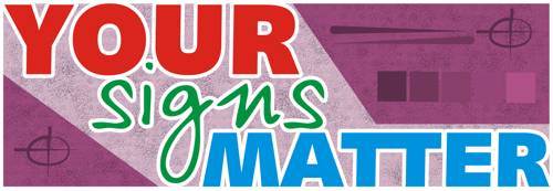
Here’s a quick one for you.
I just gave my partner Colin a ‘5 minute design challenge’
bugger, its just cost me lunch…
Attachments:
-
A suggestion for you Goop. You have full colour printing capability yes? If so, why not try merging your portfolio of work together as a background? If you have problems working this, there are tonnes of us here who will help, myself included. If you don’t fancy that, why not pick a really stunning image, something that conveys what you’re all about. I can’t think of one off hand, but I’m sure this would be an effective use of your full colour capabilities.
Keep going though mate, its one of those things that can take a while before you come up with something you’re happy with. Humble opinion, but try and steer and away from plugins and effects for now, and try and concentrate on the message you want to get across. What jobs do you really want? Who do you want your customers to be? Are you aiming for cheap n cheerful or bespoke signmaking? All good questions to ask yourself whilst designing your logo.
Sorry if I appear a bit of a know it all, its just I’ve spent quite a while designing logos and bar from when the customer specifies what he/she wants, I always end up using the ‘questions’ process to get good results.
Cheers, Dewi
-
Thanks Dewi
Hows about a list of the questions you ask yourself then.
Not being cheeky but I think it might come in usefull to me.
Goop.
-

Forbie,
Take some time, away from the PC, and try to think of a theme you like.
Engineering
Cartoon
Chrome
Medievil
Scotland
Sport
Family History
Autumn
Historical Events
Science & Progress
Local Landmarks
AutomotiveWhich one of them most applies to you as a person or best matches your business plan?.
Start the design with no more than 2 fonts and no more than 2 colours initally. Don`t be tempted into adding any more till you start to see something emerge. Screw your eyes up and look at it from a distance. You should be able to see the word “Signs” at your furthest distance.
The most effective logos are the blatantly simple ones and just because you can digitally print, it doesn`t mean that you have to.
These are just some ideas that help me.
Rod
-
some good points to consider there mate, I mentioned this to a friend and he said he would have a quick go at it too. This was his attempts….just further food for thought really 😉
Attachments:
-
Thats bizarre Nigel! I was thinking of the Yankee poster with the guy who points at you 😀
Goop, question-wise its always something along the lines of what McRod has outlined. Basically what suits the business I’m trying to design for. Usually you can ask your customer for ideas/input, asking them who their target customers are, how they’d like to be portrayed and simple questions like do they have a favourite colour. Then when you’re sat in front of the computer, you’d relay those questions in your mind to come up with a selection of logos. In your case, you can bypass the customer bit and ask yourself questions about your business. Who do you want as a customer? Are you cheap n cheerful, in the middle, bespoke? How far away do you want your sign to be seen from? Does your logo need to be transportable, ie are you planning on a website, magazine advertising, business cards etc etc?
As McRod pointed out, you don’t necessarily have to use your digital capabilities in your logo design. Some well-known designers use just black in their concept work, then start to add colour as the design progresses.
Something you can try is searching for logos on the web, see if you can find a near as dammit to what you want, then modify it to suit your business. A lot more ppl do this than you may think. Usually its a style thats copied rather than a specific logo, but when you’re struggling to come up with a concept, it helps to play with ideas and by looking at other logo designers you’ll get plenty of those. You might get into a little trouble if you copied Pepsi’s logo though 😉
Cheers, Dewi
-

So you’ve got a great catch phrase!
Well done!and along with that design from creativesign
Well need I say more!
Go for it!
John
-
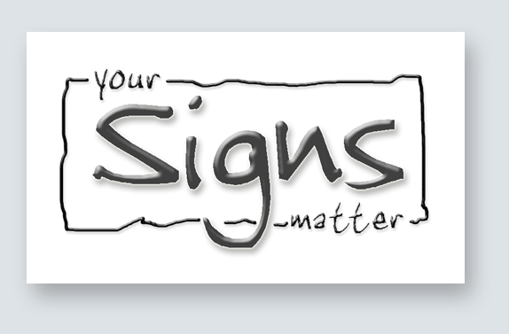
Hi Gordon.
I was goofing around with my computer.
I am sure this isn’t at all what you’d like.
But what I am trying to show you is that
if you start with black&white and go from there,
it might be a good idea. Forget the bells & whistles
and get down to the bare bones of your design.
The fancy effects can come in later.
There are a lot of good suggestions here for you,
all meant with the best of intentions.
Love…JILL 😉
Attachments:
-
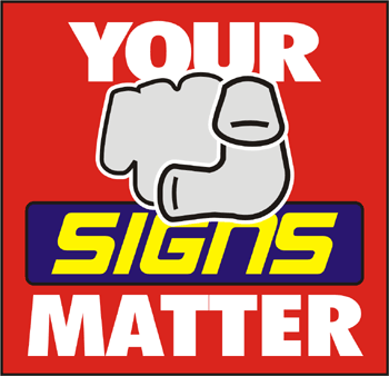
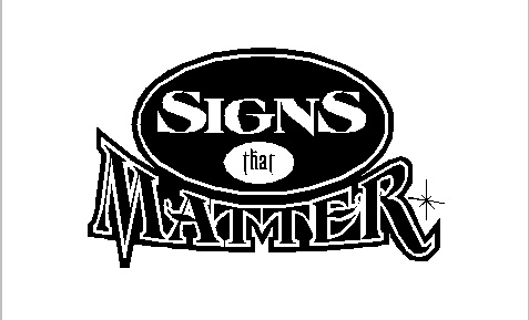
I went for something similar to jills approach here, (black & white).
The design I have used will probably not appeal to you but I wanted to show that the emphasis here is that you make signs. So I have made signs more prominent.
Attachments:
-
On the contrary Kev I like the design modern and effective yet simple for everyday use on most things.
Thanks everyone for taking the time to write comments and opinions.Goop.
-
Nice one Kev, I would agree that the Signs should be the first thing to see and the your and matter come second.
Nice and simple but catchy too, although the font is a bit too querky for me, might suit a craft person making signs out of wood(sorry if that sounds cheeky, it does actually doesn’t it 😳 )
I like it all the same (that’s a strange phrase)
Dave
Log in to reply.
