Activity Feed › Forums › Sign Making Discussions › Graphic Design Help › What do you think of this logo for a racing car?
-
What do you think of this logo for a racing car?
Posted by Dave Armstrong on January 11, 2006 at 6:00 pmNot sure if this is the right place but……..
After a few years off am going back into racing (superstoxs) again and trying to come up with ideas for signing the car.
The car is painted a chrome yellow with purple metal flake.
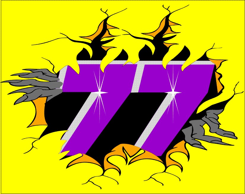
This is for the back of the car,(panel approx 500mm by 380mm) numbers through metal?
Still got sides and roof wing to do, these are a funny shape?
Any thoughts.
Thanks Dave
Attachments:
 Dave Armstrong replied 18 years, 3 months ago 6 Members · 11 Replies
 -
11 Replies
-

I think that looks great!
If you do put this on the car make sure you post a pic, I’m sure I’m not the only one who’d loved to see it done! 😀 -

Looks nice soo far.
Constr. Crit.: I wouldn´t cover the top of the numbers with the bits of the scratch, instead i would try to give it a more tridimensional effect by making them stand off trough the panel, like if they we’re lifted in the top from behind, i’m not ken on the purple aswell, but if you have other bits with purple then it should make sense to you.
another thing i would change is the hands, i’ll loose them at all (too much fullfilled) or at least i’d try to break that tendency by changing nails color or something.Hope, it didn’t look to confuse, … in fact it confused me a lot re-reading it 😕
Sry for the english 😳
Hope i helped anyway.
Cheers
Vitor Brito -

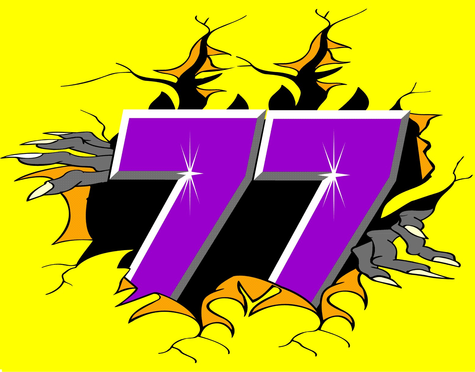
I took on board some of you idea Vitor Thanks
Had bit of a change, think it looks better.
The hands are to give some meaning to it being ripped, over the years I have painted the ripped effect with numbers – names etc coming through, but I wanted a slightly different slant on it.
But the purple will stay, as I have always raced purple and yellow (dads old colours from many moons ago)
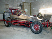
Also added a pic of the car (un painted)
Attachments:
-

Wow! Like the first one but the second one has great improvements and you’ve added the bevel to the caps
Thanks for sharing 😀
-

A few crits, although they’re probably taste based, in which case, iot’s fine.
-The hands look a little stretched and flat, they also don’t look like htey’re gripping the paintwork, I think they’d be better more curled. Also the left one seems to disappear into no-where half way down the arm.
-The flare things, not sure what they are at the moment, I would only use one of these, and place it on an area the light would be hitting the 77 the most(according to your bevel, top left)
I’m not too keen on the bevel as it stands at the moment, it needs more perspective to make it jump out a bit more; at the mo it’s a uniform width all the way around, but that again is personal taste.
The second is much better than the first, but it still feels a little flat.
What form is this graphic going to take?, cut vinyl? digital? paint?
-
Great improvement in readability !! (does the word exists 😳 )
I love the new bevel efect, altought the “flares” aren’t properly set acording to the source of light (as Ramj said), i think you should find a proper spot acording to it or change the bevel to match.
Maybe a small shadow behind the number only reflected in the top of the rip would look good too (more tridimensional), i’d try the numbers slightly bigger also. Left hand does look weird tough. Have you tried another color for the nails? (maybe Red or Strong Orange)
As if you hadn’t already doubts about the design, now i’m confusing you even more. :lol1:I’d love to drive one of those cars too. I’m jealous now!
Enough said, maybe too much dunno!! 😕
-
Thanks for your crits Vitor and Ramj, much appreciated.
Ramj- I am going to change the hands to a cartoon type image, I took the “rip” from a skull one. Not sure what you mean about the bevels? but I’ll have a play and work something out. It will probably be vinyl so I can change it easy when I want to try something different out.
Vitor- I like the idea of trying to make the 77 stand out at top.
If any one has some cartoon fingers.
Thanks Dave
-

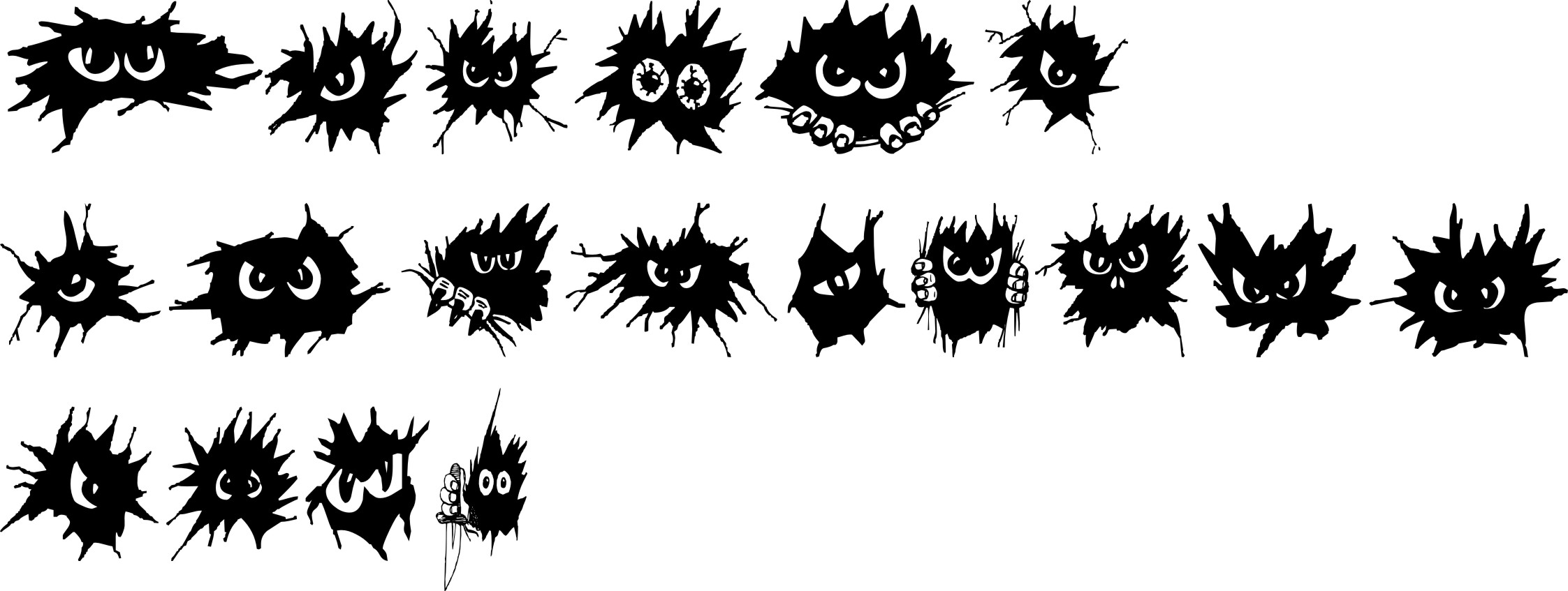
Dave I have this font called no Fear which has some good tear images, just say if you want it and I will upload it.
Peter
Attachments:
-
quote Peter Munday:Dave I have this font called no Fear which has some good tear images, just say if you want it and I will upload it.
Peter
Hi Pete, that would be good, looks like I could pinch some of the fingers out of there.
If you wouldn’t mind.
Thanks Dave -
Hi
Thanks to all so far for input, 8 weeks to get finished till first outing 😀Would anyone have a cartoon type rats head please, so I can put if as if a rat is climbing out over the number.
Finally finished painting the main body yellow, with a ghost darker yellow checkered flag all over.
Thanks in advance Dave
Log in to reply.
