Activity Feed › Forums › Sign Making Discussions › Graphic Design Help › What do you think of our Logo
-
What do you think of our Logo
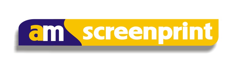
Posted by Nathan Hill on February 1, 2011 at 7:21 pmWe are a T-shirt printing company that also produced basic vinyl cut signs and vehicle livery. We have recently purchased a new roland sp540i to enable us to produce some more elaborate signs and we are especially looking to get into the vehicle wrapping market. Thats the background and we are now trying to Rebrand with new logo for website, signage and of course our van, which will be wrapped to fit in with the new branding. I have come up with the following logo and would appreciate any thoughts as it is difficult when you are doing it for yourself. ( will try to upload the ai file but struggling to get it under 400kb at the mo).
Attachments:
 Jill Marie Welsh replied 13 years, 3 months ago 14 Members · 36 Replies
 -
36 Replies
-

I don’t know if this is ok but i have managed to get a PDF under the 400kb
-

Nathan, it a very big step from t shirts to wrapping a vehicle.
and if you are trying to get into the wrapping market, then your logo and name doesn’t relate.Not being rude, but if you cant get a simple design down to 400kb, you are really going to struggle designing wraps.:(
I have no doubt our regular design experts will offer better advise than I on your logo design.
good luck with your new purchase,
Peter
-
Cheers peter your right it is daunting. I attended a wrapping course before christmas with James Deacon at grafityp which will hopefully stand us in good stead. Never had to worry about file sizes before and I can’t get my ai file less than 1000Kb i’m sure i am doing something very simple wrong. 😕
-
Nathan,
at least you are moving in the right direction by taking a course.
Your PDF is not good either.
I will pm you my email and if you send me your file, maybe I can sort it for youPeter
-

baby steps Nathan, baby steps. Wraps are the top of the vinyl market and are not easy even after a course. Besides the difficulty of getting the artwork files right to print stage, getting a good print and laminate is the next step, not too easy if on your own at that width (trust me I know) you will have waste and more than likely it will be 2 full meters of cast vinyl and laminate (big loss to profit) Wraps are time consuming and the market is very competitive.
Do you have suitable (warm and clean) premises for fitting?
Baby steps.
I’ve done the course, have all the gear, have done a few full wraps on my own, Jumbo LWB Merc full wrap took me 4 days on my own 😮 I don’t push them hard as I don’t have premises so have to arrange something if I do get a job in (I always quote on the top end price range so only do if customer is willing to pay hence not doing many)
erm, you logo (back to topic sorry) as Peter says it doesn’t read "Vehicle wrap professions" at all. When somebody is going to spend a few grand on a wrap you wouldn’t think about sending your van and money to a screen printer 😕
If you are limited company then why not start a second company trading as "AM Vehicle Wraps"
You logo looks like a t-shirt printing company, and that’s a compliment as that’s what it is for. (not a wrap company)
good luck though, it’s all still a lot of fun at the end of the day 😉 (as long as you don’t lose too much dosh)
cheers
Warren
-

I like the AM part but the font for Screenprint looks really generic.
The tagline seems to be floating in space.
Consider putting it in a panel, reverse cut lettering.
Love….Jill -
Warren,
Good point about "sending your van to a screen printer", I hadn’t thought of it like that.The business has been going for 25 years doing screen printing, and 5 years doing basic sign writing with vinyl lettering on vehicles, banners and signs. Wrapping seemed the logical progression for the business.
We do have suitable (warm and clean) premises for fitting luckily with the winters we’ve been having lately! It’s a good job by the sounds of it there are 3 of us! We test covered the work van’s bonnet today and are beginning to appreciate the difficulties involved!
Thanks for your comments.
Jill,
I think it’s back to the drawing board for Am signs/wraps perhaps! Will post my next attempt soon.Thanks for your help.
Thanks to everyone for all the constructive feedback!
-
Hi Nathan
OK good, sounds like you have a good set up and a few skills already and with the wrap course completed ti actually sounds like it could be a good next step (although still a difficult market to compete in)
It’s just the business name and logo design that you need to get right then and you’re off.
good luck mate
Warren
-

I don’t understand why vehicle wrapping is such a competitive market.
It’s difficult, time consuming and expensive (in terms of materials) so why are so many companies trying to compete when it’s so much more lucrative to do vehicle signs in cut vinyl?
In terms of materials cost and time spent pro rata – vinyl lettering generates much greater profits
-
because there is a market out there for it, and the guys who are doing it are all trying to get the market and hence it’s competitive :lol1:
that’s some straight shooting there cowboy (:)
:lol1:
-

I have to agree Phill, the only way I’d even consider going into wrapping is if I had a massive high ceiling workshop with a ramp in the middle. Crawling on the floor really isn’t that appealing to me.
-
 quote Phill Fenton:I don’t understand why vehicle wrapping is such a competitive market.
It’s difficult, time consuming and expensive (in terms of materials) so why are so many companies trying to compete when it’s so much more lucrative to do vehicle signs in cut vinyl?
In terms of materials cost and time spent pro rata – vinyl lettering generates much greater profits
Well Said that Man!
-
We have used so many over the years it is different on the unit sign and website so i am trying to tie up all aspects of the business under 1 brand as it were. i have attached our website logo that we were using when website was designed, but that is going to be brought up to date once I am happy with a new identity.
Attachments:

-
Well, after seeing that, which I almost fell asleep from seeing
(I’m kidding!)
you new logo is nicer.
But you can do better.
Try something like LHF American Sans for Screenprinting.
It’s condensed but beefier.
Even Futura Bold Condensed would be better than that skinny weak font.
I did like your new am part.
(that sounds kinky)
😳 -

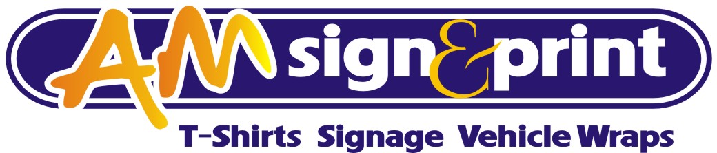
Some food for thought with Jill’s American Sans.
Attachments:
-

How about AM Signs & Screenprint?
Covers everything then & doesn’t deviate to far from your existing name.
-
 quote Harry Cleary:Some food for thought with Jill’s American Sans.
I like Harrys. But as you want to go into wrapping, I would drop the "screen" and just keep AM PRINTING OR AM SIGNS & PRINTING
-
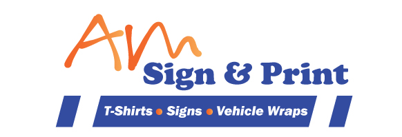
Thanks for all your great Ideas. I like your version Harry but it is quite similar to our old Logo which we are trying to get away from. I have made another attempt taking on some of your suggestions, not sure about the tagline, maybe need something less obscure and not to sure about the font. Hopefully i am getting closer.
-
I do think sign & print is better than signs and printing Harry. I think i will change that. Cheers.
-

I’m going to be really honest Nathan…..I really don’t like the AM as you have it…..to me it looks like your existing logo has just been graffitied on
I like handwritten fonts with certain sans serif fonts but for me your’s doesn’t seem attached to the bulk of the text
Personal opinion but something like Harry’s looks much more professional and more likely to attract the customer base you are chasing
-
Maybe banging my head against a brick wall persevering with this idea. I appreciate all your feed back and harry’s logo is certainly not a massive deviation from our current logo which maybe a good thing. So glad i found these boards it is fantastic to be able to gauge peoples reaction to your ideas.
Attachments:
-
Sorry Nathan, had not realised you were looking for a complete change.
I have to agree with Glenn though…the AM looks to be floating, unconnected to the logo and the white stripes on the blue band aren’t working for me either.I can’t import any of your pdf’s or ai’s to have a play, file is corrupted for some reason.
-
is this pdf any better Thanks Harry
-
Could not get pdf to work.
Its hard to design while holding my one month old grandson but here’s a suggestion.
Attachments:
-
quote Chris Wool:The opposite of hardcore
so what’s hardcore?
And dont say the opposite of softcore….Peter
-
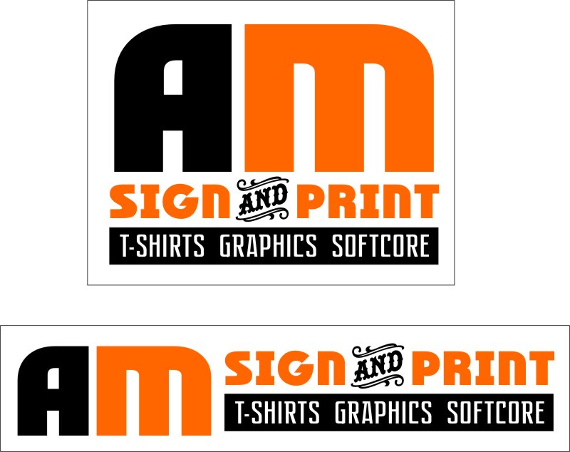
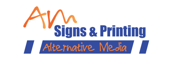
Another go.
PDF wouldn’t work so made my own AM. Trying to incorporate that graffiti font better.
Attachments:
-
Really like it Harry just the kind of thing I wanted (but couldn’t quite achieve). I can see what you mean about the am floating now it is all tied into the box. It looks much more like a logo than my effort. Thanks too to Jill liked your design also but I do like the informal AM style that harry used. Thanks everyone for your input It is very much appreciated.
-
No problem Nathan, glad to help. AI attached if you want to have a play.
Attachments:
-
Yeah I wanted to use the pdf to get the AM but it didn’t work.
Harry’s is exactly perfect.
I put the softcore in just to see if anyone was paying attention.


Log in to reply.
