Activity Feed › Forums › Sign Making Discussions › Graphic Design Help › what do you think of my new flyer layouts?
-
what do you think of my new flyer layouts?
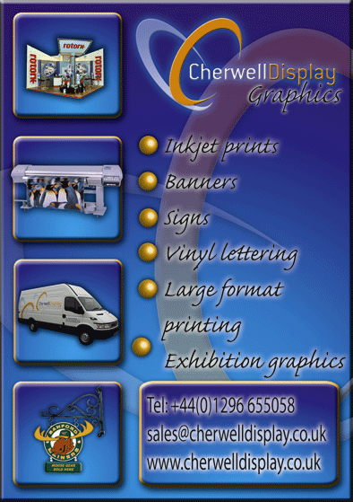
Posted by noviceDan on March 15, 2006 at 1:23 pmthis is my first stab at designing something, its for our company flyer. What do you all think? Comments appreciated.
Dan
noviceDan replied 18 years, 2 months ago 5 Members · 5 Replies -
5 Replies
-
I like the overall theme of it with the 3d blocks etc.
My only criticisms are that your Company name looks a bit wishy-washy against the background.
I think the bullet point text could be much “punchier” in a different font.
I think you might have gone a touch overboard with the drop shadows – it makes some of the text hard to read.
I really do like the overall look, I just think it could do with tweaking here & there 😛
-
how do you propose to print?
If you are printing this to the edge of an A5 you need to add bleed to cut through your rasied look on the edge may not have the desired effect you want.
-
I agree mostly with glenn.
The halo on your GRAPHICS text thats on your logo looks too strong so the black text is lost slightly. I’d change the font of youyr bullets as glenn said.
The logo in the background could be knocked back slightly to emphasize your main logo.
And if it were me doing it I maight change the colour of your boxes that the images are in just to give them some punnch as they are the same colour as the rest of the leaflet at the mo.
Layout looks sound, images are clear and the choice of colour is nice.
Tidy logo too!!
Just my opinion mind 😉
Aaron
-
Good point about the bleed. Its definitley there for a reason, as the cutting position can vary, and go right to the edge.
looks good though. I assume you’ve done the bevels in photoshop. I would just bring the percentage of the shadows down a bit, and the same with the highlights. But thats just me.
I prefer drop shadows and stuff to be hinted at, not overstated
Danny
-
Cheers guys, thanks for that. I am printing it, then cutting it out with a scalpul. I think you are right when saying about the font standing out more.
Dan
Log in to reply.


