Activity Feed › Forums › Sign Making Discussions › Graphic Design Help › what do you think i should do with this layout?
-
what do you think i should do with this layout?
Posted by Chris Wool on July 2, 2005 at 2:02 pmhad this idea now i don’t like it – i don’t use the door
have a voteBIN IT
LEAVE IT FOR A WHILE
ITS OK
chris
Attachments:
 David McDonald replied 18 years, 10 months ago 12 Members · 17 Replies
 -
17 Replies
-

sorry Chris my vote is BIN IT I think it’s too busy and not bright enough 😕
Lynn
-

Sorry me too… the photos are too square in my mind, maybe should have blended the edges, and faded them out a bit
Simon
-

sorry Chris
Bin it! Think outside the box I think the square lines of the building need to be softened instead of having them dictate your design.
Tim.
-

ide say the phone number wasnt needed if you are at the door 😕
leave the banner there till you have a better layout design, the idea is a good one, just needs a bit more thought on presentation. its offering 3 things but really only showing one. try varation on work and a bit more thought on layout.
customers are stupid, you need to spell things out to them. god knws many people we do signs for only for them to get van from someone else, when asked why, they say… oh i never knew you did vehicles too 😮 spell it out for them, ram it up there nose if you have to. something is always better than nothing. -

As Rob says, phone number isn’t really needed. Why not blend the pictures together
-

I’m gonna go way out on a limb and say you don’t need all those pix at all.
If you have the capability of going digital,
why not print something attractive and attention-getting,
like a child’s face, a pretty girl, a fancy car, or a nice sunset?
(not all on one banner!)
And your lettering needs much more contrast too.
(I do like your fonts)
Just my 2¢
Love….Jill
Attachments:
-
Don’t like it at all Chris sorry- photos are hard to get looking bright and interesting to begin with but digital print seems to dull them as well unfortunately. Do like the fonts- in fact I just seem to be copying Jill 😆
We’ve been struggling to find a good way to promote our digital print service to our customers as well- I’m in the process of producing a ‘sample’ board with different jobs we have done on it as well so I can appreciate how hard it is.
Jill that design looks awesome! did you use photoshop to produce the lettering effects- I assume the background is from a photo/image library
Rob
-
Thanks Rob.
I am by no means a photo expert! I typed “Free High Res Photos” into Google & came up with a site that had some cool pix, this is actually of a ride at a fair (in the UK of course!)
I brought it into Corel 9 and changed it into a 300 dpi bitmap, then typed the text over it, added a contour and a drop shadow. it took about 3 minutes.
Since I don’t do digital stuff, I could be way off base. I just wanted to show Chris my idea. I still think a bikini babe would look cool this way!
Love….Jill -

Chris, I am with Jill on this one too.
It all looks a bit ‘square’ to me. I wouldn’t trash it just yet though.
The problem is with this style of promotion, people start to think that all you do is vans.
That said, there is nothing wrong with montages but they are better in a seemless sort of way.
I have been wrestling with this for a while too, but came to the conclusion a week or so ago, just to go with a couple of decent pictures in brilliant colour.
Got me a ton of work, and didn’t pigeon hole me to one style of application.
Because they were so bright, it got attention, and prompted people to ask what I did.
I’ll try and find a picture and post it here later if you like.
-

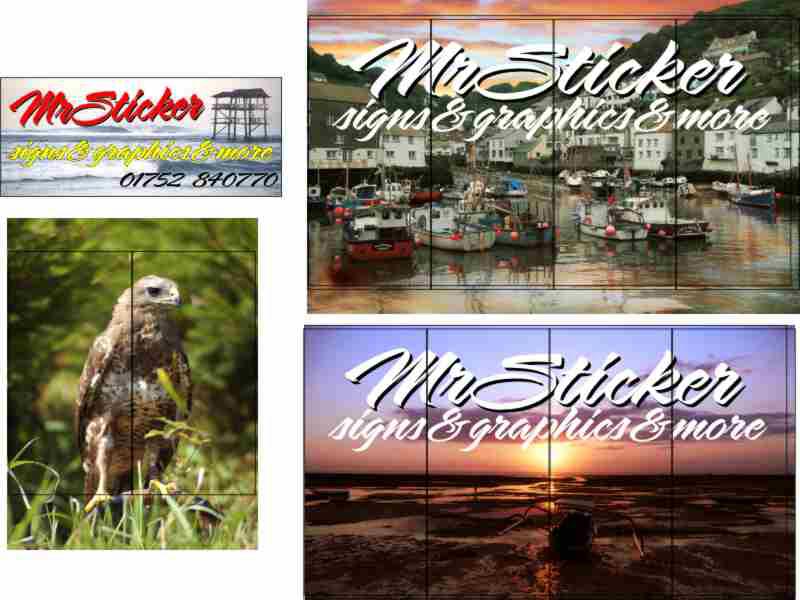
well i was either brave or daft to put it up but i do like the constructive comments thank you – if it will burn we might have a bonfire..
before i did that one here is what i was playing with but changed my original idea of how much of the front i was going to cover. thanks again for you honest opinions.
chris
the lines over the pictures are 1320mm wide so as to see the paneling
Attachments:
-
Bottom right one i like mate, sunset beach, just need the text to stand out a bit more
Simon
-
I’m with Simon….perhaps put the copy on the bottom?
See? you thought of it all on yer own without a woman nagging!
love….Jill -
luv the sunset one. everyone loves a sunset chris.
hope my wife does not see it tho, she’ll break out the champers and go all gooy on me 😥 start reminising about our youth…..
-

too many “&’s”.. grammaa, speling and punchuation!
The sunset is better as have kept it simple. If you want to portfolio then consider doing that on the inside of the shop. Maybe A4 sleeves hanging on wires.
I might prefer it if you zoomed more on the skyline then the bottom bit. try and make a cooporate repeatable image from say the skyline that would suit your van, front, leaflets, business cards, etc. A coorporate image help significantly sell your services to other companies seeking that coorporate look. Before you set your heart on printing a massive print for the front, get everything right for leaflets/A-Boards. It will make you money if you get it right.
-

Hi
Just a thought – whichever design you finally go with don’t cover 100% of the windows. It’ll look like a shop that’s closed and someone is just renting the window space for an advert – ie. the type of thing you see all the time in shopping centres.
Cheers
Macky D
Log in to reply.
