Activity Feed › Forums › Sign Making Discussions › Graphic Design Help › what do you think about this layout?
-
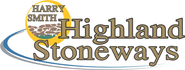
what do you think about this layout?
Posted by Gordon Forbes on December 20, 2003 at 7:54 amAnother Variant
Attachments:
 John Singh replied 20 years, 4 months ago 5 Members · 7 Replies
 -
7 Replies
-

This one mate, its the best one. If we had a “thumbs up” emoticon it would be worth three. 🙂
-

Hey Forbie!
This one gets my vote too buddy.
Watch your kerning tho.
This would have been a cool project for yer airbrush…you could have tried doing big beefy letters in maybe a grey, then added airbrush highlights & textures to imitate stone in the lettering. And a thick black outline.
I think I might change the color of the swoosh, but have no suggestions as to which…I need another cup of coffee.
Oh, and the one I hollered at you about being arc-happy…that is also the kind of font where you never use all caps, you do caps-n-lower case.
Aren’t I just a cheeky little yank broad? Please don’t think I am too bossy…I mean well.I really liked the first logo that had the buckle, etc. Too bad it didn’t work out.
I just got Corel 8 for $50 from a fellow Letterhead. Once I figure out how to install it, I can wow you with my cruddy little designs!
Have a good Holiday. (xmas)
Love- Jilly -

Thanks for the comments This was actually the first one I did.
They saw another design I did and said they wanted something similar to that.
Latest thing is he was speaking of putting the chosen logo on workgear as well Hard hats, Coverals etc etc and has to match the colour scheme on the vans etc already the reason for the Black and Gold writing. Most of his vans are white and there isn’t a lot of space left for anything large a lotof constraints.I like that variation Dewi. Teaches you how to look at things differently.
Still learning the software (Do you ever stop!)
Had to open up the kerning for the outlines. I will have to do some reading
In fact just got a couple through the post.
Gordon.
-
Humble opinion, as always, but I think Jill might be onto a good one there. Mike did something recently called bedrock that used a technique that imitated stone (using vinyl of course), that might be worth looking into. Sounds like your customer wants a cross-platform logo, a great one to look at for reference is the CAT logo used by the guys who build tracked vehicles for the building/haulage industries… they have used the same logo on vehicles, baseball caps and even shoes. Just a thought. If I can find some reference piccies I’ll dig em out if you like.
Cheers, Dewi
-

Like this one Gordon
Says it all
No ambiguityKinda liked the logo on Option 3 but like Jill says you need the right font when arching
john

Log in to reply.
