-
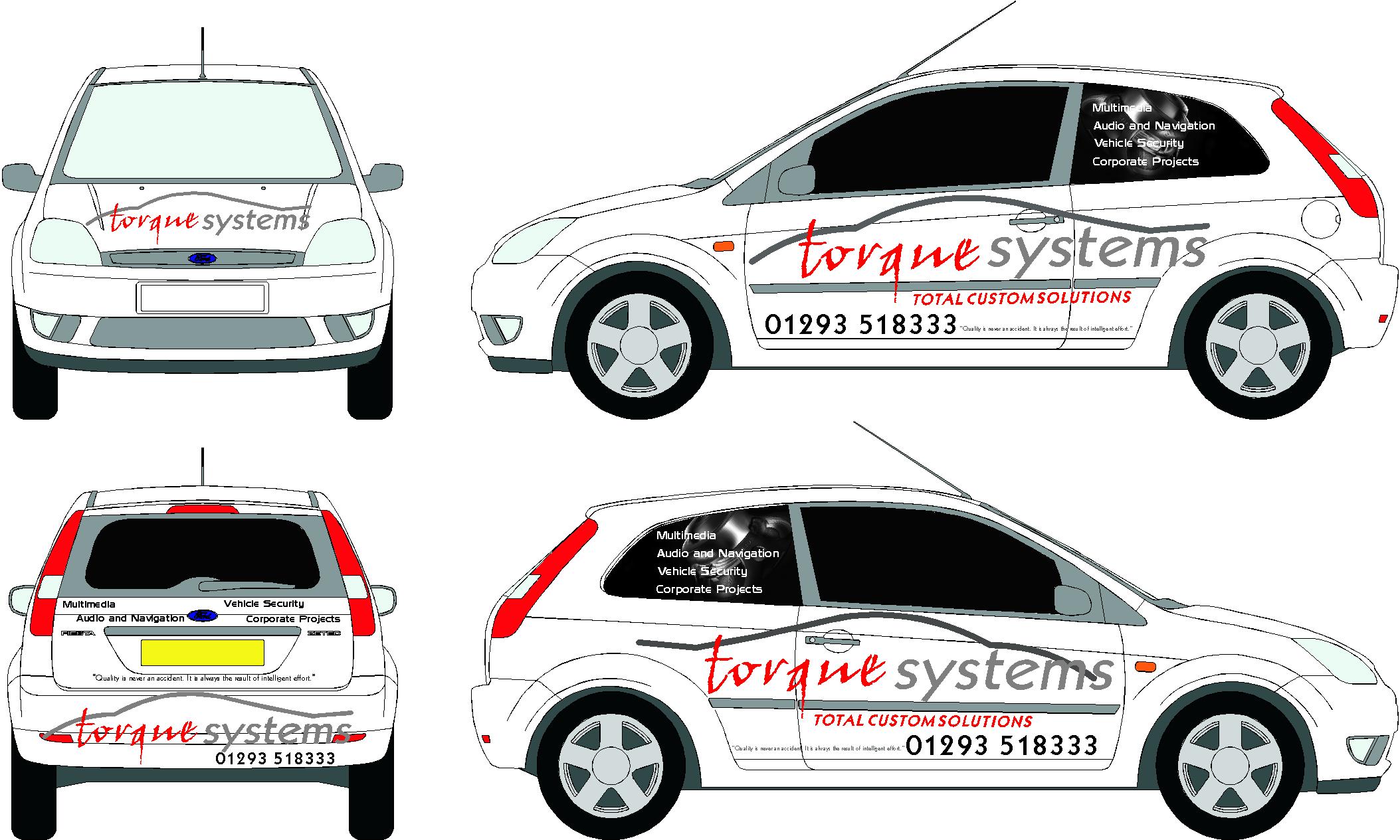
what are your views on the layout of this fiesta van?
hi all any views on this
please
thanks rich
Attachments:
Log in to reply.

hi all any views on this
please
thanks rich
Attachments:
Log in to reply.
Please confirm you want to block this member.
You will no longer be able to:
Please note: This action will also remove this member from your connections and send a report to the site admin. Please allow a few minutes for this process to complete.